When it comes to HubSpot CMS development trends, we’ve seen a lot of different requests over the years. Parallax scrolling animations, retro fonts, 3D visuals, augmented reality and more - web design trends the last few years have brought a lot of interesting features to websites. One feature that isn’t that new, stands out to us and seems to be a more popular request in our recent projects is a website mega menu. While mega menus have been around for many years, we’re just now seeing more adoption in businesses. For a very long time, confusing and difficult-to-navigate hover-over drop down menus dominated business websites. While it helped meet the needs for growing businesses with complex resources on their websites, it often came at the expense of user experience. The majority of the most valuable information remained inside individual web pages and there wasn’t much ability for users to parse through the information most relevant to them or gain a better understanding of what information was both relevant and available to them.
What are mega menus?
Mega menus are a more robust navigation menu that displays many different categories and options inside a 2D dropdown layout. Mega menus are the perfect way to enhance the user experience and place more central information in the hands of your users. Rather than guessing at what they’d like to see, your prospects can easily review a list of categories that apply to your goods and services. Segment your goods and services by industry or market to assist website visitors in better determining how your products apply to their business. The result? More organized navigation and resource centers that break down offerings by type or category.
Mega menus are one of the web development trends for HubSpot CMS that are here to stay. Here’s why we think that they’re a really valuable design trend that you should consider adding to your website.
They're more interactive
When it comes to time on page, you want to give your users options while still helping them move down the funnel in the buyer’s journey by delivering them the most relevant content. By adding a mega menu to your website, you can help your users get to the information that they need by using the categories, industries or products that you feature in your mega menu. This can help to better qualify your online prospects prior to them delving deep into your website and potentially reduces the number of steps required before they make a conversion decision.
Mega menus are used among a wide variety of industries, including healthcare, business services, e-commerce and more. Here’s a really great example of a mega menu that we partnered up with BS+Co to develop for Advanced Data Systems Corporation, a healthcare automation company. This mega menu is a great option that allows users to select a main navigation component where they can look at the solutions that are most relevant to them. The right section segments the users by industry so that they can learn more about how those solutions may work for their business specifically.
This allows users to easily access the solution that is most relevant to them without having to deal with the noise associated with the other elements of the navigation, which is a common complaint for mega menus that are very broad.
They're super easy to navigate
Many make claims that mega menus are not easy for users to navigate because of the additional display of information that isn’t relevant to that particular user. When a mega menu is poorly designed, it can be very overwhelming. However, when mega menus are broken down into categories and extraneous information is hidden from the user, it’s much more helpful.
Mega Menus are needed when there are too many sub categories in traditional drop down navigation. Mega Menus are a simpler way to manage multiple offerings and product categories. We can see this is particularly useful for business to consumer retail shops like online fashion retailers, home improvement stores and more.
Implementing mega menus helps avoid endless scrolling in their attempt to find the information they need about the topics that are most important to them. The days of scrolling to the bottom of a webpage to get to the information you need are gone, so long as you plant your mega menu properly.
Users get what they need
Through the use of a mega menu, users can easily navigate between products that they want or explore services that are most relevant to them based on the content categories present in the navigation. The more quickly a user can find what they’re looking for, the greater the potential for converting faster into a lead, since the content they’re viewing out of the gate is more relevant to their interests.
Regular dropdown menus can often hide many user options, which requires users to recall information rather than it remaining in front of them. Mega menus show your users everything in one place for an at-a-glance review of the information they’re seeking.
It also shows relationships between products and services and allows you to target more specifically by topic, service, product type, industry or individual need.
Align your content with the buyer journey
Mega menus allow you to target your content within your navigation based on the needs of your ideal buyer personas. If you are targeting specific industries or roles, have important information that’s relevant to them, want to elaborate on more specific services, or feature specific high-converting pages, this is a great opportunity to do so.
Breaking your content down by industry or most common problems based on role helps your users quickly navigate to content that they identify with. Highlighting pain points or industries can deliver relevant content more quickly than it would for a user just browsing solutions or services on your website. Think of this as a different type of content personalization.

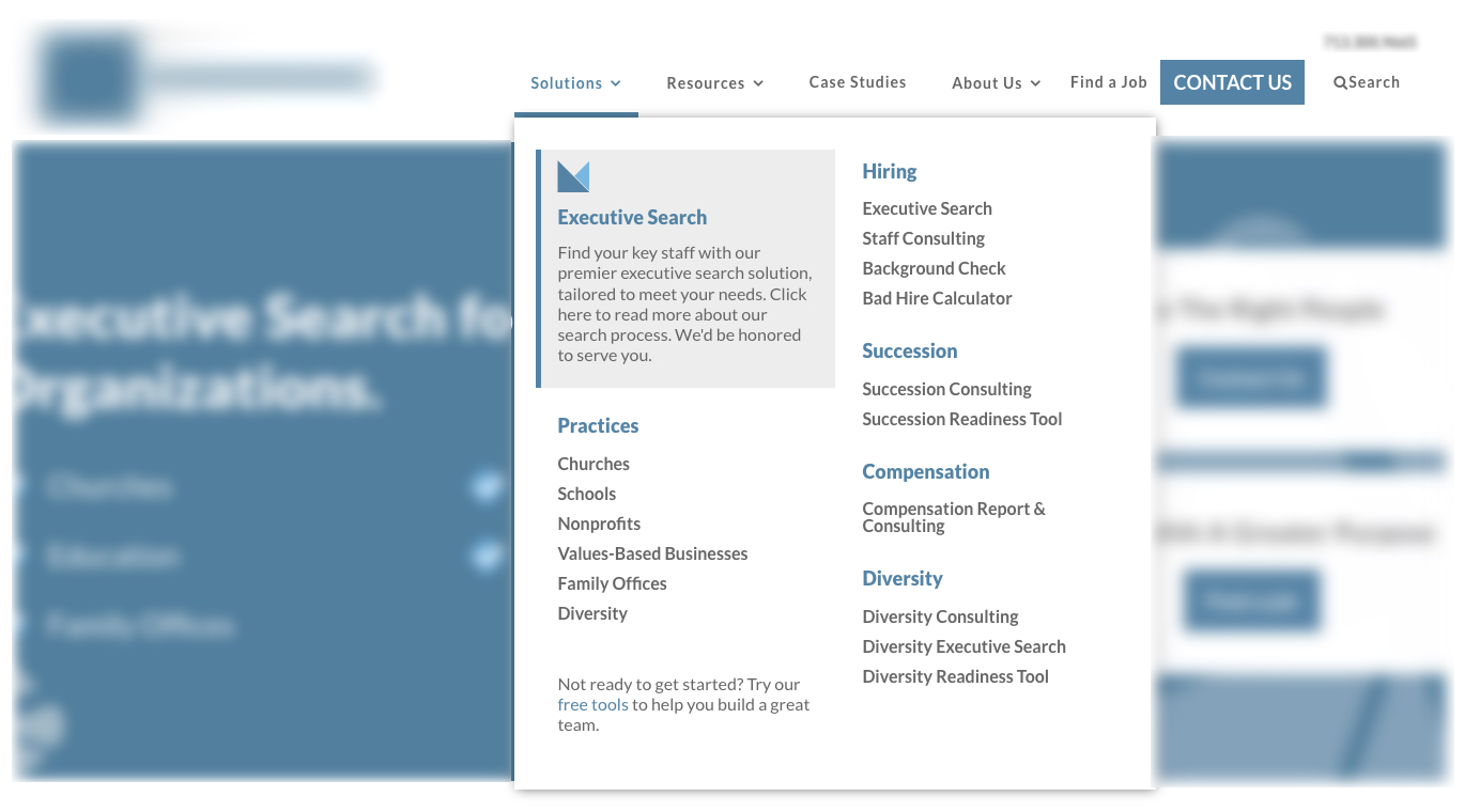
Above you’ll see how a staffing agency has targeted their solutions section and highlighted those looking for executive team members. They’ve also broken down their other service offerings very clearly by needs and segments of their market.
It’s important to organize your mega menu properly if you’re exploring adding one to your website. There are many instances where agencies or businesses failed to do the appropriate amount of research on their buyers and the lack of planning created more conversion issues than it resolved.
By doing in-depth research on your buyers, their journey from awareness to consideration and then decision, and your high converting pages and popular resources, you can easily segment your content in your navigation to better serve your customers and get them to where they want to go.
Need some help implementing a mega menu on your website?

What do you think of mega menus? Share your favorites below in the comments.
