Some Recent Thoughts...
Juicy Tidbits Without the "Tech Speak"
A compilation of ramblings about everything from HubSpot CMS development to data architecture, integrations and all the tech stuff you never knew you needed to know.

memeify the blog!
Blogs Listing - UPDATE 2024 (Jordan)

2022 Wrap-up: HubSpot Web Development Trends & 2023 Predictions
We covered some pretty good HubSpot web development projects in 2022 - here are the trends and here's what we think is in store for 2023 in HubSpot CMS.
5 Things to Add to Your Website Budget in 2023
Even if you've already created your website budget for 2023, make more room - we have a few items you probably forgot.

Why a HubSpot Mega Menu Should Be Your Next Website Investment
Your arsenal of content is getting bigger by the day - here's why a HubSpot mega menu should be your next website investment.

5 signs you’ve outgrown WordPress CMS
Your website shouldn't be breaking constantly and handicapping your marketing team. Here are a few signs that you've outgrown WordPress CMS.

Web Development for SMBs: A Mobile-First Approach to Web Design
When it comes to web development for SMBs, the best approach to web design is always mobile-first.
HubSpot CMS Development Tips: Mega Mistakes with Mega Menus
Mega menus are a great way to help your website visitors find what they need, but be sure you don't make these mistakes:
HubSpot CMS Development Trends: Mega Menus are Here to Stay
When it comes to HubSpot CMS development trends, mega menus are here to stay. Here's why:
It has been an exciting year of growth for deckerdevs. When we took the leap to make our partnership with HubSpot official, we knew that we would boost the business - but we were genuinely surprised to experience the exponential growth we’ve had this year. We’ve met new agency partners and so many HubSpot customers that we’ve helped integrate data, create custom workflows, work better with HubDB, organize resource centers and so many other cool projects along the way. We took all our projects and put them in a graph to see if we could identify some of the trends for requested projects and maybe even make some predictions for what projects we might see increased demand for in 2023.
\n","post_body":"It has been an exciting year of growth for deckerdevs. When we took the leap to make our partnership with HubSpot official, we knew that we would boost the business - but we were genuinely surprised to experience the exponential growth we’ve had this year. We’ve met new agency partners and so many HubSpot customers that we’ve helped integrate data, create custom workflows, work better with HubDB, organize resource centers and so many other cool projects along the way. We took all our projects and put them in a graph to see if we could identify some of the trends for requested projects and maybe even make some predictions for what projects we might see increased demand for in 2023.
\n\nIntegrations topped the list
\nIntegrations were the top demand in 2022 at 16% of our workload. We saw so many projects where our clients were requesting that data be moved more easily between HubSpot and their ERP software, a third party application, or social media.
Just a few examples of integrations that we completed this year:
- \n
- We helped a real estate developer integrate their property sales with contacts in HubSpot and automate the exchange of data with their ERP software to make executing contracts easier. \n
- We assisted a remodeling contractor better manage their remodeling projects and HubSpot sales contacts for improved follow-up and more efficient project management. \n
- We assisted with an integration between Stripe and HubSpot that allowed deal records to be updated when subscription payments were made \n
Most HubSpot customers pay somewhere between a few hundred to tens of thousands and some hundreds of thousands for HubSpot services and software. When you’re making such a massive investment, but still need to manually enter data between your applications, it can interfere with employee productivity and actually cause a lag in the adoption of new technology or under utilization of HubSpot. By paying to integrate your software with HubSpot, you can eliminate employee frustration, increase productivity and seamlessly move data between applications for improved analytics. This not only helps you get the most out of HubSpot, but boosts employee happiness as well.
Related: HubSpot API Integrations Improve Organizational Health
\nHubSpot consulting was a close second
\nFiguring out how to do things in HubSpot is as important to you as actually completing them, according to our workload. More than 15% of our projects this year were HubSpot consulting hours. From helping you organize your workflows, doing discovery on your business processes, understanding the complex integrations you’re considering, choosing the best software applications to help you execute your services on an everyday basis or simply consulting on page speed optimization - consulting was #2 on the list of most popular projects in 2022.
Our experience with HubSpot is longstanding and as a result we do many things that other development agencies won’t even consider or that many marketing agencies aren’t capable of. If you present a problem - there’s always a solution that we can come up with together. Creative development solutions are probably our favorite thing to tackle and we’re always happy to sit down with our prospects and clients and dig in to discuss potential solutions and help them understand their options prior to making a large investment.
Prospects want to understand their options, what the implications of this means and how they can find the middle ground between their wants, needs and budget - but this isn’t always something that can be discussed entirely in an initial call. Getting expertise from an experienced developer will help you avoid some of the pitfalls that can be associated with outsourcing your web development and go into your interviews a bit more educated about your needs. If we end up working with you, great! If not, you’ll be well-equipped to vet whatever developer you do use - and that’s what matters most.
Related: Why an experienced HubSpot CMS developer? Your website isn’t a sub sandwich.
\nWebsite updates & website overhauls came in third
\nComing in 3rd all tied up at 13% of our workload came website updates and website overhauls. This is interesting, because we’ve been making the case for the continuous improvement model for quite some time. While there’s nothing wrong with a complete website overhaul, particularly if you’re switching over platforms or have outgrown your infrastructure, establishing a budget for continuous improvement over time will help save you money in the long term. By moving to a more flexible, scalable platform like HubSpot CMS, you can plan for the growth of your website without bogging it down with additional plugins or add-ons over time. This allows you to focus on growth and making the lives of your marketers easier by constantly looking at data and tweaking your website rather than lumping all the wishlist items into your next redesign.
A website is never finished. The moment you launch, you’ll inevitably have the pangs of regret that come with not requesting additional options. By carving out a website budget every year broken out into a monthly expense you make things much more predictable and ensure that you improve your website over time rather than growing to hate it for everything it can’t do.
Related: 5 things to add to your website budget in 2023
\nOnline learning upgrades and help with HubSpot
\n10% of our development time in 2022 was spent on online learning upgrades and help with HubSpot.
So many organizations have added online learning capabilities and learning management systems to their arsenal of online content since the pandemic. Client and customer portals with online login credentials and learning management applications help organizations execute training programs for online staff, continued education workshops, certification programs or other online learning resources.
However, not all Learning Management Systems are created equal and we encourage you to ask questions prior to purchasing an LMS template in HubSpot or elsewhere to determine if the app suits your needs. It’s likely that you’ll need a little support so be sure to engage the developer or another skilled HubSpot developer to help you customize the LMS and make it your own. We highly recommend HubLMS, a HubSpot Learning Management System built by our friends at Impulse Creative. Be prepared to invest a good amount into this for the futures that you need - and don’t forget, just like with anything else, you get what you pay for. Investing up front in a system that has the features you need and is easy for the end user to navigate will ensure your success down the road and give you much better ROI than purchasing a cheaper one without support.
Across the board - whether it is LMS development, custom workflows, architecting insight for workflows, or help with HubDB, we worked a lot this year on getting you the customized features that you need and helping you organize your HubSpot portals and meet your goals.
Resource Center updates
\nNext up? We spent 8% of our time in 2022 on resource center upgrades.  You spend a LOT OF TIME on content. It’s an inbound marketers main focus. You spend the most time strategizing your content, writing blogs, curating downloads, creating landing pages, pillar pages, constantly tweaking and refining your message, begging the other teams to help you create content or provide content ideas, endlessly editing videos, getting buy-in for webinars, interviewing for white papers and case studies… it’s literally limitless. There is no end to the amount of media and content resources that a marketer puts together. When you got started you likely didn’t have a fraction of the amount of content you have now.
\n
This was a top concern for our clients this year:
\"How will we organize this content and make sure that our prospects and customers can access it easily?\"
Here are some things we did to help you update your HubSpot resource centers this year:
- \n
- We spent some time rehabbing and optimizing resource centers for load speed issues \n
- We added content drop down filters to allow prospects to browse by content type \n
- We added checkbox filters to allow prospects to view certain types of content they needed with multiple filters \n
- We completely re-faced resource centers that were dated and not displaying data in the best way \n
- We added new HubSpot custom behavioral events so you can really understand user engagement and to provide for future content direction \n
Making your content more easily accessible to the people that need it is going to do amazing things for your conversion rates. We’ve had really incredible feedback from all the updates that we’ve completed this year and we can’t wait to look back on some of the conversion rate and bounce rate analytics and make ongoing tweaks.
\n
Related: 5 website optimization tools to boost conversions
\nNavigation Updates
\nThe last one we’ll cover, which occupied 6% of our time was navigation updates. We’ve spent a lot of time this year rehabbing menus that needed to be more user friendly or offer different options for featuring new content. As we mentioned above, the content arsenal is ever-increasing for many companies and organizing that content to put it in front of your audience is more important than ever.
\n\n
 This is why we’re such huge proponents of the mega menu. You can use mega menus to present content in a more aesthetic way that helps your users easily find what they’re looking for, common actions that are taken or popular pieces of content without having to navigate through your entire site to locate what they need.
You can read more on why we think a mega menu should be your next website investment in our blog.
\n
\n
\n
Related: HubSpot CMS development trends - mega menus are here to stay
\n\n
So there you have it, our personal “wrapped list” for 2022. We took on so many incredible projects, met so many new people and you helped us challenge and refine our expertise even more in pushing the boundaries of what HubSpot can do for your businesses. We couldn’t have asked for a better first official year as a HubSpot Partner!
What’s on the docket for 2023? We think custom web applications, mega menu, superpowered content personalization, and really robust resource centers will top the charts - but integrations aren’t going anywhere for sure.
Where are you taking your website in 2023? Let us know in the comments.

It has been an exciting year of growth for deckerdevs. When we took the leap to make our partnership with HubSpot official, we knew that we would boost the business - but we were genuinely surprised to experience the exponential growth we’ve had this year. We’ve met new agency partners and so many HubSpot customers that we’ve helped integrate data, create custom workflows, work better with HubDB, organize resource centers and so many other cool projects along the way. We took all our projects and put them in a graph to see if we could identify some of the trends for requested projects and maybe even make some predictions for what projects we might see increased demand for in 2023.
\n","rss_body":"It has been an exciting year of growth for deckerdevs. When we took the leap to make our partnership with HubSpot official, we knew that we would boost the business - but we were genuinely surprised to experience the exponential growth we’ve had this year. We’ve met new agency partners and so many HubSpot customers that we’ve helped integrate data, create custom workflows, work better with HubDB, organize resource centers and so many other cool projects along the way. We took all our projects and put them in a graph to see if we could identify some of the trends for requested projects and maybe even make some predictions for what projects we might see increased demand for in 2023.
\n\nIntegrations topped the list
\nIntegrations were the top demand in 2022 at 16% of our workload. We saw so many projects where our clients were requesting that data be moved more easily between HubSpot and their ERP software, a third party application, or social media.
Just a few examples of integrations that we completed this year:
- \n
- We helped a real estate developer integrate their property sales with contacts in HubSpot and automate the exchange of data with their ERP software to make executing contracts easier. \n
- We assisted a remodeling contractor better manage their remodeling projects and HubSpot sales contacts for improved follow-up and more efficient project management. \n
- We assisted with an integration between Stripe and HubSpot that allowed deal records to be updated when subscription payments were made \n
Most HubSpot customers pay somewhere between a few hundred to tens of thousands and some hundreds of thousands for HubSpot services and software. When you’re making such a massive investment, but still need to manually enter data between your applications, it can interfere with employee productivity and actually cause a lag in the adoption of new technology or under utilization of HubSpot. By paying to integrate your software with HubSpot, you can eliminate employee frustration, increase productivity and seamlessly move data between applications for improved analytics. This not only helps you get the most out of HubSpot, but boosts employee happiness as well.
Related: HubSpot API Integrations Improve Organizational Health
\nHubSpot consulting was a close second
\nFiguring out how to do things in HubSpot is as important to you as actually completing them, according to our workload. More than 15% of our projects this year were HubSpot consulting hours. From helping you organize your workflows, doing discovery on your business processes, understanding the complex integrations you’re considering, choosing the best software applications to help you execute your services on an everyday basis or simply consulting on page speed optimization - consulting was #2 on the list of most popular projects in 2022.
Our experience with HubSpot is longstanding and as a result we do many things that other development agencies won’t even consider or that many marketing agencies aren’t capable of. If you present a problem - there’s always a solution that we can come up with together. Creative development solutions are probably our favorite thing to tackle and we’re always happy to sit down with our prospects and clients and dig in to discuss potential solutions and help them understand their options prior to making a large investment.
Prospects want to understand their options, what the implications of this means and how they can find the middle ground between their wants, needs and budget - but this isn’t always something that can be discussed entirely in an initial call. Getting expertise from an experienced developer will help you avoid some of the pitfalls that can be associated with outsourcing your web development and go into your interviews a bit more educated about your needs. If we end up working with you, great! If not, you’ll be well-equipped to vet whatever developer you do use - and that’s what matters most.
Related: Why an experienced HubSpot CMS developer? Your website isn’t a sub sandwich.
\nWebsite updates & website overhauls came in third
\nComing in 3rd all tied up at 13% of our workload came website updates and website overhauls. This is interesting, because we’ve been making the case for the continuous improvement model for quite some time. While there’s nothing wrong with a complete website overhaul, particularly if you’re switching over platforms or have outgrown your infrastructure, establishing a budget for continuous improvement over time will help save you money in the long term. By moving to a more flexible, scalable platform like HubSpot CMS, you can plan for the growth of your website without bogging it down with additional plugins or add-ons over time. This allows you to focus on growth and making the lives of your marketers easier by constantly looking at data and tweaking your website rather than lumping all the wishlist items into your next redesign.
A website is never finished. The moment you launch, you’ll inevitably have the pangs of regret that come with not requesting additional options. By carving out a website budget every year broken out into a monthly expense you make things much more predictable and ensure that you improve your website over time rather than growing to hate it for everything it can’t do.
Related: 5 things to add to your website budget in 2023
\nOnline learning upgrades and help with HubSpot
\n10% of our development time in 2022 was spent on online learning upgrades and help with HubSpot.
So many organizations have added online learning capabilities and learning management systems to their arsenal of online content since the pandemic. Client and customer portals with online login credentials and learning management applications help organizations execute training programs for online staff, continued education workshops, certification programs or other online learning resources.
However, not all Learning Management Systems are created equal and we encourage you to ask questions prior to purchasing an LMS template in HubSpot or elsewhere to determine if the app suits your needs. It’s likely that you’ll need a little support so be sure to engage the developer or another skilled HubSpot developer to help you customize the LMS and make it your own. We highly recommend HubLMS, a HubSpot Learning Management System built by our friends at Impulse Creative. Be prepared to invest a good amount into this for the futures that you need - and don’t forget, just like with anything else, you get what you pay for. Investing up front in a system that has the features you need and is easy for the end user to navigate will ensure your success down the road and give you much better ROI than purchasing a cheaper one without support.
Across the board - whether it is LMS development, custom workflows, architecting insight for workflows, or help with HubDB, we worked a lot this year on getting you the customized features that you need and helping you organize your HubSpot portals and meet your goals.
Resource Center updates
\nNext up? We spent 8% of our time in 2022 on resource center upgrades. You spend a LOT OF TIME on content. It’s an inbound marketers main focus. You spend the most time strategizing your content, writing blogs, curating downloads, creating landing pages, pillar pages, constantly tweaking and refining your message, begging the other teams to help you create content or provide content ideas, endlessly editing videos, getting buy-in for webinars, interviewing for white papers and case studies… it’s literally limitless. There is no end to the amount of media and content resources that a marketer puts together. When you got started you likely didn’t have a fraction of the amount of content you have now.
\n
This was a top concern for our clients this year:
\"How will we organize this content and make sure that our prospects and customers can access it easily?\"
Here are some things we did to help you update your HubSpot resource centers this year:
- \n
- We spent some time rehabbing and optimizing resource centers for load speed issues \n
- We added content drop down filters to allow prospects to browse by content type \n
- We added checkbox filters to allow prospects to view certain types of content they needed with multiple filters \n
- We completely re-faced resource centers that were dated and not displaying data in the best way \n
- We added new HubSpot custom behavioral events so you can really understand user engagement and to provide for future content direction \n
Making your content more easily accessible to the people that need it is going to do amazing things for your conversion rates. We’ve had really incredible feedback from all the updates that we’ve completed this year and we can’t wait to look back on some of the conversion rate and bounce rate analytics and make ongoing tweaks.
\n
Related: 5 website optimization tools to boost conversions
\nNavigation Updates
\nThe last one we’ll cover, which occupied 6% of our time was navigation updates. We’ve spent a lot of time this year rehabbing menus that needed to be more user friendly or offer different options for featuring new content. As we mentioned above, the content arsenal is ever-increasing for many companies and organizing that content to put it in front of your audience is more important than ever.
\n\n
This is why we’re such huge proponents of the mega menu. You can use mega menus to present content in a more aesthetic way that helps your users easily find what they’re looking for, common actions that are taken or popular pieces of content without having to navigate through your entire site to locate what they need.
You can read more on why we think a mega menu should be your next website investment in our blog.
\n
\n
\n
Related: HubSpot CMS development trends - mega menus are here to stay
\n\n
So there you have it, our personal “wrapped list” for 2022. We took on so many incredible projects, met so many new people and you helped us challenge and refine our expertise even more in pushing the boundaries of what HubSpot can do for your businesses. We couldn’t have asked for a better first official year as a HubSpot Partner!
What’s on the docket for 2023? We think custom web applications, mega menu, superpowered content personalization, and really robust resource centers will top the charts - but integrations aren’t going anywhere for sure.
Where are you taking your website in 2023? Let us know in the comments.
It has been an exciting year of growth for deckerdevs. When we took the leap to make our partnership with HubSpot official, we knew that we would boost the business - but we were genuinely surprised to experience the exponential growth we’ve had this year. We’ve met new agency partners and so many HubSpot customers that we’ve helped integrate data, create custom workflows, work better with HubDB, organize resource centers and so many other cool projects along the way. We took all our projects and put them in a graph to see if we could identify some of the trends for requested projects and maybe even make some predictions for what projects we might see increased demand for in 2023.
","postFeaturedImageIfEnabled":"https://6534445.fs1.hubspotusercontent-na1.net/hubfs/6534445/BLOG%20Images/deckerdevs-hubspot%20web%20development%20trends.png","postListContent":"It has been an exciting year of growth for deckerdevs. When we took the leap to make our partnership with HubSpot official, we knew that we would boost the business - but we were genuinely surprised to experience the exponential growth we’ve had this year. We’ve met new agency partners and so many HubSpot customers that we’ve helped integrate data, create custom workflows, work better with HubDB, organize resource centers and so many other cool projects along the way. We took all our projects and put them in a graph to see if we could identify some of the trends for requested projects and maybe even make some predictions for what projects we might see increased demand for in 2023.
","postListSummaryFeaturedImage":"https://6534445.fs1.hubspotusercontent-na1.net/hubfs/6534445/BLOG%20Images/deckerdevs-hubspot%20web%20development%20trends.png","postRssContent":"It has been an exciting year of growth for deckerdevs. When we took the leap to make our partnership with HubSpot official, we knew that we would boost the business - but we were genuinely surprised to experience the exponential growth we’ve had this year. We’ve met new agency partners and so many HubSpot customers that we’ve helped integrate data, create custom workflows, work better with HubDB, organize resource centers and so many other cool projects along the way. We took all our projects and put them in a graph to see if we could identify some of the trends for requested projects and maybe even make some predictions for what projects we might see increased demand for in 2023.
","postRssSummaryFeaturedImage":"https://6534445.fs1.hubspotusercontent-na1.net/hubfs/6534445/BLOG%20Images/deckerdevs-hubspot%20web%20development%20trends.png","postSummary":"It has been an exciting year of growth for deckerdevs. When we took the leap to make our partnership with HubSpot official, we knew that we would boost the business - but we were genuinely surprised to experience the exponential growth we’ve had this year. We’ve met new agency partners and so many HubSpot customers that we’ve helped integrate data, create custom workflows, work better with HubDB, organize resource centers and so many other cool projects along the way. We took all our projects and put them in a graph to see if we could identify some of the trends for requested projects and maybe even make some predictions for what projects we might see increased demand for in 2023.
\n","postSummaryRss":"It has been an exciting year of growth for deckerdevs. When we took the leap to make our partnership with HubSpot official, we knew that we would boost the business - but we were genuinely surprised to experience the exponential growth we’ve had this year. We’ve met new agency partners and so many HubSpot customers that we’ve helped integrate data, create custom workflows, work better with HubDB, organize resource centers and so many other cool projects along the way. We took all our projects and put them in a graph to see if we could identify some of the trends for requested projects and maybe even make some predictions for what projects we might see increased demand for in 2023.
","postTemplate":"deckerdevs-theme/templates/blog-content.html","previewImageSrc":null,"previewKey":"ioVTFyVP","previousPostFeaturedImage":"https://6534445.fs1.hubspotusercontent-na1.net/hubfs/6534445/BLOG%20Images/deckerdevs-website.png","previousPostFeaturedImageAltText":"","previousPostName":"5 Things to Add to Your Website Budget in 2023","previousPostSlug":"blogs/5-things-to-add-to-your-website-budget-in-2023","processingStatus":"PUBLISHED","propertyForDynamicPageCanonicalUrl":null,"propertyForDynamicPageFeaturedImage":null,"propertyForDynamicPageMetaDescription":null,"propertyForDynamicPageSlug":null,"propertyForDynamicPageTitle":null,"publicAccessRules":[],"publicAccessRulesEnabled":false,"publishDate":1671744152000,"publishDateLocalTime":1671744152000,"publishDateLocalized":{"date":1671744152000,"format":"medium","language":null},"publishImmediately":true,"publishTimezoneOffset":null,"publishedAt":1722380253527,"publishedByEmail":null,"publishedById":61310730,"publishedByName":null,"publishedUrl":"https://deckerdevs.com/blogs/2022-wrap-up-hubspot-web-development-trends-2023-predictions","resolvedDomain":"deckerdevs.com","resolvedLanguage":null,"rssBody":"It has been an exciting year of growth for deckerdevs. When we took the leap to make our partnership with HubSpot official, we knew that we would boost the business - but we were genuinely surprised to experience the exponential growth we’ve had this year. We’ve met new agency partners and so many HubSpot customers that we’ve helped integrate data, create custom workflows, work better with HubDB, organize resource centers and so many other cool projects along the way. We took all our projects and put them in a graph to see if we could identify some of the trends for requested projects and maybe even make some predictions for what projects we might see increased demand for in 2023.
\n\nIntegrations topped the list
\nIntegrations were the top demand in 2022 at 16% of our workload. We saw so many projects where our clients were requesting that data be moved more easily between HubSpot and their ERP software, a third party application, or social media.
Just a few examples of integrations that we completed this year:
- \n
- We helped a real estate developer integrate their property sales with contacts in HubSpot and automate the exchange of data with their ERP software to make executing contracts easier. \n
- We assisted a remodeling contractor better manage their remodeling projects and HubSpot sales contacts for improved follow-up and more efficient project management. \n
- We assisted with an integration between Stripe and HubSpot that allowed deal records to be updated when subscription payments were made \n
Most HubSpot customers pay somewhere between a few hundred to tens of thousands and some hundreds of thousands for HubSpot services and software. When you’re making such a massive investment, but still need to manually enter data between your applications, it can interfere with employee productivity and actually cause a lag in the adoption of new technology or under utilization of HubSpot. By paying to integrate your software with HubSpot, you can eliminate employee frustration, increase productivity and seamlessly move data between applications for improved analytics. This not only helps you get the most out of HubSpot, but boosts employee happiness as well.
Related: HubSpot API Integrations Improve Organizational Health
\nHubSpot consulting was a close second
\nFiguring out how to do things in HubSpot is as important to you as actually completing them, according to our workload. More than 15% of our projects this year were HubSpot consulting hours. From helping you organize your workflows, doing discovery on your business processes, understanding the complex integrations you’re considering, choosing the best software applications to help you execute your services on an everyday basis or simply consulting on page speed optimization - consulting was #2 on the list of most popular projects in 2022.
Our experience with HubSpot is longstanding and as a result we do many things that other development agencies won’t even consider or that many marketing agencies aren’t capable of. If you present a problem - there’s always a solution that we can come up with together. Creative development solutions are probably our favorite thing to tackle and we’re always happy to sit down with our prospects and clients and dig in to discuss potential solutions and help them understand their options prior to making a large investment.
Prospects want to understand their options, what the implications of this means and how they can find the middle ground between their wants, needs and budget - but this isn’t always something that can be discussed entirely in an initial call. Getting expertise from an experienced developer will help you avoid some of the pitfalls that can be associated with outsourcing your web development and go into your interviews a bit more educated about your needs. If we end up working with you, great! If not, you’ll be well-equipped to vet whatever developer you do use - and that’s what matters most.
Related: Why an experienced HubSpot CMS developer? Your website isn’t a sub sandwich.
\nWebsite updates & website overhauls came in third
\nComing in 3rd all tied up at 13% of our workload came website updates and website overhauls. This is interesting, because we’ve been making the case for the continuous improvement model for quite some time. While there’s nothing wrong with a complete website overhaul, particularly if you’re switching over platforms or have outgrown your infrastructure, establishing a budget for continuous improvement over time will help save you money in the long term. By moving to a more flexible, scalable platform like HubSpot CMS, you can plan for the growth of your website without bogging it down with additional plugins or add-ons over time. This allows you to focus on growth and making the lives of your marketers easier by constantly looking at data and tweaking your website rather than lumping all the wishlist items into your next redesign.
A website is never finished. The moment you launch, you’ll inevitably have the pangs of regret that come with not requesting additional options. By carving out a website budget every year broken out into a monthly expense you make things much more predictable and ensure that you improve your website over time rather than growing to hate it for everything it can’t do.
Related: 5 things to add to your website budget in 2023
\nOnline learning upgrades and help with HubSpot
\n10% of our development time in 2022 was spent on online learning upgrades and help with HubSpot.
So many organizations have added online learning capabilities and learning management systems to their arsenal of online content since the pandemic. Client and customer portals with online login credentials and learning management applications help organizations execute training programs for online staff, continued education workshops, certification programs or other online learning resources.
However, not all Learning Management Systems are created equal and we encourage you to ask questions prior to purchasing an LMS template in HubSpot or elsewhere to determine if the app suits your needs. It’s likely that you’ll need a little support so be sure to engage the developer or another skilled HubSpot developer to help you customize the LMS and make it your own. We highly recommend HubLMS, a HubSpot Learning Management System built by our friends at Impulse Creative. Be prepared to invest a good amount into this for the futures that you need - and don’t forget, just like with anything else, you get what you pay for. Investing up front in a system that has the features you need and is easy for the end user to navigate will ensure your success down the road and give you much better ROI than purchasing a cheaper one without support.
Across the board - whether it is LMS development, custom workflows, architecting insight for workflows, or help with HubDB, we worked a lot this year on getting you the customized features that you need and helping you organize your HubSpot portals and meet your goals.
Resource Center updates
\nNext up? We spent 8% of our time in 2022 on resource center upgrades. You spend a LOT OF TIME on content. It’s an inbound marketers main focus. You spend the most time strategizing your content, writing blogs, curating downloads, creating landing pages, pillar pages, constantly tweaking and refining your message, begging the other teams to help you create content or provide content ideas, endlessly editing videos, getting buy-in for webinars, interviewing for white papers and case studies… it’s literally limitless. There is no end to the amount of media and content resources that a marketer puts together. When you got started you likely didn’t have a fraction of the amount of content you have now.
\n
This was a top concern for our clients this year:
\"How will we organize this content and make sure that our prospects and customers can access it easily?\"
Here are some things we did to help you update your HubSpot resource centers this year:
- \n
- We spent some time rehabbing and optimizing resource centers for load speed issues \n
- We added content drop down filters to allow prospects to browse by content type \n
- We added checkbox filters to allow prospects to view certain types of content they needed with multiple filters \n
- We completely re-faced resource centers that were dated and not displaying data in the best way \n
- We added new HubSpot custom behavioral events so you can really understand user engagement and to provide for future content direction \n
Making your content more easily accessible to the people that need it is going to do amazing things for your conversion rates. We’ve had really incredible feedback from all the updates that we’ve completed this year and we can’t wait to look back on some of the conversion rate and bounce rate analytics and make ongoing tweaks.
\n
Related: 5 website optimization tools to boost conversions
\nNavigation Updates
\nThe last one we’ll cover, which occupied 6% of our time was navigation updates. We’ve spent a lot of time this year rehabbing menus that needed to be more user friendly or offer different options for featuring new content. As we mentioned above, the content arsenal is ever-increasing for many companies and organizing that content to put it in front of your audience is more important than ever.
\n\n
This is why we’re such huge proponents of the mega menu. You can use mega menus to present content in a more aesthetic way that helps your users easily find what they’re looking for, common actions that are taken or popular pieces of content without having to navigate through your entire site to locate what they need.
You can read more on why we think a mega menu should be your next website investment in our blog.
\n
\n
\n
Related: HubSpot CMS development trends - mega menus are here to stay
\n\n
So there you have it, our personal “wrapped list” for 2022. We took on so many incredible projects, met so many new people and you helped us challenge and refine our expertise even more in pushing the boundaries of what HubSpot can do for your businesses. We couldn’t have asked for a better first official year as a HubSpot Partner!
What’s on the docket for 2023? We think custom web applications, mega menu, superpowered content personalization, and really robust resource centers will top the charts - but integrations aren’t going anywhere for sure.
Where are you taking your website in 2023? Let us know in the comments.
It has been an exciting year of growth for deckerdevs. When we took the leap to make our partnership with HubSpot official, we knew that we would boost the business - but we were genuinely surprised to experience the exponential growth we’ve had this year. We’ve met new agency partners and so many HubSpot customers that we’ve helped integrate data, create custom workflows, work better with HubDB, organize resource centers and so many other cool projects along the way. We took all our projects and put them in a graph to see if we could identify some of the trends for requested projects and maybe even make some predictions for what projects we might see increased demand for in 2023.
\n","rssSummaryFeaturedImage":"https://6534445.fs1.hubspotusercontent-na1.net/hubfs/6534445/BLOG%20Images/deckerdevs-hubspot%20web%20development%20trends.png","scheduledUpdateDate":0,"screenshotPreviewTakenAt":1779749851741,"screenshotPreviewUrl":"https://cdn1.hubspot.net/hubshotv3/prod/e/0/511daa5c-5c57-4cf7-b06c-171b4bf98dfd.png","sections":{},"securityState":"NONE","siteId":null,"slug":"blogs/2022-wrap-up-hubspot-web-development-trends-2023-predictions","stagedFrom":null,"state":"PUBLISHED","stateWhenDeleted":null,"structuredContentPageType":null,"structuredContentType":null,"styleOverrideId":null,"subcategory":"normal_blog_post","syncedWithBlogRoot":true,"tagIds":[62770442823,81427543405,81857606195,89815248915],"tagList":[{"categoryId":3,"cdnPurgeEmbargoTime":null,"contentIds":[],"cosObjectType":"TAG","created":1640714493781,"deletedAt":0,"description":"","id":62770442823,"label":"HubSpot CMS Development","language":"en","name":"HubSpot CMS Development","portalId":6534445,"slug":"hubspot-cms-development","translatedFromId":null,"translations":{},"updated":1640714493781},{"categoryId":3,"cdnPurgeEmbargoTime":null,"contentIds":[],"cosObjectType":"TAG","created":1659974680861,"deletedAt":0,"description":"","id":81427543405,"label":"Growth-Driven Design","language":"en","name":"Growth-Driven Design","portalId":6534445,"slug":"growth-driven-design","translatedFromId":null,"translations":{},"updated":1659974680861},{"categoryId":3,"cdnPurgeEmbargoTime":null,"contentIds":[],"cosObjectType":"TAG","created":1660323635311,"deletedAt":0,"description":"","id":81857606195,"label":"Web Design Trends","language":"en","name":"Web Design Trends","portalId":6534445,"slug":"web-design-trends","translatedFromId":null,"translations":{},"updated":1660323635311},{"categoryId":3,"cdnPurgeEmbargoTime":null,"contentIds":[],"cosObjectType":"TAG","created":1666973873816,"deletedAt":0,"description":"","id":89815248915,"label":"web development budget","language":"en","name":"web development budget","portalId":6534445,"slug":"web-development-budget","translatedFromId":null,"translations":{},"updated":1666973873816}],"tagNames":["HubSpot CMS Development","Growth-Driven Design","Web Design Trends","web development budget"],"teamPerms":[],"templatePath":"","templatePathForRender":"deckerdevs-theme/templates/blog-content.html","textToAudioFileId":null,"textToAudioGenerationRequestId":null,"themePath":null,"themeSettingsValues":null,"title":"2022 Wrap-up: HubSpot Web Development Trends & 2023 Predictions","tmsId":null,"topicIds":[62770442823,81427543405,81857606195,89815248915],"topicList":[{"categoryId":3,"cdnPurgeEmbargoTime":null,"contentIds":[],"cosObjectType":"TAG","created":1640714493781,"deletedAt":0,"description":"","id":62770442823,"label":"HubSpot CMS Development","language":"en","name":"HubSpot CMS Development","portalId":6534445,"slug":"hubspot-cms-development","translatedFromId":null,"translations":{},"updated":1640714493781},{"categoryId":3,"cdnPurgeEmbargoTime":null,"contentIds":[],"cosObjectType":"TAG","created":1659974680861,"deletedAt":0,"description":"","id":81427543405,"label":"Growth-Driven Design","language":"en","name":"Growth-Driven Design","portalId":6534445,"slug":"growth-driven-design","translatedFromId":null,"translations":{},"updated":1659974680861},{"categoryId":3,"cdnPurgeEmbargoTime":null,"contentIds":[],"cosObjectType":"TAG","created":1660323635311,"deletedAt":0,"description":"","id":81857606195,"label":"Web Design Trends","language":"en","name":"Web Design Trends","portalId":6534445,"slug":"web-design-trends","translatedFromId":null,"translations":{},"updated":1660323635311},{"categoryId":3,"cdnPurgeEmbargoTime":null,"contentIds":[],"cosObjectType":"TAG","created":1666973873816,"deletedAt":0,"description":"","id":89815248915,"label":"web development budget","language":"en","name":"web development budget","portalId":6534445,"slug":"web-development-budget","translatedFromId":null,"translations":{},"updated":1666973873816}],"topicNames":["HubSpot CMS Development","Growth-Driven Design","Web Design Trends","web development budget"],"topics":[62770442823,81427543405,81857606195,89815248915],"translatedContent":{},"translatedFromId":null,"translations":{},"tweet":null,"tweetAt":null,"tweetImmediately":false,"unpublishedAt":0,"updated":1722380253531,"updatedById":61310730,"upsizeFeaturedImage":false,"url":"https://deckerdevs.com/blogs/2022-wrap-up-hubspot-web-development-trends-2023-predictions","useFeaturedImage":true,"userPerms":[],"views":null,"visibleToAll":null,"widgetContainers":{},"widgetcontainers":{},"widgets":{"blog-hero":{"body":{"column_split":"split-40-60","flip_columns_on_desktop":true,"heading":"2022 Wrap-up: HubSpot Web Development Trends & 2023 Predictions","heading_size":"h1","heading_tag":"h1","image_holder":{"image_field":{"alt":"deckerdevs-hubspot web development trends","height":1080,"loading":"lazy","max_height":1080,"max_width":1080,"size_type":"auto","src":"https://6534445.fs1.hubspotusercontent-na1.net/hubfs/6534445/BLOG%20Images/deckerdevs-hubspot%20web%20development%20trends.png","width":1080}},"module_id":82854350373},"child_css":{},"css":{},"id":"blog-hero","label":null,"module_id":82854350373,"name":"blog-hero","order":1,"smart_type":null,"styles":{},"type":"module"},"blog-image":{"body":{"image_field":{"alt":"pattern-2","height":563,"loading":"lazy","max_height":563,"max_width":1000,"size_type":"auto","src":"https://6534445.fs1.hubspotusercontent-na1.net/hubfs/6534445/pattern-2.jpg","width":1000},"module_id":62246908725},"child_css":{},"css":{},"deleted_at":1722376891031,"id":"blog-image","label":null,"module_id":62246908725,"name":"blog-image","order":3,"smart_type":null,"styles":{},"type":"module"},"blog-posts":{"body":{"heading":"Some Other Recent Thoughts"},"child_css":{},"css":{},"id":"blog-posts","label":null,"module_id":82853805588,"name":"blog-posts","order":4,"smart_type":null,"styles":{},"type":"module"}}},{"ab":false,"abStatus":null,"abTestId":null,"abVariation":false,"abVariationAutomated":false,"absoluteUrl":"https://deckerdevs.com/blogs/5-things-to-add-to-your-website-budget-in-2023","afterPostBody":null,"aifeatures":null,"allowedSlugConflict":false,"analytics":null,"analyticsPageId":"95634708372","analyticsPageType":"blog-post","approvalStatus":null,"archived":false,"archivedAt":0,"archivedInDashboard":false,"areCommentsAllowed":true,"attachedStylesheets":[],"audienceAccess":"PUBLIC","author":null,"authorName":null,"authorUsername":null,"blogAuthor":{"avatar":"","bio":"","cdnPurgeEmbargoTime":null,"cosObjectType":"BLOG_AUTHOR","created":1639920511177,"deletedAt":0,"displayName":"deckerdevs","email":"","facebook":"","fullName":"deckerdevs","gravatarUrl":null,"hasSocialProfiles":false,"id":62235724408,"label":"deckerdevs","language":"en","linkedin":"","name":"deckerdevs","portalId":6534445,"slug":"deckerdevs","translatedFromId":null,"translations":{},"twitter":"","twitterUsername":"","updated":1639920511177,"userId":null,"username":null,"website":""},"blogAuthorId":62235724408,"blogAuthorIdList":[62235724408],"blogAuthorList":[{"avatar":"","bio":"","cdnPurgeEmbargoTime":null,"cosObjectType":"BLOG_AUTHOR","created":1639920511177,"deletedAt":0,"displayName":"deckerdevs","email":"","facebook":"","fullName":"deckerdevs","gravatarUrl":null,"hasSocialProfiles":false,"id":62235724408,"label":"deckerdevs","language":"en","linkedin":"","name":"deckerdevs","portalId":6534445,"slug":"deckerdevs","translatedFromId":null,"translations":{},"twitter":"","twitterUsername":"","updated":1639920511177,"userId":null,"username":null,"website":""}],"blogPostAuthor":{"avatar":"","bio":"","cdnPurgeEmbargoTime":null,"cosObjectType":"BLOG_AUTHOR","created":1639920511177,"deletedAt":0,"displayName":"deckerdevs","email":"","facebook":"","fullName":"deckerdevs","gravatarUrl":null,"hasSocialProfiles":false,"id":62235724408,"label":"deckerdevs","language":"en","linkedin":"","name":"deckerdevs","portalId":6534445,"slug":"deckerdevs","translatedFromId":null,"translations":{},"twitter":"","twitterUsername":"","updated":1639920511177,"userId":null,"username":null,"website":""},"blogPostScheduleTaskUid":null,"blogPublishInstantEmailCampaignId":null,"blogPublishInstantEmailRetryCount":null,"blogPublishInstantEmailTaskUid":null,"blogPublishToSocialMediaTask":"DONE_NOT_SENT","blueprintTypeId":0,"businessUnitId":null,"campaign":null,"campaignName":null,"campaignUtm":null,"category":3,"categoryId":3,"cdnPurgeEmbargoTime":null,"checkPostLevelAudienceAccessFirst":true,"clonedFrom":null,"composeBody":null,"compositionId":0,"contentAccessRuleIds":[],"contentAccessRuleTypes":[],"contentGroup":62179259185,"contentGroupId":62179259185,"contentTypeCategory":3,"contentTypeCategoryId":3,"contentTypeId":null,"created":1671220610390,"createdByAgent":null,"createdById":27630257,"createdTime":1671220610390,"crmObjectId":null,"css":{},"cssText":"","ctaClicks":null,"ctaViews":null,"currentState":"PUBLISHED","currentlyPublished":true,"deletedAt":0,"deletedBy":null,"deletedByEmail":null,"deletedById":null,"domain":"","dynamicPageDataSourceId":null,"dynamicPageDataSourceType":null,"dynamicPageHubDbTableId":null,"editorVersion":"1.0","enableDomainStylesheets":null,"enableGoogleAmpOutputOverride":false,"enableLayoutStylesheets":null,"errors":[],"featuredImage":"https://6534445.fs1.hubspotusercontent-na1.net/hubfs/6534445/BLOG%20Images/deckerdevs-website.png","featuredImageAltText":"","featuredImageHeight":1080,"featuredImageLength":0,"featuredImageWidth":1080,"flexAreas":{},"folderId":null,"footerHtml":null,"footerTemplatePath":null,"footerVariantName":null,"freezeDate":1671223633000,"generateJsonLdEnabledOverride":true,"globalBlockOverrides":{},"hasContentAccessRules":false,"hasUserChanges":true,"headHtml":null,"header":null,"headerTemplatePath":null,"headerVariantName":null,"htmlTitle":"5 Things to Add to Your Website Budget in 2023","id":95634708372,"includeDefaultCustomCss":null,"isCaptchaRequired":true,"isCrawlableByBots":false,"isDraft":false,"isInstantEmailEnabled":false,"isPublished":true,"isSocialPublishingEnabled":false,"isStagedPage":false,"keywords":[],"label":"5 Things to Add to Your Website Budget in 2023","language":"en","lastEditSessionId":null,"lastEditUpdateId":null,"layoutSections":{},"legacyBlogTabid":null,"legacyId":null,"legacyPostGuid":null,"linkRelCanonicalUrl":"","listTemplate":"","liveDomain":"deckerdevs.com","mab":false,"mabExperimentId":null,"mabMaster":false,"mabVariant":false,"marketingCampaignGuids":[],"meta":{"composition_id":0,"is_crawlable_by_bots":false,"use_featured_image":true,"post_summary":"The end of the year is upon us and while you may already have created your website budget, it’s not too late to do some moving around. We talk to a lot of prospects every single day that have very little to no budget for website improvements on a monthly or annual basis. Yet these same businesses commonly report their website as their single best source of leads for their sales team. Imagine that. It’s a little like being a race car driver for 20 years only to roll up to the biggest race of your life in a minivan. We hate to be the ones to say it, but… ::whisper:: I don’t think it’s gonna get you to the finish line, friend.
We are persistently hammering home the idea that having a fast-loading, flexible website that optimizes conversion and puts the right information in front of your audience, but we’re having the same conversations over and over again.
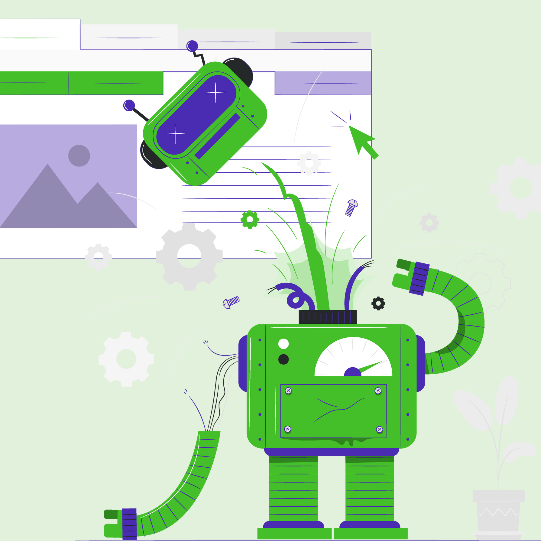
Budgets are budgets and while we haven’t mastered the development of the money manufacturing machine (we’re still working on a robot for the shower that delivers you pizza because priorities), we do know that most businesses understand the simple concept of ROI. And most marketers understand that their website is a critical and ongoing way to get more of it.
In fact, 36% of survey respondents put their top marketing channel as their website/blog in the HubSpot 2022 State of Inbound Marketing Report. It was the second biggest marketing channel behind social media.
All we want for Christmas is for you to get real with yourself on how critical investing in an ongoing strategy surrounding your website is (well, besides shower pizza, of course). That said - let’s break down 5 things we want you to consider adding to your website budget for 2023.
The end of the year is upon us and while you may already have created your website budget, it’s not too late to do some moving around. We talk to a lot of prospects every single day that have very little to no budget for website improvements on a monthly or annual basis. Yet these same businesses commonly report their website as their single best source of leads for their sales team. Imagine that. It’s a little like being a race car driver for 20 years only to roll up to the biggest race of your life in a minivan. We hate to be the ones to say it, but… ::whisper:: I don’t think it’s gonna get you to the finish line, friend.
We are persistently hammering home the idea that having a fast-loading, flexible website that optimizes conversion and puts the right information in front of your audience, but we’re having the same conversations over and over again.
Budgets are budgets and while we haven’t mastered the development of the money manufacturing machine (we’re still working on a robot for the shower that delivers you pizza because priorities), we do know that most businesses understand the simple concept of ROI. And most marketers understand that their website is a critical and ongoing way to get more of it.
In fact, 36% of survey respondents put their top marketing channel as their website/blog in the HubSpot 2022 State of Inbound Marketing Report. It was the second biggest marketing channel behind social media.
All we want for Christmas is for you to get real with yourself on how critical investing in an ongoing strategy surrounding your website is (well, besides shower pizza, of course). That said - let’s break down 5 things we want you to consider adding to your website budget for 2023.
- \n
- adopt continuous improvement \n
- optimize page speed \n
- switch to a sustainable website platform \n
- organize your content better \n
- add more back-end features and more flexible modules
Adopting continuous improvement
\nIf you’re already ahead of the game and have a set budget for certain website projects for 2023, we’re pretty proud of you, because most businesses don’t even set aside the budget to redesign their website. Rather than spending tens of thousands or hundreds of thousands of dollars on redesigning your website every few years, create a smaller, more manageable budget that allows you to continuously add new modules and features on your website. By adopting the idea of continuous improvement over time, you can do all of the following:
\n- \n
- allocate a predictable monthly budget \n
- work reliably with a skilled developer \n
- improve your website on an ongoing basis to optimize for conversions \n
- add back end functionality inside your website interface to help your marketing team upload and create content more effectively. \n
- creating workflow automations to free up your task time \n
- generate reports to help you better understand data trends over time \n
- refine navigation or resource center filters to better organize your content. \n
According to HubSpot’s 2022 Web Traffic & Analytics Report (we found it interesting that more website analytics data didn’t make the cut of the State of Inbound Report) 58% of website analysts indicated that sales, leads and conversion rates were the most important metrics in assessing website performance - and yet, few companies create a strategy and budget item to strategically improve their website to optimize these things. While website content, optimization efforts, compelling images and CTAs go a long way to improve conversions — small changes to how filters work, the location of a simple button, the functionality of a website’s navigation and so much more directly influence conversion rates.
Related: HubSpot CMS Development - The Continuous Improvement Model
\nOptimizing page speed
\n Recently a website project came to us that was launched and completed by another developer, but the resource center took more than 10 seconds to load, which annihilated conversion rates and sent their bounce rates for their most important content through the roof. The resource center was using an external cloud server that needed to be accessed on every page load rather than a native HubSpot database. We changed the configuration and assisted in media resizing and BOOM - overnight they experienced a significant load speed change. Now rather than seconds, the resource center takes only milliseconds to load, which most marketers understand is absolutely critical when it comes to conversion rates.
It’s so easy to finish up a website and just lean on what you have. “If it ain’t broke,” am I right? But sometimes what we consider to be working is actually seriously handicapping us. That minivan at the race you’re trying to win *works*, right? But it’s not exactly going to break any track records for speed.
If your website, resource center or blog is taking more than a couple seconds to load, you should invest in updates and optimization to help bring that number down, because it will do incredible things for your conversion rates.
Related: Page Speed Optimization - 5 Factors Bogging Down Your Website
\nSwitching to a sustainable platform
\n Adopting a mindset of continuous website improvement and growth driven design is only as easy as your website platform and the framework you’ve built it from. Adding on features and functionality in Wordpress may mean having to piecemeal plugins and result in a bloated website that runs more slowly. If you’re taking a more long term approach to your website, you’ll want to build on a framework that allows for these types of improvements.
We primarily work in HubSpot and have found it not only super flexible for adding new modules, but secure and fast. It’s easy to add and remove functionality and while we do recommend that you consult your developer prior to purchasing a theme, there are a lot of great options that are well-vetted by HubSpot in the theme marketplace. Custom builds allow for more flexibility, notably so, again, contacting a skilled developer before you make an investment in HubSpot CMS is pretty critical.
Related: Signs You’ve Outgrown Wordpress CMS
\nBetter content organization
\nWe’re a little obsessed with navigation and we personally believe your navigation structure will make or break your conversion rate and other important website statistics like time on site and pages viewed. We’re also huge fans of proactive planning, which is why we’ve dedicated so much time to geeking out on mega menus. We believe that your mega menu should be well-conceived and strategized and not just a way to inundate your audience with everything on your website. By organizing strategically according to the buyer’s journey, your highest converting website content and putting most frequently viewed pages front and center, you’ll do so much for the user experience on your site. Rather than your most valuable content being buried in your landing pages, why not place some directly in your menu?
Your goal as a business should be to make your website easy to navigate while also providing your prospects with the critical information that they’re looking for. Organizing your pillar pages, menu navigation and website in a way that flows properly and coincides with the buyers’ journey will set you and your website prospects up for success.
Back end features and flexible modules.
\nThere’s nothing worse than a website that you’re constantly having to piecemeal and hack to accomplish the simple goals that you have when it comes to adding content. It’s a frustration we hear come from prospect after prospect, “The interface is just kinda cumbersome” or “We just want to do this one small thing, but the feature isn’t there.” The age of not having full control over your website is over - particularly if you make a move over to HubSpot CMS.
HubSpot CMS might be a decent investment, but it’s a really great way to ensure long term scalability in your website. Take a look at what they have to say about their content management system. Considering our founder built one of the very first websites on HubSpot CMS, we can definitely attest to how it has grown and improved over the years. HubSpot is a platform committed to scalable solutions and the flexibility and power for marketers when partnered with the right developer is amazing.
Every year you probably create big goals surrounding your website, lead generation, conversions and sales. Every year you probably encounter huge obstacles with your website. Make this the year that you truly allocate and plan proactively to make sure your website services your needs and can grow with your goals in the long term. Let’s get to the end of next year and look back proud at what we’ve accomplished.
Cheers to a new approach to your website *and* sales growth when we put our budget in the right places.
What are your website goals in 2023? Let us know in the comments.
The end of the year is upon us and while you may already have created your website budget, it’s not too late to do some moving around. We talk to a lot of prospects every single day that have very little to no budget for website improvements on a monthly or annual basis. Yet these same businesses commonly report their website as their single best source of leads for their sales team. Imagine that. It’s a little like being a race car driver for 20 years only to roll up to the biggest race of your life in a minivan. We hate to be the ones to say it, but… ::whisper:: I don’t think it’s gonna get you to the finish line, friend.
We are persistently hammering home the idea that having a fast-loading, flexible website that optimizes conversion and puts the right information in front of your audience, but we’re having the same conversations over and over again.
Budgets are budgets and while we haven’t mastered the development of the money manufacturing machine (we’re still working on a robot for the shower that delivers you pizza because priorities), we do know that most businesses understand the simple concept of ROI. And most marketers understand that their website is a critical and ongoing way to get more of it.
In fact, 36% of survey respondents put their top marketing channel as their website/blog in the HubSpot 2022 State of Inbound Marketing Report. It was the second biggest marketing channel behind social media.
All we want for Christmas is for you to get real with yourself on how critical investing in an ongoing strategy surrounding your website is (well, besides shower pizza, of course). That said - let’s break down 5 things we want you to consider adding to your website budget for 2023.
- \n
- adopt continuous improvement \n
- optimize page speed \n
- switch to a sustainable website platform \n
- organize your content better \n
- add more back-end features and more flexible modules
Adopting continuous improvement
\nIf you’re already ahead of the game and have a set budget for certain website projects for 2023, we’re pretty proud of you, because most businesses don’t even set aside the budget to redesign their website. Rather than spending tens of thousands or hundreds of thousands of dollars on redesigning your website every few years, create a smaller, more manageable budget that allows you to continuously add new modules and features on your website. By adopting the idea of continuous improvement over time, you can do all of the following:
\n- \n
- allocate a predictable monthly budget \n
- work reliably with a skilled developer \n
- improve your website on an ongoing basis to optimize for conversions \n
- add back end functionality inside your website interface to help your marketing team upload and create content more effectively. \n
- creating workflow automations to free up your task time \n
- generate reports to help you better understand data trends over time \n
- refine navigation or resource center filters to better organize your content. \n
According to HubSpot’s 2022 Web Traffic & Analytics Report (we found it interesting that more website analytics data didn’t make the cut of the State of Inbound Report) 58% of website analysts indicated that sales, leads and conversion rates were the most important metrics in assessing website performance - and yet, few companies create a strategy and budget item to strategically improve their website to optimize these things. While website content, optimization efforts, compelling images and CTAs go a long way to improve conversions — small changes to how filters work, the location of a simple button, the functionality of a website’s navigation and so much more directly influence conversion rates.
Related: HubSpot CMS Development - The Continuous Improvement Model
\nOptimizing page speed
\nRecently a website project came to us that was launched and completed by another developer, but the resource center took more than 10 seconds to load, which annihilated conversion rates and sent their bounce rates for their most important content through the roof. The resource center was using an external cloud server that needed to be accessed on every page load rather than a native HubSpot database. We changed the configuration and assisted in media resizing and BOOM - overnight they experienced a significant load speed change. Now rather than seconds, the resource center takes only milliseconds to load, which most marketers understand is absolutely critical when it comes to conversion rates.
It’s so easy to finish up a website and just lean on what you have. “If it ain’t broke,” am I right? But sometimes what we consider to be working is actually seriously handicapping us. That minivan at the race you’re trying to win *works*, right? But it’s not exactly going to break any track records for speed.
If your website, resource center or blog is taking more than a couple seconds to load, you should invest in updates and optimization to help bring that number down, because it will do incredible things for your conversion rates.
Related: Page Speed Optimization - 5 Factors Bogging Down Your Website
\nSwitching to a sustainable platform
\nAdopting a mindset of continuous website improvement and growth driven design is only as easy as your website platform and the framework you’ve built it from. Adding on features and functionality in Wordpress may mean having to piecemeal plugins and result in a bloated website that runs more slowly. If you’re taking a more long term approach to your website, you’ll want to build on a framework that allows for these types of improvements.
We primarily work in HubSpot and have found it not only super flexible for adding new modules, but secure and fast. It’s easy to add and remove functionality and while we do recommend that you consult your developer prior to purchasing a theme, there are a lot of great options that are well-vetted by HubSpot in the theme marketplace. Custom builds allow for more flexibility, notably so, again, contacting a skilled developer before you make an investment in HubSpot CMS is pretty critical.
Related: Signs You’ve Outgrown Wordpress CMS
\nBetter content organization
\nWe’re a little obsessed with navigation and we personally believe your navigation structure will make or break your conversion rate and other important website statistics like time on site and pages viewed. We’re also huge fans of proactive planning, which is why we’ve dedicated so much time to geeking out on mega menus. We believe that your mega menu should be well-conceived and strategized and not just a way to inundate your audience with everything on your website. By organizing strategically according to the buyer’s journey, your highest converting website content and putting most frequently viewed pages front and center, you’ll do so much for the user experience on your site. Rather than your most valuable content being buried in your landing pages, why not place some directly in your menu?
Your goal as a business should be to make your website easy to navigate while also providing your prospects with the critical information that they’re looking for. Organizing your pillar pages, menu navigation and website in a way that flows properly and coincides with the buyers’ journey will set you and your website prospects up for success.
Back end features and flexible modules.
\nThere’s nothing worse than a website that you’re constantly having to piecemeal and hack to accomplish the simple goals that you have when it comes to adding content. It’s a frustration we hear come from prospect after prospect, “The interface is just kinda cumbersome” or “We just want to do this one small thing, but the feature isn’t there.” The age of not having full control over your website is over - particularly if you make a move over to HubSpot CMS.
HubSpot CMS might be a decent investment, but it’s a really great way to ensure long term scalability in your website. Take a look at what they have to say about their content management system. Considering our founder built one of the very first websites on HubSpot CMS, we can definitely attest to how it has grown and improved over the years. HubSpot is a platform committed to scalable solutions and the flexibility and power for marketers when partnered with the right developer is amazing.
Every year you probably create big goals surrounding your website, lead generation, conversions and sales. Every year you probably encounter huge obstacles with your website. Make this the year that you truly allocate and plan proactively to make sure your website services your needs and can grow with your goals in the long term. Let’s get to the end of next year and look back proud at what we’ve accomplished.
Cheers to a new approach to your website *and* sales growth when we put our budget in the right places.
What are your website goals in 2023? Let us know in the comments.
The end of the year is upon us and while you may already have created your website budget, it’s not too late to do some moving around. We talk to a lot of prospects every single day that have very little to no budget for website improvements on a monthly or annual basis. Yet these same businesses commonly report their website as their single best source of leads for their sales team. Imagine that. It’s a little like being a race car driver for 20 years only to roll up to the biggest race of your life in a minivan. We hate to be the ones to say it, but… ::whisper:: I don’t think it’s gonna get you to the finish line, friend.
We are persistently hammering home the idea that having a fast-loading, flexible website that optimizes conversion and puts the right information in front of your audience, but we’re having the same conversations over and over again.
Budgets are budgets and while we haven’t mastered the development of the money manufacturing machine (we’re still working on a robot for the shower that delivers you pizza because priorities), we do know that most businesses understand the simple concept of ROI. And most marketers understand that their website is a critical and ongoing way to get more of it.
In fact, 36% of survey respondents put their top marketing channel as their website/blog in the HubSpot 2022 State of Inbound Marketing Report. It was the second biggest marketing channel behind social media.
All we want for Christmas is for you to get real with yourself on how critical investing in an ongoing strategy surrounding your website is (well, besides shower pizza, of course). That said - let’s break down 5 things we want you to consider adding to your website budget for 2023.
- \n
- adopt continuous improvement \n
- optimize page speed \n
- switch to a sustainable website platform \n
- organize your content better \n
- add more back-end features and more flexible modules
Adopting continuous improvement
\nIf you’re already ahead of the game and have a set budget for certain website projects for 2023, we’re pretty proud of you, because most businesses don’t even set aside the budget to redesign their website. Rather than spending tens of thousands or hundreds of thousands of dollars on redesigning your website every few years, create a smaller, more manageable budget that allows you to continuously add new modules and features on your website. By adopting the idea of continuous improvement over time, you can do all of the following:
\n- \n
- allocate a predictable monthly budget \n
- work reliably with a skilled developer \n
- improve your website on an ongoing basis to optimize for conversions \n
- add back end functionality inside your website interface to help your marketing team upload and create content more effectively. \n
- creating workflow automations to free up your task time \n
- generate reports to help you better understand data trends over time \n
- refine navigation or resource center filters to better organize your content. \n
According to HubSpot’s 2022 Web Traffic & Analytics Report (we found it interesting that more website analytics data didn’t make the cut of the State of Inbound Report) 58% of website analysts indicated that sales, leads and conversion rates were the most important metrics in assessing website performance - and yet, few companies create a strategy and budget item to strategically improve their website to optimize these things. While website content, optimization efforts, compelling images and CTAs go a long way to improve conversions — small changes to how filters work, the location of a simple button, the functionality of a website’s navigation and so much more directly influence conversion rates.
Related: HubSpot CMS Development - The Continuous Improvement Model
\nOptimizing page speed
\nRecently a website project came to us that was launched and completed by another developer, but the resource center took more than 10 seconds to load, which annihilated conversion rates and sent their bounce rates for their most important content through the roof. The resource center was using an external cloud server that needed to be accessed on every page load rather than a native HubSpot database. We changed the configuration and assisted in media resizing and BOOM - overnight they experienced a significant load speed change. Now rather than seconds, the resource center takes only milliseconds to load, which most marketers understand is absolutely critical when it comes to conversion rates.
It’s so easy to finish up a website and just lean on what you have. “If it ain’t broke,” am I right? But sometimes what we consider to be working is actually seriously handicapping us. That minivan at the race you’re trying to win *works*, right? But it’s not exactly going to break any track records for speed.
If your website, resource center or blog is taking more than a couple seconds to load, you should invest in updates and optimization to help bring that number down, because it will do incredible things for your conversion rates.
Related: Page Speed Optimization - 5 Factors Bogging Down Your Website
\nSwitching to a sustainable platform
\nAdopting a mindset of continuous website improvement and growth driven design is only as easy as your website platform and the framework you’ve built it from. Adding on features and functionality in Wordpress may mean having to piecemeal plugins and result in a bloated website that runs more slowly. If you’re taking a more long term approach to your website, you’ll want to build on a framework that allows for these types of improvements.
We primarily work in HubSpot and have found it not only super flexible for adding new modules, but secure and fast. It’s easy to add and remove functionality and while we do recommend that you consult your developer prior to purchasing a theme, there are a lot of great options that are well-vetted by HubSpot in the theme marketplace. Custom builds allow for more flexibility, notably so, again, contacting a skilled developer before you make an investment in HubSpot CMS is pretty critical.
Related: Signs You’ve Outgrown Wordpress CMS
\nBetter content organization
\nWe’re a little obsessed with navigation and we personally believe your navigation structure will make or break your conversion rate and other important website statistics like time on site and pages viewed. We’re also huge fans of proactive planning, which is why we’ve dedicated so much time to geeking out on mega menus. We believe that your mega menu should be well-conceived and strategized and not just a way to inundate your audience with everything on your website. By organizing strategically according to the buyer’s journey, your highest converting website content and putting most frequently viewed pages front and center, you’ll do so much for the user experience on your site. Rather than your most valuable content being buried in your landing pages, why not place some directly in your menu?
Your goal as a business should be to make your website easy to navigate while also providing your prospects with the critical information that they’re looking for. Organizing your pillar pages, menu navigation and website in a way that flows properly and coincides with the buyers’ journey will set you and your website prospects up for success.
Back end features and flexible modules.
\nThere’s nothing worse than a website that you’re constantly having to piecemeal and hack to accomplish the simple goals that you have when it comes to adding content. It’s a frustration we hear come from prospect after prospect, “The interface is just kinda cumbersome” or “We just want to do this one small thing, but the feature isn’t there.” The age of not having full control over your website is over - particularly if you make a move over to HubSpot CMS.
HubSpot CMS might be a decent investment, but it’s a really great way to ensure long term scalability in your website. Take a look at what they have to say about their content management system. Considering our founder built one of the very first websites on HubSpot CMS, we can definitely attest to how it has grown and improved over the years. HubSpot is a platform committed to scalable solutions and the flexibility and power for marketers when partnered with the right developer is amazing.
Every year you probably create big goals surrounding your website, lead generation, conversions and sales. Every year you probably encounter huge obstacles with your website. Make this the year that you truly allocate and plan proactively to make sure your website services your needs and can grow with your goals in the long term. Let’s get to the end of next year and look back proud at what we’ve accomplished.
Cheers to a new approach to your website *and* sales growth when we put our budget in the right places.
What are your website goals in 2023? Let us know in the comments.
The end of the year is upon us and while you may already have created your website budget, it’s not too late to do some moving around. We talk to a lot of prospects every single day that have very little to no budget for website improvements on a monthly or annual basis. Yet these same businesses commonly report their website as their single best source of leads for their sales team. Imagine that. It’s a little like being a race car driver for 20 years only to roll up to the biggest race of your life in a minivan. We hate to be the ones to say it, but… ::whisper:: I don’t think it’s gonna get you to the finish line, friend.
We are persistently hammering home the idea that having a fast-loading, flexible website that optimizes conversion and puts the right information in front of your audience, but we’re having the same conversations over and over again.
Budgets are budgets and while we haven’t mastered the development of the money manufacturing machine (we’re still working on a robot for the shower that delivers you pizza because priorities), we do know that most businesses understand the simple concept of ROI. And most marketers understand that their website is a critical and ongoing way to get more of it.
In fact, 36% of survey respondents put their top marketing channel as their website/blog in the HubSpot 2022 State of Inbound Marketing Report. It was the second biggest marketing channel behind social media.
All we want for Christmas is for you to get real with yourself on how critical investing in an ongoing strategy surrounding your website is (well, besides shower pizza, of course). That said - let’s break down 5 things we want you to consider adding to your website budget for 2023.
There’s an important question that we’re asking when it comes to the content that you’re creating for your website:
Can HubSpot Mega Menus solve your content engagement woes?
According to SeedScientific.com, in 2018 as much as 2.5 quintillion bytes of data were created every day. Content is being created at an alarming rate in multiple mediums and it’s impossible for users to keep up. YouTube, for example, the second most visited website after Google, has 3.7 million new videos uploaded every single day.
Businesses continue to invest in content marketing and are creating content in the form of videos, podcasts, blogs, reels, social media posts and downloads at an alarming rate. According to Gartner, marketing budgets account for more than 6% of a company’s total revenue (down significantly from 11% in 2020) and 25% of that budget is used for content creation. But are users actually seeing that content?
Odds are good that the content you’re working SO hard to cultivate may not be getting the attention it deserves hiding deep within the pages of your website. For this reason, we believe that the UX/UI of your website has a direct effect on the impact of your content.
Mega Menus *can* resolve some of your content engagement woes by helping present your content in a more logical, accessible way that complements the buyer journey - it’s just a matter of architecting them properly. You could say that mega planning is necessary to architect mega menus.
Here are a few things you should know before you start the process of developing a mega menu design for your website:
Mega Menus require Mega Planning
\nWhen your users visit your website, they have a limited amount of information that they view “above the fold” (the real estate located on the screen before they even start scrolling), so it’s important to maximize that real estate as much as you possibly can. Unfortunately, the majority of the time when websites are designed, they come with massive hero images whose goal is to appeal emotionally to the buyer in some way.
Getting your customers on your side by using an image to communicate that worthy mission of your brand is honorable, but let’s be real here - it usually comes in the form of some kind of stock image that doesn’t do the job. We’re gonna be honest with you here: your tired stock photos are driving up your bounce rate. The same tired images of people working at desks smiling or even a photoshoot of your own employees smiling and working — no one cares. You are not just not resonating with your audience, you’re actively boring them. The big hero image isn’t doing it for you. So what will?
Mega menus solve the problem of addressing multiple points in the buyer journey by putting varied content in front of them and eliminating the repetition of the same tired homepage concepts that a prospective customer views over and over again. Instead? Architect a functional menu that gives them the information they need.
Architecting a Mega Menu in HubSpot requires you to have the deepest psychological understanding of your buyers. You should engage an agency or gifted marketing strategist in an exercise to determine who your buyer personas are, what their goals are, what their needs and struggles are and align those items with the products or services that you provide. It isn’t enough just to align your messaging or create a buyer persona in your content strategy and leave it there. You need to also take that buyer persona and buyer journey and apply it to the way that you display the information on your website.
Related: Mega Mistakes with Mega Menus
\n\n
Categorize your data and focus
\nIf you have multiple buyer persona roles, multiple service offerings, subcategories for those offerings and multiple categories of content in many different mediums for your audience to consume, your mega menu could become a little complicated to plan. Getting feedback from an experienced developer and using buyer journey mapping will help exponentially, but you can start by organizing your information.
\n- \n
- Buyer Personas & Industries
Establishing a list of industries that you work with on your navigation will help businesses feel comfortable that you have adequate experience in their industry. If you segment your navigation by industry it is also useful to consider a case study CTA feature or link. \n - Content Categories, Symptoms or Benefits
Listing your categories of service offerings by the symptom or benefit can help move top of the funnel prospects quickly into your educational resources by allowing them to identify the pain points they’re experiencing. \n - Services
Listing your services by the names they’re recognized for in their industry is still important for prospects at the bottom of the funnel or referral resources that need a quick understanding of what you do. If you don’t have enough space in your navigation to address both, you can use some real estate in your mega menu for a short description sentence that outlines the benefits or symptoms associated with your service lines to combine the last point with this one. \n - Icons
Icons are a great way to help a prospect further understand information in the services section if they’re unfamiliar with industry jargon. \n - Tools or Resources
This is usually the most complicated aspect of the mega menu planning process, since the arsenal of content for organizations with a digital strategy is usually quite large. You might have webinars, videos, downloads, case studies or any other number of resources in your content library. A mega menu can change that. Be sure to prioritize your highest converting content in your mega menu using a featured content area, image, CTA or link. \n - Smart Content
Smart content is being used more and more in emails, on website landing pages and inside services pages, but what about navigation? Your development team can create a sophisticated mega menu based on forms that the prospect has filled out previously or content viewed on the website. Content mapping to the buyer journey is much more powerful when you enable smart content. If you’re a HubSpot user, you can even combine smart content with lead scores and custom buyer journey mapping properties in HubSpot. An experienced HubSpot developer can really supercharge what HubSpot provides out of the box.
\nDelve into these bullets even deeper: How to Organize a Mega Menu for IT Managed Services Companies
\n \n
\n
Lay out the goals
\nIt’s important for you to take time to identify the main goals for your website prospects. Are there some high value items that you might want to put into your mega menu? You can add these with graphics, buttons or CTAs. In using our IT company example, these items might be something like “download our disaster recovery checklist” or “malware security webinar” registration link, or something as simple as “request a free technology audit”.
\n\n
These items presented in a different format in a place as frequently visited as navigation is a huge potential conversion boost and boosted exposure for valuable pieces of content that may not be getting the exposure they deserve.
\nHow will this translate to mobile?
\nMany organizations take the time to build out and plan an amazing mega menu only to present the design to us and realize - they never strategized how their mobile mega menu should be laid out. While a mega menu can translate well to mobile, you still have to give a lot of consideration to mobile design and how the decreased real estate can still present valuable information to your prospect.  With between 50 and 60% of websites being accessed from mobile devices (your B2B business may be a little more or less depending on your industry and target buyers, a mobile mega menu needs to be as much or an even greater priority than your desktop mega menu. How you’ll address CTA buttons, graphics, category breakdowns and more will be important considerations for your mobile menu. We recommend starting with your mobile design first so you can add on as you like to your desktop design. Doing it the other way around may create some frustration when you discover that you are limited in space.
Related: Mobile First Approach to Web Design
\nExperiment with flexible design and new ideas
\nThe best development partners are pushing the envelope with website design and mega menus are no exception to that rule. Allocate as much budget as possible into making your mega menu unique and flexible to the different content types and ideas as they arise. Sky’s the limit! We see the ability to add short videos, engage chat, customize with smart content and multitudes of other actions inside your mega menu.
You’ll want to be sure to discuss back end design with your developer and ensure that your user interface is flexible enough to allow for the addition or removal of graphical elements, categories, links, buttons and other media inside your mega menu design.
According to WebFX, the average SMB spends between $2000 and $12,000 every month on content marketing. Investing a decent amount into a mega menu to ensure your content is seen is important and equally or more important is how well you plan for the organization of that content. With a little strategy planning, attention to mobile first strategy, exploring your goals, allocating appropriate budget and remaining flexible in design, you can have an incredible mega menu that will service both you and your customers well in the long term.
Got some questions about planning out your mega menu design? We should chat.

There’s an important question that we’re asking when it comes to the content that you’re creating for your website:
Can HubSpot Mega Menus solve your content engagement woes?
According to SeedScientific.com, in 2018 as much as 2.5 quintillion bytes of data were created every day. Content is being created at an alarming rate in multiple mediums and it’s impossible for users to keep up. YouTube, for example, the second most visited website after Google, has 3.7 million new videos uploaded every single day.
Businesses continue to invest in content marketing and are creating content in the form of videos, podcasts, blogs, reels, social media posts and downloads at an alarming rate. According to Gartner, marketing budgets account for more than 6% of a company’s total revenue (down significantly from 11% in 2020) and 25% of that budget is used for content creation. But are users actually seeing that content?
Odds are good that the content you’re working SO hard to cultivate may not be getting the attention it deserves hiding deep within the pages of your website. For this reason, we believe that the UX/UI of your website has a direct effect on the impact of your content.
Mega Menus *can* resolve some of your content engagement woes by helping present your content in a more logical, accessible way that complements the buyer journey - it’s just a matter of architecting them properly. You could say that mega planning is necessary to architect mega menus.
Here are a few things you should know before you start the process of developing a mega menu design for your website:
Mega Menus require Mega Planning
\nWhen your users visit your website, they have a limited amount of information that they view “above the fold” (the real estate located on the screen before they even start scrolling), so it’s important to maximize that real estate as much as you possibly can. Unfortunately, the majority of the time when websites are designed, they come with massive hero images whose goal is to appeal emotionally to the buyer in some way.
Getting your customers on your side by using an image to communicate that worthy mission of your brand is honorable, but let’s be real here - it usually comes in the form of some kind of stock image that doesn’t do the job. We’re gonna be honest with you here: your tired stock photos are driving up your bounce rate. The same tired images of people working at desks smiling or even a photoshoot of your own employees smiling and working — no one cares. You are not just not resonating with your audience, you’re actively boring them. The big hero image isn’t doing it for you. So what will?
Mega menus solve the problem of addressing multiple points in the buyer journey by putting varied content in front of them and eliminating the repetition of the same tired homepage concepts that a prospective customer views over and over again. Instead? Architect a functional menu that gives them the information they need.
Architecting a Mega Menu in HubSpot requires you to have the deepest psychological understanding of your buyers. You should engage an agency or gifted marketing strategist in an exercise to determine who your buyer personas are, what their goals are, what their needs and struggles are and align those items with the products or services that you provide. It isn’t enough just to align your messaging or create a buyer persona in your content strategy and leave it there. You need to also take that buyer persona and buyer journey and apply it to the way that you display the information on your website.
Related: Mega Mistakes with Mega Menus
\n\n
Categorize your data and focus
\nIf you have multiple buyer persona roles, multiple service offerings, subcategories for those offerings and multiple categories of content in many different mediums for your audience to consume, your mega menu could become a little complicated to plan. Getting feedback from an experienced developer and using buyer journey mapping will help exponentially, but you can start by organizing your information.
\n- \n
- Buyer Personas & Industries
Establishing a list of industries that you work with on your navigation will help businesses feel comfortable that you have adequate experience in their industry. If you segment your navigation by industry it is also useful to consider a case study CTA feature or link. \n - Content Categories, Symptoms or Benefits
Listing your categories of service offerings by the symptom or benefit can help move top of the funnel prospects quickly into your educational resources by allowing them to identify the pain points they’re experiencing. \n - Services
Listing your services by the names they’re recognized for in their industry is still important for prospects at the bottom of the funnel or referral resources that need a quick understanding of what you do. If you don’t have enough space in your navigation to address both, you can use some real estate in your mega menu for a short description sentence that outlines the benefits or symptoms associated with your service lines to combine the last point with this one. \n - Icons
Icons are a great way to help a prospect further understand information in the services section if they’re unfamiliar with industry jargon. \n - Tools or Resources
This is usually the most complicated aspect of the mega menu planning process, since the arsenal of content for organizations with a digital strategy is usually quite large. You might have webinars, videos, downloads, case studies or any other number of resources in your content library. A mega menu can change that. Be sure to prioritize your highest converting content in your mega menu using a featured content area, image, CTA or link. \n - Smart Content
Smart content is being used more and more in emails, on website landing pages and inside services pages, but what about navigation? Your development team can create a sophisticated mega menu based on forms that the prospect has filled out previously or content viewed on the website. Content mapping to the buyer journey is much more powerful when you enable smart content. If you’re a HubSpot user, you can even combine smart content with lead scores and custom buyer journey mapping properties in HubSpot. An experienced HubSpot developer can really supercharge what HubSpot provides out of the box.
\nDelve into these bullets even deeper: How to Organize a Mega Menu for IT Managed Services Companies
\n \n
\n
Lay out the goals
\nIt’s important for you to take time to identify the main goals for your website prospects. Are there some high value items that you might want to put into your mega menu? You can add these with graphics, buttons or CTAs. In using our IT company example, these items might be something like “download our disaster recovery checklist” or “malware security webinar” registration link, or something as simple as “request a free technology audit”.
\n\n
These items presented in a different format in a place as frequently visited as navigation is a huge potential conversion boost and boosted exposure for valuable pieces of content that may not be getting the exposure they deserve.
\nHow will this translate to mobile?
\nMany organizations take the time to build out and plan an amazing mega menu only to present the design to us and realize - they never strategized how their mobile mega menu should be laid out. While a mega menu can translate well to mobile, you still have to give a lot of consideration to mobile design and how the decreased real estate can still present valuable information to your prospect. With between 50 and 60% of websites being accessed from mobile devices (your B2B business may be a little more or less depending on your industry and target buyers, a mobile mega menu needs to be as much or an even greater priority than your desktop mega menu. How you’ll address CTA buttons, graphics, category breakdowns and more will be important considerations for your mobile menu. We recommend starting with your mobile design first so you can add on as you like to your desktop design. Doing it the other way around may create some frustration when you discover that you are limited in space.
Related: Mobile First Approach to Web Design
\nExperiment with flexible design and new ideas
\nThe best development partners are pushing the envelope with website design and mega menus are no exception to that rule. Allocate as much budget as possible into making your mega menu unique and flexible to the different content types and ideas as they arise. Sky’s the limit! We see the ability to add short videos, engage chat, customize with smart content and multitudes of other actions inside your mega menu.
You’ll want to be sure to discuss back end design with your developer and ensure that your user interface is flexible enough to allow for the addition or removal of graphical elements, categories, links, buttons and other media inside your mega menu design.
According to WebFX, the average SMB spends between $2000 and $12,000 every month on content marketing. Investing a decent amount into a mega menu to ensure your content is seen is important and equally or more important is how well you plan for the organization of that content. With a little strategy planning, attention to mobile first strategy, exploring your goals, allocating appropriate budget and remaining flexible in design, you can have an incredible mega menu that will service both you and your customers well in the long term.
Got some questions about planning out your mega menu design? We should chat.
There’s an important question that we’re asking when it comes to the content that you’re creating for your website:
Can HubSpot Mega Menus solve your content engagement woes?
According to SeedScientific.com, in 2018 as much as 2.5 quintillion bytes of data were created every day. Content is being created at an alarming rate in multiple mediums and it’s impossible for users to keep up. YouTube, for example, the second most visited website after Google, has 3.7 million new videos uploaded every single day.
Businesses continue to invest in content marketing and are creating content in the form of videos, podcasts, blogs, reels, social media posts and downloads at an alarming rate. According to Gartner, marketing budgets account for more than 6% of a company’s total revenue (down significantly from 11% in 2020) and 25% of that budget is used for content creation. But are users actually seeing that content?
Odds are good that the content you’re working SO hard to cultivate may not be getting the attention it deserves hiding deep within the pages of your website. For this reason, we believe that the UX/UI of your website has a direct effect on the impact of your content.
Mega Menus *can* resolve some of your content engagement woes by helping present your content in a more logical, accessible way that complements the buyer journey - it’s just a matter of architecting them properly. You could say that mega planning is necessary to architect mega menus.
Here are a few things you should know before you start the process of developing a mega menu design for your website:
Mega Menus require Mega Planning
\nWhen your users visit your website, they have a limited amount of information that they view “above the fold” (the real estate located on the screen before they even start scrolling), so it’s important to maximize that real estate as much as you possibly can. Unfortunately, the majority of the time when websites are designed, they come with massive hero images whose goal is to appeal emotionally to the buyer in some way.
Getting your customers on your side by using an image to communicate that worthy mission of your brand is honorable, but let’s be real here - it usually comes in the form of some kind of stock image that doesn’t do the job. We’re gonna be honest with you here: your tired stock photos are driving up your bounce rate. The same tired images of people working at desks smiling or even a photoshoot of your own employees smiling and working — no one cares. You are not just not resonating with your audience, you’re actively boring them. The big hero image isn’t doing it for you. So what will?
Mega menus solve the problem of addressing multiple points in the buyer journey by putting varied content in front of them and eliminating the repetition of the same tired homepage concepts that a prospective customer views over and over again. Instead? Architect a functional menu that gives them the information they need.
Architecting a Mega Menu in HubSpot requires you to have the deepest psychological understanding of your buyers. You should engage an agency or gifted marketing strategist in an exercise to determine who your buyer personas are, what their goals are, what their needs and struggles are and align those items with the products or services that you provide. It isn’t enough just to align your messaging or create a buyer persona in your content strategy and leave it there. You need to also take that buyer persona and buyer journey and apply it to the way that you display the information on your website.
Related: Mega Mistakes with Mega Menus
\n\n
Categorize your data and focus
\nIf you have multiple buyer persona roles, multiple service offerings, subcategories for those offerings and multiple categories of content in many different mediums for your audience to consume, your mega menu could become a little complicated to plan. Getting feedback from an experienced developer and using buyer journey mapping will help exponentially, but you can start by organizing your information.
\n- \n
- Buyer Personas & Industries
Establishing a list of industries that you work with on your navigation will help businesses feel comfortable that you have adequate experience in their industry. If you segment your navigation by industry it is also useful to consider a case study CTA feature or link. \n - Content Categories, Symptoms or Benefits
Listing your categories of service offerings by the symptom or benefit can help move top of the funnel prospects quickly into your educational resources by allowing them to identify the pain points they’re experiencing. \n - Services
Listing your services by the names they’re recognized for in their industry is still important for prospects at the bottom of the funnel or referral resources that need a quick understanding of what you do. If you don’t have enough space in your navigation to address both, you can use some real estate in your mega menu for a short description sentence that outlines the benefits or symptoms associated with your service lines to combine the last point with this one. \n - Icons
Icons are a great way to help a prospect further understand information in the services section if they’re unfamiliar with industry jargon. \n - Tools or Resources
This is usually the most complicated aspect of the mega menu planning process, since the arsenal of content for organizations with a digital strategy is usually quite large. You might have webinars, videos, downloads, case studies or any other number of resources in your content library. A mega menu can change that. Be sure to prioritize your highest converting content in your mega menu using a featured content area, image, CTA or link. \n - Smart Content
Smart content is being used more and more in emails, on website landing pages and inside services pages, but what about navigation? Your development team can create a sophisticated mega menu based on forms that the prospect has filled out previously or content viewed on the website. Content mapping to the buyer journey is much more powerful when you enable smart content. If you’re a HubSpot user, you can even combine smart content with lead scores and custom buyer journey mapping properties in HubSpot. An experienced HubSpot developer can really supercharge what HubSpot provides out of the box.
\nDelve into these bullets even deeper: How to Organize a Mega Menu for IT Managed Services Companies
\n \n
\n
Lay out the goals
\nIt’s important for you to take time to identify the main goals for your website prospects. Are there some high value items that you might want to put into your mega menu? You can add these with graphics, buttons or CTAs. In using our IT company example, these items might be something like “download our disaster recovery checklist” or “malware security webinar” registration link, or something as simple as “request a free technology audit”.
\n\n
These items presented in a different format in a place as frequently visited as navigation is a huge potential conversion boost and boosted exposure for valuable pieces of content that may not be getting the exposure they deserve.
\nHow will this translate to mobile?
\nMany organizations take the time to build out and plan an amazing mega menu only to present the design to us and realize - they never strategized how their mobile mega menu should be laid out. While a mega menu can translate well to mobile, you still have to give a lot of consideration to mobile design and how the decreased real estate can still present valuable information to your prospect. With between 50 and 60% of websites being accessed from mobile devices (your B2B business may be a little more or less depending on your industry and target buyers, a mobile mega menu needs to be as much or an even greater priority than your desktop mega menu. How you’ll address CTA buttons, graphics, category breakdowns and more will be important considerations for your mobile menu. We recommend starting with your mobile design first so you can add on as you like to your desktop design. Doing it the other way around may create some frustration when you discover that you are limited in space.
Related: Mobile First Approach to Web Design
\nExperiment with flexible design and new ideas
\nThe best development partners are pushing the envelope with website design and mega menus are no exception to that rule. Allocate as much budget as possible into making your mega menu unique and flexible to the different content types and ideas as they arise. Sky’s the limit! We see the ability to add short videos, engage chat, customize with smart content and multitudes of other actions inside your mega menu.
You’ll want to be sure to discuss back end design with your developer and ensure that your user interface is flexible enough to allow for the addition or removal of graphical elements, categories, links, buttons and other media inside your mega menu design.
According to WebFX, the average SMB spends between $2000 and $12,000 every month on content marketing. Investing a decent amount into a mega menu to ensure your content is seen is important and equally or more important is how well you plan for the organization of that content. With a little strategy planning, attention to mobile first strategy, exploring your goals, allocating appropriate budget and remaining flexible in design, you can have an incredible mega menu that will service both you and your customers well in the long term.
Got some questions about planning out your mega menu design? We should chat.
There’s an important question that we’re asking when it comes to the content that you’re creating for your website:
Can HubSpot Mega Menus solve your content engagement woes?
According to SeedScientific.com, in 2018 as much as 2.5 quintillion bytes of data were created every day. Content is being created at an alarming rate in multiple mediums and it’s impossible for users to keep up. YouTube, for example, the second most visited website after Google, has 3.7 million new videos uploaded every single day.
Businesses continue to invest in content marketing and are creating content in the form of videos, podcasts, blogs, reels, social media posts and downloads at an alarming rate. According to Gartner, marketing budgets account for more than 6% of a company’s total revenue (down significantly from 11% in 2020) and 25% of that budget is used for content creation. But are users actually seeing that content?
Odds are good that the content you’re working SO hard to cultivate may not be getting the attention it deserves hiding deep within the pages of your website. For this reason, we believe that the UX/UI of your website has a direct effect on the impact of your content.
Mega Menus *can* resolve some of your content engagement woes by helping present your content in a more logical, accessible way that complements the buyer journey - it’s just a matter of architecting them properly. You could say that mega planning is necessary to architect mega menus.
Here are a few things you should know before you start the process of developing a mega menu design for your website:
WordPress CMS has always been a great way for a small business to develop a pretty customized website. You choose a theme or framework, add some plugins and you’re off to the races. Even a technically savvy small business owner could theoretically walk themselves through basic WordPress development - and many have (though we don’t recommend this).
The problem is, over time this piecemeal approach that served you well in your initial stages ends up cumbersome and doesn’t quite suit your business as it grows. Small businesses outgrow their initial Wordpress framework all the time and we help drive them to a custom solution. How do you know when your business has outgrown Wordpress, though?

Businesses grow. It’s what they’re all meant to do and it’s what we as business owners want. But as they grow, businesses and their teams add line of business applications, additional employees, marketing functions, content and additional functionality to the website. All of a sudden what used to work so well for your business is bogged down, barely keeping up and holding our marketing teams back from really leaping into digital marketing and turning the website into a lead generation tool.
If you’re starting to worry that your WordPress website is holding you back, here are a few signs that you might be outgrowing WordPress…
You find yourself compromising on what you want.
\nPlugins. Am I right? Plugins were always to website features what apps were to user needs with the iPhone. There was always a plugin that did what you needed. Fast forward a few years, and as more and more developers stop supporting their plugins, there are fewer secure options to get your goals accomplished inside WordPress. This means you’ve added multiple plugins to accomplish a goal or help with a workflow, resulting in piecemeal websites bogged down by plugins that aren’t properly supported which leads to security holes and slower load times.
\nYour site keeps getting hacked
\nThe security holes that come with outdated plugins really get you in trouble. The multitudes of WordPress plugins and the clunky way you piece together your website might’ve worked when you were just getting going, but once those plugins went out of date they opened huge security holes and it’s possible your site has been compromised. WordPress is well known for their vulnerability issues. While captcha and security tools can help, attacks can slip through from time to time, because the majority of the plugins hosted on WordPress are third party plugins.
\nUpdates break your website
\nWordPress core, themes, and plugins are almost constantly updating to make up for the security vulnerabilities and attacks, but every time they update to accommodate those security gaps, it has the potential to break your website, especially when the developers that created your theme or plugins may not be updating at the same rate that WordPress. Approaching these plugin updates reactively can mean that you experience downtime before your developer can get in to fix these items - and as a growing business, that downtime becomes more and more costly if you’re relying on your website for any kind of revenue.
But it’s not just outdated plugins that can cause your website to break, but misplaced code and styling within WordPress core, themes and plugins can cause updates to break your website as well. Oftentimes developers hack together CSS and HTML and put it in the wrong places or fail to create child themes and directly update the theme files, instead. They may also target part of the structure that shouldn’t be targeted within a theme or even modify core WordPress files. An example of this might be when you ask a developer to update your WordPress site, and after updating the styling is totally out of whack. Some WordPress themes have very specific rules around how the theme should be updated and developers don’t always follow them or leave behind appropriate documentation, which may work if they’re the only one updating the website long term, but if things are misplaced and themes aren’t treated with best practices, updates will inevitably break your site.
You’re exploring integrations
\nAs your business grows, you’ll find that the pieces of software that you use to manage your day to day items may not serve you as well. You might bring on more robust applications, and eventually you might even want to integrate those applications closely with your website. Customer portals, custom calculators, learning centers, the details of customer registration, event management or sales handoffs are just some of the integrations and applications that customers have approached us to design on their behalf. Integrating these applications or building integrations between an already bogged down website and business application needs to be considered carefully. Investing so heavily in advanced integrations should be part of a really comprehensive evaluation of all your technology - including your website.
\nYour site is slow AF
\nWe discuss the frustration associated with bogged down websites all the time - and it’s a huge segment of the reason that a lot of companies decide to completely overhaul their website. Piecing together functionality that you need using multiple plugins for form capture, graphic displays and chatbots for example is great from a functionality and feature perspective, but pile that on with photo gallery and product management and things start to get slower and slower. Your new marketing manager has even more great ideas - but your site is already too slow and you know that slow loading sites are not good for Google *or* user conversions.
Your website served you well for a long time, but you can’t expect what you started with to continue serving you through this growth period in your business. Just like you upgrade phones and computers and processes, you need to upgrade your website framework and CMS. If you’re experiencing any of the above, it’s very likely that it’s time to upgrade from WordPress and hiring a skilled, experienced developer is gonna get you there.
It’s no secret that at deckerdevs we’re HubSpot advocates. We’ve invested a lot of time and funding into growing our knowledge base and experience in HubSpot. We’ve been around since the onset of this powerful automation software and as we continue to watch their CMS grow, we know we can count on the same boundary-pushing best practices, security, user friendliness and attention to detail they’ve always moved forward in their marketing software. Is HubSpot CMS the solution for every business that has outgrown WordPress? Not necessarily. But it might be.
What’s your WordPress struggle?
Let us know what you’re dealing with in the comments or book some time and let’s chat it out.
\n

WordPress CMS has always been a great way for a small business to develop a pretty customized website. You choose a theme or framework, add some plugins and you’re off to the races. Even a technically savvy small business owner could theoretically walk themselves through basic WordPress development - and many have (though we don’t recommend this).
The problem is, over time this piecemeal approach that served you well in your initial stages ends up cumbersome and doesn’t quite suit your business as it grows. Small businesses outgrow their initial Wordpress framework all the time and we help drive them to a custom solution. How do you know when your business has outgrown Wordpress, though?
Businesses grow. It’s what they’re all meant to do and it’s what we as business owners want. But as they grow, businesses and their teams add line of business applications, additional employees, marketing functions, content and additional functionality to the website. All of a sudden what used to work so well for your business is bogged down, barely keeping up and holding our marketing teams back from really leaping into digital marketing and turning the website into a lead generation tool.
If you’re starting to worry that your WordPress website is holding you back, here are a few signs that you might be outgrowing WordPress…
You find yourself compromising on what you want.
\nPlugins. Am I right? Plugins were always to website features what apps were to user needs with the iPhone. There was always a plugin that did what you needed. Fast forward a few years, and as more and more developers stop supporting their plugins, there are fewer secure options to get your goals accomplished inside WordPress. This means you’ve added multiple plugins to accomplish a goal or help with a workflow, resulting in piecemeal websites bogged down by plugins that aren’t properly supported which leads to security holes and slower load times.
\nYour site keeps getting hacked
\nThe security holes that come with outdated plugins really get you in trouble. The multitudes of WordPress plugins and the clunky way you piece together your website might’ve worked when you were just getting going, but once those plugins went out of date they opened huge security holes and it’s possible your site has been compromised. WordPress is well known for their vulnerability issues. While captcha and security tools can help, attacks can slip through from time to time, because the majority of the plugins hosted on WordPress are third party plugins.
\nUpdates break your website
\nWordPress core, themes, and plugins are almost constantly updating to make up for the security vulnerabilities and attacks, but every time they update to accommodate those security gaps, it has the potential to break your website, especially when the developers that created your theme or plugins may not be updating at the same rate that WordPress. Approaching these plugin updates reactively can mean that you experience downtime before your developer can get in to fix these items - and as a growing business, that downtime becomes more and more costly if you’re relying on your website for any kind of revenue.
But it’s not just outdated plugins that can cause your website to break, but misplaced code and styling within WordPress core, themes and plugins can cause updates to break your website as well. Oftentimes developers hack together CSS and HTML and put it in the wrong places or fail to create child themes and directly update the theme files, instead. They may also target part of the structure that shouldn’t be targeted within a theme or even modify core WordPress files. An example of this might be when you ask a developer to update your WordPress site, and after updating the styling is totally out of whack. Some WordPress themes have very specific rules around how the theme should be updated and developers don’t always follow them or leave behind appropriate documentation, which may work if they’re the only one updating the website long term, but if things are misplaced and themes aren’t treated with best practices, updates will inevitably break your site.
You’re exploring integrations
\nAs your business grows, you’ll find that the pieces of software that you use to manage your day to day items may not serve you as well. You might bring on more robust applications, and eventually you might even want to integrate those applications closely with your website. Customer portals, custom calculators, learning centers, the details of customer registration, event management or sales handoffs are just some of the integrations and applications that customers have approached us to design on their behalf. Integrating these applications or building integrations between an already bogged down website and business application needs to be considered carefully. Investing so heavily in advanced integrations should be part of a really comprehensive evaluation of all your technology - including your website.
\nYour site is slow AF
\nWe discuss the frustration associated with bogged down websites all the time - and it’s a huge segment of the reason that a lot of companies decide to completely overhaul their website. Piecing together functionality that you need using multiple plugins for form capture, graphic displays and chatbots for example is great from a functionality and feature perspective, but pile that on with photo gallery and product management and things start to get slower and slower. Your new marketing manager has even more great ideas - but your site is already too slow and you know that slow loading sites are not good for Google *or* user conversions.
Your website served you well for a long time, but you can’t expect what you started with to continue serving you through this growth period in your business. Just like you upgrade phones and computers and processes, you need to upgrade your website framework and CMS. If you’re experiencing any of the above, it’s very likely that it’s time to upgrade from WordPress and hiring a skilled, experienced developer is gonna get you there.
It’s no secret that at deckerdevs we’re HubSpot advocates. We’ve invested a lot of time and funding into growing our knowledge base and experience in HubSpot. We’ve been around since the onset of this powerful automation software and as we continue to watch their CMS grow, we know we can count on the same boundary-pushing best practices, security, user friendliness and attention to detail they’ve always moved forward in their marketing software. Is HubSpot CMS the solution for every business that has outgrown WordPress? Not necessarily. But it might be.
What’s your WordPress struggle?
Let us know what you’re dealing with in the comments or book some time and let’s chat it out.
\n
WordPress CMS has always been a great way for a small business to develop a pretty customized website. You choose a theme or framework, add some plugins and you’re off to the races. Even a technically savvy small business owner could theoretically walk themselves through basic WordPress development - and many have (though we don’t recommend this).
The problem is, over time this piecemeal approach that served you well in your initial stages ends up cumbersome and doesn’t quite suit your business as it grows. Small businesses outgrow their initial Wordpress framework all the time and we help drive them to a custom solution. How do you know when your business has outgrown Wordpress, though?
Businesses grow. It’s what they’re all meant to do and it’s what we as business owners want. But as they grow, businesses and their teams add line of business applications, additional employees, marketing functions, content and additional functionality to the website. All of a sudden what used to work so well for your business is bogged down, barely keeping up and holding our marketing teams back from really leaping into digital marketing and turning the website into a lead generation tool.
If you’re starting to worry that your WordPress website is holding you back, here are a few signs that you might be outgrowing WordPress…
You find yourself compromising on what you want.
\nPlugins. Am I right? Plugins were always to website features what apps were to user needs with the iPhone. There was always a plugin that did what you needed. Fast forward a few years, and as more and more developers stop supporting their plugins, there are fewer secure options to get your goals accomplished inside WordPress. This means you’ve added multiple plugins to accomplish a goal or help with a workflow, resulting in piecemeal websites bogged down by plugins that aren’t properly supported which leads to security holes and slower load times.
\nYour site keeps getting hacked
\nThe security holes that come with outdated plugins really get you in trouble. The multitudes of WordPress plugins and the clunky way you piece together your website might’ve worked when you were just getting going, but once those plugins went out of date they opened huge security holes and it’s possible your site has been compromised. WordPress is well known for their vulnerability issues. While captcha and security tools can help, attacks can slip through from time to time, because the majority of the plugins hosted on WordPress are third party plugins.
\nUpdates break your website
\nWordPress core, themes, and plugins are almost constantly updating to make up for the security vulnerabilities and attacks, but every time they update to accommodate those security gaps, it has the potential to break your website, especially when the developers that created your theme or plugins may not be updating at the same rate that WordPress. Approaching these plugin updates reactively can mean that you experience downtime before your developer can get in to fix these items - and as a growing business, that downtime becomes more and more costly if you’re relying on your website for any kind of revenue.
But it’s not just outdated plugins that can cause your website to break, but misplaced code and styling within WordPress core, themes and plugins can cause updates to break your website as well. Oftentimes developers hack together CSS and HTML and put it in the wrong places or fail to create child themes and directly update the theme files, instead. They may also target part of the structure that shouldn’t be targeted within a theme or even modify core WordPress files. An example of this might be when you ask a developer to update your WordPress site, and after updating the styling is totally out of whack. Some WordPress themes have very specific rules around how the theme should be updated and developers don’t always follow them or leave behind appropriate documentation, which may work if they’re the only one updating the website long term, but if things are misplaced and themes aren’t treated with best practices, updates will inevitably break your site.
You’re exploring integrations
\nAs your business grows, you’ll find that the pieces of software that you use to manage your day to day items may not serve you as well. You might bring on more robust applications, and eventually you might even want to integrate those applications closely with your website. Customer portals, custom calculators, learning centers, the details of customer registration, event management or sales handoffs are just some of the integrations and applications that customers have approached us to design on their behalf. Integrating these applications or building integrations between an already bogged down website and business application needs to be considered carefully. Investing so heavily in advanced integrations should be part of a really comprehensive evaluation of all your technology - including your website.
\nYour site is slow AF
\nWe discuss the frustration associated with bogged down websites all the time - and it’s a huge segment of the reason that a lot of companies decide to completely overhaul their website. Piecing together functionality that you need using multiple plugins for form capture, graphic displays and chatbots for example is great from a functionality and feature perspective, but pile that on with photo gallery and product management and things start to get slower and slower. Your new marketing manager has even more great ideas - but your site is already too slow and you know that slow loading sites are not good for Google *or* user conversions.
Your website served you well for a long time, but you can’t expect what you started with to continue serving you through this growth period in your business. Just like you upgrade phones and computers and processes, you need to upgrade your website framework and CMS. If you’re experiencing any of the above, it’s very likely that it’s time to upgrade from WordPress and hiring a skilled, experienced developer is gonna get you there.
It’s no secret that at deckerdevs we’re HubSpot advocates. We’ve invested a lot of time and funding into growing our knowledge base and experience in HubSpot. We’ve been around since the onset of this powerful automation software and as we continue to watch their CMS grow, we know we can count on the same boundary-pushing best practices, security, user friendliness and attention to detail they’ve always moved forward in their marketing software. Is HubSpot CMS the solution for every business that has outgrown WordPress? Not necessarily. But it might be.
What’s your WordPress struggle?
Let us know what you’re dealing with in the comments or book some time and let’s chat it out.
\n
WordPress CMS has always been a great way for a small business to develop a pretty customized website. You choose a theme or framework, add some plugins and you’re off to the races. Even a technically savvy small business owner could theoretically walk themselves through basic WordPress development - and many have (though we don’t recommend this).
The problem is, over time this piecemeal approach that served you well in your initial stages ends up cumbersome and doesn’t quite suit your business as it grows. Small businesses outgrow their initial Wordpress framework all the time and we help drive them to a custom solution. How do you know when your business has outgrown Wordpress, though?
There are so many things you should know when delving into web development for SMBs. We see so many clients that get caught up in how they want their website to look, but many seem to ignore how the interface they are envisioning will work best for the website visitors that they attract. Statistics surrounding user behavior and trends associated with this behavior are important for you to understand how to best engage users on your new website. When it comes to web development for SMBs, a mobile-first approach to web design is no longer an option, but a necessity.
Your new website should be fast to load, easy to navigate, with navigation and graphic elements that intentionally move the reader to the information they’re seeking - and in a world that’s operating at a breakneck speed, you’ve got to do it quickly. 
According to a Think with Google interview of Mobile Specialists from Google Central Europe, as user expectations increase, many companies lose revenue due to non-performing mobile sites:
“Mobile users have two main needs: They want simplicity and also want to use web pages as intuitively as they are used to on the desktop PC. The customer wants to perform a desired action on the page as quickly as possible, for example, to place an order.”
We’ve gathered up a pretty solid list of user behavior statistics for you to peruse and get an idea of what your prospects might be looking for that supports mobile-first design and web applications.
A better user experience is essential:
\n42% of people will leave a website because of poor functionality (Top Design Firms 2021)
\nPeople want what they want when they want it. According to HubSpot, Google doesn’t share its search volume data. However, it’s estimated Google processes approximately 63,000 search queries every second, translating to 5.6 billion searches per day and approximately 2 trillion global searches per year. The average person conducts between three and four searches each day. The competition to be placed on the first page of those queries is tight. Imagine reaching the top only to realize that the user experience on your website is pushing half of your audience away?
We discuss it extensively in our blog about website quality assurance testing. Your developer should check and double check every page and every link on your website for functionality to make sure it goes to the right place, no forms are glitching, and everything is rendering properly on multiple different browsers and devices.
A working website is the most basic starting point for businesses, but you should go farther than that to create a website that actually converts by testing your website BEFORE you launch it.
You should run new website concepts through user testing or a platform like Attention Insight to get preliminary data on how users will interact with your design. Attention Insight is an artificial intelligence program that helps determine the prospective performance of a website’s initial design using AI-generated attention analytics. Using AI, you can determine where a user’s attention is going and if the intended CTAs and most important website elements are really the focus based on more than 30,000 images from eye tracking studies.
It might seem like a tedious extra step to have to analyze UX so deeply, but it’s a great way to get insight on preliminary designs and go beyond aesthetics and into functionality.
It doesn’t take much to push away website prospects that you’ve worked hard to get to your site in the first place, so make sure you do what you can to keep them there.
Mobile-first isn’t an option, it’s a requirement.
\nAccording to StatCounter, 60.43% of website traffic was from mobile phones in May 2022. That’s up more than 4% from 2021.
\nFor many years designers utilized a desktop-first approach when they designed websites. The assumption was that most people accessed websites with desktop computers (which was the case for a very long time). This approach worked fine when there wasn’t such a large majority of traffic with expectations for accessing a fully functional version of a website from their mobile devices.
Now, with so many accessing websites remotely and on the go, mobile-first design is the expectation.
Our designers use a mobile-first approach to web design when creating websites for clients. While this is considered best practice, there are still a lot of prospects that come to us to help them get their website to the finish line with websites that already have a desktop design, but no mobile design. While we have accommodated these in the past, we much prefer to design the mobile experience first so that we can easily scale up having more space rather than doing the opposite and cramming all the elements from desktop design into a smaller space.
Here’s what Google Expert Julius Schroder had to say:
Desktop web pages can not and should not just be recreated one to one for mobile devices. Because desktop works very differently – be it with forms, questionnaires, the number of fields or buttons. With mobile, all the relevant features have to be accommodated on a much smaller screen, while at the same time the website needs to be fast and the design user-friendly. It is called with all these factors: Mobile first! Because the first impression counts: A majority of the online buyers, 79%, does not return to the respective website after a bad user experience.
Native apps aren’t always the best approach.
\n
According to Top Design Firms, 32% of businesses already have a mobile app and 42% plan to build one in the future.
However, according to a Google/Ipsos study from 2021, 50% of smartphone users would rather use a mobile site when browsing or shopping than download a mobile app.
\n
We can relate.
Who wants to crowd their home screen with one more app on their phone used every now and then?
Rather than cluttering up the screens of your users, consider a really heavy focus on mobile-first design. Create special navigation, eliminate unnecessary elements and design a functional, yet beautiful interface for your customers to get everything they need and nothing they don’t. This will not only keep people on your website for longer, but very likely increase conversions.
Web Applications are a great way to deliver an app experience through a mobile browser. We’ve developed many different web apps for our customers, including calculators, online shops, message boards, learning centers and more. Maintenance and development time for web apps are much shorter than native apps.
When it comes to creating the experience your clients and customers are looking for, a fast loading website with mobile-first design are probably the two most important aspects of your website redesign. Be strategic about how you approach your online presence and plan web applications in tandem with your website, even if you have to do your development in phases. A phased approach will allow you to extend your budget further and ensure you’re able to take the appropriate time to do UX testing, user surveys and collect other data to make sure that you’re delivering the type of experience that your customers need on their mobile devices when interacting with your brand.
What’s the worst mobile website experience you’ve encountered? Share it in the comments.

There are so many things you should know when delving into web development for SMBs. We see so many clients that get caught up in how they want their website to look, but many seem to ignore how the interface they are envisioning will work best for the website visitors that they attract. Statistics surrounding user behavior and trends associated with this behavior are important for you to understand how to best engage users on your new website. When it comes to web development for SMBs, a mobile-first approach to web design is no longer an option, but a necessity.
Your new website should be fast to load, easy to navigate, with navigation and graphic elements that intentionally move the reader to the information they’re seeking - and in a world that’s operating at a breakneck speed, you’ve got to do it quickly.
According to a Think with Google interview of Mobile Specialists from Google Central Europe, as user expectations increase, many companies lose revenue due to non-performing mobile sites:
“Mobile users have two main needs: They want simplicity and also want to use web pages as intuitively as they are used to on the desktop PC. The customer wants to perform a desired action on the page as quickly as possible, for example, to place an order.”
We’ve gathered up a pretty solid list of user behavior statistics for you to peruse and get an idea of what your prospects might be looking for that supports mobile-first design and web applications.
A better user experience is essential:
\n42% of people will leave a website because of poor functionality (Top Design Firms 2021)
\nPeople want what they want when they want it. According to HubSpot, Google doesn’t share its search volume data. However, it’s estimated Google processes approximately 63,000 search queries every second, translating to 5.6 billion searches per day and approximately 2 trillion global searches per year. The average person conducts between three and four searches each day. The competition to be placed on the first page of those queries is tight. Imagine reaching the top only to realize that the user experience on your website is pushing half of your audience away?
We discuss it extensively in our blog about website quality assurance testing. Your developer should check and double check every page and every link on your website for functionality to make sure it goes to the right place, no forms are glitching, and everything is rendering properly on multiple different browsers and devices.
A working website is the most basic starting point for businesses, but you should go farther than that to create a website that actually converts by testing your website BEFORE you launch it.
You should run new website concepts through user testing or a platform like Attention Insight to get preliminary data on how users will interact with your design. Attention Insight is an artificial intelligence program that helps determine the prospective performance of a website’s initial design using AI-generated attention analytics. Using AI, you can determine where a user’s attention is going and if the intended CTAs and most important website elements are really the focus based on more than 30,000 images from eye tracking studies.
It might seem like a tedious extra step to have to analyze UX so deeply, but it’s a great way to get insight on preliminary designs and go beyond aesthetics and into functionality.
It doesn’t take much to push away website prospects that you’ve worked hard to get to your site in the first place, so make sure you do what you can to keep them there.
Mobile-first isn’t an option, it’s a requirement.
\nAccording to StatCounter, 60.43% of website traffic was from mobile phones in May 2022. That’s up more than 4% from 2021.
\nFor many years designers utilized a desktop-first approach when they designed websites. The assumption was that most people accessed websites with desktop computers (which was the case for a very long time). This approach worked fine when there wasn’t such a large majority of traffic with expectations for accessing a fully functional version of a website from their mobile devices.
Now, with so many accessing websites remotely and on the go, mobile-first design is the expectation.
Our designers use a mobile-first approach to web design when creating websites for clients. While this is considered best practice, there are still a lot of prospects that come to us to help them get their website to the finish line with websites that already have a desktop design, but no mobile design. While we have accommodated these in the past, we much prefer to design the mobile experience first so that we can easily scale up having more space rather than doing the opposite and cramming all the elements from desktop design into a smaller space.
Here’s what Google Expert Julius Schroder had to say:
Desktop web pages can not and should not just be recreated one to one for mobile devices. Because desktop works very differently – be it with forms, questionnaires, the number of fields or buttons. With mobile, all the relevant features have to be accommodated on a much smaller screen, while at the same time the website needs to be fast and the design user-friendly. It is called with all these factors: Mobile first! Because the first impression counts: A majority of the online buyers, 79%, does not return to the respective website after a bad user experience.
Native apps aren’t always the best approach.
\n
According to Top Design Firms, 32% of businesses already have a mobile app and 42% plan to build one in the future.
However, according to a Google/Ipsos study from 2021, 50% of smartphone users would rather use a mobile site when browsing or shopping than download a mobile app.
\n
We can relate.
Who wants to crowd their home screen with one more app on their phone used every now and then?
Rather than cluttering up the screens of your users, consider a really heavy focus on mobile-first design. Create special navigation, eliminate unnecessary elements and design a functional, yet beautiful interface for your customers to get everything they need and nothing they don’t. This will not only keep people on your website for longer, but very likely increase conversions.
Web Applications are a great way to deliver an app experience through a mobile browser. We’ve developed many different web apps for our customers, including calculators, online shops, message boards, learning centers and more. Maintenance and development time for web apps are much shorter than native apps.
When it comes to creating the experience your clients and customers are looking for, a fast loading website with mobile-first design are probably the two most important aspects of your website redesign. Be strategic about how you approach your online presence and plan web applications in tandem with your website, even if you have to do your development in phases. A phased approach will allow you to extend your budget further and ensure you’re able to take the appropriate time to do UX testing, user surveys and collect other data to make sure that you’re delivering the type of experience that your customers need on their mobile devices when interacting with your brand.
What’s the worst mobile website experience you’ve encountered? Share it in the comments.
There are so many things you should know when delving into web development for SMBs. We see so many clients that get caught up in how they want their website to look, but many seem to ignore how the interface they are envisioning will work best for the website visitors that they attract. Statistics surrounding user behavior and trends associated with this behavior are important for you to understand how to best engage users on your new website. When it comes to web development for SMBs, a mobile-first approach to web design is no longer an option, but a necessity.
Your new website should be fast to load, easy to navigate, with navigation and graphic elements that intentionally move the reader to the information they’re seeking - and in a world that’s operating at a breakneck speed, you’ve got to do it quickly.
According to a Think with Google interview of Mobile Specialists from Google Central Europe, as user expectations increase, many companies lose revenue due to non-performing mobile sites:
“Mobile users have two main needs: They want simplicity and also want to use web pages as intuitively as they are used to on the desktop PC. The customer wants to perform a desired action on the page as quickly as possible, for example, to place an order.”
We’ve gathered up a pretty solid list of user behavior statistics for you to peruse and get an idea of what your prospects might be looking for that supports mobile-first design and web applications.
A better user experience is essential:
\n42% of people will leave a website because of poor functionality (Top Design Firms 2021)
\nPeople want what they want when they want it. According to HubSpot, Google doesn’t share its search volume data. However, it’s estimated Google processes approximately 63,000 search queries every second, translating to 5.6 billion searches per day and approximately 2 trillion global searches per year. The average person conducts between three and four searches each day. The competition to be placed on the first page of those queries is tight. Imagine reaching the top only to realize that the user experience on your website is pushing half of your audience away?
We discuss it extensively in our blog about website quality assurance testing. Your developer should check and double check every page and every link on your website for functionality to make sure it goes to the right place, no forms are glitching, and everything is rendering properly on multiple different browsers and devices.
A working website is the most basic starting point for businesses, but you should go farther than that to create a website that actually converts by testing your website BEFORE you launch it.
You should run new website concepts through user testing or a platform like Attention Insight to get preliminary data on how users will interact with your design. Attention Insight is an artificial intelligence program that helps determine the prospective performance of a website’s initial design using AI-generated attention analytics. Using AI, you can determine where a user’s attention is going and if the intended CTAs and most important website elements are really the focus based on more than 30,000 images from eye tracking studies.
It might seem like a tedious extra step to have to analyze UX so deeply, but it’s a great way to get insight on preliminary designs and go beyond aesthetics and into functionality.
It doesn’t take much to push away website prospects that you’ve worked hard to get to your site in the first place, so make sure you do what you can to keep them there.
Mobile-first isn’t an option, it’s a requirement.
\nAccording to StatCounter, 60.43% of website traffic was from mobile phones in May 2022. That’s up more than 4% from 2021.
\nFor many years designers utilized a desktop-first approach when they designed websites. The assumption was that most people accessed websites with desktop computers (which was the case for a very long time). This approach worked fine when there wasn’t such a large majority of traffic with expectations for accessing a fully functional version of a website from their mobile devices.
Now, with so many accessing websites remotely and on the go, mobile-first design is the expectation.
Our designers use a mobile-first approach to web design when creating websites for clients. While this is considered best practice, there are still a lot of prospects that come to us to help them get their website to the finish line with websites that already have a desktop design, but no mobile design. While we have accommodated these in the past, we much prefer to design the mobile experience first so that we can easily scale up having more space rather than doing the opposite and cramming all the elements from desktop design into a smaller space.
Here’s what Google Expert Julius Schroder had to say:
Desktop web pages can not and should not just be recreated one to one for mobile devices. Because desktop works very differently – be it with forms, questionnaires, the number of fields or buttons. With mobile, all the relevant features have to be accommodated on a much smaller screen, while at the same time the website needs to be fast and the design user-friendly. It is called with all these factors: Mobile first! Because the first impression counts: A majority of the online buyers, 79%, does not return to the respective website after a bad user experience.
Native apps aren’t always the best approach.
\n
According to Top Design Firms, 32% of businesses already have a mobile app and 42% plan to build one in the future.
However, according to a Google/Ipsos study from 2021, 50% of smartphone users would rather use a mobile site when browsing or shopping than download a mobile app.
\n
We can relate.
Who wants to crowd their home screen with one more app on their phone used every now and then?
Rather than cluttering up the screens of your users, consider a really heavy focus on mobile-first design. Create special navigation, eliminate unnecessary elements and design a functional, yet beautiful interface for your customers to get everything they need and nothing they don’t. This will not only keep people on your website for longer, but very likely increase conversions.
Web Applications are a great way to deliver an app experience through a mobile browser. We’ve developed many different web apps for our customers, including calculators, online shops, message boards, learning centers and more. Maintenance and development time for web apps are much shorter than native apps.
When it comes to creating the experience your clients and customers are looking for, a fast loading website with mobile-first design are probably the two most important aspects of your website redesign. Be strategic about how you approach your online presence and plan web applications in tandem with your website, even if you have to do your development in phases. A phased approach will allow you to extend your budget further and ensure you’re able to take the appropriate time to do UX testing, user surveys and collect other data to make sure that you’re delivering the type of experience that your customers need on their mobile devices when interacting with your brand.
What’s the worst mobile website experience you’ve encountered? Share it in the comments.
There are so many things you should know when delving into web development for SMBs. We see so many clients that get caught up in how they want their website to look, but many seem to ignore how the interface they are envisioning will work best for the website visitors that they attract. Statistics surrounding user behavior and trends associated with this behavior are important for you to understand how to best engage users on your new website. When it comes to web development for SMBs, a mobile-first approach to web design is no longer an option, but a necessity.
Your new website should be fast to load, easy to navigate, with navigation and graphic elements that intentionally move the reader to the information they’re seeking - and in a world that’s operating at a breakneck speed, you’ve got to do it quickly.
According to a Think with Google interview of Mobile Specialists from Google Central Europe, as user expectations increase, many companies lose revenue due to non-performing mobile sites:
“Mobile users have two main needs: They want simplicity and also want to use web pages as intuitively as they are used to on the desktop PC. The customer wants to perform a desired action on the page as quickly as possible, for example, to place an order.”
We’ve gathered up a pretty solid list of user behavior statistics for you to peruse and get an idea of what your prospects might be looking for that supports mobile-first design and web applications.
We said it. When it comes to HubSpot CMS development, we think that mega menus are an excellent way to organize your navigation and pre-qualify your prospects on your website by putting the information in front of them that is most relevant to their interests.
\n\n
But not all mega menus are created equal. It’s important that you create a mega menu that’s strategic to the needs of your buyers, functional, usable and logical. While this can seem like a “no shit” statement, you’d be surprised how many times we’ve had clients approach us with a pretty design from their design team, only to find little to no research or thought was put into how the mega menu they’re requesting is structured. Your website should be intentional. Manufacturers don’t put extra parts inside your vehicle or television that don’t function to make that machine work better and your website is no different. Every element of your website should be like a cog in a machine, working together to generate leads, further qualify existing leads or sell additional products and services to your existing customers. You should have a strategy session with your marketing agency or internal marketing department to break down buyer personas, aspects of the buyer journey, content and conversion opportunities. If you haven’t taken the time to do this, odds are good that you may be making one of these mega mistakes with your mega menus.
Not having a comprehensive strategy
\n
We know your web designer is amazing, but do they really understand your buyer persona? You should approach your graphic or web design team with a strategic plan that breaks down where prospects on your website may need to go and what their goals and needs are. In order to do that, you have to first create that plan.
What does that look like? It looks like taking a deeper dive into their needs by exploring how they might answer the following questions:
- \n
- As this target buyer persona, what am I looking to get out of my experience with this company’s website?
As you probably know by now, the buyer’s journey has multiple stages. Regardless of where a prospect is at in their journey you need to make sure that you have information within your mega menu that caters to these different stages. Breaking down your resource topics or finding new ways to address pain points inside your navigation will go a long way towards catering to that experience. \n - Are there specifics to my industry that I need to know when considering these products and services?
Are there special regulations related to your products and services that mean certain industries must be treated in a special way?
Do you have a special certification relevant to the financial, health or government industries? (Bonus 3 for 1)
You’ll want to highlight your experience, because those prospects that find themselves in niche industries are often looking for partners that are experienced in those industries and the regulations associated with them. \n - What are the biggest symptoms of my pain and where can I find information relevant to resolving that pain?
This one is a slam dunk. Working with a well-qualified wordsmith will usually yield really amazing categories that you can place into your mega menu that really speak to your audience - find those most common pain points and work from there. \n - I fit into a specific role - is there content that I would want to see relevant to that role?
Industries are one thing, but don’t forget that organizing content by a persona’s role in the organization can be really useful too. Executives versus managers have very different perspectives and their concerns are often related but with very different focuses. \n - How can I find the information most relevant to me with minimal effort?
We operate in an ADD nation that is instant gratification. Keep this in mind when building your navigation and make sure the buyer’s bigger priorities are front and center in your navigation. Deep buyer persona research will help you unlock these insights. \n
Watch your language
\n
Using the right words is always essential when communicating with your prospects. When it comes to doing business, organizations seem to throw around jargon-heavy words related to their industry, products and services so much internally they don’t realize that their prospects have no idea what they’re talking about. Choosing the right words associated with a buyer's needs in your navigation is critical to the success of your mega menu. To determine what these are. Again, a talented wordsmith can help, but you’ll also want to do some buyer persona interviews with your target audience profiles. Incentivize your best customers or lost prospects to sit with you and understand their concerns, the words they’re using relative to your products and services and how they think.
There will be certain trigger words that help your buyers make their decisions, diagnose their pain points and better understand your offerings. Wherever possible, try to determine what those trigger words are so that you can compel your prospects to take action on your mega menu.
Are your buyers looking for specific solutions to their problems? Consider adding those problems and their solutions to your mega menu. If your products have specifically branded names that a brand new prospect may not be able to recognize, place them underneath a broader category, add an icon representing it or even consider adding a small description underneath, space allowing.
Your mega menu is hover dependent
\n
Hover-over menus in theory are believed by some to be faster and easier for users to navigate. However, when it comes to mega menus, it can be a little presumptuous to think you know how a user is going to move their mouse. The majority of users pause their mouse prior to making the decision to move to the content that they want. Pre-empting this with hover-over pop up navigation can be annoying to users. It gets worse when an organization assumes they can push their website prospects through hover tunnels that require a mouse to be moved slowly and carefully across other elements to reach the information that they are looking for. By not allowing a user to move their cursor the way they want without the menu closing, you’re creating frustration and extra work to get to the information they’re looking for, which is the opposite of your goal. We almost always advise our clients to go with menus that require click through, but many still opt for hover, since it’s what they’re accustomed to.
Hover-over items on the edge of a menu are more difficult to click, requiring more focus and potentially increasing frustration. While this can sometimes be remedied by adding extra space to the menu to avoid it closing if a prospect misses their mark, it usually doesn’t make the hover-over menu much more usable.
Hover-over menus also don’t take into account mobile devices, so the functionality cannot translate well for users moving between devices. Rather than using a hover-over mega menu, we recommend that clients stick to mega menus that activate upon being clicked - which is a clear user intention, saving time and keeping your website visitors happy.
You haven't considered images, buttons or logos
\n
Adding compelling images, icons or call to action buttons on your mega menus are a great way to add engagement and draw your user in while giving them context. Visual elements can help users quickly analyze information and understand more about the products, services and information that you’re offering inside your menu.
You didn't plan for mobile
\n
Have you taken the opportunity to look at your website traffic by device lately? Odds are very good that over the years the percentage of users viewing your website from mobile devices has increased significantly. We always develop our websites with a “mobile first” approach. That means that if a company or agency approaches us with a design in mind, one of our first questions will be - where’s the mobile design? In many instances mobile traffic is outpacing desktop traffic significantly.
If you haven’t taken the time to create a mobile design, be sure that your developer talks through how your mega menu will translate to mobile devices and that you settle on the functionality prior to beginning the project. An involved mobile mega menu may increase the cost of the project, so you need to be ready to pay a little more to convert your mega menu over to a user friendly design that works on mobile devices and achieves your original goals.
You're blocking critical conversion opportunities
\n
This goes without saying, but you don’t want your mega menu to deploy on landing pages. When it comes to pages that have very specific goals, like your resource downloads, webinar sign ups or other conversion opportunities, you’ll want to eliminate the navigation entirely or shift to a new format for those pages so that expanded mega menus don’t occupy the important conversion real estate that should be a prospect’s focus when they reach your landing page.
What’s the point of an amazing landing page if it’s only going to be covered up by a massive (hopefully not hover-over) mega menu? Take the time to do a little role play scenario and test your pages accordingly, not just inside your organization, but outside as well. Make sure that your designs make sense, don’t get in the way of the main focus of your website and offer expanded opportunities for conversion rather than covering them up.
We still think that mega menus are here to stay and for savvy organizations that are deep in resources and information for their website visitors, they’re quickly becoming an essential. Ask yourself what critical information is missing from your main website navigation and how a mega menu design could give your users exactly what they need. The right mega menu can increase the time a prospect spends on your website, may reduce your bounce rate and can even increase your visitor to lead conversions.
If you need help with your mega menu or you've been wanting to redesign it more intuitively to serve the needs of your website visitors, we can help.
\n
Tell us:
Do you prefer hover-over menus or click through menus?
Let us know in the comments!
","rss_summary":"We said it. When it comes to HubSpot CMS development, we think that mega menus are an excellent way to organize your navigation and pre-qualify your prospects on your website by putting the information in front of them that is most relevant to their interests.
\n\n
But not all mega menus are created equal. It’s important that you create a mega menu that’s strategic to the needs of your buyers, functional, usable and logical. While this can seem like a “no shit” statement, you’d be surprised how many times we’ve had clients approach us with a pretty design from their design team, only to find little to no research or thought was put into how the mega menu they’re requesting is structured. Your website should be intentional. Manufacturers don’t put extra parts inside your vehicle or television that don’t function to make that machine work better and your website is no different. Every element of your website should be like a cog in a machine, working together to generate leads, further qualify existing leads or sell additional products and services to your existing customers. You should have a strategy session with your marketing agency or internal marketing department to break down buyer personas, aspects of the buyer journey, content and conversion opportunities. If you haven’t taken the time to do this, odds are good that you may be making one of these mega mistakes with your mega menus.
We said it. When it comes to HubSpot CMS development, we think that mega menus are an excellent way to organize your navigation and pre-qualify your prospects on your website by putting the information in front of them that is most relevant to their interests.
\n\n
But not all mega menus are created equal. It’s important that you create a mega menu that’s strategic to the needs of your buyers, functional, usable and logical. While this can seem like a “no shit” statement, you’d be surprised how many times we’ve had clients approach us with a pretty design from their design team, only to find little to no research or thought was put into how the mega menu they’re requesting is structured. Your website should be intentional. Manufacturers don’t put extra parts inside your vehicle or television that don’t function to make that machine work better and your website is no different. Every element of your website should be like a cog in a machine, working together to generate leads, further qualify existing leads or sell additional products and services to your existing customers. You should have a strategy session with your marketing agency or internal marketing department to break down buyer personas, aspects of the buyer journey, content and conversion opportunities. If you haven’t taken the time to do this, odds are good that you may be making one of these mega mistakes with your mega menus.
Not having a comprehensive strategy
\n
We know your web designer is amazing, but do they really understand your buyer persona? You should approach your graphic or web design team with a strategic plan that breaks down where prospects on your website may need to go and what their goals and needs are. In order to do that, you have to first create that plan.
What does that look like? It looks like taking a deeper dive into their needs by exploring how they might answer the following questions:
- \n
- As this target buyer persona, what am I looking to get out of my experience with this company’s website?
As you probably know by now, the buyer’s journey has multiple stages. Regardless of where a prospect is at in their journey you need to make sure that you have information within your mega menu that caters to these different stages. Breaking down your resource topics or finding new ways to address pain points inside your navigation will go a long way towards catering to that experience. \n - Are there specifics to my industry that I need to know when considering these products and services?
Are there special regulations related to your products and services that mean certain industries must be treated in a special way?
Do you have a special certification relevant to the financial, health or government industries? (Bonus 3 for 1)
You’ll want to highlight your experience, because those prospects that find themselves in niche industries are often looking for partners that are experienced in those industries and the regulations associated with them. \n - What are the biggest symptoms of my pain and where can I find information relevant to resolving that pain?
This one is a slam dunk. Working with a well-qualified wordsmith will usually yield really amazing categories that you can place into your mega menu that really speak to your audience - find those most common pain points and work from there. \n - I fit into a specific role - is there content that I would want to see relevant to that role?
Industries are one thing, but don’t forget that organizing content by a persona’s role in the organization can be really useful too. Executives versus managers have very different perspectives and their concerns are often related but with very different focuses. \n - How can I find the information most relevant to me with minimal effort?
We operate in an ADD nation that is instant gratification. Keep this in mind when building your navigation and make sure the buyer’s bigger priorities are front and center in your navigation. Deep buyer persona research will help you unlock these insights. \n
Watch your language
\n
Using the right words is always essential when communicating with your prospects. When it comes to doing business, organizations seem to throw around jargon-heavy words related to their industry, products and services so much internally they don’t realize that their prospects have no idea what they’re talking about. Choosing the right words associated with a buyer's needs in your navigation is critical to the success of your mega menu. To determine what these are. Again, a talented wordsmith can help, but you’ll also want to do some buyer persona interviews with your target audience profiles. Incentivize your best customers or lost prospects to sit with you and understand their concerns, the words they’re using relative to your products and services and how they think.
There will be certain trigger words that help your buyers make their decisions, diagnose their pain points and better understand your offerings. Wherever possible, try to determine what those trigger words are so that you can compel your prospects to take action on your mega menu.
Are your buyers looking for specific solutions to their problems? Consider adding those problems and their solutions to your mega menu. If your products have specifically branded names that a brand new prospect may not be able to recognize, place them underneath a broader category, add an icon representing it or even consider adding a small description underneath, space allowing.
Your mega menu is hover dependent
\n
Hover-over menus in theory are believed by some to be faster and easier for users to navigate. However, when it comes to mega menus, it can be a little presumptuous to think you know how a user is going to move their mouse. The majority of users pause their mouse prior to making the decision to move to the content that they want. Pre-empting this with hover-over pop up navigation can be annoying to users. It gets worse when an organization assumes they can push their website prospects through hover tunnels that require a mouse to be moved slowly and carefully across other elements to reach the information that they are looking for. By not allowing a user to move their cursor the way they want without the menu closing, you’re creating frustration and extra work to get to the information they’re looking for, which is the opposite of your goal. We almost always advise our clients to go with menus that require click through, but many still opt for hover, since it’s what they’re accustomed to.
Hover-over items on the edge of a menu are more difficult to click, requiring more focus and potentially increasing frustration. While this can sometimes be remedied by adding extra space to the menu to avoid it closing if a prospect misses their mark, it usually doesn’t make the hover-over menu much more usable.
Hover-over menus also don’t take into account mobile devices, so the functionality cannot translate well for users moving between devices. Rather than using a hover-over mega menu, we recommend that clients stick to mega menus that activate upon being clicked - which is a clear user intention, saving time and keeping your website visitors happy.
You haven't considered images, buttons or logos
\n
Adding compelling images, icons or call to action buttons on your mega menus are a great way to add engagement and draw your user in while giving them context. Visual elements can help users quickly analyze information and understand more about the products, services and information that you’re offering inside your menu.
You didn't plan for mobile
\n
Have you taken the opportunity to look at your website traffic by device lately? Odds are very good that over the years the percentage of users viewing your website from mobile devices has increased significantly. We always develop our websites with a “mobile first” approach. That means that if a company or agency approaches us with a design in mind, one of our first questions will be - where’s the mobile design? In many instances mobile traffic is outpacing desktop traffic significantly.
If you haven’t taken the time to create a mobile design, be sure that your developer talks through how your mega menu will translate to mobile devices and that you settle on the functionality prior to beginning the project. An involved mobile mega menu may increase the cost of the project, so you need to be ready to pay a little more to convert your mega menu over to a user friendly design that works on mobile devices and achieves your original goals.
You're blocking critical conversion opportunities
\n
This goes without saying, but you don’t want your mega menu to deploy on landing pages. When it comes to pages that have very specific goals, like your resource downloads, webinar sign ups or other conversion opportunities, you’ll want to eliminate the navigation entirely or shift to a new format for those pages so that expanded mega menus don’t occupy the important conversion real estate that should be a prospect’s focus when they reach your landing page.
What’s the point of an amazing landing page if it’s only going to be covered up by a massive (hopefully not hover-over) mega menu? Take the time to do a little role play scenario and test your pages accordingly, not just inside your organization, but outside as well. Make sure that your designs make sense, don’t get in the way of the main focus of your website and offer expanded opportunities for conversion rather than covering them up.
We still think that mega menus are here to stay and for savvy organizations that are deep in resources and information for their website visitors, they’re quickly becoming an essential. Ask yourself what critical information is missing from your main website navigation and how a mega menu design could give your users exactly what they need. The right mega menu can increase the time a prospect spends on your website, may reduce your bounce rate and can even increase your visitor to lead conversions.
If you need help with your mega menu or you've been wanting to redesign it more intuitively to serve the needs of your website visitors, we can help.
\n
Tell us:
Do you prefer hover-over menus or click through menus?
Let us know in the comments!
","enable_google_amp_output_override":false,"generate_json_ld_enabled":true,"blog_post_schedule_task_uid":null,"blog_publish_to_social_media_task":"DONE_NOT_SENT","blog_publish_instant_email_task_uid":null,"blog_publish_instant_email_campaign_id":null,"blog_publish_instant_email_retry_count":null,"keywords":[],"composition_id":0,"is_crawlable_by_bots":false,"head_html":null,"footer_html":null,"attached_stylesheets":[],"enable_domain_stylesheets":null,"include_default_custom_css":null,"layout_sections":{},"past_mab_experiment_ids":[],"deleted_by":null,"featured_image_alt_text":"","is_staged_page":false,"enable_layout_stylesheets":null,"tweet":null,"tweet_at":null,"campaign_name":null,"campaign_utm":null,"meta_keywords":null,"meta_description":"Mega menus are a great way to help your website visitors find what they need, but be sure you don't make these mistakes:","tweet_immediately":false,"publish_immediately":true,"security_state":"NONE","scheduled_update_date":0,"placement_guids":[],"header_template_path":null,"header_variant_name":null,"footer_template_path":null,"footer_variant_name":null,"global_block_overrides":{},"property_for_dynamic_page_title":null,"property_for_dynamic_page_slug":null,"property_for_dynamic_page_meta_description":null,"property_for_dynamic_page_featured_image":null,"property_for_dynamic_page_canonical_url":null,"preview_image_src":null,"legacy_blog_tabid":null,"legacy_post_guid":null,"performable_variation_letter":null,"style_override_id":null,"has_user_changes":true,"css":{},"css_text":"","unpublished_at":0,"published_by_id":61310730,"allowed_slug_conflict":false,"ai_features":null,"link_rel_canonical_url":"","page_redirected":false,"page_expiry_enabled":null,"page_expiry_date":null,"page_expiry_redirect_id":null,"page_expiry_redirect_url":null,"deleted_by_id":null,"state_when_deleted":null,"cloned_from":null,"staged_from":null,"personas":[],"compose_body":null,"featured_image":"https://6534445.fs1.hubspotusercontent-na1.net/hubfs/6534445/BLOG%20Images/deckerdevs-mega%20menu%20mistakes2.png","featured_image_width":1080,"featured_image_height":1080,"publish_timezone_offset":null,"theme_settings_values":null,"editor_version":"1.0","password":null,"header":null,"published_at":1722384440382,"last_edit_session_id":null,"last_edit_update_id":null,"created_by_agent":null},"metaDescription":"Mega menus are a great way to help your website visitors find what they need, but be sure you don't make these mistakes:","metaKeywords":null,"name":"HubSpot CMS Development Tips: Mega Mistakes with Mega Menus","nextPostFeaturedImage":"https://6534445.fs1.hubspotusercontent-na1.net/hubfs/6534445/Screenshots/mega-menu-staffing.jpg","nextPostFeaturedImageAltText":"hubspot cms development mega menu","nextPostName":"HubSpot CMS Development Trends: Mega Menus are Here to Stay","nextPostSlug":"blogs/hubspot-cms-development-trends-mega-menus-are-here-to-stay","pageExpiryDate":null,"pageExpiryEnabled":null,"pageExpiryRedirectId":null,"pageExpiryRedirectUrl":null,"pageRedirected":false,"pageTitle":"HubSpot CMS Development Tips: Mega Mistakes with Mega Menus","parentBlog":{"absoluteUrl":"https://deckerdevs.com/blogs","allowComments":true,"ampBodyColor":"#404040","ampBodyFont":"'Helvetica Neue', Helvetica, Arial, sans-serif","ampBodyFontSize":"18","ampCustomCss":"","ampHeaderBackgroundColor":"#ffffff","ampHeaderColor":"#1e1e1e","ampHeaderFont":"'Helvetica Neue', Helvetica, Arial, sans-serif","ampHeaderFontSize":"36","ampLinkColor":"#416bb3","ampLogoAlt":"","ampLogoHeight":0,"ampLogoSrc":"","ampLogoWidth":0,"analyticsPageId":62179259185,"attachedStylesheets":[],"audienceAccess":"PUBLIC","businessUnitId":null,"captchaAfterDays":7,"captchaAlways":false,"categoryId":3,"cdnPurgeEmbargoTime":null,"closeCommentsOlder":0,"commentDateFormat":"medium","commentFormGuid":"cb653aa1-3db4-4167-9b59-744c46d49682","commentMaxThreadDepth":3,"commentModeration":false,"commentNotificationEmails":["nicholas@deckerdevs.com","jessica@deckerdevs.com"],"commentShouldCreateContact":true,"commentVerificationText":"Thanks for participating in this conversation! We look forward to responding and to assisting where we can","cosObjectType":"BLOG","created":1639786189589,"createdDateTime":1639786189589,"dailyNotificationEmailId":null,"dateFormattingLanguage":null,"defaultGroupStyleId":"","defaultNotificationFromName":"","defaultNotificationReplyTo":"","deletedAt":0,"description":"rev up your hubspot system to the max! deckerdevs' turbo-charged blog is your ultimate guide to harnessing the full potential of hubspot development. unleash the marketing magic with ingenious tips, tricks, and hacks. get ready to level up your hubspot game!","domain":"","domainWhenPublished":"deckerdevs.com","emailApiSubscriptionId":null,"enableGoogleAmpOutput":false,"enableSocialAutoPublishing":false,"generateJsonLdEnabled":true,"header":null,"htmlFooter":"","htmlFooterIsShared":true,"htmlHead":"","htmlHeadIsShared":true,"htmlKeywords":[],"htmlTitle":"deckerdevs thought nuggets","id":62179259185,"ilsSubscriptionListsByType":{},"instantNotificationEmailId":null,"itemLayoutId":null,"itemTemplateIsShared":false,"itemTemplatePath":"deckerdevs-theme/templates/blog-content.html","label":"deckerdevs live blog","language":"en","legacyGuid":null,"legacyModuleId":null,"legacyTabId":null,"listingLayoutId":null,"listingPageId":62179259186,"listingTemplatePath":"","liveDomain":"deckerdevs.com","monthFilterFormat":"MMMM yyyy","monthlyNotificationEmailId":null,"name":"deckerdevs live blog","parentBlogUpdateTaskId":null,"portalId":6534445,"postHtmlFooter":"","postHtmlHead":"","postsPerListingPage":9,"postsPerRssFeed":10,"publicAccessRules":[],"publicAccessRulesEnabled":false,"publicTitle":"thought nuggets","publishDateFormat":"medium","resolvedDomain":"deckerdevs.com","rootUrl":"https://deckerdevs.com/blogs","rssCustomFeed":null,"rssDescription":null,"rssItemFooter":null,"rssItemHeader":null,"settingsOverrides":{"itemLayoutId":false,"itemTemplatePath":false,"itemTemplateIsShared":false,"listingLayoutId":false,"listingTemplatePath":false,"postsPerListingPage":false,"showSummaryInListing":false,"useFeaturedImageInSummary":false,"htmlHead":false,"postHtmlHead":false,"htmlHeadIsShared":false,"htmlFooter":false,"listingPageHtmlFooter":false,"postHtmlFooter":false,"htmlFooterIsShared":false,"attachedStylesheets":false,"postsPerRssFeed":false,"showSummaryInRss":false,"showSummaryInEmails":false,"showSummariesInEmails":false,"allowComments":false,"commentShouldCreateContact":false,"commentModeration":false,"closeCommentsOlder":false,"commentNotificationEmails":false,"commentMaxThreadDepth":false,"commentVerificationText":false,"socialAccountTwitter":false,"showSocialLinkTwitter":false,"showSocialLinkLinkedin":false,"showSocialLinkFacebook":false,"enableGoogleAmpOutput":false,"ampLogoSrc":false,"ampLogoHeight":false,"ampLogoWidth":false,"ampLogoAlt":false,"ampHeaderFont":false,"ampHeaderFontSize":false,"ampHeaderColor":false,"ampHeaderBackgroundColor":false,"ampBodyFont":false,"ampBodyFontSize":false,"ampBodyColor":false,"ampLinkColor":false,"generateJsonLdEnabled":false},"showSocialLinkFacebook":true,"showSocialLinkLinkedin":true,"showSocialLinkTwitter":true,"showSummaryInEmails":true,"showSummaryInListing":true,"showSummaryInRss":true,"siteId":null,"slug":"blogs","socialAccountTwitter":"","state":null,"subscriptionContactsProperty":null,"subscriptionEmailType":null,"subscriptionFormGuid":null,"subscriptionListsByType":{},"title":null,"translatedFromId":null,"translations":{},"updated":1712344124471,"updatedDateTime":1712344124471,"urlBase":"deckerdevs.com/blogs","urlSegments":{"all":"all","archive":"archive","author":"author","page":"page","tag":"tag"},"useFeaturedImageInSummary":true,"usesDefaultTemplate":false,"weeklyNotificationEmailId":null},"password":null,"pastMabExperimentIds":[],"performableGuid":null,"performableVariationLetter":null,"personalizationStrategyId":null,"personalizationVariantStatus":null,"personas":[],"placementGuids":[],"portableKey":null,"portalId":6534445,"position":null,"postBody":"We said it. When it comes to HubSpot CMS development, we think that mega menus are an excellent way to organize your navigation and pre-qualify your prospects on your website by putting the information in front of them that is most relevant to their interests.
\n\n
But not all mega menus are created equal. It’s important that you create a mega menu that’s strategic to the needs of your buyers, functional, usable and logical. While this can seem like a “no shit” statement, you’d be surprised how many times we’ve had clients approach us with a pretty design from their design team, only to find little to no research or thought was put into how the mega menu they’re requesting is structured. Your website should be intentional. Manufacturers don’t put extra parts inside your vehicle or television that don’t function to make that machine work better and your website is no different. Every element of your website should be like a cog in a machine, working together to generate leads, further qualify existing leads or sell additional products and services to your existing customers. You should have a strategy session with your marketing agency or internal marketing department to break down buyer personas, aspects of the buyer journey, content and conversion opportunities. If you haven’t taken the time to do this, odds are good that you may be making one of these mega mistakes with your mega menus.
Not having a comprehensive strategy
\n
We know your web designer is amazing, but do they really understand your buyer persona? You should approach your graphic or web design team with a strategic plan that breaks down where prospects on your website may need to go and what their goals and needs are. In order to do that, you have to first create that plan.
What does that look like? It looks like taking a deeper dive into their needs by exploring how they might answer the following questions:
- \n
- As this target buyer persona, what am I looking to get out of my experience with this company’s website?
As you probably know by now, the buyer’s journey has multiple stages. Regardless of where a prospect is at in their journey you need to make sure that you have information within your mega menu that caters to these different stages. Breaking down your resource topics or finding new ways to address pain points inside your navigation will go a long way towards catering to that experience. \n - Are there specifics to my industry that I need to know when considering these products and services?
Are there special regulations related to your products and services that mean certain industries must be treated in a special way?
Do you have a special certification relevant to the financial, health or government industries? (Bonus 3 for 1)
You’ll want to highlight your experience, because those prospects that find themselves in niche industries are often looking for partners that are experienced in those industries and the regulations associated with them. \n - What are the biggest symptoms of my pain and where can I find information relevant to resolving that pain?
This one is a slam dunk. Working with a well-qualified wordsmith will usually yield really amazing categories that you can place into your mega menu that really speak to your audience - find those most common pain points and work from there. \n - I fit into a specific role - is there content that I would want to see relevant to that role?
Industries are one thing, but don’t forget that organizing content by a persona’s role in the organization can be really useful too. Executives versus managers have very different perspectives and their concerns are often related but with very different focuses. \n - How can I find the information most relevant to me with minimal effort?
We operate in an ADD nation that is instant gratification. Keep this in mind when building your navigation and make sure the buyer’s bigger priorities are front and center in your navigation. Deep buyer persona research will help you unlock these insights. \n
Watch your language
\n
Using the right words is always essential when communicating with your prospects. When it comes to doing business, organizations seem to throw around jargon-heavy words related to their industry, products and services so much internally they don’t realize that their prospects have no idea what they’re talking about. Choosing the right words associated with a buyer's needs in your navigation is critical to the success of your mega menu. To determine what these are. Again, a talented wordsmith can help, but you’ll also want to do some buyer persona interviews with your target audience profiles. Incentivize your best customers or lost prospects to sit with you and understand their concerns, the words they’re using relative to your products and services and how they think.
There will be certain trigger words that help your buyers make their decisions, diagnose their pain points and better understand your offerings. Wherever possible, try to determine what those trigger words are so that you can compel your prospects to take action on your mega menu.
Are your buyers looking for specific solutions to their problems? Consider adding those problems and their solutions to your mega menu. If your products have specifically branded names that a brand new prospect may not be able to recognize, place them underneath a broader category, add an icon representing it or even consider adding a small description underneath, space allowing.
Your mega menu is hover dependent
\n
Hover-over menus in theory are believed by some to be faster and easier for users to navigate. However, when it comes to mega menus, it can be a little presumptuous to think you know how a user is going to move their mouse. The majority of users pause their mouse prior to making the decision to move to the content that they want. Pre-empting this with hover-over pop up navigation can be annoying to users. It gets worse when an organization assumes they can push their website prospects through hover tunnels that require a mouse to be moved slowly and carefully across other elements to reach the information that they are looking for. By not allowing a user to move their cursor the way they want without the menu closing, you’re creating frustration and extra work to get to the information they’re looking for, which is the opposite of your goal. We almost always advise our clients to go with menus that require click through, but many still opt for hover, since it’s what they’re accustomed to.
Hover-over items on the edge of a menu are more difficult to click, requiring more focus and potentially increasing frustration. While this can sometimes be remedied by adding extra space to the menu to avoid it closing if a prospect misses their mark, it usually doesn’t make the hover-over menu much more usable.
Hover-over menus also don’t take into account mobile devices, so the functionality cannot translate well for users moving between devices. Rather than using a hover-over mega menu, we recommend that clients stick to mega menus that activate upon being clicked - which is a clear user intention, saving time and keeping your website visitors happy.
You haven't considered images, buttons or logos
\n
Adding compelling images, icons or call to action buttons on your mega menus are a great way to add engagement and draw your user in while giving them context. Visual elements can help users quickly analyze information and understand more about the products, services and information that you’re offering inside your menu.
You didn't plan for mobile
\n
Have you taken the opportunity to look at your website traffic by device lately? Odds are very good that over the years the percentage of users viewing your website from mobile devices has increased significantly. We always develop our websites with a “mobile first” approach. That means that if a company or agency approaches us with a design in mind, one of our first questions will be - where’s the mobile design? In many instances mobile traffic is outpacing desktop traffic significantly.
If you haven’t taken the time to create a mobile design, be sure that your developer talks through how your mega menu will translate to mobile devices and that you settle on the functionality prior to beginning the project. An involved mobile mega menu may increase the cost of the project, so you need to be ready to pay a little more to convert your mega menu over to a user friendly design that works on mobile devices and achieves your original goals.
You're blocking critical conversion opportunities
\n
This goes without saying, but you don’t want your mega menu to deploy on landing pages. When it comes to pages that have very specific goals, like your resource downloads, webinar sign ups or other conversion opportunities, you’ll want to eliminate the navigation entirely or shift to a new format for those pages so that expanded mega menus don’t occupy the important conversion real estate that should be a prospect’s focus when they reach your landing page.
What’s the point of an amazing landing page if it’s only going to be covered up by a massive (hopefully not hover-over) mega menu? Take the time to do a little role play scenario and test your pages accordingly, not just inside your organization, but outside as well. Make sure that your designs make sense, don’t get in the way of the main focus of your website and offer expanded opportunities for conversion rather than covering them up.
We still think that mega menus are here to stay and for savvy organizations that are deep in resources and information for their website visitors, they’re quickly becoming an essential. Ask yourself what critical information is missing from your main website navigation and how a mega menu design could give your users exactly what they need. The right mega menu can increase the time a prospect spends on your website, may reduce your bounce rate and can even increase your visitor to lead conversions.
If you need help with your mega menu or you've been wanting to redesign it more intuitively to serve the needs of your website visitors, we can help.
\n
Tell us:
Do you prefer hover-over menus or click through menus?
Let us know in the comments!
","postBodyRss":"We said it. When it comes to HubSpot CMS development, we think that mega menus are an excellent way to organize your navigation and pre-qualify your prospects on your website by putting the information in front of them that is most relevant to their interests.
\n\n
But not all mega menus are created equal. It’s important that you create a mega menu that’s strategic to the needs of your buyers, functional, usable and logical. While this can seem like a “no shit” statement, you’d be surprised how many times we’ve had clients approach us with a pretty design from their design team, only to find little to no research or thought was put into how the mega menu they’re requesting is structured. Your website should be intentional. Manufacturers don’t put extra parts inside your vehicle or television that don’t function to make that machine work better and your website is no different. Every element of your website should be like a cog in a machine, working together to generate leads, further qualify existing leads or sell additional products and services to your existing customers. You should have a strategy session with your marketing agency or internal marketing department to break down buyer personas, aspects of the buyer journey, content and conversion opportunities. If you haven’t taken the time to do this, odds are good that you may be making one of these mega mistakes with your mega menus.
Not having a comprehensive strategy
\n
We know your web designer is amazing, but do they really understand your buyer persona? You should approach your graphic or web design team with a strategic plan that breaks down where prospects on your website may need to go and what their goals and needs are. In order to do that, you have to first create that plan.
What does that look like? It looks like taking a deeper dive into their needs by exploring how they might answer the following questions:
- \n
- As this target buyer persona, what am I looking to get out of my experience with this company’s website?
As you probably know by now, the buyer’s journey has multiple stages. Regardless of where a prospect is at in their journey you need to make sure that you have information within your mega menu that caters to these different stages. Breaking down your resource topics or finding new ways to address pain points inside your navigation will go a long way towards catering to that experience. \n - Are there specifics to my industry that I need to know when considering these products and services?
Are there special regulations related to your products and services that mean certain industries must be treated in a special way?
Do you have a special certification relevant to the financial, health or government industries? (Bonus 3 for 1)
You’ll want to highlight your experience, because those prospects that find themselves in niche industries are often looking for partners that are experienced in those industries and the regulations associated with them. \n - What are the biggest symptoms of my pain and where can I find information relevant to resolving that pain?
This one is a slam dunk. Working with a well-qualified wordsmith will usually yield really amazing categories that you can place into your mega menu that really speak to your audience - find those most common pain points and work from there. \n - I fit into a specific role - is there content that I would want to see relevant to that role?
Industries are one thing, but don’t forget that organizing content by a persona’s role in the organization can be really useful too. Executives versus managers have very different perspectives and their concerns are often related but with very different focuses. \n - How can I find the information most relevant to me with minimal effort?
We operate in an ADD nation that is instant gratification. Keep this in mind when building your navigation and make sure the buyer’s bigger priorities are front and center in your navigation. Deep buyer persona research will help you unlock these insights. \n
Watch your language
\n
Using the right words is always essential when communicating with your prospects. When it comes to doing business, organizations seem to throw around jargon-heavy words related to their industry, products and services so much internally they don’t realize that their prospects have no idea what they’re talking about. Choosing the right words associated with a buyer's needs in your navigation is critical to the success of your mega menu. To determine what these are. Again, a talented wordsmith can help, but you’ll also want to do some buyer persona interviews with your target audience profiles. Incentivize your best customers or lost prospects to sit with you and understand their concerns, the words they’re using relative to your products and services and how they think.
There will be certain trigger words that help your buyers make their decisions, diagnose their pain points and better understand your offerings. Wherever possible, try to determine what those trigger words are so that you can compel your prospects to take action on your mega menu.
Are your buyers looking for specific solutions to their problems? Consider adding those problems and their solutions to your mega menu. If your products have specifically branded names that a brand new prospect may not be able to recognize, place them underneath a broader category, add an icon representing it or even consider adding a small description underneath, space allowing.
Your mega menu is hover dependent
\n
Hover-over menus in theory are believed by some to be faster and easier for users to navigate. However, when it comes to mega menus, it can be a little presumptuous to think you know how a user is going to move their mouse. The majority of users pause their mouse prior to making the decision to move to the content that they want. Pre-empting this with hover-over pop up navigation can be annoying to users. It gets worse when an organization assumes they can push their website prospects through hover tunnels that require a mouse to be moved slowly and carefully across other elements to reach the information that they are looking for. By not allowing a user to move their cursor the way they want without the menu closing, you’re creating frustration and extra work to get to the information they’re looking for, which is the opposite of your goal. We almost always advise our clients to go with menus that require click through, but many still opt for hover, since it’s what they’re accustomed to.
Hover-over items on the edge of a menu are more difficult to click, requiring more focus and potentially increasing frustration. While this can sometimes be remedied by adding extra space to the menu to avoid it closing if a prospect misses their mark, it usually doesn’t make the hover-over menu much more usable.
Hover-over menus also don’t take into account mobile devices, so the functionality cannot translate well for users moving between devices. Rather than using a hover-over mega menu, we recommend that clients stick to mega menus that activate upon being clicked - which is a clear user intention, saving time and keeping your website visitors happy.
You haven't considered images, buttons or logos
\n
Adding compelling images, icons or call to action buttons on your mega menus are a great way to add engagement and draw your user in while giving them context. Visual elements can help users quickly analyze information and understand more about the products, services and information that you’re offering inside your menu.
You didn't plan for mobile
\n
Have you taken the opportunity to look at your website traffic by device lately? Odds are very good that over the years the percentage of users viewing your website from mobile devices has increased significantly. We always develop our websites with a “mobile first” approach. That means that if a company or agency approaches us with a design in mind, one of our first questions will be - where’s the mobile design? In many instances mobile traffic is outpacing desktop traffic significantly.
If you haven’t taken the time to create a mobile design, be sure that your developer talks through how your mega menu will translate to mobile devices and that you settle on the functionality prior to beginning the project. An involved mobile mega menu may increase the cost of the project, so you need to be ready to pay a little more to convert your mega menu over to a user friendly design that works on mobile devices and achieves your original goals.
You're blocking critical conversion opportunities
\n
This goes without saying, but you don’t want your mega menu to deploy on landing pages. When it comes to pages that have very specific goals, like your resource downloads, webinar sign ups or other conversion opportunities, you’ll want to eliminate the navigation entirely or shift to a new format for those pages so that expanded mega menus don’t occupy the important conversion real estate that should be a prospect’s focus when they reach your landing page.
What’s the point of an amazing landing page if it’s only going to be covered up by a massive (hopefully not hover-over) mega menu? Take the time to do a little role play scenario and test your pages accordingly, not just inside your organization, but outside as well. Make sure that your designs make sense, don’t get in the way of the main focus of your website and offer expanded opportunities for conversion rather than covering them up.
We still think that mega menus are here to stay and for savvy organizations that are deep in resources and information for their website visitors, they’re quickly becoming an essential. Ask yourself what critical information is missing from your main website navigation and how a mega menu design could give your users exactly what they need. The right mega menu can increase the time a prospect spends on your website, may reduce your bounce rate and can even increase your visitor to lead conversions.
If you need help with your mega menu or you've been wanting to redesign it more intuitively to serve the needs of your website visitors, we can help.
\n
Tell us:
Do you prefer hover-over menus or click through menus?
Let us know in the comments!
","postEmailContent":"We said it. When it comes to HubSpot CMS development, we think that mega menus are an excellent way to organize your navigation and pre-qualify your prospects on your website by putting the information in front of them that is most relevant to their interests.
\n\n
But not all mega menus are created equal. It’s important that you create a mega menu that’s strategic to the needs of your buyers, functional, usable and logical. While this can seem like a “no shit” statement, you’d be surprised how many times we’ve had clients approach us with a pretty design from their design team, only to find little to no research or thought was put into how the mega menu they’re requesting is structured.
Your website should be intentional. Manufacturers don’t put extra parts inside your vehicle or television that don’t function to make that machine work better and your website is no different. Every element of your website should be like a cog in a machine, working together to generate leads, further qualify existing leads or sell additional products and services to your existing customers. You should have a strategy session with your marketing agency or internal marketing department to break down buyer personas, aspects of the buyer journey, content and conversion opportunities. If you haven’t taken the time to do this, odds are good that you may be making one of these mega mistakes with your mega menus.
We said it. When it comes to HubSpot CMS development, we think that mega menus are an excellent way to organize your navigation and pre-qualify your prospects on your website by putting the information in front of them that is most relevant to their interests.
\n\n
But not all mega menus are created equal. It’s important that you create a mega menu that’s strategic to the needs of your buyers, functional, usable and logical. While this can seem like a “no shit” statement, you’d be surprised how many times we’ve had clients approach us with a pretty design from their design team, only to find little to no research or thought was put into how the mega menu they’re requesting is structured. Your website should be intentional. Manufacturers don’t put extra parts inside your vehicle or television that don’t function to make that machine work better and your website is no different. Every element of your website should be like a cog in a machine, working together to generate leads, further qualify existing leads or sell additional products and services to your existing customers. You should have a strategy session with your marketing agency or internal marketing department to break down buyer personas, aspects of the buyer journey, content and conversion opportunities. If you haven’t taken the time to do this, odds are good that you may be making one of these mega mistakes with your mega menus.
We said it. When it comes to HubSpot CMS development, we think that mega menus are an excellent way to organize your navigation and pre-qualify your prospects on your website by putting the information in front of them that is most relevant to their interests.
\n\n
But not all mega menus are created equal. It’s important that you create a mega menu that’s strategic to the needs of your buyers, functional, usable and logical. While this can seem like a “no shit” statement, you’d be surprised how many times we’ve had clients approach us with a pretty design from their design team, only to find little to no research or thought was put into how the mega menu they’re requesting is structured.
Your website should be intentional. Manufacturers don’t put extra parts inside your vehicle or television that don’t function to make that machine work better and your website is no different. Every element of your website should be like a cog in a machine, working together to generate leads, further qualify existing leads or sell additional products and services to your existing customers. You should have a strategy session with your marketing agency or internal marketing department to break down buyer personas, aspects of the buyer journey, content and conversion opportunities. If you haven’t taken the time to do this, odds are good that you may be making one of these mega mistakes with your mega menus.
We said it. When it comes to HubSpot CMS development, we think that mega menus are an excellent way to organize your navigation and pre-qualify your prospects on your website by putting the information in front of them that is most relevant to their interests.
\n\n
But not all mega menus are created equal. It’s important that you create a mega menu that’s strategic to the needs of your buyers, functional, usable and logical. While this can seem like a “no shit” statement, you’d be surprised how many times we’ve had clients approach us with a pretty design from their design team, only to find little to no research or thought was put into how the mega menu they’re requesting is structured. Your website should be intentional. Manufacturers don’t put extra parts inside your vehicle or television that don’t function to make that machine work better and your website is no different. Every element of your website should be like a cog in a machine, working together to generate leads, further qualify existing leads or sell additional products and services to your existing customers. You should have a strategy session with your marketing agency or internal marketing department to break down buyer personas, aspects of the buyer journey, content and conversion opportunities. If you haven’t taken the time to do this, odds are good that you may be making one of these mega mistakes with your mega menus.
Not having a comprehensive strategy
\n
We know your web designer is amazing, but do they really understand your buyer persona? You should approach your graphic or web design team with a strategic plan that breaks down where prospects on your website may need to go and what their goals and needs are. In order to do that, you have to first create that plan.
What does that look like? It looks like taking a deeper dive into their needs by exploring how they might answer the following questions:
- \n
- As this target buyer persona, what am I looking to get out of my experience with this company’s website?
As you probably know by now, the buyer’s journey has multiple stages. Regardless of where a prospect is at in their journey you need to make sure that you have information within your mega menu that caters to these different stages. Breaking down your resource topics or finding new ways to address pain points inside your navigation will go a long way towards catering to that experience. \n - Are there specifics to my industry that I need to know when considering these products and services?
Are there special regulations related to your products and services that mean certain industries must be treated in a special way?
Do you have a special certification relevant to the financial, health or government industries? (Bonus 3 for 1)
You’ll want to highlight your experience, because those prospects that find themselves in niche industries are often looking for partners that are experienced in those industries and the regulations associated with them. \n - What are the biggest symptoms of my pain and where can I find information relevant to resolving that pain?
This one is a slam dunk. Working with a well-qualified wordsmith will usually yield really amazing categories that you can place into your mega menu that really speak to your audience - find those most common pain points and work from there. \n - I fit into a specific role - is there content that I would want to see relevant to that role?
Industries are one thing, but don’t forget that organizing content by a persona’s role in the organization can be really useful too. Executives versus managers have very different perspectives and their concerns are often related but with very different focuses. \n - How can I find the information most relevant to me with minimal effort?
We operate in an ADD nation that is instant gratification. Keep this in mind when building your navigation and make sure the buyer’s bigger priorities are front and center in your navigation. Deep buyer persona research will help you unlock these insights. \n
Watch your language
\n
Using the right words is always essential when communicating with your prospects. When it comes to doing business, organizations seem to throw around jargon-heavy words related to their industry, products and services so much internally they don’t realize that their prospects have no idea what they’re talking about. Choosing the right words associated with a buyer's needs in your navigation is critical to the success of your mega menu. To determine what these are. Again, a talented wordsmith can help, but you’ll also want to do some buyer persona interviews with your target audience profiles. Incentivize your best customers or lost prospects to sit with you and understand their concerns, the words they’re using relative to your products and services and how they think.
There will be certain trigger words that help your buyers make their decisions, diagnose their pain points and better understand your offerings. Wherever possible, try to determine what those trigger words are so that you can compel your prospects to take action on your mega menu.
Are your buyers looking for specific solutions to their problems? Consider adding those problems and their solutions to your mega menu. If your products have specifically branded names that a brand new prospect may not be able to recognize, place them underneath a broader category, add an icon representing it or even consider adding a small description underneath, space allowing.
Your mega menu is hover dependent
\n
Hover-over menus in theory are believed by some to be faster and easier for users to navigate. However, when it comes to mega menus, it can be a little presumptuous to think you know how a user is going to move their mouse. The majority of users pause their mouse prior to making the decision to move to the content that they want. Pre-empting this with hover-over pop up navigation can be annoying to users. It gets worse when an organization assumes they can push their website prospects through hover tunnels that require a mouse to be moved slowly and carefully across other elements to reach the information that they are looking for. By not allowing a user to move their cursor the way they want without the menu closing, you’re creating frustration and extra work to get to the information they’re looking for, which is the opposite of your goal. We almost always advise our clients to go with menus that require click through, but many still opt for hover, since it’s what they’re accustomed to.
Hover-over items on the edge of a menu are more difficult to click, requiring more focus and potentially increasing frustration. While this can sometimes be remedied by adding extra space to the menu to avoid it closing if a prospect misses their mark, it usually doesn’t make the hover-over menu much more usable.
Hover-over menus also don’t take into account mobile devices, so the functionality cannot translate well for users moving between devices. Rather than using a hover-over mega menu, we recommend that clients stick to mega menus that activate upon being clicked - which is a clear user intention, saving time and keeping your website visitors happy.
You haven't considered images, buttons or logos
\n
Adding compelling images, icons or call to action buttons on your mega menus are a great way to add engagement and draw your user in while giving them context. Visual elements can help users quickly analyze information and understand more about the products, services and information that you’re offering inside your menu.
You didn't plan for mobile
\n
Have you taken the opportunity to look at your website traffic by device lately? Odds are very good that over the years the percentage of users viewing your website from mobile devices has increased significantly. We always develop our websites with a “mobile first” approach. That means that if a company or agency approaches us with a design in mind, one of our first questions will be - where’s the mobile design? In many instances mobile traffic is outpacing desktop traffic significantly.
If you haven’t taken the time to create a mobile design, be sure that your developer talks through how your mega menu will translate to mobile devices and that you settle on the functionality prior to beginning the project. An involved mobile mega menu may increase the cost of the project, so you need to be ready to pay a little more to convert your mega menu over to a user friendly design that works on mobile devices and achieves your original goals.
You're blocking critical conversion opportunities
\n
This goes without saying, but you don’t want your mega menu to deploy on landing pages. When it comes to pages that have very specific goals, like your resource downloads, webinar sign ups or other conversion opportunities, you’ll want to eliminate the navigation entirely or shift to a new format for those pages so that expanded mega menus don’t occupy the important conversion real estate that should be a prospect’s focus when they reach your landing page.
What’s the point of an amazing landing page if it’s only going to be covered up by a massive (hopefully not hover-over) mega menu? Take the time to do a little role play scenario and test your pages accordingly, not just inside your organization, but outside as well. Make sure that your designs make sense, don’t get in the way of the main focus of your website and offer expanded opportunities for conversion rather than covering them up.
We still think that mega menus are here to stay and for savvy organizations that are deep in resources and information for their website visitors, they’re quickly becoming an essential. Ask yourself what critical information is missing from your main website navigation and how a mega menu design could give your users exactly what they need. The right mega menu can increase the time a prospect spends on your website, may reduce your bounce rate and can even increase your visitor to lead conversions.
If you need help with your mega menu or you've been wanting to redesign it more intuitively to serve the needs of your website visitors, we can help.
\n
Tell us:
Do you prefer hover-over menus or click through menus?
Let us know in the comments!
","rssSummary":"We said it. When it comes to HubSpot CMS development, we think that mega menus are an excellent way to organize your navigation and pre-qualify your prospects on your website by putting the information in front of them that is most relevant to their interests.
\n\n
But not all mega menus are created equal. It’s important that you create a mega menu that’s strategic to the needs of your buyers, functional, usable and logical. While this can seem like a “no shit” statement, you’d be surprised how many times we’ve had clients approach us with a pretty design from their design team, only to find little to no research or thought was put into how the mega menu they’re requesting is structured. Your website should be intentional. Manufacturers don’t put extra parts inside your vehicle or television that don’t function to make that machine work better and your website is no different. Every element of your website should be like a cog in a machine, working together to generate leads, further qualify existing leads or sell additional products and services to your existing customers. You should have a strategy session with your marketing agency or internal marketing department to break down buyer personas, aspects of the buyer journey, content and conversion opportunities. If you haven’t taken the time to do this, odds are good that you may be making one of these mega mistakes with your mega menus.
When it comes to HubSpot CMS development trends, we’ve seen a lot of different requests over the years. Parallax scrolling animations, retro fonts, 3D visuals, augmented reality and more - web design trends the last few years have brought a lot of interesting features to websites. One feature that isn’t that new, stands out to us and seems to be a more popular request in our recent projects is a website mega menu. While mega menus have been around for many years, we’re just now seeing more adoption in businesses. For a very long time, confusing and difficult-to-navigate hover-over drop down menus dominated business websites. While it helped meet the needs for growing businesses with complex resources on their websites, it often came at the expense of user experience. The majority of the most valuable information remained inside individual web pages and there wasn’t much ability for users to parse through the information most relevant to them or gain a better understanding of what information was both relevant and available to them.
\n","post_body":"When it comes to HubSpot CMS development trends, we’ve seen a lot of different requests over the years. Parallax scrolling animations, retro fonts, 3D visuals, augmented reality and more - web design trends the last few years have brought a lot of interesting features to websites. One feature that isn’t that new, stands out to us and seems to be a more popular request in our recent projects is a website mega menu. While mega menus have been around for many years, we’re just now seeing more adoption in businesses. For a very long time, confusing and difficult-to-navigate hover-over drop down menus dominated business websites. While it helped meet the needs for growing businesses with complex resources on their websites, it often came at the expense of user experience. The majority of the most valuable information remained inside individual web pages and there wasn’t much ability for users to parse through the information most relevant to them or gain a better understanding of what information was both relevant and available to them.
\n\nWhat are mega menus?
\nMega menus are a more robust navigation menu that displays many different categories and options inside a 2D dropdown layout. Mega menus are the perfect way to enhance the user experience and place more central information in the hands of your users. Rather than guessing at what they’d like to see, your prospects can easily review a list of categories that apply to your goods and services. Segment your goods and services by industry or market to assist website visitors in better determining how your products apply to their business. The result? More organized navigation and resource centers that break down offerings by type or category.
Mega menus are one of the web development trends for HubSpot CMS that are here to stay. Here’s why we think that they’re a really valuable design trend that you should consider adding to your website.
They're more interactive
\nWhen it comes to time on page, you want to give your users options while still helping them move down the funnel in the buyer’s journey by delivering them the most relevant content. By adding a mega menu to your website, you can help your users get to the information that they need by using the categories, industries or products that you feature in your mega menu. This can help to better qualify your online prospects prior to them delving deep into your website and potentially reduces the number of steps required before they make a conversion decision.
\n
Mega menus are used among a wide variety of industries, including healthcare, business services, e-commerce and more. Here’s a really great example of a mega menu that we partnered up with BS+Co to develop for Advanced Data Systems Corporation, a healthcare automation company. This mega menu is a great option that allows users to select a main navigation component where they can look at the solutions that are most relevant to them. The right section segments the users by industry so that they can learn more about how those solutions may work for their business specifically.
This allows users to easily access the solution that is most relevant to them without having to deal with the noise associated with the other elements of the navigation, which is a common complaint for mega menus that are very broad.
They're super easy to navigate
\nMany make claims that mega menus are not easy for users to navigate because of the additional display of information that isn’t relevant to that particular user. When a mega menu is poorly designed, it can be very overwhelming. However, when mega menus are broken down into categories and extraneous information is hidden from the user, it’s much more helpful.
Mega Menus are needed when there are too many sub categories in traditional drop down navigation. Mega Menus are a simpler way to manage multiple offerings and product categories. We can see this is particularly useful for business to consumer retail shops like online fashion retailers, home improvement stores and more.
Implementing mega menus helps avoid endless scrolling in their attempt to find the information they need about the topics that are most important to them. The days of scrolling to the bottom of a webpage to get to the information you need are gone, so long as you plant your mega menu properly.
Users get what they need
\n
Through the use of a mega menu, users can easily navigate between products that they want or explore services that are most relevant to them based on the content categories present in the navigation. The more quickly a user can find what they’re looking for, the greater the potential for converting faster into a lead, since the content they’re viewing out of the gate is more relevant to their interests.
Regular dropdown menus can often hide many user options, which requires users to recall information rather than it remaining in front of them. Mega menus show your users everything in one place for an at-a-glance review of the information they’re seeking.
It also shows relationships between products and services and allows you to target more specifically by topic, service, product type, industry or individual need.
Align your content with the buyer journey
\n
Mega menus allow you to target your content within your navigation based on the needs of your ideal buyer personas. If you are targeting specific industries or roles, have important information that’s relevant to them, want to elaborate on more specific services, or feature specific high-converting pages, this is a great opportunity to do so.
Breaking your content down by industry or most common problems based on role helps your users quickly navigate to content that they identify with. Highlighting pain points or industries can deliver relevant content more quickly than it would for a user just browsing solutions or services on your website. Think of this as a different type of content personalization.

Above you’ll see how a staffing agency has targeted their solutions section and highlighted those looking for executive team members. They’ve also broken down their other service offerings very clearly by needs and segments of their market.
It’s important to organize your mega menu properly if you’re exploring adding one to your website. There are many instances where agencies or businesses failed to do the appropriate amount of research on their buyers and the lack of planning created more conversion issues than it resolved.
By doing in-depth research on your buyers, their journey from awareness to consideration and then decision, and your high converting pages and popular resources, you can easily segment your content in your navigation to better serve your customers and get them to where they want to go.
Need some help implementing a mega menu on your website?
What do you think of mega menus? Share your favorites below in the comments.
When it comes to HubSpot CMS development trends, we’ve seen a lot of different requests over the years. Parallax scrolling animations, retro fonts, 3D visuals, augmented reality and more - web design trends the last few years have brought a lot of interesting features to websites. One feature that isn’t that new, stands out to us and seems to be a more popular request in our recent projects is a website mega menu. While mega menus have been around for many years, we’re just now seeing more adoption in businesses. For a very long time, confusing and difficult-to-navigate hover-over drop down menus dominated business websites. While it helped meet the needs for growing businesses with complex resources on their websites, it often came at the expense of user experience. The majority of the most valuable information remained inside individual web pages and there wasn’t much ability for users to parse through the information most relevant to them or gain a better understanding of what information was both relevant and available to them.
\n","rss_body":"When it comes to HubSpot CMS development trends, we’ve seen a lot of different requests over the years. Parallax scrolling animations, retro fonts, 3D visuals, augmented reality and more - web design trends the last few years have brought a lot of interesting features to websites. One feature that isn’t that new, stands out to us and seems to be a more popular request in our recent projects is a website mega menu. While mega menus have been around for many years, we’re just now seeing more adoption in businesses. For a very long time, confusing and difficult-to-navigate hover-over drop down menus dominated business websites. While it helped meet the needs for growing businesses with complex resources on their websites, it often came at the expense of user experience. The majority of the most valuable information remained inside individual web pages and there wasn’t much ability for users to parse through the information most relevant to them or gain a better understanding of what information was both relevant and available to them.
\n\nWhat are mega menus?
\nMega menus are a more robust navigation menu that displays many different categories and options inside a 2D dropdown layout. Mega menus are the perfect way to enhance the user experience and place more central information in the hands of your users. Rather than guessing at what they’d like to see, your prospects can easily review a list of categories that apply to your goods and services. Segment your goods and services by industry or market to assist website visitors in better determining how your products apply to their business. The result? More organized navigation and resource centers that break down offerings by type or category.
Mega menus are one of the web development trends for HubSpot CMS that are here to stay. Here’s why we think that they’re a really valuable design trend that you should consider adding to your website.
They're more interactive
\nWhen it comes to time on page, you want to give your users options while still helping them move down the funnel in the buyer’s journey by delivering them the most relevant content. By adding a mega menu to your website, you can help your users get to the information that they need by using the categories, industries or products that you feature in your mega menu. This can help to better qualify your online prospects prior to them delving deep into your website and potentially reduces the number of steps required before they make a conversion decision.
\nMega menus are used among a wide variety of industries, including healthcare, business services, e-commerce and more. Here’s a really great example of a mega menu that we partnered up with BS+Co to develop for Advanced Data Systems Corporation, a healthcare automation company. This mega menu is a great option that allows users to select a main navigation component where they can look at the solutions that are most relevant to them. The right section segments the users by industry so that they can learn more about how those solutions may work for their business specifically.
This allows users to easily access the solution that is most relevant to them without having to deal with the noise associated with the other elements of the navigation, which is a common complaint for mega menus that are very broad.
They're super easy to navigate
\nMany make claims that mega menus are not easy for users to navigate because of the additional display of information that isn’t relevant to that particular user. When a mega menu is poorly designed, it can be very overwhelming. However, when mega menus are broken down into categories and extraneous information is hidden from the user, it’s much more helpful.
Mega Menus are needed when there are too many sub categories in traditional drop down navigation. Mega Menus are a simpler way to manage multiple offerings and product categories. We can see this is particularly useful for business to consumer retail shops like online fashion retailers, home improvement stores and more.
Implementing mega menus helps avoid endless scrolling in their attempt to find the information they need about the topics that are most important to them. The days of scrolling to the bottom of a webpage to get to the information you need are gone, so long as you plant your mega menu properly.
Users get what they need
\n
Through the use of a mega menu, users can easily navigate between products that they want or explore services that are most relevant to them based on the content categories present in the navigation. The more quickly a user can find what they’re looking for, the greater the potential for converting faster into a lead, since the content they’re viewing out of the gate is more relevant to their interests.
Regular dropdown menus can often hide many user options, which requires users to recall information rather than it remaining in front of them. Mega menus show your users everything in one place for an at-a-glance review of the information they’re seeking.
It also shows relationships between products and services and allows you to target more specifically by topic, service, product type, industry or individual need.
Align your content with the buyer journey
\n
Mega menus allow you to target your content within your navigation based on the needs of your ideal buyer personas. If you are targeting specific industries or roles, have important information that’s relevant to them, want to elaborate on more specific services, or feature specific high-converting pages, this is a great opportunity to do so.
Breaking your content down by industry or most common problems based on role helps your users quickly navigate to content that they identify with. Highlighting pain points or industries can deliver relevant content more quickly than it would for a user just browsing solutions or services on your website. Think of this as a different type of content personalization.
Above you’ll see how a staffing agency has targeted their solutions section and highlighted those looking for executive team members. They’ve also broken down their other service offerings very clearly by needs and segments of their market.
It’s important to organize your mega menu properly if you’re exploring adding one to your website. There are many instances where agencies or businesses failed to do the appropriate amount of research on their buyers and the lack of planning created more conversion issues than it resolved.
By doing in-depth research on your buyers, their journey from awareness to consideration and then decision, and your high converting pages and popular resources, you can easily segment your content in your navigation to better serve your customers and get them to where they want to go.
Need some help implementing a mega menu on your website?
What do you think of mega menus? Share your favorites below in the comments.
When it comes to HubSpot CMS development trends, we’ve seen a lot of different requests over the years. Parallax scrolling animations, retro fonts, 3D visuals, augmented reality and more - web design trends the last few years have brought a lot of interesting features to websites. One feature that isn’t that new, stands out to us and seems to be a more popular request in our recent projects is a website mega menu. While mega menus have been around for many years, we’re just now seeing more adoption in businesses. For a very long time, confusing and difficult-to-navigate hover-over drop down menus dominated business websites. While it helped meet the needs for growing businesses with complex resources on their websites, it often came at the expense of user experience. The majority of the most valuable information remained inside individual web pages and there wasn’t much ability for users to parse through the information most relevant to them or gain a better understanding of what information was both relevant and available to them.
","postFeaturedImageIfEnabled":"https://6534445.fs1.hubspotusercontent-na1.net/hubfs/6534445/Screenshots/mega-menu-staffing.jpg","postListContent":"When it comes to HubSpot CMS development trends, we’ve seen a lot of different requests over the years. Parallax scrolling animations, retro fonts, 3D visuals, augmented reality and more - web design trends the last few years have brought a lot of interesting features to websites. One feature that isn’t that new, stands out to us and seems to be a more popular request in our recent projects is a website mega menu. While mega menus have been around for many years, we’re just now seeing more adoption in businesses. For a very long time, confusing and difficult-to-navigate hover-over drop down menus dominated business websites. While it helped meet the needs for growing businesses with complex resources on their websites, it often came at the expense of user experience. The majority of the most valuable information remained inside individual web pages and there wasn’t much ability for users to parse through the information most relevant to them or gain a better understanding of what information was both relevant and available to them.
","postListSummaryFeaturedImage":"https://6534445.fs1.hubspotusercontent-na1.net/hubfs/6534445/Screenshots/mega-menu-staffing.jpg","postRssContent":"When it comes to HubSpot CMS development trends, we’ve seen a lot of different requests over the years. Parallax scrolling animations, retro fonts, 3D visuals, augmented reality and more - web design trends the last few years have brought a lot of interesting features to websites. One feature that isn’t that new, stands out to us and seems to be a more popular request in our recent projects is a website mega menu. While mega menus have been around for many years, we’re just now seeing more adoption in businesses. For a very long time, confusing and difficult-to-navigate hover-over drop down menus dominated business websites. While it helped meet the needs for growing businesses with complex resources on their websites, it often came at the expense of user experience. The majority of the most valuable information remained inside individual web pages and there wasn’t much ability for users to parse through the information most relevant to them or gain a better understanding of what information was both relevant and available to them.
","postRssSummaryFeaturedImage":"https://6534445.fs1.hubspotusercontent-na1.net/hubfs/6534445/Screenshots/mega-menu-staffing.jpg","postSummary":"When it comes to HubSpot CMS development trends, we’ve seen a lot of different requests over the years. Parallax scrolling animations, retro fonts, 3D visuals, augmented reality and more - web design trends the last few years have brought a lot of interesting features to websites. One feature that isn’t that new, stands out to us and seems to be a more popular request in our recent projects is a website mega menu. While mega menus have been around for many years, we’re just now seeing more adoption in businesses. For a very long time, confusing and difficult-to-navigate hover-over drop down menus dominated business websites. While it helped meet the needs for growing businesses with complex resources on their websites, it often came at the expense of user experience. The majority of the most valuable information remained inside individual web pages and there wasn’t much ability for users to parse through the information most relevant to them or gain a better understanding of what information was both relevant and available to them.
\n","postSummaryRss":"When it comes to HubSpot CMS development trends, we’ve seen a lot of different requests over the years. Parallax scrolling animations, retro fonts, 3D visuals, augmented reality and more - web design trends the last few years have brought a lot of interesting features to websites. One feature that isn’t that new, stands out to us and seems to be a more popular request in our recent projects is a website mega menu. While mega menus have been around for many years, we’re just now seeing more adoption in businesses. For a very long time, confusing and difficult-to-navigate hover-over drop down menus dominated business websites. While it helped meet the needs for growing businesses with complex resources on their websites, it often came at the expense of user experience. The majority of the most valuable information remained inside individual web pages and there wasn’t much ability for users to parse through the information most relevant to them or gain a better understanding of what information was both relevant and available to them.
","postTemplate":"deckerdevs-theme/templates/blog-content.html","previewImageSrc":null,"previewKey":"EgMwDoAd","previousPostFeaturedImage":"https://6534445.fs1.hubspotusercontent-na1.net/hubfs/6534445/BLOG%20Images/deckerdevs-mega%20menu%20mistakes2.png","previousPostFeaturedImageAltText":"","previousPostName":"HubSpot CMS Development Tips: Mega Mistakes with Mega Menus","previousPostSlug":"blogs/hubspot-cms-development-tips-mega-mistakes-with-mega-menus","processingStatus":"PUBLISHED","propertyForDynamicPageCanonicalUrl":null,"propertyForDynamicPageFeaturedImage":null,"propertyForDynamicPageMetaDescription":null,"propertyForDynamicPageSlug":null,"propertyForDynamicPageTitle":null,"publicAccessRules":[],"publicAccessRulesEnabled":false,"publishDate":1660322381000,"publishDateLocalTime":1660322381000,"publishDateLocalized":{"date":1660322381000,"format":"medium","language":null},"publishImmediately":true,"publishTimezoneOffset":null,"publishedAt":1718126434431,"publishedByEmail":null,"publishedById":8982263,"publishedByName":null,"publishedUrl":"https://deckerdevs.com/blogs/hubspot-cms-development-trends-mega-menus-are-here-to-stay","resolvedDomain":"deckerdevs.com","resolvedLanguage":null,"rssBody":"When it comes to HubSpot CMS development trends, we’ve seen a lot of different requests over the years. Parallax scrolling animations, retro fonts, 3D visuals, augmented reality and more - web design trends the last few years have brought a lot of interesting features to websites. One feature that isn’t that new, stands out to us and seems to be a more popular request in our recent projects is a website mega menu. While mega menus have been around for many years, we’re just now seeing more adoption in businesses. For a very long time, confusing and difficult-to-navigate hover-over drop down menus dominated business websites. While it helped meet the needs for growing businesses with complex resources on their websites, it often came at the expense of user experience. The majority of the most valuable information remained inside individual web pages and there wasn’t much ability for users to parse through the information most relevant to them or gain a better understanding of what information was both relevant and available to them.
\n\nWhat are mega menus?
\nMega menus are a more robust navigation menu that displays many different categories and options inside a 2D dropdown layout. Mega menus are the perfect way to enhance the user experience and place more central information in the hands of your users. Rather than guessing at what they’d like to see, your prospects can easily review a list of categories that apply to your goods and services. Segment your goods and services by industry or market to assist website visitors in better determining how your products apply to their business. The result? More organized navigation and resource centers that break down offerings by type or category.
Mega menus are one of the web development trends for HubSpot CMS that are here to stay. Here’s why we think that they’re a really valuable design trend that you should consider adding to your website.
They're more interactive
\nWhen it comes to time on page, you want to give your users options while still helping them move down the funnel in the buyer’s journey by delivering them the most relevant content. By adding a mega menu to your website, you can help your users get to the information that they need by using the categories, industries or products that you feature in your mega menu. This can help to better qualify your online prospects prior to them delving deep into your website and potentially reduces the number of steps required before they make a conversion decision.
\nMega menus are used among a wide variety of industries, including healthcare, business services, e-commerce and more. Here’s a really great example of a mega menu that we partnered up with BS+Co to develop for Advanced Data Systems Corporation, a healthcare automation company. This mega menu is a great option that allows users to select a main navigation component where they can look at the solutions that are most relevant to them. The right section segments the users by industry so that they can learn more about how those solutions may work for their business specifically.
This allows users to easily access the solution that is most relevant to them without having to deal with the noise associated with the other elements of the navigation, which is a common complaint for mega menus that are very broad.
They're super easy to navigate
\nMany make claims that mega menus are not easy for users to navigate because of the additional display of information that isn’t relevant to that particular user. When a mega menu is poorly designed, it can be very overwhelming. However, when mega menus are broken down into categories and extraneous information is hidden from the user, it’s much more helpful.
Mega Menus are needed when there are too many sub categories in traditional drop down navigation. Mega Menus are a simpler way to manage multiple offerings and product categories. We can see this is particularly useful for business to consumer retail shops like online fashion retailers, home improvement stores and more.
Implementing mega menus helps avoid endless scrolling in their attempt to find the information they need about the topics that are most important to them. The days of scrolling to the bottom of a webpage to get to the information you need are gone, so long as you plant your mega menu properly.
Users get what they need
\n
Through the use of a mega menu, users can easily navigate between products that they want or explore services that are most relevant to them based on the content categories present in the navigation. The more quickly a user can find what they’re looking for, the greater the potential for converting faster into a lead, since the content they’re viewing out of the gate is more relevant to their interests.
Regular dropdown menus can often hide many user options, which requires users to recall information rather than it remaining in front of them. Mega menus show your users everything in one place for an at-a-glance review of the information they’re seeking.
It also shows relationships between products and services and allows you to target more specifically by topic, service, product type, industry or individual need.
Align your content with the buyer journey
\n
Mega menus allow you to target your content within your navigation based on the needs of your ideal buyer personas. If you are targeting specific industries or roles, have important information that’s relevant to them, want to elaborate on more specific services, or feature specific high-converting pages, this is a great opportunity to do so.
Breaking your content down by industry or most common problems based on role helps your users quickly navigate to content that they identify with. Highlighting pain points or industries can deliver relevant content more quickly than it would for a user just browsing solutions or services on your website. Think of this as a different type of content personalization.
Above you’ll see how a staffing agency has targeted their solutions section and highlighted those looking for executive team members. They’ve also broken down their other service offerings very clearly by needs and segments of their market.
It’s important to organize your mega menu properly if you’re exploring adding one to your website. There are many instances where agencies or businesses failed to do the appropriate amount of research on their buyers and the lack of planning created more conversion issues than it resolved.
By doing in-depth research on your buyers, their journey from awareness to consideration and then decision, and your high converting pages and popular resources, you can easily segment your content in your navigation to better serve your customers and get them to where they want to go.
Need some help implementing a mega menu on your website?
What do you think of mega menus? Share your favorites below in the comments.
When it comes to HubSpot CMS development trends, we’ve seen a lot of different requests over the years. Parallax scrolling animations, retro fonts, 3D visuals, augmented reality and more - web design trends the last few years have brought a lot of interesting features to websites. One feature that isn’t that new, stands out to us and seems to be a more popular request in our recent projects is a website mega menu. While mega menus have been around for many years, we’re just now seeing more adoption in businesses. For a very long time, confusing and difficult-to-navigate hover-over drop down menus dominated business websites. While it helped meet the needs for growing businesses with complex resources on their websites, it often came at the expense of user experience. The majority of the most valuable information remained inside individual web pages and there wasn’t much ability for users to parse through the information most relevant to them or gain a better understanding of what information was both relevant and available to them.
\n","rssSummaryFeaturedImage":"https://6534445.fs1.hubspotusercontent-na1.net/hubfs/6534445/Screenshots/mega-menu-staffing.jpg","scheduledUpdateDate":0,"screenshotPreviewTakenAt":1782667232777,"screenshotPreviewUrl":"https://cdn1.hubspot.net/hubshotv3/prod/e/0/6e48fe8f-be9c-4ad7-9b99-27f2acf9aedc.png","sections":{},"securityState":"NONE","siteId":null,"slug":"blogs/hubspot-cms-development-trends-mega-menus-are-here-to-stay","stagedFrom":null,"state":"PUBLISHED","stateWhenDeleted":null,"structuredContentPageType":null,"structuredContentType":null,"styleOverrideId":null,"subcategory":"normal_blog_post","syncedWithBlogRoot":true,"tagIds":[62770442823,81857606195,94338241715],"tagList":[{"categoryId":3,"cdnPurgeEmbargoTime":null,"contentIds":[],"cosObjectType":"TAG","created":1640714493781,"deletedAt":0,"description":"","id":62770442823,"label":"HubSpot CMS Development","language":"en","name":"HubSpot CMS Development","portalId":6534445,"slug":"hubspot-cms-development","translatedFromId":null,"translations":{},"updated":1640714493781},{"categoryId":3,"cdnPurgeEmbargoTime":null,"contentIds":[],"cosObjectType":"TAG","created":1660323635311,"deletedAt":0,"description":"","id":81857606195,"label":"Web Design Trends","language":"en","name":"Web Design Trends","portalId":6534445,"slug":"web-design-trends","translatedFromId":null,"translations":{},"updated":1660323635311},{"categoryId":3,"cdnPurgeEmbargoTime":null,"contentIds":[],"cosObjectType":"TAG","created":1670343408539,"deletedAt":0,"description":"","id":94338241715,"label":"mega menu","language":"en","name":"mega menu","portalId":6534445,"slug":"mega-menu","translatedFromId":null,"translations":{},"updated":1670343408539}],"tagNames":["HubSpot CMS Development","Web Design Trends","mega menu"],"teamPerms":[],"templatePath":"","templatePathForRender":"deckerdevs-theme/templates/blog-content.html","textToAudioFileId":null,"textToAudioGenerationRequestId":null,"themePath":null,"themeSettingsValues":null,"title":"HubSpot CMS Development Trends: Mega Menus are Here to Stay","tmsId":null,"topicIds":[62770442823,81857606195,94338241715],"topicList":[{"categoryId":3,"cdnPurgeEmbargoTime":null,"contentIds":[],"cosObjectType":"TAG","created":1640714493781,"deletedAt":0,"description":"","id":62770442823,"label":"HubSpot CMS Development","language":"en","name":"HubSpot CMS Development","portalId":6534445,"slug":"hubspot-cms-development","translatedFromId":null,"translations":{},"updated":1640714493781},{"categoryId":3,"cdnPurgeEmbargoTime":null,"contentIds":[],"cosObjectType":"TAG","created":1660323635311,"deletedAt":0,"description":"","id":81857606195,"label":"Web Design Trends","language":"en","name":"Web Design Trends","portalId":6534445,"slug":"web-design-trends","translatedFromId":null,"translations":{},"updated":1660323635311},{"categoryId":3,"cdnPurgeEmbargoTime":null,"contentIds":[],"cosObjectType":"TAG","created":1670343408539,"deletedAt":0,"description":"","id":94338241715,"label":"mega menu","language":"en","name":"mega menu","portalId":6534445,"slug":"mega-menu","translatedFromId":null,"translations":{},"updated":1670343408539}],"topicNames":["HubSpot CMS Development","Web Design Trends","mega menu"],"topics":[62770442823,81857606195,94338241715],"translatedContent":{},"translatedFromId":null,"translations":{},"tweet":null,"tweetAt":null,"tweetImmediately":false,"unpublishedAt":0,"updated":1718126434435,"updatedById":8982263,"upsizeFeaturedImage":false,"url":"https://deckerdevs.com/blogs/hubspot-cms-development-trends-mega-menus-are-here-to-stay","useFeaturedImage":true,"userPerms":[],"views":null,"visibleToAll":null,"widgetContainers":{},"widgetcontainers":{},"widgets":{"blog-image":{"body":{"image_field":{"alt":"pattern","height":563,"loading":"lazy","max_height":563,"max_width":1000,"size_type":"auto","src":"https://6534445.fs1.hubspotusercontent-na1.net/hubfs/6534445/deckerdevs%20brand%20assets/pattern.jpg","width":1000},"module_id":62246908725},"child_css":{},"css":{},"deleted_at":1692282600554,"id":"blog-image","label":null,"module_id":62246908725,"name":"blog-image","order":3,"smart_type":null,"styles":{},"type":"module"}}}],"offset":0,"total":7,"totalCount":7}