Some Recent Thoughts...
Juicy Tidbits Without the "Tech Speak"
A compilation of ramblings about everything from HubSpot CMS development to data architecture, integrations and all the tech stuff you never knew you needed to know.

memeify the blog!
Blogs Listing - UPDATE 2024 (Jordan)

Content Overload: It's time for a Content Library or Resource Center
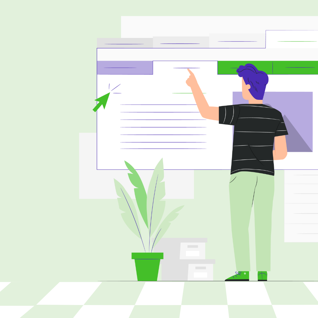
You spend a *lot* of time and money on content - don't you think it's time you created a content library or resource center?

5 Things Wrecking ECommerce Conversion Rates with Holiday Shoppers
Are you ruing your ecommerce conversion rates with your holiday shoppers? Here are a few tips...
Why a HubSpot Mega Menu Should Be Your Next Website Investment
Your arsenal of content is getting bigger by the day - here's why a HubSpot mega menu should be your next website investment.

How to Organize a Mega Menu for IT Managed Services Company
Here's how to organize your mega menu for IT managed services companies.

How’d you do? Let’s Talk Site Performance for Black Friday Weekend
When it comes to site performance for Black Friday and Cyber Monday, you don't want to miss a THING.

Your Web Development Budget Restrictions are Holding You Back
Your web development budget restrictions will handicap your marketing and sales goals and cost you more than you think.

Web Development for SMBs: A Mobile-First Approach to Web Design
When it comes to web development for SMBs, the best approach to web design is always mobile-first.
HubSpot CMS Development Tips: Mega Mistakes with Mega Menus
Mega menus are a great way to help your website visitors find what they need, but be sure you don't make these mistakes:
Businesses and marketers are going all in on content marketing. 60% of marketers report that they create at least one new piece of content every day. While you’re busy planning the perfect path for your top-funnel prospects to jump down the rabbit hole of your website content, more often than not, it looks more like playing whack-a-mole. A random download here, a webinar registration, a few blogs viewed - you think they’re qualified and go in with the automation only to find you’ve missed the mark.
\n","post_body":"Businesses and marketers are going all in on content marketing. 60% of marketers report that they create at least one new piece of content every day. While you’re busy planning the perfect path for your top-funnel prospects to jump down the rabbit hole of your website content, more often than not, it looks more like playing whack-a-mole. A random download here, a webinar registration, a few blogs viewed - you think they’re qualified and go in with the automation only to find you’ve missed the mark.
\n\n
If there’s one overarching truth when it comes to content marketing, it’s that prospects are sick of being talked at. They don’t want you to explain to them the intricacies of your products through impersonal e-mail automation. Some of them would rather rabbit hole through all the content you have on a topic themselves, while others would prefer a webinar, a case study or a series of YouTube videos. While pillar pages help to centralize related content, they don’t always provide the full picture that resounds best with your website visitors or help you cross sell additional services and product lines.
The search bar has been a good resource in the past, but we all know that sometimes tags or keywords are missed by busy marketers - and not all the content that’s relevant to that search term can be displayed perfectly in that moment, either.
The only way to create an empowered, individualized experience for your prospect is to centralize all your website assets in a resource center, knowledge base or website content library that delivers all the assets you’ve created in one space.
How do you know you’re ready to deliver a content library to your audience? Here are a few signs:
Your prospects come in hot and then putter out.
\nQualified prospects are the best, aren’t they? There’s something about looking through a new CRM contact and reviewing their conversion path that is super validating to a marketer. But all too often those prospects get to a conversion point and putter out, even if you have automation in place to try to push them down the funnel a bit. Rather than scaring them away with a phone call or cycling through new automations, maybe you need to remind them of the arsenal of information that is at their fingertips. If you have a content library or resource center to send them, it allows them to browse these assets at their leisure and serves to help them learn on their own time.
\n
Your “best” content has stopped converting
\nIt’s such a beautiful thing when you create that perfect piece of content that converts leads and continues to work for you over time, but not all pieces of content are evergreen. When content stops converting you may think that redesigning your CTA or A/B testing the landing page are the best options. However, placing that piece of content in a central location on your website that your prospects and customers can easily peruse is a great way to get more eyes on it.
Content libraries or resource centers can include feature graphics, prominently featured links and special filters that help your prospects view the content that’s most relevant to them.
You’re creating a lot of content and most of it just… hangs out.
\nBlogs on blogs on blogs, infographics, checklists, videos, webinars, white papers, case studies - your marketing team might be hard at work funneling out incredible content for your audience… but what are you seeing from it? Content libraries allow you to take all of that content that’s hanging out waiting for any kind of traction and centralizes it.
Your library of resources can be organized however you want - with multiple checkbox categories for topics and information formats or by industry. This is empowering for website prospects and helps them to feel more comfortable browsing information and accessing what they need rather than worrying about the impending spam associated with having to rabbit hole through your content inefficiently through blog categories and reviewing CTAs or having to scroll endlessly down your list of resources in your navigation without any idea what they want, need or should be looking for.
You need to centralize information for your current customers
\nA resource center or content library can help your current customers learn more about the products or services that they’ve purchased or may need to purchase in the future. Having a resource center in place allows your current customers to look through these resources.
An educated customer isn’t just going to stick around a little longer, they also will spend less time on the phone asking questions with your customer service team and might even become an evangelist for your products and services if you put enough helpful information out there.
Educating current customers in addition to prospects is invaluable from a retention perspective and helps ensure that they remain informed of all the additional products and services that you offer. It’s easy to draw the conclusion that an informed customer might have a higher lifetime value than a customer that doesn’t have access to the information that helps them remember why they have you around.

Your marketing team spends hours upon hours generating thought provoking, original content. In spite of this big fact, 60% of companies only reuse and repurpose content sporadically. Worse yet, 19% of companies don’t reuse or repurpose their content at all. Creating a content library will not only help to centralize your content, but will help push your prospects further down the sales funnel, create more informed evangelists and assist with customer retention and employee productivity.
If you haven’t taken the time to plan out your content library strategy or need help organizing it, feel free to book some time with us and we'll show you some of the ones we've done and help you configure yours.

Businesses and marketers are going all in on content marketing. 60% of marketers report that they create at least one new piece of content every day. While you’re busy planning the perfect path for your top-funnel prospects to jump down the rabbit hole of your website content, more often than not, it looks more like playing whack-a-mole. A random download here, a webinar registration, a few blogs viewed - you think they’re qualified and go in with the automation only to find you’ve missed the mark.
\n","rss_body":"Businesses and marketers are going all in on content marketing. 60% of marketers report that they create at least one new piece of content every day. While you’re busy planning the perfect path for your top-funnel prospects to jump down the rabbit hole of your website content, more often than not, it looks more like playing whack-a-mole. A random download here, a webinar registration, a few blogs viewed - you think they’re qualified and go in with the automation only to find you’ve missed the mark.
\n\n
If there’s one overarching truth when it comes to content marketing, it’s that prospects are sick of being talked at. They don’t want you to explain to them the intricacies of your products through impersonal e-mail automation. Some of them would rather rabbit hole through all the content you have on a topic themselves, while others would prefer a webinar, a case study or a series of YouTube videos. While pillar pages help to centralize related content, they don’t always provide the full picture that resounds best with your website visitors or help you cross sell additional services and product lines.
The search bar has been a good resource in the past, but we all know that sometimes tags or keywords are missed by busy marketers - and not all the content that’s relevant to that search term can be displayed perfectly in that moment, either.
The only way to create an empowered, individualized experience for your prospect is to centralize all your website assets in a resource center, knowledge base or website content library that delivers all the assets you’ve created in one space.
How do you know you’re ready to deliver a content library to your audience? Here are a few signs:
Your prospects come in hot and then putter out.
\nQualified prospects are the best, aren’t they? There’s something about looking through a new CRM contact and reviewing their conversion path that is super validating to a marketer. But all too often those prospects get to a conversion point and putter out, even if you have automation in place to try to push them down the funnel a bit. Rather than scaring them away with a phone call or cycling through new automations, maybe you need to remind them of the arsenal of information that is at their fingertips. If you have a content library or resource center to send them, it allows them to browse these assets at their leisure and serves to help them learn on their own time.
\n
Your “best” content has stopped converting
\nIt’s such a beautiful thing when you create that perfect piece of content that converts leads and continues to work for you over time, but not all pieces of content are evergreen. When content stops converting you may think that redesigning your CTA or A/B testing the landing page are the best options. However, placing that piece of content in a central location on your website that your prospects and customers can easily peruse is a great way to get more eyes on it.
Content libraries or resource centers can include feature graphics, prominently featured links and special filters that help your prospects view the content that’s most relevant to them.
You’re creating a lot of content and most of it just… hangs out.
\nBlogs on blogs on blogs, infographics, checklists, videos, webinars, white papers, case studies - your marketing team might be hard at work funneling out incredible content for your audience… but what are you seeing from it? Content libraries allow you to take all of that content that’s hanging out waiting for any kind of traction and centralizes it.
Your library of resources can be organized however you want - with multiple checkbox categories for topics and information formats or by industry. This is empowering for website prospects and helps them to feel more comfortable browsing information and accessing what they need rather than worrying about the impending spam associated with having to rabbit hole through your content inefficiently through blog categories and reviewing CTAs or having to scroll endlessly down your list of resources in your navigation without any idea what they want, need or should be looking for.
You need to centralize information for your current customers
\nA resource center or content library can help your current customers learn more about the products or services that they’ve purchased or may need to purchase in the future. Having a resource center in place allows your current customers to look through these resources.
An educated customer isn’t just going to stick around a little longer, they also will spend less time on the phone asking questions with your customer service team and might even become an evangelist for your products and services if you put enough helpful information out there.
Educating current customers in addition to prospects is invaluable from a retention perspective and helps ensure that they remain informed of all the additional products and services that you offer. It’s easy to draw the conclusion that an informed customer might have a higher lifetime value than a customer that doesn’t have access to the information that helps them remember why they have you around.
Your marketing team spends hours upon hours generating thought provoking, original content. In spite of this big fact, 60% of companies only reuse and repurpose content sporadically. Worse yet, 19% of companies don’t reuse or repurpose their content at all. Creating a content library will not only help to centralize your content, but will help push your prospects further down the sales funnel, create more informed evangelists and assist with customer retention and employee productivity.
If you haven’t taken the time to plan out your content library strategy or need help organizing it, feel free to book some time with us and we'll show you some of the ones we've done and help you configure yours.
Businesses and marketers are going all in on content marketing. 60% of marketers report that they create at least one new piece of content every day. While you’re busy planning the perfect path for your top-funnel prospects to jump down the rabbit hole of your website content, more often than not, it looks more like playing whack-a-mole. A random download here, a webinar registration, a few blogs viewed - you think they’re qualified and go in with the automation only to find you’ve missed the mark.
","postFeaturedImageIfEnabled":"https://6534445.fs1.hubspotusercontent-na1.net/hubfs/6534445/BLOG%20Images/Information-Overload.webp","postListContent":"Businesses and marketers are going all in on content marketing. 60% of marketers report that they create at least one new piece of content every day. While you’re busy planning the perfect path for your top-funnel prospects to jump down the rabbit hole of your website content, more often than not, it looks more like playing whack-a-mole. A random download here, a webinar registration, a few blogs viewed - you think they’re qualified and go in with the automation only to find you’ve missed the mark.
","postListSummaryFeaturedImage":"https://6534445.fs1.hubspotusercontent-na1.net/hubfs/6534445/BLOG%20Images/Information-Overload.webp","postRssContent":"Businesses and marketers are going all in on content marketing. 60% of marketers report that they create at least one new piece of content every day. While you’re busy planning the perfect path for your top-funnel prospects to jump down the rabbit hole of your website content, more often than not, it looks more like playing whack-a-mole. A random download here, a webinar registration, a few blogs viewed - you think they’re qualified and go in with the automation only to find you’ve missed the mark.
","postRssSummaryFeaturedImage":"https://6534445.fs1.hubspotusercontent-na1.net/hubfs/6534445/BLOG%20Images/Information-Overload.webp","postSummary":"Businesses and marketers are going all in on content marketing. 60% of marketers report that they create at least one new piece of content every day. While you’re busy planning the perfect path for your top-funnel prospects to jump down the rabbit hole of your website content, more often than not, it looks more like playing whack-a-mole. A random download here, a webinar registration, a few blogs viewed - you think they’re qualified and go in with the automation only to find you’ve missed the mark.
\n","postSummaryRss":"Businesses and marketers are going all in on content marketing. 60% of marketers report that they create at least one new piece of content every day. While you’re busy planning the perfect path for your top-funnel prospects to jump down the rabbit hole of your website content, more often than not, it looks more like playing whack-a-mole. A random download here, a webinar registration, a few blogs viewed - you think they’re qualified and go in with the automation only to find you’ve missed the mark.
","postTemplate":"deckerdevs-theme/templates/blog-content.html","previewImageSrc":null,"previewKey":"MIUJbKka","previousPostFeaturedImage":"https://6534445.fs1.hubspotusercontent-na1.net/hubfs/6534445/BLOG%20Images/wrecking%20ecommerce%202.webp","previousPostFeaturedImageAltText":"conversion optimization","previousPostName":"5 Things Wrecking ECommerce Conversion Rates with Holiday Shoppers","previousPostSlug":"blogs/5-things-wrecking-ecommerce-conversion-rates-with-holiday-shoppers","processingStatus":"PUBLISHED","propertyForDynamicPageCanonicalUrl":null,"propertyForDynamicPageFeaturedImage":null,"propertyForDynamicPageMetaDescription":null,"propertyForDynamicPageSlug":null,"propertyForDynamicPageTitle":null,"publicAccessRules":[],"publicAccessRulesEnabled":false,"publishDate":1673634944000,"publishDateLocalTime":1673634944000,"publishDateLocalized":{"date":1673634944000,"format":"medium","language":null},"publishImmediately":true,"publishTimezoneOffset":null,"publishedAt":1691596998707,"publishedByEmail":null,"publishedById":8982263,"publishedByName":null,"publishedUrl":"https://deckerdevs.com/blogs/content-overload-its-time-for-a-website-content-library-or-resource-center","resolvedDomain":"deckerdevs.com","resolvedLanguage":null,"rssBody":"Businesses and marketers are going all in on content marketing. 60% of marketers report that they create at least one new piece of content every day. While you’re busy planning the perfect path for your top-funnel prospects to jump down the rabbit hole of your website content, more often than not, it looks more like playing whack-a-mole. A random download here, a webinar registration, a few blogs viewed - you think they’re qualified and go in with the automation only to find you’ve missed the mark.
\n\n
If there’s one overarching truth when it comes to content marketing, it’s that prospects are sick of being talked at. They don’t want you to explain to them the intricacies of your products through impersonal e-mail automation. Some of them would rather rabbit hole through all the content you have on a topic themselves, while others would prefer a webinar, a case study or a series of YouTube videos. While pillar pages help to centralize related content, they don’t always provide the full picture that resounds best with your website visitors or help you cross sell additional services and product lines.
The search bar has been a good resource in the past, but we all know that sometimes tags or keywords are missed by busy marketers - and not all the content that’s relevant to that search term can be displayed perfectly in that moment, either.
The only way to create an empowered, individualized experience for your prospect is to centralize all your website assets in a resource center, knowledge base or website content library that delivers all the assets you’ve created in one space.
How do you know you’re ready to deliver a content library to your audience? Here are a few signs:
Your prospects come in hot and then putter out.
\nQualified prospects are the best, aren’t they? There’s something about looking through a new CRM contact and reviewing their conversion path that is super validating to a marketer. But all too often those prospects get to a conversion point and putter out, even if you have automation in place to try to push them down the funnel a bit. Rather than scaring them away with a phone call or cycling through new automations, maybe you need to remind them of the arsenal of information that is at their fingertips. If you have a content library or resource center to send them, it allows them to browse these assets at their leisure and serves to help them learn on their own time.
\n
Your “best” content has stopped converting
\nIt’s such a beautiful thing when you create that perfect piece of content that converts leads and continues to work for you over time, but not all pieces of content are evergreen. When content stops converting you may think that redesigning your CTA or A/B testing the landing page are the best options. However, placing that piece of content in a central location on your website that your prospects and customers can easily peruse is a great way to get more eyes on it.
Content libraries or resource centers can include feature graphics, prominently featured links and special filters that help your prospects view the content that’s most relevant to them.
You’re creating a lot of content and most of it just… hangs out.
\nBlogs on blogs on blogs, infographics, checklists, videos, webinars, white papers, case studies - your marketing team might be hard at work funneling out incredible content for your audience… but what are you seeing from it? Content libraries allow you to take all of that content that’s hanging out waiting for any kind of traction and centralizes it.
Your library of resources can be organized however you want - with multiple checkbox categories for topics and information formats or by industry. This is empowering for website prospects and helps them to feel more comfortable browsing information and accessing what they need rather than worrying about the impending spam associated with having to rabbit hole through your content inefficiently through blog categories and reviewing CTAs or having to scroll endlessly down your list of resources in your navigation without any idea what they want, need or should be looking for.
You need to centralize information for your current customers
\nA resource center or content library can help your current customers learn more about the products or services that they’ve purchased or may need to purchase in the future. Having a resource center in place allows your current customers to look through these resources.
An educated customer isn’t just going to stick around a little longer, they also will spend less time on the phone asking questions with your customer service team and might even become an evangelist for your products and services if you put enough helpful information out there.
Educating current customers in addition to prospects is invaluable from a retention perspective and helps ensure that they remain informed of all the additional products and services that you offer. It’s easy to draw the conclusion that an informed customer might have a higher lifetime value than a customer that doesn’t have access to the information that helps them remember why they have you around.
Your marketing team spends hours upon hours generating thought provoking, original content. In spite of this big fact, 60% of companies only reuse and repurpose content sporadically. Worse yet, 19% of companies don’t reuse or repurpose their content at all. Creating a content library will not only help to centralize your content, but will help push your prospects further down the sales funnel, create more informed evangelists and assist with customer retention and employee productivity.
If you haven’t taken the time to plan out your content library strategy or need help organizing it, feel free to book some time with us and we'll show you some of the ones we've done and help you configure yours.
Businesses and marketers are going all in on content marketing. 60% of marketers report that they create at least one new piece of content every day. While you’re busy planning the perfect path for your top-funnel prospects to jump down the rabbit hole of your website content, more often than not, it looks more like playing whack-a-mole. A random download here, a webinar registration, a few blogs viewed - you think they’re qualified and go in with the automation only to find you’ve missed the mark.
\n","rssSummaryFeaturedImage":"https://6534445.fs1.hubspotusercontent-na1.net/hubfs/6534445/BLOG%20Images/Information-Overload.webp","scheduledUpdateDate":0,"screenshotPreviewTakenAt":1777651504110,"screenshotPreviewUrl":"https://cdn1.hubspot.net/hubshotv3/prod/e/0/828263bb-9f8c-4e96-9168-3c06a10e4edc.png","sections":{},"securityState":"NONE","siteId":null,"slug":"blogs/content-overload-its-time-for-a-website-content-library-or-resource-center","stagedFrom":null,"state":"PUBLISHED","stateWhenDeleted":null,"structuredContentPageType":null,"structuredContentType":null,"styleOverrideId":null,"subcategory":"normal_blog_post","syncedWithBlogRoot":true,"tagIds":[62770428190,82133680259,98457582138,98464015968],"tagList":[{"categoryId":3,"cdnPurgeEmbargoTime":null,"contentIds":[],"cosObjectType":"TAG","created":1640714484700,"deletedAt":0,"description":"","id":62770428190,"label":"Conversion Optimization","language":"en","name":"Conversion Optimization","portalId":6534445,"slug":"conversion-optimization","translatedFromId":null,"translations":{},"updated":1640714484700},{"categoryId":3,"cdnPurgeEmbargoTime":null,"contentIds":[],"cosObjectType":"TAG","created":1660665478382,"deletedAt":0,"description":"","id":82133680259,"label":"UX Design","language":"en","name":"UX Design","portalId":6534445,"slug":"ux-design","translatedFromId":null,"translations":{},"updated":1660665478382},{"categoryId":3,"cdnPurgeEmbargoTime":null,"contentIds":[],"cosObjectType":"TAG","created":1673634826716,"deletedAt":0,"description":"","id":98457582138,"label":"Content Library","language":"en","name":"Content Library","portalId":6534445,"slug":"content-library","translatedFromId":null,"translations":{},"updated":1673634826716},{"categoryId":3,"cdnPurgeEmbargoTime":null,"contentIds":[],"cosObjectType":"TAG","created":1673634836597,"deletedAt":0,"description":"","id":98464015968,"label":"Resource Center","language":"en","name":"Resource Center","portalId":6534445,"slug":"resource-center","translatedFromId":null,"translations":{},"updated":1673634836597}],"tagNames":["Conversion Optimization","UX Design","Content Library","Resource Center"],"teamPerms":[],"templatePath":"","templatePathForRender":"deckerdevs-theme/templates/blog-content.html","textToAudioFileId":null,"textToAudioGenerationRequestId":null,"themePath":null,"themeSettingsValues":null,"title":"Content Overload: It's time for a Content Library or Resource Center","tmsId":null,"topicIds":[62770428190,82133680259,98457582138,98464015968],"topicList":[{"categoryId":3,"cdnPurgeEmbargoTime":null,"contentIds":[],"cosObjectType":"TAG","created":1640714484700,"deletedAt":0,"description":"","id":62770428190,"label":"Conversion Optimization","language":"en","name":"Conversion Optimization","portalId":6534445,"slug":"conversion-optimization","translatedFromId":null,"translations":{},"updated":1640714484700},{"categoryId":3,"cdnPurgeEmbargoTime":null,"contentIds":[],"cosObjectType":"TAG","created":1660665478382,"deletedAt":0,"description":"","id":82133680259,"label":"UX Design","language":"en","name":"UX Design","portalId":6534445,"slug":"ux-design","translatedFromId":null,"translations":{},"updated":1660665478382},{"categoryId":3,"cdnPurgeEmbargoTime":null,"contentIds":[],"cosObjectType":"TAG","created":1673634826716,"deletedAt":0,"description":"","id":98457582138,"label":"Content Library","language":"en","name":"Content Library","portalId":6534445,"slug":"content-library","translatedFromId":null,"translations":{},"updated":1673634826716},{"categoryId":3,"cdnPurgeEmbargoTime":null,"contentIds":[],"cosObjectType":"TAG","created":1673634836597,"deletedAt":0,"description":"","id":98464015968,"label":"Resource Center","language":"en","name":"Resource Center","portalId":6534445,"slug":"resource-center","translatedFromId":null,"translations":{},"updated":1673634836597}],"topicNames":["Conversion Optimization","UX Design","Content Library","Resource Center"],"topics":[62770428190,82133680259,98457582138,98464015968],"translatedContent":{},"translatedFromId":null,"translations":{},"tweet":null,"tweetAt":null,"tweetImmediately":false,"unpublishedAt":0,"updated":1691596998711,"updatedById":8982263,"upsizeFeaturedImage":false,"url":"https://deckerdevs.com/blogs/content-overload-its-time-for-a-website-content-library-or-resource-center","useFeaturedImage":true,"userPerms":[],"views":null,"visibleToAll":null,"widgetContainers":{},"widgetcontainers":{},"widgets":{"blog-image":{"body":{"image_field":{"alt":"pattern-2","height":563,"loading":"lazy","max_height":563,"max_width":1000,"size_type":"auto","src":"https://6534445.fs1.hubspotusercontent-na1.net/hubfs/6534445/pattern-2.jpg","width":1000}},"child_css":{},"css":{},"deleted_at":1691596990159,"id":"blog-image","label":null,"module_id":62246908725,"name":"blog-image","order":3,"smart_type":null,"styles":{},"type":"module"}}},{"ab":false,"abStatus":null,"abTestId":null,"abVariation":false,"abVariationAutomated":false,"absoluteUrl":"https://deckerdevs.com/blogs/5-things-wrecking-ecommerce-conversion-rates-with-holiday-shoppers","afterPostBody":null,"aifeatures":null,"allowedSlugConflict":false,"analytics":null,"analyticsPageId":"95497440299","analyticsPageType":"blog-post","approvalStatus":null,"archived":false,"archivedAt":0,"archivedInDashboard":false,"areCommentsAllowed":true,"attachedStylesheets":[],"audienceAccess":"PUBLIC","author":null,"authorName":null,"authorUsername":null,"blogAuthor":{"avatar":"","bio":"","cdnPurgeEmbargoTime":null,"cosObjectType":"BLOG_AUTHOR","created":1639920511177,"deletedAt":0,"displayName":"deckerdevs","email":"","facebook":"","fullName":"deckerdevs","gravatarUrl":null,"hasSocialProfiles":false,"id":62235724408,"label":"deckerdevs","language":"en","linkedin":"","name":"deckerdevs","portalId":6534445,"slug":"deckerdevs","translatedFromId":null,"translations":{},"twitter":"","twitterUsername":"","updated":1639920511177,"userId":null,"username":null,"website":""},"blogAuthorId":62235724408,"blogAuthorIdList":[62235724408],"blogAuthorList":[{"avatar":"","bio":"","cdnPurgeEmbargoTime":null,"cosObjectType":"BLOG_AUTHOR","created":1639920511177,"deletedAt":0,"displayName":"deckerdevs","email":"","facebook":"","fullName":"deckerdevs","gravatarUrl":null,"hasSocialProfiles":false,"id":62235724408,"label":"deckerdevs","language":"en","linkedin":"","name":"deckerdevs","portalId":6534445,"slug":"deckerdevs","translatedFromId":null,"translations":{},"twitter":"","twitterUsername":"","updated":1639920511177,"userId":null,"username":null,"website":""}],"blogPostAuthor":{"avatar":"","bio":"","cdnPurgeEmbargoTime":null,"cosObjectType":"BLOG_AUTHOR","created":1639920511177,"deletedAt":0,"displayName":"deckerdevs","email":"","facebook":"","fullName":"deckerdevs","gravatarUrl":null,"hasSocialProfiles":false,"id":62235724408,"label":"deckerdevs","language":"en","linkedin":"","name":"deckerdevs","portalId":6534445,"slug":"deckerdevs","translatedFromId":null,"translations":{},"twitter":"","twitterUsername":"","updated":1639920511177,"userId":null,"username":null,"website":""},"blogPostScheduleTaskUid":null,"blogPublishInstantEmailCampaignId":null,"blogPublishInstantEmailRetryCount":null,"blogPublishInstantEmailTaskUid":null,"blogPublishToSocialMediaTask":"DONE_NOT_SENT","blueprintTypeId":0,"businessUnitId":null,"campaign":null,"campaignName":null,"campaignUtm":null,"category":3,"categoryId":3,"cdnPurgeEmbargoTime":null,"checkPostLevelAudienceAccessFirst":true,"clonedFrom":null,"composeBody":null,"compositionId":0,"contentAccessRuleIds":[],"contentAccessRuleTypes":[],"contentGroup":62179259185,"contentGroupId":62179259185,"contentTypeCategory":3,"contentTypeCategoryId":3,"contentTypeId":null,"created":1671127124941,"createdByAgent":null,"createdById":27630257,"createdTime":1671127124941,"crmObjectId":null,"css":{},"cssText":"","ctaClicks":null,"ctaViews":null,"currentState":"PUBLISHED","currentlyPublished":true,"deletedAt":0,"deletedBy":null,"deletedByEmail":null,"deletedById":null,"domain":"","dynamicPageDataSourceId":null,"dynamicPageDataSourceType":null,"dynamicPageHubDbTableId":null,"editorVersion":"1.0","enableDomainStylesheets":null,"enableGoogleAmpOutputOverride":false,"enableLayoutStylesheets":null,"errors":[],"featuredImage":"https://6534445.fs1.hubspotusercontent-na1.net/hubfs/6534445/BLOG%20Images/wrecking%20ecommerce%202.webp","featuredImageAltText":"conversion optimization","featuredImageHeight":425,"featuredImageLength":0,"featuredImageWidth":350,"flexAreas":{},"folderId":null,"footerHtml":null,"footerTemplatePath":null,"footerVariantName":null,"freezeDate":1671128216000,"generateJsonLdEnabledOverride":true,"globalBlockOverrides":{},"hasContentAccessRules":false,"hasUserChanges":true,"headHtml":null,"header":null,"headerTemplatePath":null,"headerVariantName":null,"htmlTitle":"5 Things Wrecking ECommerce Conversion Rates with Holiday Shoppers","id":95497440299,"includeDefaultCustomCss":null,"isCaptchaRequired":true,"isCrawlableByBots":false,"isDraft":false,"isInstantEmailEnabled":false,"isPublished":true,"isSocialPublishingEnabled":false,"isStagedPage":false,"keywords":[],"label":"5 Things Wrecking ECommerce Conversion Rates with Holiday Shoppers","language":"en","lastEditSessionId":null,"lastEditUpdateId":null,"layoutSections":{},"legacyBlogTabid":null,"legacyId":null,"legacyPostGuid":null,"linkRelCanonicalUrl":null,"listTemplate":"","liveDomain":"deckerdevs.com","mab":false,"mabExperimentId":null,"mabMaster":false,"mabVariant":false,"marketingCampaignGuids":[],"meta":{"html_title":"5 Things Wrecking ECommerce Conversion Rates with Holiday Shoppers","public_access_rules":[],"public_access_rules_enabled":false,"use_featured_image":true,"tag_ids":[62770428190,82133680259,95497434208],"topic_ids":[62770428190,82133680259,95497434208],"post_summary":" It’s the most wonderful time of the year…
But it’s also more competitive than it has ever been. 196.7 million shoppers took to online stores on Black Friday Weekend for a total spend of $9.12 billion. Despite the increase in spending, predictions remain uncertain for how the rest of the holiday shopping season will go.
It’s more important than ever to not fuck up your e-commerce conversion rates with your holiday shoppers. Is your current conversion strategy (or lack of one) killing your conversion rates? Let’s dig in and look at some of the big mistakes we’ve seen with e-commerce websites around the holiday season and how you can avoid them:
It’s the most wonderful time of the year…
But it’s also more competitive than it has ever been. 196.7 million shoppers took to online stores on Black Friday Weekend for a total spend of $9.12 billion. Despite the increase in spending, predictions remain uncertain for how the rest of the holiday shopping season will go.
It’s more important than ever to not fuck up your e-commerce conversion rates with your holiday shoppers. Is your current conversion strategy (or lack of one) killing your conversion rates? Let’s dig in and look at some of the big mistakes we’ve seen with e-commerce websites around the holiday season and how you can avoid them:
You have no personalization campaigns running.
\nHoliday shopping messaging inundates our browsers and social media platforms on every device we use. Sales emails, text messages promising huge savings, and social media ads are constantly finding their way into our everyday activities around the holidays. Like the old days of website pop ups and spam phone calls, it seems more retailers than ever are making their way into every aspect of our lives… and as more and more shoppers opt out of text and email messaging from brands they no longer want to hear from, it’s more important than ever to give people a reason to “opt in”.
Specials are great, but when it comes to sales incentives, small businesses will have a tough time keeping up with retail giants. Instead, try using your text, e-mail and social media platform to create personalized messaging that resounds with your buyers. Most major e-commerce platforms offer personalization recommendations in the form of code that can be pasted into emails to recommend products based on recent purchases, but don’t stop there. Personalized content on your website pages based on viewed products, inside your mega menu navigation and in landing pages based on previous conversions are the perfect way to increase conversion rates.
Don’t believe me? Here are some great statistics on personalization for conversion rates from outgrow.co:
- \n
- Lack of personalized content generates 83% lower response rate in an average marketing campaign \n
- Personalization can reduce acquisition costs by as much as 50% \n
- Personalized content results in repeat purchases in nearly 44% of customers \n
- Personalized CTAs convert over 200% better than non-personalized CTAs \n
Your page speed is horrendous
\nDead horse. Beaten.
Sorry, we have to. We cannot hammer home enough the importance of page speed optimization, particularly for e-commerce websites and absolutely when it comes to the biggest shopping month of the year. If you haven’t given this a read, check out these 5 factors bogging down your website and make sure to do whatever you can to optimize your website for load speeds this holiday season.
Need a little more proof? Here are some e-commerce page load stats you should take a look at:
- \n
- 57% of customers will leave your site if your page load times are longer than 3 seconds (80% of these people will never come back and 44% of the 80% will tell a friend. Ouch.) \n
- A 2 second delay in page load speed reduces session length by 51% \n
- For every additional second it takes your website to load, your conversion rate decreases by 7% \n
Optimize your images. Optimize your videos. Use lazy loading. And USE A DEVELOPER THAT KNOWS WHAT THEY’RE DOING! You should have a best practices process document for uploading new listings to your website and make sure that your employees are trained to avoid large images or videos being loaded to your website without your knowledge. Every second matters.
\nRelated: How’d You Do? Let’s Talk Site Performance for Black Friday Weekend
\n\n
You aren’t prominently featuring your offers
\nThis one seems pretty obvious, but you’d be surprised. While text, e-mail and social media marketing are the go-to for promoting holiday deals and shopping incentives, your website is even better. Many retailers shy away from pop ups and banners, but they’re the best way to promote holiday deals to your audience. A pop up with special codes, text opt in for holiday deal promo codes or a banner placed prominently at the top of your page are all great options for promoting your holiday shopping offers to your website visitors .
GetSiteControl.com has great suggestions for banner placement on your website with live examples for promotions during the holiday season. They make suggestions not only for banner placement locations but also ideas for what to put in those banners like:
- \n
- Limited coupon promotions \n
- A Banner advertising shipping incentives \n
- Product recommendations pop ups \n
- Gift card reminders \n
- Filter options inside website banners \n
- E-mail sign up forms \n
Be sure to make your banner easy to navigate out of for customers that aren’t interested to avoid user frustration.
\nYou’re not creating urgency
\nWhen it comes to conversion, creating urgency is proven to increase the likelihood that a customer buys from you. According to Optimonk, a pop up sale banner with a countdown timer on it conversion 4.5% higher than a pop up sale banner without a timer.
Marcus Taylor or CXL posted an interesting blog on creating urgency in the launch of a limited resource package deal he created for musicians. He offered his bundle package for 100 hours total and did everything he could to optimize his conversion rate. He increased it from 2.5 to 10%, which increased his sales by 332% (woah!). He makes some really good suggestions in his article to decrease buyer anxiety while creating urgency by giving them both rational and emotional reasons to buy and supporting those by offering clarity and relevance to that decision. This article is packed with great advice - like real versus implied urgency and why is important to put deadlines on any deals that you run. But his most important takeaway is his discussion on how to handle urgency and his A/B test:
“Adding urgency doesn’t work if your offer is full of distractions, or if your value proposition is crap. It won’t work if your offer’s irrelevant to your audience, or if your audience doesn’t trust you.”
He A/B tested a countdown timer on his CTAs - and Variation B (with the countdown) increased conversion from 3.5% to 10%
If that’s not enough fuel to tell you to create urgency with your audience during holiday shopping, I don’t know what is.
You have no abandoned cart plans in place
\nYou need a strategy for abandoned carts and page exits. In 2021 70% of online shoppers on Black Friday abandoned their shopping carts. Rather than losing this revenue, create a strategy and put proactive measures in place to make sure your customers convert.
Offering your customers the ability to create a wish list or save for later option for their items either inside the shopping cart or as a pop up is a great way to keep them interested in the products they’ve added to their cart. Robust e-mail automation will help here as well, as an automatic e-mail for abandoned carts should be sent out immediately following cart abandonment. Sending an immediate e-mail one hour after a cart has been abandoned has the greatest chance for website conversion, according to Rejoiner.com.
But don’t stop there. Rejoiner also mentions that second and third abandoned cart e-mails can be sent to capture additional revenue, which accounted for 50% of the revenue recaptured from their entire abandoned e-mail campaign.
Don’t discount the value of discounts (heh) - in those second and third abandoned cart e-mails, adding a discount incentive. Unexpected shipping costs are a common reason that abandoned shopping carts occur, and they’re responsible for around 25% of abandoned shopping carts. Offering free or discounted shipping could be another good way to convert those people on the line in your campaigns. A robust automation plan will help you personalize the content in your abandoned cart campaigns to get more out of your customer base. You can easily set these up in HubSpot or in your e-commerce platform, depending on which you use.
With your increased supply costs and logistics expenses, you need to make sure that you convert customers at a higher rate on your website. The holiday shopping season is your biggest opportunity and your time is running out. Do what you can to set your retail business up to success now and plan even more proactively next year to help increase those conversion rates and boost your sales in 2023.
If you haven’t created your 2023 e-commerce strategy yet, it’s probably time. Book some time with us and lets go over your optimization plans.
","rss_summary":"
It’s the most wonderful time of the year…
But it’s also more competitive than it has ever been. 196.7 million shoppers took to online stores on Black Friday Weekend for a total spend of $9.12 billion. Despite the increase in spending, predictions remain uncertain for how the rest of the holiday shopping season will go.
It’s more important than ever to not fuck up your e-commerce conversion rates with your holiday shoppers. Is your current conversion strategy (or lack of one) killing your conversion rates? Let’s dig in and look at some of the big mistakes we’ve seen with e-commerce websites around the holiday season and how you can avoid them:
You have no personalization campaigns running.
\nHoliday shopping messaging inundates our browsers and social media platforms on every device we use. Sales emails, text messages promising huge savings, and social media ads are constantly finding their way into our everyday activities around the holidays. Like the old days of website pop ups and spam phone calls, it seems more retailers than ever are making their way into every aspect of our lives… and as more and more shoppers opt out of text and email messaging from brands they no longer want to hear from, it’s more important than ever to give people a reason to “opt in”.
Specials are great, but when it comes to sales incentives, small businesses will have a tough time keeping up with retail giants. Instead, try using your text, e-mail and social media platform to create personalized messaging that resounds with your buyers. Most major e-commerce platforms offer personalization recommendations in the form of code that can be pasted into emails to recommend products based on recent purchases, but don’t stop there. Personalized content on your website pages based on viewed products, inside your mega menu navigation and in landing pages based on previous conversions are the perfect way to increase conversion rates.
Don’t believe me? Here are some great statistics on personalization for conversion rates from outgrow.co:
- \n
- Lack of personalized content generates 83% lower response rate in an average marketing campaign \n
- Personalization can reduce acquisition costs by as much as 50% \n
- Personalized content results in repeat purchases in nearly 44% of customers \n
- Personalized CTAs convert over 200% better than non-personalized CTAs \n
Your page speed is horrendous
\nDead horse. Beaten.
Sorry, we have to. We cannot hammer home enough the importance of page speed optimization, particularly for e-commerce websites and absolutely when it comes to the biggest shopping month of the year. If you haven’t given this a read, check out these 5 factors bogging down your website and make sure to do whatever you can to optimize your website for load speeds this holiday season.
Need a little more proof? Here are some e-commerce page load stats you should take a look at:
- \n
- 57% of customers will leave your site if your page load times are longer than 3 seconds (80% of these people will never come back and 44% of the 80% will tell a friend. Ouch.) \n
- A 2 second delay in page load speed reduces session length by 51% \n
- For every additional second it takes your website to load, your conversion rate decreases by 7% \n
Optimize your images. Optimize your videos. Use lazy loading. And USE A DEVELOPER THAT KNOWS WHAT THEY’RE DOING! You should have a best practices process document for uploading new listings to your website and make sure that your employees are trained to avoid large images or videos being loaded to your website without your knowledge. Every second matters.
\nRelated: How’d You Do? Let’s Talk Site Performance for Black Friday Weekend
\n\n
You aren’t prominently featuring your offers
\nThis one seems pretty obvious, but you’d be surprised. While text, e-mail and social media marketing are the go-to for promoting holiday deals and shopping incentives, your website is even better. Many retailers shy away from pop ups and banners, but they’re the best way to promote holiday deals to your audience. A pop up with special codes, text opt in for holiday deal promo codes or a banner placed prominently at the top of your page are all great options for promoting your holiday shopping offers to your website visitors .
GetSiteControl.com has great suggestions for banner placement on your website with live examples for promotions during the holiday season. They make suggestions not only for banner placement locations but also ideas for what to put in those banners like:
- \n
- Limited coupon promotions \n
- A Banner advertising shipping incentives \n
- Product recommendations pop ups \n
- Gift card reminders \n
- Filter options inside website banners \n
- E-mail sign up forms \n
Be sure to make your banner easy to navigate out of for customers that aren’t interested to avoid user frustration.
\nYou’re not creating urgency
\nWhen it comes to conversion, creating urgency is proven to increase the likelihood that a customer buys from you. According to Optimonk, a pop up sale banner with a countdown timer on it conversion 4.5% higher than a pop up sale banner without a timer.
Marcus Taylor or CXL posted an interesting blog on creating urgency in the launch of a limited resource package deal he created for musicians. He offered his bundle package for 100 hours total and did everything he could to optimize his conversion rate. He increased it from 2.5 to 10%, which increased his sales by 332% (woah!). He makes some really good suggestions in his article to decrease buyer anxiety while creating urgency by giving them both rational and emotional reasons to buy and supporting those by offering clarity and relevance to that decision. This article is packed with great advice - like real versus implied urgency and why is important to put deadlines on any deals that you run. But his most important takeaway is his discussion on how to handle urgency and his A/B test:
“Adding urgency doesn’t work if your offer is full of distractions, or if your value proposition is crap. It won’t work if your offer’s irrelevant to your audience, or if your audience doesn’t trust you.”
He A/B tested a countdown timer on his CTAs - and Variation B (with the countdown) increased conversion from 3.5% to 10%
If that’s not enough fuel to tell you to create urgency with your audience during holiday shopping, I don’t know what is.
You have no abandoned cart plans in place
\nYou need a strategy for abandoned carts and page exits. In 2021 70% of online shoppers on Black Friday abandoned their shopping carts. Rather than losing this revenue, create a strategy and put proactive measures in place to make sure your customers convert.
Offering your customers the ability to create a wish list or save for later option for their items either inside the shopping cart or as a pop up is a great way to keep them interested in the products they’ve added to their cart. Robust e-mail automation will help here as well, as an automatic e-mail for abandoned carts should be sent out immediately following cart abandonment. Sending an immediate e-mail one hour after a cart has been abandoned has the greatest chance for website conversion, according to Rejoiner.com.
But don’t stop there. Rejoiner also mentions that second and third abandoned cart e-mails can be sent to capture additional revenue, which accounted for 50% of the revenue recaptured from their entire abandoned e-mail campaign.
Don’t discount the value of discounts (heh) - in those second and third abandoned cart e-mails, adding a discount incentive. Unexpected shipping costs are a common reason that abandoned shopping carts occur, and they’re responsible for around 25% of abandoned shopping carts. Offering free or discounted shipping could be another good way to convert those people on the line in your campaigns. A robust automation plan will help you personalize the content in your abandoned cart campaigns to get more out of your customer base. You can easily set these up in HubSpot or in your e-commerce platform, depending on which you use.
With your increased supply costs and logistics expenses, you need to make sure that you convert customers at a higher rate on your website. The holiday shopping season is your biggest opportunity and your time is running out. Do what you can to set your retail business up to success now and plan even more proactively next year to help increase those conversion rates and boost your sales in 2023.
If you haven’t created your 2023 e-commerce strategy yet, it’s probably time. Book some time with us and lets go over your optimization plans.
","enable_google_amp_output_override":false,"generate_json_ld_enabled":true,"blog_post_schedule_task_uid":null,"blog_publish_to_social_media_task":"DONE_NOT_SENT","blog_publish_instant_email_task_uid":null,"blog_publish_instant_email_campaign_id":null,"blog_publish_instant_email_retry_count":null,"keywords":[],"composition_id":0,"is_crawlable_by_bots":false,"head_html":null,"footer_html":null,"attached_stylesheets":[],"enable_domain_stylesheets":null,"include_default_custom_css":null,"layout_sections":{},"past_mab_experiment_ids":[],"deleted_by":null,"featured_image_alt_text":"conversion optimization","is_staged_page":false,"enable_layout_stylesheets":null,"tweet":null,"tweet_at":null,"campaign_name":null,"campaign_utm":null,"meta_keywords":null,"meta_description":"Are you ruing your ecommerce conversion rates with your holiday shoppers? Here are a few tips...","tweet_immediately":false,"publish_immediately":true,"security_state":"NONE","scheduled_update_date":0,"placement_guids":[],"header_template_path":null,"header_variant_name":null,"footer_template_path":null,"footer_variant_name":null,"global_block_overrides":{},"property_for_dynamic_page_title":null,"property_for_dynamic_page_slug":null,"property_for_dynamic_page_meta_description":null,"property_for_dynamic_page_featured_image":null,"property_for_dynamic_page_canonical_url":null,"preview_image_src":null,"legacy_blog_tabid":null,"legacy_post_guid":null,"performable_variation_letter":null,"style_override_id":null,"has_user_changes":true,"css":{},"css_text":"","unpublished_at":0,"published_by_id":8982263,"allowed_slug_conflict":false,"ai_features":null,"link_rel_canonical_url":null,"page_redirected":false,"page_expiry_enabled":null,"page_expiry_date":null,"page_expiry_redirect_id":null,"page_expiry_redirect_url":null,"deleted_by_id":null,"state_when_deleted":null,"cloned_from":null,"staged_from":null,"personas":[],"compose_body":null,"featured_image":"https://6534445.fs1.hubspotusercontent-na1.net/hubfs/6534445/BLOG%20Images/wrecking%20ecommerce%202.webp","featured_image_width":350,"featured_image_height":425,"publish_timezone_offset":null,"theme_settings_values":null,"editor_version":"1.0","password":null,"header":null,"published_at":1691598264859,"last_edit_session_id":null,"last_edit_update_id":null,"created_by_agent":null},"metaDescription":"Are you ruing your ecommerce conversion rates with your holiday shoppers? Here are a few tips...","metaKeywords":null,"name":"5 Things Wrecking ECommerce Conversion Rates with Holiday Shoppers","nextPostFeaturedImage":"https://6534445.fs1.hubspotusercontent-na1.net/hubfs/6534445/BLOG%20Images/deckerdevs-hs%20megamenu.png","nextPostFeaturedImageAltText":"","nextPostName":"Why a HubSpot Mega Menu Should Be Your Next Website Investment","nextPostSlug":"blogs/why-a-hubspot-mega-menu-should-be-your-next-website-investment","pageExpiryDate":null,"pageExpiryEnabled":null,"pageExpiryRedirectId":null,"pageExpiryRedirectUrl":null,"pageRedirected":false,"pageTitle":"5 Things Wrecking ECommerce Conversion Rates with Holiday Shoppers","parentBlog":{"absoluteUrl":"https://deckerdevs.com/blogs","allowComments":true,"ampBodyColor":"#404040","ampBodyFont":"'Helvetica Neue', Helvetica, Arial, sans-serif","ampBodyFontSize":"18","ampCustomCss":"","ampHeaderBackgroundColor":"#ffffff","ampHeaderColor":"#1e1e1e","ampHeaderFont":"'Helvetica Neue', Helvetica, Arial, sans-serif","ampHeaderFontSize":"36","ampLinkColor":"#416bb3","ampLogoAlt":"","ampLogoHeight":0,"ampLogoSrc":"","ampLogoWidth":0,"analyticsPageId":62179259185,"attachedStylesheets":[],"audienceAccess":"PUBLIC","businessUnitId":null,"captchaAfterDays":7,"captchaAlways":false,"categoryId":3,"cdnPurgeEmbargoTime":null,"closeCommentsOlder":0,"commentDateFormat":"medium","commentFormGuid":"cb653aa1-3db4-4167-9b59-744c46d49682","commentMaxThreadDepth":3,"commentModeration":false,"commentNotificationEmails":["nicholas@deckerdevs.com","jessica@deckerdevs.com"],"commentShouldCreateContact":true,"commentVerificationText":"Thanks for participating in this conversation! We look forward to responding and to assisting where we can","cosObjectType":"BLOG","created":1639786189589,"createdDateTime":1639786189589,"dailyNotificationEmailId":null,"dateFormattingLanguage":null,"defaultGroupStyleId":"","defaultNotificationFromName":"","defaultNotificationReplyTo":"","deletedAt":0,"description":"rev up your hubspot system to the max! deckerdevs' turbo-charged blog is your ultimate guide to harnessing the full potential of hubspot development. unleash the marketing magic with ingenious tips, tricks, and hacks. get ready to level up your hubspot game!","domain":"","domainWhenPublished":"deckerdevs.com","emailApiSubscriptionId":null,"enableGoogleAmpOutput":false,"enableSocialAutoPublishing":false,"generateJsonLdEnabled":true,"header":null,"htmlFooter":"","htmlFooterIsShared":true,"htmlHead":"","htmlHeadIsShared":true,"htmlKeywords":[],"htmlTitle":"deckerdevs thought nuggets","id":62179259185,"ilsSubscriptionListsByType":{},"instantNotificationEmailId":null,"itemLayoutId":null,"itemTemplateIsShared":false,"itemTemplatePath":"deckerdevs-theme/templates/blog-content.html","label":"deckerdevs live blog","language":"en","legacyGuid":null,"legacyModuleId":null,"legacyTabId":null,"listingLayoutId":null,"listingPageId":62179259186,"listingTemplatePath":"","liveDomain":"deckerdevs.com","monthFilterFormat":"MMMM yyyy","monthlyNotificationEmailId":null,"name":"deckerdevs live blog","parentBlogUpdateTaskId":null,"portalId":6534445,"postHtmlFooter":"","postHtmlHead":"","postsPerListingPage":9,"postsPerRssFeed":10,"publicAccessRules":[],"publicAccessRulesEnabled":false,"publicTitle":"thought nuggets","publishDateFormat":"medium","resolvedDomain":"deckerdevs.com","rootUrl":"https://deckerdevs.com/blogs","rssCustomFeed":null,"rssDescription":null,"rssItemFooter":null,"rssItemHeader":null,"settingsOverrides":{"itemLayoutId":false,"itemTemplatePath":false,"itemTemplateIsShared":false,"listingLayoutId":false,"listingTemplatePath":false,"postsPerListingPage":false,"showSummaryInListing":false,"useFeaturedImageInSummary":false,"htmlHead":false,"postHtmlHead":false,"htmlHeadIsShared":false,"htmlFooter":false,"listingPageHtmlFooter":false,"postHtmlFooter":false,"htmlFooterIsShared":false,"attachedStylesheets":false,"postsPerRssFeed":false,"showSummaryInRss":false,"showSummaryInEmails":false,"showSummariesInEmails":false,"allowComments":false,"commentShouldCreateContact":false,"commentModeration":false,"closeCommentsOlder":false,"commentNotificationEmails":false,"commentMaxThreadDepth":false,"commentVerificationText":false,"socialAccountTwitter":false,"showSocialLinkTwitter":false,"showSocialLinkLinkedin":false,"showSocialLinkFacebook":false,"enableGoogleAmpOutput":false,"ampLogoSrc":false,"ampLogoHeight":false,"ampLogoWidth":false,"ampLogoAlt":false,"ampHeaderFont":false,"ampHeaderFontSize":false,"ampHeaderColor":false,"ampHeaderBackgroundColor":false,"ampBodyFont":false,"ampBodyFontSize":false,"ampBodyColor":false,"ampLinkColor":false,"generateJsonLdEnabled":false},"showSocialLinkFacebook":true,"showSocialLinkLinkedin":true,"showSocialLinkTwitter":true,"showSummaryInEmails":true,"showSummaryInListing":true,"showSummaryInRss":true,"siteId":null,"slug":"blogs","socialAccountTwitter":"","state":null,"subscriptionContactsProperty":null,"subscriptionEmailType":null,"subscriptionFormGuid":null,"subscriptionListsByType":{},"title":null,"translatedFromId":null,"translations":{},"updated":1712344124471,"updatedDateTime":1712344124471,"urlBase":"deckerdevs.com/blogs","urlSegments":{"all":"all","archive":"archive","author":"author","page":"page","tag":"tag"},"useFeaturedImageInSummary":true,"usesDefaultTemplate":false,"weeklyNotificationEmailId":null},"password":null,"pastMabExperimentIds":[],"performableGuid":null,"performableVariationLetter":null,"personalizationStrategyId":null,"personalizationVariantStatus":null,"personas":[],"placementGuids":[],"portableKey":null,"portalId":6534445,"position":null,"postBody":"
It’s the most wonderful time of the year…
But it’s also more competitive than it has ever been. 196.7 million shoppers took to online stores on Black Friday Weekend for a total spend of $9.12 billion. Despite the increase in spending, predictions remain uncertain for how the rest of the holiday shopping season will go.
It’s more important than ever to not fuck up your e-commerce conversion rates with your holiday shoppers. Is your current conversion strategy (or lack of one) killing your conversion rates? Let’s dig in and look at some of the big mistakes we’ve seen with e-commerce websites around the holiday season and how you can avoid them:
You have no personalization campaigns running.
\nHoliday shopping messaging inundates our browsers and social media platforms on every device we use. Sales emails, text messages promising huge savings, and social media ads are constantly finding their way into our everyday activities around the holidays. Like the old days of website pop ups and spam phone calls, it seems more retailers than ever are making their way into every aspect of our lives… and as more and more shoppers opt out of text and email messaging from brands they no longer want to hear from, it’s more important than ever to give people a reason to “opt in”.
Specials are great, but when it comes to sales incentives, small businesses will have a tough time keeping up with retail giants. Instead, try using your text, e-mail and social media platform to create personalized messaging that resounds with your buyers. Most major e-commerce platforms offer personalization recommendations in the form of code that can be pasted into emails to recommend products based on recent purchases, but don’t stop there. Personalized content on your website pages based on viewed products, inside your mega menu navigation and in landing pages based on previous conversions are the perfect way to increase conversion rates.
Don’t believe me? Here are some great statistics on personalization for conversion rates from outgrow.co:
- \n
- Lack of personalized content generates 83% lower response rate in an average marketing campaign \n
- Personalization can reduce acquisition costs by as much as 50% \n
- Personalized content results in repeat purchases in nearly 44% of customers \n
- Personalized CTAs convert over 200% better than non-personalized CTAs \n
Your page speed is horrendous
\nDead horse. Beaten.
Sorry, we have to. We cannot hammer home enough the importance of page speed optimization, particularly for e-commerce websites and absolutely when it comes to the biggest shopping month of the year. If you haven’t given this a read, check out these 5 factors bogging down your website and make sure to do whatever you can to optimize your website for load speeds this holiday season.
Need a little more proof? Here are some e-commerce page load stats you should take a look at:
- \n
- 57% of customers will leave your site if your page load times are longer than 3 seconds (80% of these people will never come back and 44% of the 80% will tell a friend. Ouch.) \n
- A 2 second delay in page load speed reduces session length by 51% \n
- For every additional second it takes your website to load, your conversion rate decreases by 7% \n
Optimize your images. Optimize your videos. Use lazy loading. And USE A DEVELOPER THAT KNOWS WHAT THEY’RE DOING! You should have a best practices process document for uploading new listings to your website and make sure that your employees are trained to avoid large images or videos being loaded to your website without your knowledge. Every second matters.
\nRelated: How’d You Do? Let’s Talk Site Performance for Black Friday Weekend
\n\n
You aren’t prominently featuring your offers
\nThis one seems pretty obvious, but you’d be surprised. While text, e-mail and social media marketing are the go-to for promoting holiday deals and shopping incentives, your website is even better. Many retailers shy away from pop ups and banners, but they’re the best way to promote holiday deals to your audience. A pop up with special codes, text opt in for holiday deal promo codes or a banner placed prominently at the top of your page are all great options for promoting your holiday shopping offers to your website visitors .
GetSiteControl.com has great suggestions for banner placement on your website with live examples for promotions during the holiday season. They make suggestions not only for banner placement locations but also ideas for what to put in those banners like:
- \n
- Limited coupon promotions \n
- A Banner advertising shipping incentives \n
- Product recommendations pop ups \n
- Gift card reminders \n
- Filter options inside website banners \n
- E-mail sign up forms \n
Be sure to make your banner easy to navigate out of for customers that aren’t interested to avoid user frustration.
\nYou’re not creating urgency
\nWhen it comes to conversion, creating urgency is proven to increase the likelihood that a customer buys from you. According to Optimonk, a pop up sale banner with a countdown timer on it conversion 4.5% higher than a pop up sale banner without a timer.
Marcus Taylor or CXL posted an interesting blog on creating urgency in the launch of a limited resource package deal he created for musicians. He offered his bundle package for 100 hours total and did everything he could to optimize his conversion rate. He increased it from 2.5 to 10%, which increased his sales by 332% (woah!). He makes some really good suggestions in his article to decrease buyer anxiety while creating urgency by giving them both rational and emotional reasons to buy and supporting those by offering clarity and relevance to that decision. This article is packed with great advice - like real versus implied urgency and why is important to put deadlines on any deals that you run. But his most important takeaway is his discussion on how to handle urgency and his A/B test:
“Adding urgency doesn’t work if your offer is full of distractions, or if your value proposition is crap. It won’t work if your offer’s irrelevant to your audience, or if your audience doesn’t trust you.”
He A/B tested a countdown timer on his CTAs - and Variation B (with the countdown) increased conversion from 3.5% to 10%
If that’s not enough fuel to tell you to create urgency with your audience during holiday shopping, I don’t know what is.
You have no abandoned cart plans in place
\nYou need a strategy for abandoned carts and page exits. In 2021 70% of online shoppers on Black Friday abandoned their shopping carts. Rather than losing this revenue, create a strategy and put proactive measures in place to make sure your customers convert.
Offering your customers the ability to create a wish list or save for later option for their items either inside the shopping cart or as a pop up is a great way to keep them interested in the products they’ve added to their cart. Robust e-mail automation will help here as well, as an automatic e-mail for abandoned carts should be sent out immediately following cart abandonment. Sending an immediate e-mail one hour after a cart has been abandoned has the greatest chance for website conversion, according to Rejoiner.com.
But don’t stop there. Rejoiner also mentions that second and third abandoned cart e-mails can be sent to capture additional revenue, which accounted for 50% of the revenue recaptured from their entire abandoned e-mail campaign.
Don’t discount the value of discounts (heh) - in those second and third abandoned cart e-mails, adding a discount incentive. Unexpected shipping costs are a common reason that abandoned shopping carts occur, and they’re responsible for around 25% of abandoned shopping carts. Offering free or discounted shipping could be another good way to convert those people on the line in your campaigns. A robust automation plan will help you personalize the content in your abandoned cart campaigns to get more out of your customer base. You can easily set these up in HubSpot or in your e-commerce platform, depending on which you use.
With your increased supply costs and logistics expenses, you need to make sure that you convert customers at a higher rate on your website. The holiday shopping season is your biggest opportunity and your time is running out. Do what you can to set your retail business up to success now and plan even more proactively next year to help increase those conversion rates and boost your sales in 2023.
If you haven’t created your 2023 e-commerce strategy yet, it’s probably time. Book some time with us and lets go over your optimization plans.
","postBodyRss":"
It’s the most wonderful time of the year…
But it’s also more competitive than it has ever been. 196.7 million shoppers took to online stores on Black Friday Weekend for a total spend of $9.12 billion. Despite the increase in spending, predictions remain uncertain for how the rest of the holiday shopping season will go.
It’s more important than ever to not fuck up your e-commerce conversion rates with your holiday shoppers. Is your current conversion strategy (or lack of one) killing your conversion rates? Let’s dig in and look at some of the big mistakes we’ve seen with e-commerce websites around the holiday season and how you can avoid them:
You have no personalization campaigns running.
\nHoliday shopping messaging inundates our browsers and social media platforms on every device we use. Sales emails, text messages promising huge savings, and social media ads are constantly finding their way into our everyday activities around the holidays. Like the old days of website pop ups and spam phone calls, it seems more retailers than ever are making their way into every aspect of our lives… and as more and more shoppers opt out of text and email messaging from brands they no longer want to hear from, it’s more important than ever to give people a reason to “opt in”.
Specials are great, but when it comes to sales incentives, small businesses will have a tough time keeping up with retail giants. Instead, try using your text, e-mail and social media platform to create personalized messaging that resounds with your buyers. Most major e-commerce platforms offer personalization recommendations in the form of code that can be pasted into emails to recommend products based on recent purchases, but don’t stop there. Personalized content on your website pages based on viewed products, inside your mega menu navigation and in landing pages based on previous conversions are the perfect way to increase conversion rates.
Don’t believe me? Here are some great statistics on personalization for conversion rates from outgrow.co:
- \n
- Lack of personalized content generates 83% lower response rate in an average marketing campaign \n
- Personalization can reduce acquisition costs by as much as 50% \n
- Personalized content results in repeat purchases in nearly 44% of customers \n
- Personalized CTAs convert over 200% better than non-personalized CTAs \n
Your page speed is horrendous
\nDead horse. Beaten.
Sorry, we have to. We cannot hammer home enough the importance of page speed optimization, particularly for e-commerce websites and absolutely when it comes to the biggest shopping month of the year. If you haven’t given this a read, check out these 5 factors bogging down your website and make sure to do whatever you can to optimize your website for load speeds this holiday season.
Need a little more proof? Here are some e-commerce page load stats you should take a look at:
- \n
- 57% of customers will leave your site if your page load times are longer than 3 seconds (80% of these people will never come back and 44% of the 80% will tell a friend. Ouch.) \n
- A 2 second delay in page load speed reduces session length by 51% \n
- For every additional second it takes your website to load, your conversion rate decreases by 7% \n
Optimize your images. Optimize your videos. Use lazy loading. And USE A DEVELOPER THAT KNOWS WHAT THEY’RE DOING! You should have a best practices process document for uploading new listings to your website and make sure that your employees are trained to avoid large images or videos being loaded to your website without your knowledge. Every second matters.
\nRelated: How’d You Do? Let’s Talk Site Performance for Black Friday Weekend
\n\n
You aren’t prominently featuring your offers
\nThis one seems pretty obvious, but you’d be surprised. While text, e-mail and social media marketing are the go-to for promoting holiday deals and shopping incentives, your website is even better. Many retailers shy away from pop ups and banners, but they’re the best way to promote holiday deals to your audience. A pop up with special codes, text opt in for holiday deal promo codes or a banner placed prominently at the top of your page are all great options for promoting your holiday shopping offers to your website visitors .
GetSiteControl.com has great suggestions for banner placement on your website with live examples for promotions during the holiday season. They make suggestions not only for banner placement locations but also ideas for what to put in those banners like:
- \n
- Limited coupon promotions \n
- A Banner advertising shipping incentives \n
- Product recommendations pop ups \n
- Gift card reminders \n
- Filter options inside website banners \n
- E-mail sign up forms \n
Be sure to make your banner easy to navigate out of for customers that aren’t interested to avoid user frustration.
\nYou’re not creating urgency
\nWhen it comes to conversion, creating urgency is proven to increase the likelihood that a customer buys from you. According to Optimonk, a pop up sale banner with a countdown timer on it conversion 4.5% higher than a pop up sale banner without a timer.
Marcus Taylor or CXL posted an interesting blog on creating urgency in the launch of a limited resource package deal he created for musicians. He offered his bundle package for 100 hours total and did everything he could to optimize his conversion rate. He increased it from 2.5 to 10%, which increased his sales by 332% (woah!). He makes some really good suggestions in his article to decrease buyer anxiety while creating urgency by giving them both rational and emotional reasons to buy and supporting those by offering clarity and relevance to that decision. This article is packed with great advice - like real versus implied urgency and why is important to put deadlines on any deals that you run. But his most important takeaway is his discussion on how to handle urgency and his A/B test:
“Adding urgency doesn’t work if your offer is full of distractions, or if your value proposition is crap. It won’t work if your offer’s irrelevant to your audience, or if your audience doesn’t trust you.”
He A/B tested a countdown timer on his CTAs - and Variation B (with the countdown) increased conversion from 3.5% to 10%
If that’s not enough fuel to tell you to create urgency with your audience during holiday shopping, I don’t know what is.
You have no abandoned cart plans in place
\nYou need a strategy for abandoned carts and page exits. In 2021 70% of online shoppers on Black Friday abandoned their shopping carts. Rather than losing this revenue, create a strategy and put proactive measures in place to make sure your customers convert.
Offering your customers the ability to create a wish list or save for later option for their items either inside the shopping cart or as a pop up is a great way to keep them interested in the products they’ve added to their cart. Robust e-mail automation will help here as well, as an automatic e-mail for abandoned carts should be sent out immediately following cart abandonment. Sending an immediate e-mail one hour after a cart has been abandoned has the greatest chance for website conversion, according to Rejoiner.com.
But don’t stop there. Rejoiner also mentions that second and third abandoned cart e-mails can be sent to capture additional revenue, which accounted for 50% of the revenue recaptured from their entire abandoned e-mail campaign.
Don’t discount the value of discounts (heh) - in those second and third abandoned cart e-mails, adding a discount incentive. Unexpected shipping costs are a common reason that abandoned shopping carts occur, and they’re responsible for around 25% of abandoned shopping carts. Offering free or discounted shipping could be another good way to convert those people on the line in your campaigns. A robust automation plan will help you personalize the content in your abandoned cart campaigns to get more out of your customer base. You can easily set these up in HubSpot or in your e-commerce platform, depending on which you use.
With your increased supply costs and logistics expenses, you need to make sure that you convert customers at a higher rate on your website. The holiday shopping season is your biggest opportunity and your time is running out. Do what you can to set your retail business up to success now and plan even more proactively next year to help increase those conversion rates and boost your sales in 2023.
If you haven’t created your 2023 e-commerce strategy yet, it’s probably time. Book some time with us and lets go over your optimization plans.
","postEmailContent":"
It’s the most wonderful time of the year…
But it’s also more competitive than it has ever been. 196.7 million shoppers took to online stores on Black Friday Weekend for a total spend of $9.12 billion. Despite the increase in spending, predictions remain uncertain for how the rest of the holiday shopping season will go.
It’s more important than ever to not fuck up your e-commerce conversion rates with your holiday shoppers. Is your current conversion strategy (or lack of one) killing your conversion rates? Let’s dig in and look at some of the big mistakes we’ve seen with e-commerce websites around the holiday season and how you can avoid them:
You have no personalization campaigns running.
\nHoliday shopping messaging inundates our browsers and social media platforms on every device we use. Sales emails, text messages promising huge savings, and social media ads are constantly finding their way into our everyday activities around the holidays. Like the old days of website pop ups and spam phone calls, it seems more retailers than ever are making their way into every aspect of our lives… and as more and more shoppers opt out of text and email messaging from brands they no longer want to hear from, it’s more important than ever to give people a reason to “opt in”.
Specials are great, but when it comes to sales incentives, small businesses will have a tough time keeping up with retail giants. Instead, try using your text, e-mail and social media platform to create personalized messaging that resounds with your buyers. Most major e-commerce platforms offer personalization recommendations in the form of code that can be pasted into emails to recommend products based on recent purchases, but don’t stop there. Personalized content on your website pages based on viewed products, inside your mega menu navigation and in landing pages based on previous conversions are the perfect way to increase conversion rates.
Don’t believe me? Here are some great statistics on personalization for conversion rates from outgrow.co:
- \n
- Lack of personalized content generates 83% lower response rate in an average marketing campaign \n
- Personalization can reduce acquisition costs by as much as 50% \n
- Personalized content results in repeat purchases in nearly 44% of customers \n
- Personalized CTAs convert over 200% better than non-personalized CTAs \n
Your page speed is horrendous
\nDead horse. Beaten.
Sorry, we have to. We cannot hammer home enough the importance of page speed optimization, particularly for e-commerce websites and absolutely when it comes to the biggest shopping month of the year. If you haven’t given this a read, check out these 5 factors bogging down your website and make sure to do whatever you can to optimize your website for load speeds this holiday season.
Need a little more proof? Here are some e-commerce page load stats you should take a look at:
- \n
- 57% of customers will leave your site if your page load times are longer than 3 seconds (80% of these people will never come back and 44% of the 80% will tell a friend. Ouch.) \n
- A 2 second delay in page load speed reduces session length by 51% \n
- For every additional second it takes your website to load, your conversion rate decreases by 7% \n
Optimize your images. Optimize your videos. Use lazy loading. And USE A DEVELOPER THAT KNOWS WHAT THEY’RE DOING! You should have a best practices process document for uploading new listings to your website and make sure that your employees are trained to avoid large images or videos being loaded to your website without your knowledge. Every second matters.
\nRelated: How’d You Do? Let’s Talk Site Performance for Black Friday Weekend
\n\n
You aren’t prominently featuring your offers
\nThis one seems pretty obvious, but you’d be surprised. While text, e-mail and social media marketing are the go-to for promoting holiday deals and shopping incentives, your website is even better. Many retailers shy away from pop ups and banners, but they’re the best way to promote holiday deals to your audience. A pop up with special codes, text opt in for holiday deal promo codes or a banner placed prominently at the top of your page are all great options for promoting your holiday shopping offers to your website visitors .
GetSiteControl.com has great suggestions for banner placement on your website with live examples for promotions during the holiday season. They make suggestions not only for banner placement locations but also ideas for what to put in those banners like:
- \n
- Limited coupon promotions \n
- A Banner advertising shipping incentives \n
- Product recommendations pop ups \n
- Gift card reminders \n
- Filter options inside website banners \n
- E-mail sign up forms \n
Be sure to make your banner easy to navigate out of for customers that aren’t interested to avoid user frustration.
\nYou’re not creating urgency
\nWhen it comes to conversion, creating urgency is proven to increase the likelihood that a customer buys from you. According to Optimonk, a pop up sale banner with a countdown timer on it conversion 4.5% higher than a pop up sale banner without a timer.
Marcus Taylor or CXL posted an interesting blog on creating urgency in the launch of a limited resource package deal he created for musicians. He offered his bundle package for 100 hours total and did everything he could to optimize his conversion rate. He increased it from 2.5 to 10%, which increased his sales by 332% (woah!). He makes some really good suggestions in his article to decrease buyer anxiety while creating urgency by giving them both rational and emotional reasons to buy and supporting those by offering clarity and relevance to that decision. This article is packed with great advice - like real versus implied urgency and why is important to put deadlines on any deals that you run. But his most important takeaway is his discussion on how to handle urgency and his A/B test:
“Adding urgency doesn’t work if your offer is full of distractions, or if your value proposition is crap. It won’t work if your offer’s irrelevant to your audience, or if your audience doesn’t trust you.”
He A/B tested a countdown timer on his CTAs - and Variation B (with the countdown) increased conversion from 3.5% to 10%
If that’s not enough fuel to tell you to create urgency with your audience during holiday shopping, I don’t know what is.
You have no abandoned cart plans in place
\nYou need a strategy for abandoned carts and page exits. In 2021 70% of online shoppers on Black Friday abandoned their shopping carts. Rather than losing this revenue, create a strategy and put proactive measures in place to make sure your customers convert.
Offering your customers the ability to create a wish list or save for later option for their items either inside the shopping cart or as a pop up is a great way to keep them interested in the products they’ve added to their cart. Robust e-mail automation will help here as well, as an automatic e-mail for abandoned carts should be sent out immediately following cart abandonment. Sending an immediate e-mail one hour after a cart has been abandoned has the greatest chance for website conversion, according to Rejoiner.com.
But don’t stop there. Rejoiner also mentions that second and third abandoned cart e-mails can be sent to capture additional revenue, which accounted for 50% of the revenue recaptured from their entire abandoned e-mail campaign.
Don’t discount the value of discounts (heh) - in those second and third abandoned cart e-mails, adding a discount incentive. Unexpected shipping costs are a common reason that abandoned shopping carts occur, and they’re responsible for around 25% of abandoned shopping carts. Offering free or discounted shipping could be another good way to convert those people on the line in your campaigns. A robust automation plan will help you personalize the content in your abandoned cart campaigns to get more out of your customer base. You can easily set these up in HubSpot or in your e-commerce platform, depending on which you use.
With your increased supply costs and logistics expenses, you need to make sure that you convert customers at a higher rate on your website. The holiday shopping season is your biggest opportunity and your time is running out. Do what you can to set your retail business up to success now and plan even more proactively next year to help increase those conversion rates and boost your sales in 2023.
If you haven’t created your 2023 e-commerce strategy yet, it’s probably time. Book some time with us and lets go over your optimization plans.
","rssSummary":"
It’s the most wonderful time of the year…
But it’s also more competitive than it has ever been. 196.7 million shoppers took to online stores on Black Friday Weekend for a total spend of $9.12 billion. Despite the increase in spending, predictions remain uncertain for how the rest of the holiday shopping season will go.
It’s more important than ever to not fuck up your e-commerce conversion rates with your holiday shoppers. Is your current conversion strategy (or lack of one) killing your conversion rates? Let’s dig in and look at some of the big mistakes we’ve seen with e-commerce websites around the holiday season and how you can avoid them:
There’s an important question that we’re asking when it comes to the content that you’re creating for your website:
Can HubSpot Mega Menus solve your content engagement woes?
According to SeedScientific.com, in 2018 as much as 2.5 quintillion bytes of data were created every day. Content is being created at an alarming rate in multiple mediums and it’s impossible for users to keep up. YouTube, for example, the second most visited website after Google, has 3.7 million new videos uploaded every single day.
Businesses continue to invest in content marketing and are creating content in the form of videos, podcasts, blogs, reels, social media posts and downloads at an alarming rate. According to Gartner, marketing budgets account for more than 6% of a company’s total revenue (down significantly from 11% in 2020) and 25% of that budget is used for content creation. But are users actually seeing that content?
Odds are good that the content you’re working SO hard to cultivate may not be getting the attention it deserves hiding deep within the pages of your website. For this reason, we believe that the UX/UI of your website has a direct effect on the impact of your content.
Mega Menus *can* resolve some of your content engagement woes by helping present your content in a more logical, accessible way that complements the buyer journey - it’s just a matter of architecting them properly. You could say that mega planning is necessary to architect mega menus.
Here are a few things you should know before you start the process of developing a mega menu design for your website:
Mega Menus require Mega Planning
\n When your users visit your website, they have a limited amount of information that they view “above the fold” (the real estate located on the screen before they even start scrolling), so it’s important to maximize that real estate as much as you possibly can. Unfortunately, the majority of the time when websites are designed, they come with massive hero images whose goal is to appeal emotionally to the buyer in some way.
Getting your customers on your side by using an image to communicate that worthy mission of your brand is honorable, but let’s be real here - it usually comes in the form of some kind of stock image that doesn’t do the job. We’re gonna be honest with you here: your tired stock photos are driving up your bounce rate. The same tired images of people working at desks smiling or even a photoshoot of your own employees smiling and working — no one cares. You are not just not resonating with your audience, you’re actively boring them. The big hero image isn’t doing it for you. So what will?
Mega menus solve the problem of addressing multiple points in the buyer journey by putting varied content in front of them and eliminating the repetition of the same tired homepage concepts that a prospective customer views over and over again. Instead? Architect a functional menu that gives them the information they need.
Architecting a Mega Menu in HubSpot requires you to have the deepest psychological understanding of your buyers. You should engage an agency or gifted marketing strategist in an exercise to determine who your buyer personas are, what their goals are, what their needs and struggles are and align those items with the products or services that you provide. It isn’t enough just to align your messaging or create a buyer persona in your content strategy and leave it there. You need to also take that buyer persona and buyer journey and apply it to the way that you display the information on your website.
Related: Mega Mistakes with Mega Menus
\n\n
Categorize your data and focus
\nIf you have multiple buyer persona roles, multiple service offerings, subcategories for those offerings and multiple categories of content in many different mediums for your audience to consume, your mega menu could become a little complicated to plan. Getting feedback from an experienced developer and using buyer journey mapping will help exponentially, but you can start by organizing your information.
\n- \n
- Buyer Personas & Industries
Establishing a list of industries that you work with on your navigation will help businesses feel comfortable that you have adequate experience in their industry. If you segment your navigation by industry it is also useful to consider a case study CTA feature or link. \n - Content Categories, Symptoms or Benefits
Listing your categories of service offerings by the symptom or benefit can help move top of the funnel prospects quickly into your educational resources by allowing them to identify the pain points they’re experiencing. \n - Services
Listing your services by the names they’re recognized for in their industry is still important for prospects at the bottom of the funnel or referral resources that need a quick understanding of what you do. If you don’t have enough space in your navigation to address both, you can use some real estate in your mega menu for a short description sentence that outlines the benefits or symptoms associated with your service lines to combine the last point with this one. \n - Icons
Icons are a great way to help a prospect further understand information in the services section if they’re unfamiliar with industry jargon. \n - Tools or Resources
This is usually the most complicated aspect of the mega menu planning process, since the arsenal of content for organizations with a digital strategy is usually quite large. You might have webinars, videos, downloads, case studies or any other number of resources in your content library. A mega menu can change that. Be sure to prioritize your highest converting content in your mega menu using a featured content area, image, CTA or link. \n - Smart Content
Smart content is being used more and more in emails, on website landing pages and inside services pages, but what about navigation? Your development team can create a sophisticated mega menu based on forms that the prospect has filled out previously or content viewed on the website. Content mapping to the buyer journey is much more powerful when you enable smart content. If you’re a HubSpot user, you can even combine smart content with lead scores and custom buyer journey mapping properties in HubSpot. An experienced HubSpot developer can really supercharge what HubSpot provides out of the box.
\nDelve into these bullets even deeper: How to Organize a Mega Menu for IT Managed Services Companies
\n \n
\n
Lay out the goals
\nIt’s important for you to take time to identify the main goals for your website prospects. Are there some high value items that you might want to put into your mega menu? You can add these with graphics, buttons or CTAs. In using our IT company example, these items might be something like “download our disaster recovery checklist” or “malware security webinar” registration link, or something as simple as “request a free technology audit”.
\n\n
These items presented in a different format in a place as frequently visited as navigation is a huge potential conversion boost and boosted exposure for valuable pieces of content that may not be getting the exposure they deserve.
\nHow will this translate to mobile?
\nMany organizations take the time to build out and plan an amazing mega menu only to present the design to us and realize - they never strategized how their mobile mega menu should be laid out. While a mega menu can translate well to mobile, you still have to give a lot of consideration to mobile design and how the decreased real estate can still present valuable information to your prospect.  With between 50 and 60% of websites being accessed from mobile devices (your B2B business may be a little more or less depending on your industry and target buyers, a mobile mega menu needs to be as much or an even greater priority than your desktop mega menu. How you’ll address CTA buttons, graphics, category breakdowns and more will be important considerations for your mobile menu. We recommend starting with your mobile design first so you can add on as you like to your desktop design. Doing it the other way around may create some frustration when you discover that you are limited in space.
Related: Mobile First Approach to Web Design
\nExperiment with flexible design and new ideas
\nThe best development partners are pushing the envelope with website design and mega menus are no exception to that rule. Allocate as much budget as possible into making your mega menu unique and flexible to the different content types and ideas as they arise. Sky’s the limit! We see the ability to add short videos, engage chat, customize with smart content and multitudes of other actions inside your mega menu.
You’ll want to be sure to discuss back end design with your developer and ensure that your user interface is flexible enough to allow for the addition or removal of graphical elements, categories, links, buttons and other media inside your mega menu design.
According to WebFX, the average SMB spends between $2000 and $12,000 every month on content marketing. Investing a decent amount into a mega menu to ensure your content is seen is important and equally or more important is how well you plan for the organization of that content. With a little strategy planning, attention to mobile first strategy, exploring your goals, allocating appropriate budget and remaining flexible in design, you can have an incredible mega menu that will service both you and your customers well in the long term.
Got some questions about planning out your mega menu design? We should chat.
There’s an important question that we’re asking when it comes to the content that you’re creating for your website:
Can HubSpot Mega Menus solve your content engagement woes?
According to SeedScientific.com, in 2018 as much as 2.5 quintillion bytes of data were created every day. Content is being created at an alarming rate in multiple mediums and it’s impossible for users to keep up. YouTube, for example, the second most visited website after Google, has 3.7 million new videos uploaded every single day.
Businesses continue to invest in content marketing and are creating content in the form of videos, podcasts, blogs, reels, social media posts and downloads at an alarming rate. According to Gartner, marketing budgets account for more than 6% of a company’s total revenue (down significantly from 11% in 2020) and 25% of that budget is used for content creation. But are users actually seeing that content?
Odds are good that the content you’re working SO hard to cultivate may not be getting the attention it deserves hiding deep within the pages of your website. For this reason, we believe that the UX/UI of your website has a direct effect on the impact of your content.
Mega Menus *can* resolve some of your content engagement woes by helping present your content in a more logical, accessible way that complements the buyer journey - it’s just a matter of architecting them properly. You could say that mega planning is necessary to architect mega menus.
Here are a few things you should know before you start the process of developing a mega menu design for your website:
Mega Menus require Mega Planning
\nWhen your users visit your website, they have a limited amount of information that they view “above the fold” (the real estate located on the screen before they even start scrolling), so it’s important to maximize that real estate as much as you possibly can. Unfortunately, the majority of the time when websites are designed, they come with massive hero images whose goal is to appeal emotionally to the buyer in some way.
Getting your customers on your side by using an image to communicate that worthy mission of your brand is honorable, but let’s be real here - it usually comes in the form of some kind of stock image that doesn’t do the job. We’re gonna be honest with you here: your tired stock photos are driving up your bounce rate. The same tired images of people working at desks smiling or even a photoshoot of your own employees smiling and working — no one cares. You are not just not resonating with your audience, you’re actively boring them. The big hero image isn’t doing it for you. So what will?
Mega menus solve the problem of addressing multiple points in the buyer journey by putting varied content in front of them and eliminating the repetition of the same tired homepage concepts that a prospective customer views over and over again. Instead? Architect a functional menu that gives them the information they need.
Architecting a Mega Menu in HubSpot requires you to have the deepest psychological understanding of your buyers. You should engage an agency or gifted marketing strategist in an exercise to determine who your buyer personas are, what their goals are, what their needs and struggles are and align those items with the products or services that you provide. It isn’t enough just to align your messaging or create a buyer persona in your content strategy and leave it there. You need to also take that buyer persona and buyer journey and apply it to the way that you display the information on your website.
Related: Mega Mistakes with Mega Menus
\n\n
Categorize your data and focus
\nIf you have multiple buyer persona roles, multiple service offerings, subcategories for those offerings and multiple categories of content in many different mediums for your audience to consume, your mega menu could become a little complicated to plan. Getting feedback from an experienced developer and using buyer journey mapping will help exponentially, but you can start by organizing your information.
\n- \n
- Buyer Personas & Industries
Establishing a list of industries that you work with on your navigation will help businesses feel comfortable that you have adequate experience in their industry. If you segment your navigation by industry it is also useful to consider a case study CTA feature or link. \n - Content Categories, Symptoms or Benefits
Listing your categories of service offerings by the symptom or benefit can help move top of the funnel prospects quickly into your educational resources by allowing them to identify the pain points they’re experiencing. \n - Services
Listing your services by the names they’re recognized for in their industry is still important for prospects at the bottom of the funnel or referral resources that need a quick understanding of what you do. If you don’t have enough space in your navigation to address both, you can use some real estate in your mega menu for a short description sentence that outlines the benefits or symptoms associated with your service lines to combine the last point with this one. \n - Icons
Icons are a great way to help a prospect further understand information in the services section if they’re unfamiliar with industry jargon. \n - Tools or Resources
This is usually the most complicated aspect of the mega menu planning process, since the arsenal of content for organizations with a digital strategy is usually quite large. You might have webinars, videos, downloads, case studies or any other number of resources in your content library. A mega menu can change that. Be sure to prioritize your highest converting content in your mega menu using a featured content area, image, CTA or link. \n - Smart Content
Smart content is being used more and more in emails, on website landing pages and inside services pages, but what about navigation? Your development team can create a sophisticated mega menu based on forms that the prospect has filled out previously or content viewed on the website. Content mapping to the buyer journey is much more powerful when you enable smart content. If you’re a HubSpot user, you can even combine smart content with lead scores and custom buyer journey mapping properties in HubSpot. An experienced HubSpot developer can really supercharge what HubSpot provides out of the box.
\nDelve into these bullets even deeper: How to Organize a Mega Menu for IT Managed Services Companies
\n \n
\n
Lay out the goals
\nIt’s important for you to take time to identify the main goals for your website prospects. Are there some high value items that you might want to put into your mega menu? You can add these with graphics, buttons or CTAs. In using our IT company example, these items might be something like “download our disaster recovery checklist” or “malware security webinar” registration link, or something as simple as “request a free technology audit”.
\n\n
These items presented in a different format in a place as frequently visited as navigation is a huge potential conversion boost and boosted exposure for valuable pieces of content that may not be getting the exposure they deserve.
\nHow will this translate to mobile?
\nMany organizations take the time to build out and plan an amazing mega menu only to present the design to us and realize - they never strategized how their mobile mega menu should be laid out. While a mega menu can translate well to mobile, you still have to give a lot of consideration to mobile design and how the decreased real estate can still present valuable information to your prospect. With between 50 and 60% of websites being accessed from mobile devices (your B2B business may be a little more or less depending on your industry and target buyers, a mobile mega menu needs to be as much or an even greater priority than your desktop mega menu. How you’ll address CTA buttons, graphics, category breakdowns and more will be important considerations for your mobile menu. We recommend starting with your mobile design first so you can add on as you like to your desktop design. Doing it the other way around may create some frustration when you discover that you are limited in space.
Related: Mobile First Approach to Web Design
\nExperiment with flexible design and new ideas
\nThe best development partners are pushing the envelope with website design and mega menus are no exception to that rule. Allocate as much budget as possible into making your mega menu unique and flexible to the different content types and ideas as they arise. Sky’s the limit! We see the ability to add short videos, engage chat, customize with smart content and multitudes of other actions inside your mega menu.
You’ll want to be sure to discuss back end design with your developer and ensure that your user interface is flexible enough to allow for the addition or removal of graphical elements, categories, links, buttons and other media inside your mega menu design.
According to WebFX, the average SMB spends between $2000 and $12,000 every month on content marketing. Investing a decent amount into a mega menu to ensure your content is seen is important and equally or more important is how well you plan for the organization of that content. With a little strategy planning, attention to mobile first strategy, exploring your goals, allocating appropriate budget and remaining flexible in design, you can have an incredible mega menu that will service both you and your customers well in the long term.
Got some questions about planning out your mega menu design? We should chat.
There’s an important question that we’re asking when it comes to the content that you’re creating for your website:
Can HubSpot Mega Menus solve your content engagement woes?
According to SeedScientific.com, in 2018 as much as 2.5 quintillion bytes of data were created every day. Content is being created at an alarming rate in multiple mediums and it’s impossible for users to keep up. YouTube, for example, the second most visited website after Google, has 3.7 million new videos uploaded every single day.
Businesses continue to invest in content marketing and are creating content in the form of videos, podcasts, blogs, reels, social media posts and downloads at an alarming rate. According to Gartner, marketing budgets account for more than 6% of a company’s total revenue (down significantly from 11% in 2020) and 25% of that budget is used for content creation. But are users actually seeing that content?
Odds are good that the content you’re working SO hard to cultivate may not be getting the attention it deserves hiding deep within the pages of your website. For this reason, we believe that the UX/UI of your website has a direct effect on the impact of your content.
Mega Menus *can* resolve some of your content engagement woes by helping present your content in a more logical, accessible way that complements the buyer journey - it’s just a matter of architecting them properly. You could say that mega planning is necessary to architect mega menus.
Here are a few things you should know before you start the process of developing a mega menu design for your website:
Mega Menus require Mega Planning
\nWhen your users visit your website, they have a limited amount of information that they view “above the fold” (the real estate located on the screen before they even start scrolling), so it’s important to maximize that real estate as much as you possibly can. Unfortunately, the majority of the time when websites are designed, they come with massive hero images whose goal is to appeal emotionally to the buyer in some way.
Getting your customers on your side by using an image to communicate that worthy mission of your brand is honorable, but let’s be real here - it usually comes in the form of some kind of stock image that doesn’t do the job. We’re gonna be honest with you here: your tired stock photos are driving up your bounce rate. The same tired images of people working at desks smiling or even a photoshoot of your own employees smiling and working — no one cares. You are not just not resonating with your audience, you’re actively boring them. The big hero image isn’t doing it for you. So what will?
Mega menus solve the problem of addressing multiple points in the buyer journey by putting varied content in front of them and eliminating the repetition of the same tired homepage concepts that a prospective customer views over and over again. Instead? Architect a functional menu that gives them the information they need.
Architecting a Mega Menu in HubSpot requires you to have the deepest psychological understanding of your buyers. You should engage an agency or gifted marketing strategist in an exercise to determine who your buyer personas are, what their goals are, what their needs and struggles are and align those items with the products or services that you provide. It isn’t enough just to align your messaging or create a buyer persona in your content strategy and leave it there. You need to also take that buyer persona and buyer journey and apply it to the way that you display the information on your website.
Related: Mega Mistakes with Mega Menus
\n\n
Categorize your data and focus
\nIf you have multiple buyer persona roles, multiple service offerings, subcategories for those offerings and multiple categories of content in many different mediums for your audience to consume, your mega menu could become a little complicated to plan. Getting feedback from an experienced developer and using buyer journey mapping will help exponentially, but you can start by organizing your information.
\n- \n
- Buyer Personas & Industries
Establishing a list of industries that you work with on your navigation will help businesses feel comfortable that you have adequate experience in their industry. If you segment your navigation by industry it is also useful to consider a case study CTA feature or link. \n - Content Categories, Symptoms or Benefits
Listing your categories of service offerings by the symptom or benefit can help move top of the funnel prospects quickly into your educational resources by allowing them to identify the pain points they’re experiencing. \n - Services
Listing your services by the names they’re recognized for in their industry is still important for prospects at the bottom of the funnel or referral resources that need a quick understanding of what you do. If you don’t have enough space in your navigation to address both, you can use some real estate in your mega menu for a short description sentence that outlines the benefits or symptoms associated with your service lines to combine the last point with this one. \n - Icons
Icons are a great way to help a prospect further understand information in the services section if they’re unfamiliar with industry jargon. \n - Tools or Resources
This is usually the most complicated aspect of the mega menu planning process, since the arsenal of content for organizations with a digital strategy is usually quite large. You might have webinars, videos, downloads, case studies or any other number of resources in your content library. A mega menu can change that. Be sure to prioritize your highest converting content in your mega menu using a featured content area, image, CTA or link. \n - Smart Content
Smart content is being used more and more in emails, on website landing pages and inside services pages, but what about navigation? Your development team can create a sophisticated mega menu based on forms that the prospect has filled out previously or content viewed on the website. Content mapping to the buyer journey is much more powerful when you enable smart content. If you’re a HubSpot user, you can even combine smart content with lead scores and custom buyer journey mapping properties in HubSpot. An experienced HubSpot developer can really supercharge what HubSpot provides out of the box.
\nDelve into these bullets even deeper: How to Organize a Mega Menu for IT Managed Services Companies
\n \n
\n
Lay out the goals
\nIt’s important for you to take time to identify the main goals for your website prospects. Are there some high value items that you might want to put into your mega menu? You can add these with graphics, buttons or CTAs. In using our IT company example, these items might be something like “download our disaster recovery checklist” or “malware security webinar” registration link, or something as simple as “request a free technology audit”.
\n\n
These items presented in a different format in a place as frequently visited as navigation is a huge potential conversion boost and boosted exposure for valuable pieces of content that may not be getting the exposure they deserve.
\nHow will this translate to mobile?
\nMany organizations take the time to build out and plan an amazing mega menu only to present the design to us and realize - they never strategized how their mobile mega menu should be laid out. While a mega menu can translate well to mobile, you still have to give a lot of consideration to mobile design and how the decreased real estate can still present valuable information to your prospect. With between 50 and 60% of websites being accessed from mobile devices (your B2B business may be a little more or less depending on your industry and target buyers, a mobile mega menu needs to be as much or an even greater priority than your desktop mega menu. How you’ll address CTA buttons, graphics, category breakdowns and more will be important considerations for your mobile menu. We recommend starting with your mobile design first so you can add on as you like to your desktop design. Doing it the other way around may create some frustration when you discover that you are limited in space.
Related: Mobile First Approach to Web Design
\nExperiment with flexible design and new ideas
\nThe best development partners are pushing the envelope with website design and mega menus are no exception to that rule. Allocate as much budget as possible into making your mega menu unique and flexible to the different content types and ideas as they arise. Sky’s the limit! We see the ability to add short videos, engage chat, customize with smart content and multitudes of other actions inside your mega menu.
You’ll want to be sure to discuss back end design with your developer and ensure that your user interface is flexible enough to allow for the addition or removal of graphical elements, categories, links, buttons and other media inside your mega menu design.
According to WebFX, the average SMB spends between $2000 and $12,000 every month on content marketing. Investing a decent amount into a mega menu to ensure your content is seen is important and equally or more important is how well you plan for the organization of that content. With a little strategy planning, attention to mobile first strategy, exploring your goals, allocating appropriate budget and remaining flexible in design, you can have an incredible mega menu that will service both you and your customers well in the long term.
Got some questions about planning out your mega menu design? We should chat.
There’s an important question that we’re asking when it comes to the content that you’re creating for your website:
Can HubSpot Mega Menus solve your content engagement woes?
According to SeedScientific.com, in 2018 as much as 2.5 quintillion bytes of data were created every day. Content is being created at an alarming rate in multiple mediums and it’s impossible for users to keep up. YouTube, for example, the second most visited website after Google, has 3.7 million new videos uploaded every single day.
Businesses continue to invest in content marketing and are creating content in the form of videos, podcasts, blogs, reels, social media posts and downloads at an alarming rate. According to Gartner, marketing budgets account for more than 6% of a company’s total revenue (down significantly from 11% in 2020) and 25% of that budget is used for content creation. But are users actually seeing that content?
Odds are good that the content you’re working SO hard to cultivate may not be getting the attention it deserves hiding deep within the pages of your website. For this reason, we believe that the UX/UI of your website has a direct effect on the impact of your content.
Mega Menus *can* resolve some of your content engagement woes by helping present your content in a more logical, accessible way that complements the buyer journey - it’s just a matter of architecting them properly. You could say that mega planning is necessary to architect mega menus.
Here are a few things you should know before you start the process of developing a mega menu design for your website:
When it comes to the specifics of organizing a mega menu, every business and industry is totally different. While some service offerings for consumer service brands might be very basic, a B2B brand with complex services offerings or retail brands with lots of different categories might need to go about how they organize a mega menu totally differently. The competition and market share in the IT Managed Services space has grown exponentially in the wake of the Covid-19 pandemic. According to Yahoo, The industry is estimated to reach nearly $245 billion by the end of 2022. From remote employment to cloud hosting, data access, and managing security breaches, the role of the IT Managed Services Company is more important than ever in the world of business. But how can you create a mega menu that encompasses the breadth of the services, industries, and resources that you offer without inundating your prospects?
\n","post_body":"When it comes to the specifics of organizing a mega menu, every business and industry is totally different. While some service offerings for consumer service brands might be very basic, a B2B brand with complex services offerings or retail brands with lots of different categories might need to go about how they organize a mega menu totally differently. The competition and market share in the IT Managed Services space has grown exponentially in the wake of the Covid-19 pandemic. According to Yahoo, The industry is estimated to reach nearly $245 billion by the end of 2022. From remote employment to cloud hosting, data access, and managing security breaches, the role of the IT Managed Services Company is more important than ever in the world of business. But how can you create a mega menu that encompasses the breadth of the services, industries, and resources that you offer without inundating your prospects?
\n\n
Planning and organization are everything here.
Here are a few things you need to know when it comes to learning how to organize a mega menu in the IT Managed Services industry:
\nBuyer Personas & Industries
\nIT Managed Services Companies usually have a few different buyer personas, depending on the types of businesses they serve. They might be talking to an IT Director or CTO, an Operations Manager or a business owner. The daily focuses and concerns for each of these roles are all totally different.
While a high level Chief Technology Officer or Chief Information Office may be focused on evolving technology or business continuity, an Operations Manager or COO might be focused on employee efficiency or customer service. All of these personas will be a bit bottom-line driven, but none more than the CEO or CFO inside an organization. The executive and management levels at these companies may work in any different industry and have varied responsibilities based on their unique role in the organizations. These are important CTAs to consider, in addition to any industry verticals that you may want to address whose focuses might be even more specific.
If you have specific industries you specialize in like Construction, Nonprofit or Real Estate, you’ll want to break these down in your mega menu. While most IT professionals and Managed Services companies understand that a blanket proactive approach to IT can be applied across industries, it does make professionals feel good when they know that a vendor has experience in their particular industry.
Content Categories, Symptoms or Benefits
\nYou’ll want to make sure that you categorize your content with symptoms and benefits, for your top-funnel prospects that are not as well versed in your service offerings. Ask yourself: What are the categories of content that you’re writing about for your audience? These might correlate with your services, which you’ll list separately, but might more directly speak to the issues or symptoms that your prospects or buyer personas are suffering from. Categorizing your content by the types of problems that your prospects are trying to solve is a great way to guide them down further into their buyer journey by speaking to their problems directly.
For a Managed Services Company mega menu, you might want to include items like, “Employee Efficiency, Disaster Recovery Planning and Malware & Virus Protection,” rather than industry specific services like, “Business Continuity” or “Technology Planning” or “Security Services” - speaking to symptoms or benefits helps avoid jargon and keeps the benefit or chief concern front and center - which is usually the best option for prospects that still find themselves early in the decision making process.
Services
\nListing your services by the names they’re recognized for in your industry is still important for prospects at the bottom of the funnel or referral resources that need a quick understanding of what you do. If you don’t have enough space in your navigation to address both, symptoms and services you can use some real estate in your mega menu for a short description sentence that outlines the benefits or symptoms associated with your service lines to combine the last point with this one.
For the IT industry specifically, services terms like Business Continuity and Cloud Services may resonate with well-qualified prospects like an IT Director, CTO or CIO while the more general symptom-specific categories listed above might appeal more to an Operations Executive, CEO or Management Level prospect or buyer that is less familiar with the offerings associated with the Managed Services industry. Your mega menu has the ability to address both with either separate categories or additional areas for descriptions.
Icons
If you don’t have much real estate to offer descriptions or just want to add a little extra flair to your mega menu, Icons are a great way to help a prospect further understand information in the services section. It can also help provide a graphical representation for top-funnel prospects if they’re unfamiliar with industry jargon.
For Managed Services companies, a shield to indicate security protection, a cloud for cloud hosting, a phone icon for VOIP services — there are a number of icons to help further explain your services without using too much additional real estate on lengthy descriptions. Icons can say a lot, keep things clear and concise and direct your buyers easily.
Tools or Resources
\nThis is usually the most complicated aspect of the mega menu planning process, since the arsenal of content for organizations with a digital strategy is usually quite large. An IT company might have a disaster recovery checklist, an IT security eBook, a guide for choosing the best VOIP system, a webinar breaking down the latest security threat or phishing attempt, or pillar pages that really help a prospect dig into to the different aspects of business continuity, employee efficiency and how it all impacts the bottom line, bringing those resources all together.
Multiple content types, topics and mediums of delivery make that pretty complicated to break down on a mega menu alone. We highly recommend resource center filters and in some cases multiple filters to help your website prospects better sift through that content. You can break your mega menu categories down by content type, add that content by industry or as it relates to the symptoms your fix and and services you provide.
If you have pillar pages to organize your content, they might have previously been hidden deep within a resource center or only found through a CTA or organic search. A mega menu can change that, placing your highest converting content at the top of the page in your mega menu using a featured content area, image, CTA or link.
Get creative with how you layout your resources and tools within the different categories provided and feel free to experiment with different formats over a certain time period to test what seems to work the best.
Smart Content
\nSmart content is being used more and more in e-mails, on website landing pages and inside services pages, but what about navigation? If you’re a HubSpot customer, HubSpot doesn’t include smart content in navigation out of the box, but we are huge supporters of taking technology to the next level and we’ve been experimenting with smart content in mega menu formats.
If a user has filled out a form, your development team can create a sophisticated mega menu based on forms that the prospect has filled out previously or content viewed on the website. If your prospect has downloaded and consumed multiple resources regarding Business Continuity services, for example, your mega menu can be configured to display content that aids them in their buyer journey by placing business continuity, disaster planning, cloud hosting and backup solutions front and center in their mega menu display.
Content mapping to the buyer journey is much more powerful when you enable smart content. HubSpot users can even combine smart content with lead scores and custom buyer journey mapping properties in HubSpot. An experienced HubSpot developer can really supercharge what HubSpot provides out of the box.
Mega menus are seriously unutilized and as a technology company, IT Managed Services providers really need to explore how a robust mega menu can really help their users access all the valuable content they publish. Organize that content by industry, service, symptom and benefit and place the most important CTAs inside your mega menu using icons, links, graphics and buttons to take your mega menu to the next level.
Ready to implement a mega menu for your IT Managed Services company website, but not sure where to start? Schedule a meeting and let’s break it down together.
When it comes to the specifics of organizing a mega menu, every business and industry is totally different. While some service offerings for consumer service brands might be very basic, a B2B brand with complex services offerings or retail brands with lots of different categories might need to go about how they organize a mega menu totally differently. The competition and market share in the IT Managed Services space has grown exponentially in the wake of the Covid-19 pandemic. According to Yahoo, The industry is estimated to reach nearly $245 billion by the end of 2022. From remote employment to cloud hosting, data access, and managing security breaches, the role of the IT Managed Services Company is more important than ever in the world of business. But how can you create a mega menu that encompasses the breadth of the services, industries, and resources that you offer without inundating your prospects?
\n","rss_body":"When it comes to the specifics of organizing a mega menu, every business and industry is totally different. While some service offerings for consumer service brands might be very basic, a B2B brand with complex services offerings or retail brands with lots of different categories might need to go about how they organize a mega menu totally differently. The competition and market share in the IT Managed Services space has grown exponentially in the wake of the Covid-19 pandemic. According to Yahoo, The industry is estimated to reach nearly $245 billion by the end of 2022. From remote employment to cloud hosting, data access, and managing security breaches, the role of the IT Managed Services Company is more important than ever in the world of business. But how can you create a mega menu that encompasses the breadth of the services, industries, and resources that you offer without inundating your prospects?
\n\n
Planning and organization are everything here.
Here are a few things you need to know when it comes to learning how to organize a mega menu in the IT Managed Services industry:
\nBuyer Personas & Industries
\nIT Managed Services Companies usually have a few different buyer personas, depending on the types of businesses they serve. They might be talking to an IT Director or CTO, an Operations Manager or a business owner. The daily focuses and concerns for each of these roles are all totally different.
While a high level Chief Technology Officer or Chief Information Office may be focused on evolving technology or business continuity, an Operations Manager or COO might be focused on employee efficiency or customer service. All of these personas will be a bit bottom-line driven, but none more than the CEO or CFO inside an organization. The executive and management levels at these companies may work in any different industry and have varied responsibilities based on their unique role in the organizations. These are important CTAs to consider, in addition to any industry verticals that you may want to address whose focuses might be even more specific.
If you have specific industries you specialize in like Construction, Nonprofit or Real Estate, you’ll want to break these down in your mega menu. While most IT professionals and Managed Services companies understand that a blanket proactive approach to IT can be applied across industries, it does make professionals feel good when they know that a vendor has experience in their particular industry.
Content Categories, Symptoms or Benefits
\nYou’ll want to make sure that you categorize your content with symptoms and benefits, for your top-funnel prospects that are not as well versed in your service offerings. Ask yourself: What are the categories of content that you’re writing about for your audience? These might correlate with your services, which you’ll list separately, but might more directly speak to the issues or symptoms that your prospects or buyer personas are suffering from. Categorizing your content by the types of problems that your prospects are trying to solve is a great way to guide them down further into their buyer journey by speaking to their problems directly.
For a Managed Services Company mega menu, you might want to include items like, “Employee Efficiency, Disaster Recovery Planning and Malware & Virus Protection,” rather than industry specific services like, “Business Continuity” or “Technology Planning” or “Security Services” - speaking to symptoms or benefits helps avoid jargon and keeps the benefit or chief concern front and center - which is usually the best option for prospects that still find themselves early in the decision making process.
Services
\nListing your services by the names they’re recognized for in your industry is still important for prospects at the bottom of the funnel or referral resources that need a quick understanding of what you do. If you don’t have enough space in your navigation to address both, symptoms and services you can use some real estate in your mega menu for a short description sentence that outlines the benefits or symptoms associated with your service lines to combine the last point with this one.
For the IT industry specifically, services terms like Business Continuity and Cloud Services may resonate with well-qualified prospects like an IT Director, CTO or CIO while the more general symptom-specific categories listed above might appeal more to an Operations Executive, CEO or Management Level prospect or buyer that is less familiar with the offerings associated with the Managed Services industry. Your mega menu has the ability to address both with either separate categories or additional areas for descriptions.
Icons
If you don’t have much real estate to offer descriptions or just want to add a little extra flair to your mega menu, Icons are a great way to help a prospect further understand information in the services section. It can also help provide a graphical representation for top-funnel prospects if they’re unfamiliar with industry jargon.
For Managed Services companies, a shield to indicate security protection, a cloud for cloud hosting, a phone icon for VOIP services — there are a number of icons to help further explain your services without using too much additional real estate on lengthy descriptions. Icons can say a lot, keep things clear and concise and direct your buyers easily.
Tools or Resources
\nThis is usually the most complicated aspect of the mega menu planning process, since the arsenal of content for organizations with a digital strategy is usually quite large. An IT company might have a disaster recovery checklist, an IT security eBook, a guide for choosing the best VOIP system, a webinar breaking down the latest security threat or phishing attempt, or pillar pages that really help a prospect dig into to the different aspects of business continuity, employee efficiency and how it all impacts the bottom line, bringing those resources all together.
Multiple content types, topics and mediums of delivery make that pretty complicated to break down on a mega menu alone. We highly recommend resource center filters and in some cases multiple filters to help your website prospects better sift through that content. You can break your mega menu categories down by content type, add that content by industry or as it relates to the symptoms your fix and and services you provide.
If you have pillar pages to organize your content, they might have previously been hidden deep within a resource center or only found through a CTA or organic search. A mega menu can change that, placing your highest converting content at the top of the page in your mega menu using a featured content area, image, CTA or link.
Get creative with how you layout your resources and tools within the different categories provided and feel free to experiment with different formats over a certain time period to test what seems to work the best.
Smart Content
\nSmart content is being used more and more in e-mails, on website landing pages and inside services pages, but what about navigation? If you’re a HubSpot customer, HubSpot doesn’t include smart content in navigation out of the box, but we are huge supporters of taking technology to the next level and we’ve been experimenting with smart content in mega menu formats.
If a user has filled out a form, your development team can create a sophisticated mega menu based on forms that the prospect has filled out previously or content viewed on the website. If your prospect has downloaded and consumed multiple resources regarding Business Continuity services, for example, your mega menu can be configured to display content that aids them in their buyer journey by placing business continuity, disaster planning, cloud hosting and backup solutions front and center in their mega menu display.
Content mapping to the buyer journey is much more powerful when you enable smart content. HubSpot users can even combine smart content with lead scores and custom buyer journey mapping properties in HubSpot. An experienced HubSpot developer can really supercharge what HubSpot provides out of the box.
Mega menus are seriously unutilized and as a technology company, IT Managed Services providers really need to explore how a robust mega menu can really help their users access all the valuable content they publish. Organize that content by industry, service, symptom and benefit and place the most important CTAs inside your mega menu using icons, links, graphics and buttons to take your mega menu to the next level.
Ready to implement a mega menu for your IT Managed Services company website, but not sure where to start? Schedule a meeting and let’s break it down together.
When it comes to the specifics of organizing a mega menu, every business and industry is totally different. While some service offerings for consumer service brands might be very basic, a B2B brand with complex services offerings or retail brands with lots of different categories might need to go about how they organize a mega menu totally differently. The competition and market share in the IT Managed Services space has grown exponentially in the wake of the Covid-19 pandemic. According to Yahoo, The industry is estimated to reach nearly $245 billion by the end of 2022. From remote employment to cloud hosting, data access, and managing security breaches, the role of the IT Managed Services Company is more important than ever in the world of business. But how can you create a mega menu that encompasses the breadth of the services, industries, and resources that you offer without inundating your prospects?
","postFeaturedImageIfEnabled":"https://i.imgflip.com/1itoun.jpg?a463920","postListContent":"When it comes to the specifics of organizing a mega menu, every business and industry is totally different. While some service offerings for consumer service brands might be very basic, a B2B brand with complex services offerings or retail brands with lots of different categories might need to go about how they organize a mega menu totally differently. The competition and market share in the IT Managed Services space has grown exponentially in the wake of the Covid-19 pandemic. According to Yahoo, The industry is estimated to reach nearly $245 billion by the end of 2022. From remote employment to cloud hosting, data access, and managing security breaches, the role of the IT Managed Services Company is more important than ever in the world of business. But how can you create a mega menu that encompasses the breadth of the services, industries, and resources that you offer without inundating your prospects?
","postListSummaryFeaturedImage":"https://i.imgflip.com/1itoun.jpg?a463920","postRssContent":"When it comes to the specifics of organizing a mega menu, every business and industry is totally different. While some service offerings for consumer service brands might be very basic, a B2B brand with complex services offerings or retail brands with lots of different categories might need to go about how they organize a mega menu totally differently. The competition and market share in the IT Managed Services space has grown exponentially in the wake of the Covid-19 pandemic. According to Yahoo, The industry is estimated to reach nearly $245 billion by the end of 2022. From remote employment to cloud hosting, data access, and managing security breaches, the role of the IT Managed Services Company is more important than ever in the world of business. But how can you create a mega menu that encompasses the breadth of the services, industries, and resources that you offer without inundating your prospects?
","postRssSummaryFeaturedImage":"https://i.imgflip.com/1itoun.jpg?a463920","postSummary":"When it comes to the specifics of organizing a mega menu, every business and industry is totally different. While some service offerings for consumer service brands might be very basic, a B2B brand with complex services offerings or retail brands with lots of different categories might need to go about how they organize a mega menu totally differently. The competition and market share in the IT Managed Services space has grown exponentially in the wake of the Covid-19 pandemic. According to Yahoo, The industry is estimated to reach nearly $245 billion by the end of 2022. From remote employment to cloud hosting, data access, and managing security breaches, the role of the IT Managed Services Company is more important than ever in the world of business. But how can you create a mega menu that encompasses the breadth of the services, industries, and resources that you offer without inundating your prospects?
\n","postSummaryRss":"When it comes to the specifics of organizing a mega menu, every business and industry is totally different. While some service offerings for consumer service brands might be very basic, a B2B brand with complex services offerings or retail brands with lots of different categories might need to go about how they organize a mega menu totally differently. The competition and market share in the IT Managed Services space has grown exponentially in the wake of the Covid-19 pandemic. According to Yahoo, The industry is estimated to reach nearly $245 billion by the end of 2022. From remote employment to cloud hosting, data access, and managing security breaches, the role of the IT Managed Services Company is more important than ever in the world of business. But how can you create a mega menu that encompasses the breadth of the services, industries, and resources that you offer without inundating your prospects?
","postTemplate":"deckerdevs-theme/templates/blog-content.html","previewImageSrc":null,"previewKey":"VlSqpRqO","previousPostFeaturedImage":"https://6534445.fs1.hubspotusercontent-na1.net/hubfs/6534445/BLOG%20Images/deckerdevs-hs%20megamenu.png","previousPostFeaturedImageAltText":"","previousPostName":"Why a HubSpot Mega Menu Should Be Your Next Website Investment","previousPostSlug":"blogs/why-a-hubspot-mega-menu-should-be-your-next-website-investment","processingStatus":"PUBLISHED","propertyForDynamicPageCanonicalUrl":null,"propertyForDynamicPageFeaturedImage":null,"propertyForDynamicPageMetaDescription":null,"propertyForDynamicPageSlug":null,"propertyForDynamicPageTitle":null,"publicAccessRules":[],"publicAccessRulesEnabled":false,"publishDate":1670343471000,"publishDateLocalTime":1670343471000,"publishDateLocalized":{"date":1670343471000,"format":"medium","language":null},"publishImmediately":true,"publishTimezoneOffset":null,"publishedAt":1718903384763,"publishedByEmail":null,"publishedById":52616225,"publishedByName":null,"publishedUrl":"https://deckerdevs.com/blogs/how-to-organize-a-mega-menu-for-it-managed-services-company","resolvedDomain":"deckerdevs.com","resolvedLanguage":null,"rssBody":"When it comes to the specifics of organizing a mega menu, every business and industry is totally different. While some service offerings for consumer service brands might be very basic, a B2B brand with complex services offerings or retail brands with lots of different categories might need to go about how they organize a mega menu totally differently. The competition and market share in the IT Managed Services space has grown exponentially in the wake of the Covid-19 pandemic. According to Yahoo, The industry is estimated to reach nearly $245 billion by the end of 2022. From remote employment to cloud hosting, data access, and managing security breaches, the role of the IT Managed Services Company is more important than ever in the world of business. But how can you create a mega menu that encompasses the breadth of the services, industries, and resources that you offer without inundating your prospects?
\n\n
Planning and organization are everything here.
Here are a few things you need to know when it comes to learning how to organize a mega menu in the IT Managed Services industry:
\nBuyer Personas & Industries
\nIT Managed Services Companies usually have a few different buyer personas, depending on the types of businesses they serve. They might be talking to an IT Director or CTO, an Operations Manager or a business owner. The daily focuses and concerns for each of these roles are all totally different.
While a high level Chief Technology Officer or Chief Information Office may be focused on evolving technology or business continuity, an Operations Manager or COO might be focused on employee efficiency or customer service. All of these personas will be a bit bottom-line driven, but none more than the CEO or CFO inside an organization. The executive and management levels at these companies may work in any different industry and have varied responsibilities based on their unique role in the organizations. These are important CTAs to consider, in addition to any industry verticals that you may want to address whose focuses might be even more specific.
If you have specific industries you specialize in like Construction, Nonprofit or Real Estate, you’ll want to break these down in your mega menu. While most IT professionals and Managed Services companies understand that a blanket proactive approach to IT can be applied across industries, it does make professionals feel good when they know that a vendor has experience in their particular industry.
Content Categories, Symptoms or Benefits
\nYou’ll want to make sure that you categorize your content with symptoms and benefits, for your top-funnel prospects that are not as well versed in your service offerings. Ask yourself: What are the categories of content that you’re writing about for your audience? These might correlate with your services, which you’ll list separately, but might more directly speak to the issues or symptoms that your prospects or buyer personas are suffering from. Categorizing your content by the types of problems that your prospects are trying to solve is a great way to guide them down further into their buyer journey by speaking to their problems directly.
For a Managed Services Company mega menu, you might want to include items like, “Employee Efficiency, Disaster Recovery Planning and Malware & Virus Protection,” rather than industry specific services like, “Business Continuity” or “Technology Planning” or “Security Services” - speaking to symptoms or benefits helps avoid jargon and keeps the benefit or chief concern front and center - which is usually the best option for prospects that still find themselves early in the decision making process.
Services
\nListing your services by the names they’re recognized for in your industry is still important for prospects at the bottom of the funnel or referral resources that need a quick understanding of what you do. If you don’t have enough space in your navigation to address both, symptoms and services you can use some real estate in your mega menu for a short description sentence that outlines the benefits or symptoms associated with your service lines to combine the last point with this one.
For the IT industry specifically, services terms like Business Continuity and Cloud Services may resonate with well-qualified prospects like an IT Director, CTO or CIO while the more general symptom-specific categories listed above might appeal more to an Operations Executive, CEO or Management Level prospect or buyer that is less familiar with the offerings associated with the Managed Services industry. Your mega menu has the ability to address both with either separate categories or additional areas for descriptions.
Icons
If you don’t have much real estate to offer descriptions or just want to add a little extra flair to your mega menu, Icons are a great way to help a prospect further understand information in the services section. It can also help provide a graphical representation for top-funnel prospects if they’re unfamiliar with industry jargon.
For Managed Services companies, a shield to indicate security protection, a cloud for cloud hosting, a phone icon for VOIP services — there are a number of icons to help further explain your services without using too much additional real estate on lengthy descriptions. Icons can say a lot, keep things clear and concise and direct your buyers easily.
Tools or Resources
\nThis is usually the most complicated aspect of the mega menu planning process, since the arsenal of content for organizations with a digital strategy is usually quite large. An IT company might have a disaster recovery checklist, an IT security eBook, a guide for choosing the best VOIP system, a webinar breaking down the latest security threat or phishing attempt, or pillar pages that really help a prospect dig into to the different aspects of business continuity, employee efficiency and how it all impacts the bottom line, bringing those resources all together.
Multiple content types, topics and mediums of delivery make that pretty complicated to break down on a mega menu alone. We highly recommend resource center filters and in some cases multiple filters to help your website prospects better sift through that content. You can break your mega menu categories down by content type, add that content by industry or as it relates to the symptoms your fix and and services you provide.
If you have pillar pages to organize your content, they might have previously been hidden deep within a resource center or only found through a CTA or organic search. A mega menu can change that, placing your highest converting content at the top of the page in your mega menu using a featured content area, image, CTA or link.
Get creative with how you layout your resources and tools within the different categories provided and feel free to experiment with different formats over a certain time period to test what seems to work the best.
Smart Content
\nSmart content is being used more and more in e-mails, on website landing pages and inside services pages, but what about navigation? If you’re a HubSpot customer, HubSpot doesn’t include smart content in navigation out of the box, but we are huge supporters of taking technology to the next level and we’ve been experimenting with smart content in mega menu formats.
If a user has filled out a form, your development team can create a sophisticated mega menu based on forms that the prospect has filled out previously or content viewed on the website. If your prospect has downloaded and consumed multiple resources regarding Business Continuity services, for example, your mega menu can be configured to display content that aids them in their buyer journey by placing business continuity, disaster planning, cloud hosting and backup solutions front and center in their mega menu display.
Content mapping to the buyer journey is much more powerful when you enable smart content. HubSpot users can even combine smart content with lead scores and custom buyer journey mapping properties in HubSpot. An experienced HubSpot developer can really supercharge what HubSpot provides out of the box.
Mega menus are seriously unutilized and as a technology company, IT Managed Services providers really need to explore how a robust mega menu can really help their users access all the valuable content they publish. Organize that content by industry, service, symptom and benefit and place the most important CTAs inside your mega menu using icons, links, graphics and buttons to take your mega menu to the next level.
Ready to implement a mega menu for your IT Managed Services company website, but not sure where to start? Schedule a meeting and let’s break it down together.
When it comes to the specifics of organizing a mega menu, every business and industry is totally different. While some service offerings for consumer service brands might be very basic, a B2B brand with complex services offerings or retail brands with lots of different categories might need to go about how they organize a mega menu totally differently. The competition and market share in the IT Managed Services space has grown exponentially in the wake of the Covid-19 pandemic. According to Yahoo, The industry is estimated to reach nearly $245 billion by the end of 2022. From remote employment to cloud hosting, data access, and managing security breaches, the role of the IT Managed Services Company is more important than ever in the world of business. But how can you create a mega menu that encompasses the breadth of the services, industries, and resources that you offer without inundating your prospects?
\n","rssSummaryFeaturedImage":"https://i.imgflip.com/1itoun.jpg?a463920","scheduledUpdateDate":0,"screenshotPreviewTakenAt":1776272982614,"screenshotPreviewUrl":"https://cdn1.hubspot.net/hubshotv3/prod/e/0/bc7eb220-f654-4a9a-9043-121b7df9157d.png","sections":{},"securityState":"NONE","siteId":null,"slug":"blogs/how-to-organize-a-mega-menu-for-it-managed-services-company","stagedFrom":null,"state":"PUBLISHED","stateWhenDeleted":null,"structuredContentPageType":null,"structuredContentType":null,"styleOverrideId":null,"subcategory":"normal_blog_post","syncedWithBlogRoot":true,"tagIds":[62770428190,64085693442,82133680259,94338241715],"tagList":[{"categoryId":3,"cdnPurgeEmbargoTime":null,"contentIds":[],"cosObjectType":"TAG","created":1640714484700,"deletedAt":0,"description":"","id":62770428190,"label":"Conversion Optimization","language":"en","name":"Conversion Optimization","portalId":6534445,"slug":"conversion-optimization","translatedFromId":null,"translations":{},"updated":1640714484700},{"categoryId":3,"cdnPurgeEmbargoTime":null,"contentIds":[],"cosObjectType":"TAG","created":1642438757996,"deletedAt":0,"description":"","id":64085693442,"label":"website optimization","language":"en","name":"website optimization","portalId":6534445,"slug":"website-optimization","translatedFromId":null,"translations":{},"updated":1642438757996},{"categoryId":3,"cdnPurgeEmbargoTime":null,"contentIds":[],"cosObjectType":"TAG","created":1660665478382,"deletedAt":0,"description":"","id":82133680259,"label":"UX Design","language":"en","name":"UX Design","portalId":6534445,"slug":"ux-design","translatedFromId":null,"translations":{},"updated":1660665478382},{"categoryId":3,"cdnPurgeEmbargoTime":null,"contentIds":[],"cosObjectType":"TAG","created":1670343408539,"deletedAt":0,"description":"","id":94338241715,"label":"mega menu","language":"en","name":"mega menu","portalId":6534445,"slug":"mega-menu","translatedFromId":null,"translations":{},"updated":1670343408539}],"tagNames":["Conversion Optimization","website optimization","UX Design","mega menu"],"teamPerms":[],"templatePath":"","templatePathForRender":"deckerdevs-theme/templates/blog-content.html","textToAudioFileId":null,"textToAudioGenerationRequestId":null,"themePath":null,"themeSettingsValues":null,"title":"How to Organize a Mega Menu for IT Managed Services Company","tmsId":null,"topicIds":[62770428190,64085693442,82133680259,94338241715],"topicList":[{"categoryId":3,"cdnPurgeEmbargoTime":null,"contentIds":[],"cosObjectType":"TAG","created":1640714484700,"deletedAt":0,"description":"","id":62770428190,"label":"Conversion Optimization","language":"en","name":"Conversion Optimization","portalId":6534445,"slug":"conversion-optimization","translatedFromId":null,"translations":{},"updated":1640714484700},{"categoryId":3,"cdnPurgeEmbargoTime":null,"contentIds":[],"cosObjectType":"TAG","created":1642438757996,"deletedAt":0,"description":"","id":64085693442,"label":"website optimization","language":"en","name":"website optimization","portalId":6534445,"slug":"website-optimization","translatedFromId":null,"translations":{},"updated":1642438757996},{"categoryId":3,"cdnPurgeEmbargoTime":null,"contentIds":[],"cosObjectType":"TAG","created":1660665478382,"deletedAt":0,"description":"","id":82133680259,"label":"UX Design","language":"en","name":"UX Design","portalId":6534445,"slug":"ux-design","translatedFromId":null,"translations":{},"updated":1660665478382},{"categoryId":3,"cdnPurgeEmbargoTime":null,"contentIds":[],"cosObjectType":"TAG","created":1670343408539,"deletedAt":0,"description":"","id":94338241715,"label":"mega menu","language":"en","name":"mega menu","portalId":6534445,"slug":"mega-menu","translatedFromId":null,"translations":{},"updated":1670343408539}],"topicNames":["Conversion Optimization","website optimization","UX Design","mega menu"],"topics":[62770428190,64085693442,82133680259,94338241715],"translatedContent":{},"translatedFromId":null,"translations":{},"tweet":null,"tweetAt":null,"tweetImmediately":false,"unpublishedAt":0,"updated":1718903384767,"updatedById":52616225,"upsizeFeaturedImage":false,"url":"https://deckerdevs.com/blogs/how-to-organize-a-mega-menu-for-it-managed-services-company","useFeaturedImage":true,"userPerms":[],"views":null,"visibleToAll":null,"widgetContainers":{},"widgetcontainers":{},"widgets":{"blog-image":{"body":{"image_field":{"alt":"pattern-2","height":563,"loading":"lazy","max_height":563,"max_width":1000,"size_type":"auto","src":"https://6534445.fs1.hubspotusercontent-na1.net/hubfs/6534445/pattern-2.jpg","width":1000}},"child_css":{},"css":{},"deleted_at":1718903377682,"id":"blog-image","label":null,"module_id":62246908725,"name":"blog-image","order":3,"smart_type":null,"styles":{},"type":"module"}}},{"ab":false,"abStatus":null,"abTestId":null,"abVariation":false,"abVariationAutomated":false,"absoluteUrl":"https://deckerdevs.com/blogs/howd-you-do-lets-talk-site-performance-for-black-friday-weekend","afterPostBody":null,"aifeatures":null,"allowedSlugConflict":false,"analytics":null,"analyticsPageId":"93641938346","analyticsPageType":"blog-post","approvalStatus":null,"archived":false,"archivedAt":0,"archivedInDashboard":false,"areCommentsAllowed":true,"attachedStylesheets":[],"audienceAccess":"PUBLIC","author":null,"authorName":null,"authorUsername":null,"blogAuthor":{"avatar":"","bio":"","cdnPurgeEmbargoTime":null,"cosObjectType":"BLOG_AUTHOR","created":1639920511177,"deletedAt":0,"displayName":"deckerdevs","email":"","facebook":"","fullName":"deckerdevs","gravatarUrl":null,"hasSocialProfiles":false,"id":62235724408,"label":"deckerdevs","language":"en","linkedin":"","name":"deckerdevs","portalId":6534445,"slug":"deckerdevs","translatedFromId":null,"translations":{},"twitter":"","twitterUsername":"","updated":1639920511177,"userId":null,"username":null,"website":""},"blogAuthorId":62235724408,"blogAuthorIdList":[62235724408],"blogAuthorList":[{"avatar":"","bio":"","cdnPurgeEmbargoTime":null,"cosObjectType":"BLOG_AUTHOR","created":1639920511177,"deletedAt":0,"displayName":"deckerdevs","email":"","facebook":"","fullName":"deckerdevs","gravatarUrl":null,"hasSocialProfiles":false,"id":62235724408,"label":"deckerdevs","language":"en","linkedin":"","name":"deckerdevs","portalId":6534445,"slug":"deckerdevs","translatedFromId":null,"translations":{},"twitter":"","twitterUsername":"","updated":1639920511177,"userId":null,"username":null,"website":""}],"blogPostAuthor":{"avatar":"","bio":"","cdnPurgeEmbargoTime":null,"cosObjectType":"BLOG_AUTHOR","created":1639920511177,"deletedAt":0,"displayName":"deckerdevs","email":"","facebook":"","fullName":"deckerdevs","gravatarUrl":null,"hasSocialProfiles":false,"id":62235724408,"label":"deckerdevs","language":"en","linkedin":"","name":"deckerdevs","portalId":6534445,"slug":"deckerdevs","translatedFromId":null,"translations":{},"twitter":"","twitterUsername":"","updated":1639920511177,"userId":null,"username":null,"website":""},"blogPostScheduleTaskUid":null,"blogPublishInstantEmailCampaignId":null,"blogPublishInstantEmailRetryCount":null,"blogPublishInstantEmailTaskUid":null,"blogPublishToSocialMediaTask":"DONE_NOT_SENT","blueprintTypeId":0,"businessUnitId":null,"campaign":null,"campaignName":null,"campaignUtm":null,"category":3,"categoryId":3,"cdnPurgeEmbargoTime":null,"checkPostLevelAudienceAccessFirst":true,"clonedFrom":null,"composeBody":null,"compositionId":0,"contentAccessRuleIds":[],"contentAccessRuleTypes":[],"contentGroup":62179259185,"contentGroupId":62179259185,"contentTypeCategory":3,"contentTypeCategoryId":3,"contentTypeId":null,"created":1669821817684,"createdByAgent":null,"createdById":27630257,"createdTime":1669821817684,"crmObjectId":null,"css":{},"cssText":"","ctaClicks":null,"ctaViews":null,"currentState":"PUBLISHED","currentlyPublished":true,"deletedAt":0,"deletedBy":null,"deletedByEmail":null,"deletedById":null,"domain":"","dynamicPageDataSourceId":null,"dynamicPageDataSourceType":null,"dynamicPageHubDbTableId":null,"editorVersion":"1.0","enableDomainStylesheets":null,"enableGoogleAmpOutputOverride":false,"enableLayoutStylesheets":null,"errors":[],"featuredImage":"https://6534445.fs1.hubspotusercontent-na1.net/hubfs/6534445/I%20LOOKED%20AT%20YOUR%20WEBSITE-jpg.jpeg","featuredImageAltText":"","featuredImageHeight":336,"featuredImageLength":0,"featuredImageWidth":550,"flexAreas":{},"folderId":null,"footerHtml":null,"footerTemplatePath":null,"footerVariantName":null,"freezeDate":1669822902000,"generateJsonLdEnabledOverride":true,"globalBlockOverrides":{},"hasContentAccessRules":false,"hasUserChanges":true,"headHtml":null,"header":null,"headerTemplatePath":null,"headerVariantName":null,"htmlTitle":"How’d you do? Let’s Talk Site Performance for Black Friday Weekend","id":93641938346,"includeDefaultCustomCss":null,"isCaptchaRequired":true,"isCrawlableByBots":false,"isDraft":false,"isInstantEmailEnabled":false,"isPublished":true,"isSocialPublishingEnabled":false,"isStagedPage":false,"keywords":[],"label":"How’d you do? Let’s Talk Site Performance for Black Friday Weekend","language":"en","lastEditSessionId":null,"lastEditUpdateId":null,"layoutSections":{},"legacyBlogTabid":null,"legacyId":null,"legacyPostGuid":null,"linkRelCanonicalUrl":null,"listTemplate":"","liveDomain":"deckerdevs.com","mab":false,"mabExperimentId":null,"mabMaster":false,"mabVariant":false,"marketingCampaignGuids":[],"meta":{"html_title":"How’d you do? Let’s Talk Site Performance for Black Friday Weekend","public_access_rules":[],"public_access_rules_enabled":false,"use_featured_image":true,"tag_ids":[62770428190,62770428201,82133680259,93642178952],"topic_ids":[62770428190,62770428201,82133680259,93642178952],"post_summary":"Black Friday Weekend comes and goes every year and between Black Friday, Small Business Saturday, and Cyber Monday - the opportunity is ripe to have the best weekend in retail that you have all year round. With a record $9.12 Billion spent this Black Friday, we hope that you took the opportunity to get a little piece for yourself. Tell us, how’d you do? Let’s talk about your website performance for Black Friday weekend…
So many marketers spend months preparing for this weekend and work overtime trying to send e-mails, execute ads and get the word out about their products and sales to maximize revenue. Managing coupon codes, carefully curating and planning your e-mail blasts, optimizing your products for search and spending a premium on social media and display ads are just some of the tactics that we see online retailers leveraging to increase their sales this weekend.
To say that there are a lot of factors that come into play when it comes to maximizing your sales during the biggest shopping weekend of the year is an understatement. Each of them are incredibly important, as your success during this weekend and the holiday shopping season in general depends on all of them. But there are a few factors that you may not have considered when it comes to your website and Cyber Monday or optimizing your website for online shopping in general.
Black Friday Weekend comes and goes every year and between Black Friday, Small Business Saturday, and Cyber Monday - the opportunity is ripe to have the best weekend in retail that you have all year round. With a record $9.12 Billion spent this Black Friday, we hope that you took the opportunity to get a little piece for yourself. Tell us, how’d you do? Let’s talk about your website performance for Black Friday weekend…
So many marketers spend months preparing for this weekend and work overtime trying to send e-mails, execute ads and get the word out about their products and sales to maximize revenue. Managing coupon codes, carefully curating and planning your e-mail blasts, optimizing your products for search and spending a premium on social media and display ads are just some of the tactics that we see online retailers leveraging to increase their sales this weekend.
To say that there are a lot of factors that come into play when it comes to maximizing your sales during the biggest shopping weekend of the year is an understatement. Each of them are incredibly important, as your success during this weekend and the holiday shopping season in general depends on all of them. But there are a few factors that you may not have considered when it comes to your website and Cyber Monday or optimizing your website for online shopping in general.

We bring up page speed optimization, conversion optimization and user experience relative to retail sales quite a bit in our conversations with clients old and new. But so many fail to account for site performance in all of the rush to promote and get as many people to their website as possible. To optimize your site performance for Black Friday weekend, here are our best tips:
Dig Deep into Page Load Speed
\nFrom image size to video size to all of the scripts that you’re running - the factors bogging down your page load speed are usually small things that stack up over time as you add content, pages and features. For retail customers we usually see issues with slow loading catalogs, images and videos that bog things down.
A bogged down website doesn’t do great things for your bounce rate. Google found that websites whose load times go from 1-3 seconds bounce rate increase probability goes up 32%. And that only gets worse as the load speed goes up. A website whose load speed increases from 1 to 5 seconds has a 90% chance of bounce rate increase.
Page speed optimization is not just an opportunity to optimize sales, but a requirement moving forward. User expectations are increasing too, and across the board for mobile websites the average time It takes to fully load a mobile landing page has dropped by seven seconds.
Bottom line? Reduce your page load time and you’ll do wonders for keeping people on your website and converting those prospects into sales.
Related: Page Speed Optimization - 5 Factors Bogging Down Your Website
\nBoost Conversion Rates with Mega Menus
\nWe are *huge* proponents of mega menus, particularly for organizations that have a lot of information that users need to parse and access quickly and that couldn’t be more true than for retail brands. Companies like GameStop, Home Depot, Wayfair, Best Buy, and even Amazon are constantly testing different versions of mega menus. This allows them to better cater to the complex product offerings, deals and specials they have and optimize conversions by making their information simpler to access.
A mega menu is an expandable menu that allows the user to display a two-dimensional drop-down layout. It usually consists of multiple categories and products associated with those categories along with frequently purchased items, links, and graphics promoting special deals and promotions. 
Mega menus are a great way to circumvent impatient customers that might be sensitive to load times when clicking through a website to find the information they’re looking for. They offer a centralized place to see your offerings, which helps avoid user frustration. When a shopper can find everything they’re looking for and understand the depth of your offerings without having to click through to multiple pages on your website, it instantly qualifies your traffic and makes for a better user experience every single time.
Related: Mega Menus are Here to Stay
\nTake a good hard look at your User Experience
\nWe’ve talked about them before, but we can’t stress enough the importance of user experience. A Mega menu or page speed optimization will get you started, but as most marketers know, user experience is an ever-evolving process that requires continuous tweaking and feedback. It goes beyond the standard A-B testing and gets deep into how design draws the eyes or how the color of a button or well-placed sale banner can totally change the game.
Take a look at heat maps, create user experience surveys and do whatever you can to really dig into the intelligence of how every aspect of your website is performing.
Microsoft Clarity is a great (and FREE!) tool that we’ve been testing out recently to help us dig into user sessions and understand a little more about how users are navigating websites. Hot Jar and Lucky Orange are also great tools. If you’re still in the design phase of your landing page and want feedback pre-launch (this is great for all your campaign planning for next year!) Attention Insight is a great paid tool that pulls from AI to predict user behavior and understand how your layout and design will impact user behavior.
Related: 5 Website Optimization Tools to Boost Conversions
If the personal inundation you received from retail brands in your e-mail inbox and text stream this weekend isn’t indication enough, we’re here to tell you: competition is heating up for the attention and wallets of your customers and prospects. It is absolutely critical not only that you take the steps you’re already taking to maximize marketing budget and get in front of their faces - but once you have their attention, you really need to be positive that your website is helping you seal the deal.
By looking at your site navigation, user sessions, heat maps, and optimizing your page load speed, you can increase your conversion rates significantly and boost sales even more going into the holiday season.
Just because Black Friday Weekend is over doesn’t mean that you shouldn’t do things now to optimize your site through the holiday shopping season.
Tell us in the comments how you guys did and what you’ll be doing better for the rest of the holiday shopping season.

Black Friday Weekend comes and goes every year and between Black Friday, Small Business Saturday, and Cyber Monday - the opportunity is ripe to have the best weekend in retail that you have all year round. With a record $9.12 Billion spent this Black Friday, we hope that you took the opportunity to get a little piece for yourself. Tell us, how’d you do? Let’s talk about your website performance for Black Friday weekend…
So many marketers spend months preparing for this weekend and work overtime trying to send e-mails, execute ads and get the word out about their products and sales to maximize revenue. Managing coupon codes, carefully curating and planning your e-mail blasts, optimizing your products for search and spending a premium on social media and display ads are just some of the tactics that we see online retailers leveraging to increase their sales this weekend.
To say that there are a lot of factors that come into play when it comes to maximizing your sales during the biggest shopping weekend of the year is an understatement. Each of them are incredibly important, as your success during this weekend and the holiday shopping season in general depends on all of them. But there are a few factors that you may not have considered when it comes to your website and Cyber Monday or optimizing your website for online shopping in general.
We bring up page speed optimization, conversion optimization and user experience relative to retail sales quite a bit in our conversations with clients old and new. But so many fail to account for site performance in all of the rush to promote and get as many people to their website as possible. To optimize your site performance for Black Friday weekend, here are our best tips:
Dig Deep into Page Load Speed
\nFrom image size to video size to all of the scripts that you’re running - the factors bogging down your page load speed are usually small things that stack up over time as you add content, pages and features. For retail customers we usually see issues with slow loading catalogs, images and videos that bog things down.
A bogged down website doesn’t do great things for your bounce rate. Google found that websites whose load times go from 1-3 seconds bounce rate increase probability goes up 32%. And that only gets worse as the load speed goes up. A website whose load speed increases from 1 to 5 seconds has a 90% chance of bounce rate increase.
Page speed optimization is not just an opportunity to optimize sales, but a requirement moving forward. User expectations are increasing too, and across the board for mobile websites the average time It takes to fully load a mobile landing page has dropped by seven seconds.
Bottom line? Reduce your page load time and you’ll do wonders for keeping people on your website and converting those prospects into sales.
Related: Page Speed Optimization - 5 Factors Bogging Down Your Website
\nBoost Conversion Rates with Mega Menus
\nWe are *huge* proponents of mega menus, particularly for organizations that have a lot of information that users need to parse and access quickly and that couldn’t be more true than for retail brands. Companies like GameStop, Home Depot, Wayfair, Best Buy, and even Amazon are constantly testing different versions of mega menus. This allows them to better cater to the complex product offerings, deals and specials they have and optimize conversions by making their information simpler to access.
A mega menu is an expandable menu that allows the user to display a two-dimensional drop-down layout. It usually consists of multiple categories and products associated with those categories along with frequently purchased items, links, and graphics promoting special deals and promotions.
Mega menus are a great way to circumvent impatient customers that might be sensitive to load times when clicking through a website to find the information they’re looking for. They offer a centralized place to see your offerings, which helps avoid user frustration. When a shopper can find everything they’re looking for and understand the depth of your offerings without having to click through to multiple pages on your website, it instantly qualifies your traffic and makes for a better user experience every single time.
Related: Mega Menus are Here to Stay
\nTake a good hard look at your User Experience
\nWe’ve talked about them before, but we can’t stress enough the importance of user experience. A Mega menu or page speed optimization will get you started, but as most marketers know, user experience is an ever-evolving process that requires continuous tweaking and feedback. It goes beyond the standard A-B testing and gets deep into how design draws the eyes or how the color of a button or well-placed sale banner can totally change the game.
Take a look at heat maps, create user experience surveys and do whatever you can to really dig into the intelligence of how every aspect of your website is performing.
Microsoft Clarity is a great (and FREE!) tool that we’ve been testing out recently to help us dig into user sessions and understand a little more about how users are navigating websites. Hot Jar and Lucky Orange are also great tools. If you’re still in the design phase of your landing page and want feedback pre-launch (this is great for all your campaign planning for next year!) Attention Insight is a great paid tool that pulls from AI to predict user behavior and understand how your layout and design will impact user behavior.
Related: 5 Website Optimization Tools to Boost Conversions
If the personal inundation you received from retail brands in your e-mail inbox and text stream this weekend isn’t indication enough, we’re here to tell you: competition is heating up for the attention and wallets of your customers and prospects. It is absolutely critical not only that you take the steps you’re already taking to maximize marketing budget and get in front of their faces - but once you have their attention, you really need to be positive that your website is helping you seal the deal.
By looking at your site navigation, user sessions, heat maps, and optimizing your page load speed, you can increase your conversion rates significantly and boost sales even more going into the holiday season.
Just because Black Friday Weekend is over doesn’t mean that you shouldn’t do things now to optimize your site through the holiday shopping season.
Tell us in the comments how you guys did and what you’ll be doing better for the rest of the holiday shopping season.
Black Friday Weekend comes and goes every year and between Black Friday, Small Business Saturday, and Cyber Monday - the opportunity is ripe to have the best weekend in retail that you have all year round. With a record $9.12 Billion spent this Black Friday, we hope that you took the opportunity to get a little piece for yourself. Tell us, how’d you do? Let’s talk about your website performance for Black Friday weekend…
So many marketers spend months preparing for this weekend and work overtime trying to send e-mails, execute ads and get the word out about their products and sales to maximize revenue. Managing coupon codes, carefully curating and planning your e-mail blasts, optimizing your products for search and spending a premium on social media and display ads are just some of the tactics that we see online retailers leveraging to increase their sales this weekend.
To say that there are a lot of factors that come into play when it comes to maximizing your sales during the biggest shopping weekend of the year is an understatement. Each of them are incredibly important, as your success during this weekend and the holiday shopping season in general depends on all of them. But there are a few factors that you may not have considered when it comes to your website and Cyber Monday or optimizing your website for online shopping in general.
We bring up page speed optimization, conversion optimization and user experience relative to retail sales quite a bit in our conversations with clients old and new. But so many fail to account for site performance in all of the rush to promote and get as many people to their website as possible. To optimize your site performance for Black Friday weekend, here are our best tips:
Dig Deep into Page Load Speed
\nFrom image size to video size to all of the scripts that you’re running - the factors bogging down your page load speed are usually small things that stack up over time as you add content, pages and features. For retail customers we usually see issues with slow loading catalogs, images and videos that bog things down.
A bogged down website doesn’t do great things for your bounce rate. Google found that websites whose load times go from 1-3 seconds bounce rate increase probability goes up 32%. And that only gets worse as the load speed goes up. A website whose load speed increases from 1 to 5 seconds has a 90% chance of bounce rate increase.
Page speed optimization is not just an opportunity to optimize sales, but a requirement moving forward. User expectations are increasing too, and across the board for mobile websites the average time It takes to fully load a mobile landing page has dropped by seven seconds.
Bottom line? Reduce your page load time and you’ll do wonders for keeping people on your website and converting those prospects into sales.
Related: Page Speed Optimization - 5 Factors Bogging Down Your Website
\nBoost Conversion Rates with Mega Menus
\nWe are *huge* proponents of mega menus, particularly for organizations that have a lot of information that users need to parse and access quickly and that couldn’t be more true than for retail brands. Companies like GameStop, Home Depot, Wayfair, Best Buy, and even Amazon are constantly testing different versions of mega menus. This allows them to better cater to the complex product offerings, deals and specials they have and optimize conversions by making their information simpler to access.
A mega menu is an expandable menu that allows the user to display a two-dimensional drop-down layout. It usually consists of multiple categories and products associated with those categories along with frequently purchased items, links, and graphics promoting special deals and promotions.
Mega menus are a great way to circumvent impatient customers that might be sensitive to load times when clicking through a website to find the information they’re looking for. They offer a centralized place to see your offerings, which helps avoid user frustration. When a shopper can find everything they’re looking for and understand the depth of your offerings without having to click through to multiple pages on your website, it instantly qualifies your traffic and makes for a better user experience every single time.
Related: Mega Menus are Here to Stay
\nTake a good hard look at your User Experience
\nWe’ve talked about them before, but we can’t stress enough the importance of user experience. A Mega menu or page speed optimization will get you started, but as most marketers know, user experience is an ever-evolving process that requires continuous tweaking and feedback. It goes beyond the standard A-B testing and gets deep into how design draws the eyes or how the color of a button or well-placed sale banner can totally change the game.
Take a look at heat maps, create user experience surveys and do whatever you can to really dig into the intelligence of how every aspect of your website is performing.
Microsoft Clarity is a great (and FREE!) tool that we’ve been testing out recently to help us dig into user sessions and understand a little more about how users are navigating websites. Hot Jar and Lucky Orange are also great tools. If you’re still in the design phase of your landing page and want feedback pre-launch (this is great for all your campaign planning for next year!) Attention Insight is a great paid tool that pulls from AI to predict user behavior and understand how your layout and design will impact user behavior.
Related: 5 Website Optimization Tools to Boost Conversions
If the personal inundation you received from retail brands in your e-mail inbox and text stream this weekend isn’t indication enough, we’re here to tell you: competition is heating up for the attention and wallets of your customers and prospects. It is absolutely critical not only that you take the steps you’re already taking to maximize marketing budget and get in front of their faces - but once you have their attention, you really need to be positive that your website is helping you seal the deal.
By looking at your site navigation, user sessions, heat maps, and optimizing your page load speed, you can increase your conversion rates significantly and boost sales even more going into the holiday season.
Just because Black Friday Weekend is over doesn’t mean that you shouldn’t do things now to optimize your site through the holiday shopping season.
Tell us in the comments how you guys did and what you’ll be doing better for the rest of the holiday shopping season.
Black Friday Weekend comes and goes every year and between Black Friday, Small Business Saturday, and Cyber Monday - the opportunity is ripe to have the best weekend in retail that you have all year round. With a record $9.12 Billion spent this Black Friday, we hope that you took the opportunity to get a little piece for yourself. Tell us, how’d you do? Let’s talk about your website performance for Black Friday weekend…
So many marketers spend months preparing for this weekend and work overtime trying to send e-mails, execute ads and get the word out about their products and sales to maximize revenue. Managing coupon codes, carefully curating and planning your e-mail blasts, optimizing your products for search and spending a premium on social media and display ads are just some of the tactics that we see online retailers leveraging to increase their sales this weekend.
To say that there are a lot of factors that come into play when it comes to maximizing your sales during the biggest shopping weekend of the year is an understatement. Each of them are incredibly important, as your success during this weekend and the holiday shopping season in general depends on all of them. But there are a few factors that you may not have considered when it comes to your website and Cyber Monday or optimizing your website for online shopping in general.
In the world of construction, building a strong foundation ensures the strength of your structure. David Allan Coe said, “It is not the beauty of a building you should look at; it’s the construction of the foundation that will stand the test of time.”
The same is true for the framework of your website. It’s not enough to pick a solid platform like HubSpot, you need to have a skilled developer that knows their way around those platforms to build your website for performance, security and conversions. All too often, we see companies held back by their web development budget when it comes to redesigning their website. We’ve had countless meetings with prospects that decide to take a less expensive route to develop their website, thinking that they’re comparing apples to apples in the proposal process only to find they’ve been severely oversold.
Allocating the appropriate amount to your web development budget without being taken advantage of is critical. Your website budget should be proportionate to your expectations for performance, lead goals and expectations for features and turnaround. Every website and business is totally different, so there’s really no wrong answer here - it’s just a matter of aligning your expectations with the budget that you have and choosing the right partner to get you there.

Here are a few ways that your web development budget restrictions can potentially hold you back:
Under-budgeting your website is a growth handicap.
\n
Not having the budget you need for the goals you have for your website is probably the biggest problem we run into when we receive new proposal requests. Before you start the process of vetting developers and requesting proposals, you’ll want to identify what your goals are by asking some important questions:
What are your expectations for your website performance from a lead generation perspective?
Are you a small business that just desires a simple, informative website or do you want your website to be a lead generation machine?
Is your website a hub of information?
Does it need to operate as its own location and generate revenue with a retail store presence?
These are incredibly important questions that will help you determine the best platform and host for your website. Choosing a platform and infrastructure that can grow with your needs over time is the best route. Starting with a “low budget” website and then having to switch platforms or code from scratch because you hired an inexperienced developer will just end up costing you more in the long run.
One of the things that drives us crazy is clients approaching us with a tiny budget and big dreams. Do we wish you could have everything you want for the price you’ve imagined? Of course. But we live in the real world where an equitable energetic exchange is required to get the things that you want and need. We don’t mean to sound insensitive, but it’s just the harsh reality. Quality comes at a price. Do yourself and your organization a favor by not tossing out random numbers before you’ve clearly communicated your wants, needs and goals to a skilled web developer. Talking through your list with a developer will help you balance your business’ budget with the realities of your needs as a business owner and marketer.
Once you have a better idea of your total investment to achieve your goals, you can break that down into the appropriate timeline to help bridge the gap between your budget and the website that you want without compromising features or the integrity of the framework that you’re building from.
RELATED: The problem with cheap outsourced web development
\nHiring low budget talent yields low budget results.
\n
A website that takes forever to load due to poorly written code.
A website that is ranking poorly because the developer didn’t populate meta descriptions or other SEO data.
A website whose media library is too big, because the developer failed to resize images.
A website with no capabilities to easy generate content or conversion opportunities.
Did you know that a bounce rate increases by 123% if page loading time takes more than 1 second?
If your website is taking a long time to load, you’re missing opportunity.
Every millisecond matters. An increased bounce rate means less website conversions, which means less sales.
Hiring an inexperienced web developer can literally cost you tens to hundreds of thousands over the lifetime of that website - and you’re going to let a few thousand dollars keep you from the prospect of exponential sales growth?
That’s a lot of power in the hands of your developer and for that reason you should hire an expert.
Some web developers are order takers, but we’ve written about it before: your website isn’t a sub sandwich. You need a web developer that can proactively plan your website with your goals in mind, that understands the complex needs of businesses and the marketers that serve them. Websites go beyond aesthetics and gifted developers understand that the bones and the intricacies of clean code, a kick ass user experience and a back end that marketers love is the secret recipe to meeting your website goals.
Lack of experience can cost you employee productivity.
\n
Just because they didn’t abandon the project and might have taken your website to launch, doesn’t mean your developer served you well. Far too often in the development process, businesses and marketing agencies look at the aesthetics of the front end, but none of the back end user interface.
RELATED: So your developer ghosted you, now what?
\n
Their outsourced developer or freelancer partner will launch the site and make the interface impossible to use for the marketer. The content is all too often not easily modified, or requires some level of coding knowledge to update.
A website should not just be easy for a user to navigate that is considering your products and services, but it also needs to be easy to update. So often we encounter prospects that need better access to their websites or need us to edit or modify things that they cannot access that should have easily been granted to the marketers before the website launched. Lack of access and a poor back end experience lead to frustrated, disengaged marketers.
Why is this a problem?
According to VentureBeat.com, not only are 91% of employees already frustrated with workplace technology but, “a staggering 71% of leaders acknowledge that employees will consider looking for a new job if their current employer does not provide access to the tools, technology or information they need to do their jobs well.” Every new piece of software or technology that you introduce for your marketing team to use should be simpler, user-friendly and efficient. And the top complaint? 51% of the top complaints were related to slow speeds. Frustrated marketers are less efficient. Happy marketers are more productive. Not investing in the right developer can be very costly.
By working with a talented developer, they can proactively discuss what back-end options you’d like to see during the design phase so that once your website is launched you have more flexibility to test different options, change colors, add filters or change content in a truly customizable way. This gives your marketing team flexibility and allows you to create the experience they’re looking for by partnering with a developer that knows how to do that.
RELATED: Developer Utopia - What to expect when you hire an experienced HubSpot Developer
\nBudget efficiency matters.
\n
We want to finish with this one, because we cannot express enough how important it is for you to understand that estimated hours from two different developers are not an apples to apples comparison. What one developer estimates as taking an hour might not include extensive browser and device testing or adding the types of features that marketers like to see in the back end. Effectively you’ve paid for an aesthetic product, but not received one that is also functional for both your customers and prospects and the team that is creating content within it.
The same idea applies to per-hour rates. A developer charging less per hour likely has less experience than a seasoned developer that can code more cleanly with less bugs and still provide you with better functionality that you didn’t even realize you needed.
Losing prospects to budget restrictions is tough for any web development agency, but what’s tougher is when they come back and have to spend even more starting from scratch, or worse, have run out of money and are forced to work with a mess that was left behind by an inexperienced web developer.
Balancing budget in a small business can be difficult, but investing into a powerful, functional website that serves your needs in the long term is incredibly important. There are many ways that websites can be phased over time to accommodate small business budgets and still allow you to hire talented developers.
When you choose your web developer based on experience rather than budget, you set yourself up for success and build the foundation of a powerful website that your customers, employees and executive team will thank you for later.
Don’t know the right questions to ask when you’re vetting developers for your next website project in HubSpot or Wordpress? Check out our blog offering insight on questions to ask when interviewing website developers.
","rss_summary":"
In the world of construction, building a strong foundation ensures the strength of your structure. David Allan Coe said, “It is not the beauty of a building you should look at; it’s the construction of the foundation that will stand the test of time.”
The same is true for the framework of your website. It’s not enough to pick a solid platform like HubSpot, you need to have a skilled developer that knows their way around those platforms to build your website for performance, security and conversions. All too often, we see companies held back by their web development budget when it comes to redesigning their website. We’ve had countless meetings with prospects that decide to take a less expensive route to develop their website, thinking that they’re comparing apples to apples in the proposal process only to find they’ve been severely oversold.
Allocating the appropriate amount to your web development budget without being taken advantage of is critical. Your website budget should be proportionate to your expectations for performance, lead goals and expectations for features and turnaround. Every website and business is totally different, so there’s really no wrong answer here - it’s just a matter of aligning your expectations with the budget that you have and choosing the right partner to get you there.
Here are a few ways that your web development budget restrictions can potentially hold you back:
Under-budgeting your website is a growth handicap.
\n
Not having the budget you need for the goals you have for your website is probably the biggest problem we run into when we receive new proposal requests. Before you start the process of vetting developers and requesting proposals, you’ll want to identify what your goals are by asking some important questions:
What are your expectations for your website performance from a lead generation perspective?
Are you a small business that just desires a simple, informative website or do you want your website to be a lead generation machine?
Is your website a hub of information?
Does it need to operate as its own location and generate revenue with a retail store presence?
These are incredibly important questions that will help you determine the best platform and host for your website. Choosing a platform and infrastructure that can grow with your needs over time is the best route. Starting with a “low budget” website and then having to switch platforms or code from scratch because you hired an inexperienced developer will just end up costing you more in the long run.
One of the things that drives us crazy is clients approaching us with a tiny budget and big dreams. Do we wish you could have everything you want for the price you’ve imagined? Of course. But we live in the real world where an equitable energetic exchange is required to get the things that you want and need. We don’t mean to sound insensitive, but it’s just the harsh reality. Quality comes at a price. Do yourself and your organization a favor by not tossing out random numbers before you’ve clearly communicated your wants, needs and goals to a skilled web developer. Talking through your list with a developer will help you balance your business’ budget with the realities of your needs as a business owner and marketer.
Once you have a better idea of your total investment to achieve your goals, you can break that down into the appropriate timeline to help bridge the gap between your budget and the website that you want without compromising features or the integrity of the framework that you’re building from.
RELATED: The problem with cheap outsourced web development
\nHiring low budget talent yields low budget results.
\n
A website that takes forever to load due to poorly written code.
A website that is ranking poorly because the developer didn’t populate meta descriptions or other SEO data.
A website whose media library is too big, because the developer failed to resize images.
A website with no capabilities to easy generate content or conversion opportunities.
Did you know that a bounce rate increases by 123% if page loading time takes more than 1 second?
If your website is taking a long time to load, you’re missing opportunity.
Every millisecond matters. An increased bounce rate means less website conversions, which means less sales.
Hiring an inexperienced web developer can literally cost you tens to hundreds of thousands over the lifetime of that website - and you’re going to let a few thousand dollars keep you from the prospect of exponential sales growth?
That’s a lot of power in the hands of your developer and for that reason you should hire an expert.
Some web developers are order takers, but we’ve written about it before: your website isn’t a sub sandwich. You need a web developer that can proactively plan your website with your goals in mind, that understands the complex needs of businesses and the marketers that serve them. Websites go beyond aesthetics and gifted developers understand that the bones and the intricacies of clean code, a kick ass user experience and a back end that marketers love is the secret recipe to meeting your website goals.
Lack of experience can cost you employee productivity.
\n
Just because they didn’t abandon the project and might have taken your website to launch, doesn’t mean your developer served you well. Far too often in the development process, businesses and marketing agencies look at the aesthetics of the front end, but none of the back end user interface.
RELATED: So your developer ghosted you, now what?
\n
Their outsourced developer or freelancer partner will launch the site and make the interface impossible to use for the marketer. The content is all too often not easily modified, or requires some level of coding knowledge to update.
A website should not just be easy for a user to navigate that is considering your products and services, but it also needs to be easy to update. So often we encounter prospects that need better access to their websites or need us to edit or modify things that they cannot access that should have easily been granted to the marketers before the website launched. Lack of access and a poor back end experience lead to frustrated, disengaged marketers.
Why is this a problem?
According to VentureBeat.com, not only are 91% of employees already frustrated with workplace technology but, “a staggering 71% of leaders acknowledge that employees will consider looking for a new job if their current employer does not provide access to the tools, technology or information they need to do their jobs well.” Every new piece of software or technology that you introduce for your marketing team to use should be simpler, user-friendly and efficient. And the top complaint? 51% of the top complaints were related to slow speeds. Frustrated marketers are less efficient. Happy marketers are more productive. Not investing in the right developer can be very costly.
By working with a talented developer, they can proactively discuss what back-end options you’d like to see during the design phase so that once your website is launched you have more flexibility to test different options, change colors, add filters or change content in a truly customizable way. This gives your marketing team flexibility and allows you to create the experience they’re looking for by partnering with a developer that knows how to do that.
RELATED: Developer Utopia - What to expect when you hire an experienced HubSpot Developer
\nBudget efficiency matters.
\n
We want to finish with this one, because we cannot express enough how important it is for you to understand that estimated hours from two different developers are not an apples to apples comparison. What one developer estimates as taking an hour might not include extensive browser and device testing or adding the types of features that marketers like to see in the back end. Effectively you’ve paid for an aesthetic product, but not received one that is also functional for both your customers and prospects and the team that is creating content within it.
The same idea applies to per-hour rates. A developer charging less per hour likely has less experience than a seasoned developer that can code more cleanly with less bugs and still provide you with better functionality that you didn’t even realize you needed.
Losing prospects to budget restrictions is tough for any web development agency, but what’s tougher is when they come back and have to spend even more starting from scratch, or worse, have run out of money and are forced to work with a mess that was left behind by an inexperienced web developer.
Balancing budget in a small business can be difficult, but investing into a powerful, functional website that serves your needs in the long term is incredibly important. There are many ways that websites can be phased over time to accommodate small business budgets and still allow you to hire talented developers.
When you choose your web developer based on experience rather than budget, you set yourself up for success and build the foundation of a powerful website that your customers, employees and executive team will thank you for later.
Don’t know the right questions to ask when you’re vetting developers for your next website project in HubSpot or Wordpress? Check out our blog offering insight on questions to ask when interviewing website developers.
","enable_google_amp_output_override":false,"generate_json_ld_enabled":true,"blog_post_schedule_task_uid":null,"blog_publish_to_social_media_task":"DONE_NOT_SENT","blog_publish_instant_email_task_uid":null,"blog_publish_instant_email_campaign_id":null,"blog_publish_instant_email_retry_count":null,"keywords":[],"composition_id":0,"is_crawlable_by_bots":false,"head_html":null,"footer_html":null,"attached_stylesheets":[],"enable_domain_stylesheets":null,"include_default_custom_css":null,"layout_sections":{},"past_mab_experiment_ids":[],"deleted_by":null,"featured_image_alt_text":"","is_staged_page":false,"enable_layout_stylesheets":null,"tweet":null,"tweet_at":null,"campaign_name":null,"campaign_utm":null,"meta_keywords":null,"meta_description":"Your web development budget restrictions will handicap your marketing and sales goals and cost you more than you think.","tweet_immediately":false,"publish_immediately":true,"security_state":"NONE","scheduled_update_date":0,"placement_guids":[],"header_template_path":null,"header_variant_name":null,"footer_template_path":null,"footer_variant_name":null,"global_block_overrides":{},"property_for_dynamic_page_title":null,"property_for_dynamic_page_slug":null,"property_for_dynamic_page_meta_description":null,"property_for_dynamic_page_featured_image":null,"property_for_dynamic_page_canonical_url":null,"preview_image_src":null,"legacy_blog_tabid":null,"legacy_post_guid":null,"performable_variation_letter":null,"style_override_id":null,"has_user_changes":true,"css":{},"css_text":"","unpublished_at":0,"published_by_id":27630257,"allowed_slug_conflict":false,"ai_features":null,"link_rel_canonical_url":null,"page_redirected":false,"page_expiry_enabled":null,"page_expiry_date":null,"page_expiry_redirect_id":null,"page_expiry_redirect_url":null,"deleted_by_id":null,"state_when_deleted":null,"cloned_from":null,"staged_from":null,"personas":[],"compose_body":null,"featured_image":"https://6534445.fs1.hubspotusercontent-na1.net/hubfs/6534445/BLOG%20Images/no%20limit.webp","featured_image_width":629,"featured_image_height":361,"publish_timezone_offset":null,"theme_settings_values":null,"editor_version":"1.0","published_at":1692279747748,"password":null,"header":null,"last_edit_session_id":null,"last_edit_update_id":null,"created_by_agent":null},"metaDescription":"Your web development budget restrictions will handicap your marketing and sales goals and cost you more than you think.","metaKeywords":null,"name":"Your Web Development Budget Restrictions are Holding You Back","nextPostFeaturedImage":"https://6534445.fs1.hubspotusercontent-na1.net/hubfs/6534445/mobile-first-mobile-last-meme.jpg","nextPostFeaturedImageAltText":"mobile-first web design","nextPostName":"Web Development for SMBs: A Mobile-First Approach to Web Design","nextPostSlug":"blogs/web-development-for-smb-a-mobile-first-approach-to-web-design","pageExpiryDate":null,"pageExpiryEnabled":null,"pageExpiryRedirectId":null,"pageExpiryRedirectUrl":null,"pageRedirected":false,"pageTitle":"Your Web Development Budget Restrictions are Holding You Back","parentBlog":{"absoluteUrl":"https://deckerdevs.com/blogs","allowComments":true,"ampBodyColor":"#404040","ampBodyFont":"'Helvetica Neue', Helvetica, Arial, sans-serif","ampBodyFontSize":"18","ampCustomCss":"","ampHeaderBackgroundColor":"#ffffff","ampHeaderColor":"#1e1e1e","ampHeaderFont":"'Helvetica Neue', Helvetica, Arial, sans-serif","ampHeaderFontSize":"36","ampLinkColor":"#416bb3","ampLogoAlt":"","ampLogoHeight":0,"ampLogoSrc":"","ampLogoWidth":0,"analyticsPageId":62179259185,"attachedStylesheets":[],"audienceAccess":"PUBLIC","businessUnitId":null,"captchaAfterDays":7,"captchaAlways":false,"categoryId":3,"cdnPurgeEmbargoTime":null,"closeCommentsOlder":0,"commentDateFormat":"medium","commentFormGuid":"cb653aa1-3db4-4167-9b59-744c46d49682","commentMaxThreadDepth":3,"commentModeration":false,"commentNotificationEmails":["nicholas@deckerdevs.com","jessica@deckerdevs.com"],"commentShouldCreateContact":true,"commentVerificationText":"Thanks for participating in this conversation! We look forward to responding and to assisting where we can","cosObjectType":"BLOG","created":1639786189589,"createdDateTime":1639786189589,"dailyNotificationEmailId":null,"dateFormattingLanguage":null,"defaultGroupStyleId":"","defaultNotificationFromName":"","defaultNotificationReplyTo":"","deletedAt":0,"description":"rev up your hubspot system to the max! deckerdevs' turbo-charged blog is your ultimate guide to harnessing the full potential of hubspot development. unleash the marketing magic with ingenious tips, tricks, and hacks. get ready to level up your hubspot game!","domain":"","domainWhenPublished":"deckerdevs.com","emailApiSubscriptionId":null,"enableGoogleAmpOutput":false,"enableSocialAutoPublishing":false,"generateJsonLdEnabled":true,"header":null,"htmlFooter":"","htmlFooterIsShared":true,"htmlHead":"","htmlHeadIsShared":true,"htmlKeywords":[],"htmlTitle":"deckerdevs thought nuggets","id":62179259185,"ilsSubscriptionListsByType":{},"instantNotificationEmailId":null,"itemLayoutId":null,"itemTemplateIsShared":false,"itemTemplatePath":"deckerdevs-theme/templates/blog-content.html","label":"deckerdevs live blog","language":"en","legacyGuid":null,"legacyModuleId":null,"legacyTabId":null,"listingLayoutId":null,"listingPageId":62179259186,"listingTemplatePath":"","liveDomain":"deckerdevs.com","monthFilterFormat":"MMMM yyyy","monthlyNotificationEmailId":null,"name":"deckerdevs live blog","parentBlogUpdateTaskId":null,"portalId":6534445,"postHtmlFooter":"","postHtmlHead":"","postsPerListingPage":9,"postsPerRssFeed":10,"publicAccessRules":[],"publicAccessRulesEnabled":false,"publicTitle":"thought nuggets","publishDateFormat":"medium","resolvedDomain":"deckerdevs.com","rootUrl":"https://deckerdevs.com/blogs","rssCustomFeed":null,"rssDescription":null,"rssItemFooter":null,"rssItemHeader":null,"settingsOverrides":{"itemLayoutId":false,"itemTemplatePath":false,"itemTemplateIsShared":false,"listingLayoutId":false,"listingTemplatePath":false,"postsPerListingPage":false,"showSummaryInListing":false,"useFeaturedImageInSummary":false,"htmlHead":false,"postHtmlHead":false,"htmlHeadIsShared":false,"htmlFooter":false,"listingPageHtmlFooter":false,"postHtmlFooter":false,"htmlFooterIsShared":false,"attachedStylesheets":false,"postsPerRssFeed":false,"showSummaryInRss":false,"showSummaryInEmails":false,"showSummariesInEmails":false,"allowComments":false,"commentShouldCreateContact":false,"commentModeration":false,"closeCommentsOlder":false,"commentNotificationEmails":false,"commentMaxThreadDepth":false,"commentVerificationText":false,"socialAccountTwitter":false,"showSocialLinkTwitter":false,"showSocialLinkLinkedin":false,"showSocialLinkFacebook":false,"enableGoogleAmpOutput":false,"ampLogoSrc":false,"ampLogoHeight":false,"ampLogoWidth":false,"ampLogoAlt":false,"ampHeaderFont":false,"ampHeaderFontSize":false,"ampHeaderColor":false,"ampHeaderBackgroundColor":false,"ampBodyFont":false,"ampBodyFontSize":false,"ampBodyColor":false,"ampLinkColor":false,"generateJsonLdEnabled":false},"showSocialLinkFacebook":true,"showSocialLinkLinkedin":true,"showSocialLinkTwitter":true,"showSummaryInEmails":true,"showSummaryInListing":true,"showSummaryInRss":true,"siteId":null,"slug":"blogs","socialAccountTwitter":"","state":null,"subscriptionContactsProperty":null,"subscriptionEmailType":null,"subscriptionFormGuid":null,"subscriptionListsByType":{},"title":null,"translatedFromId":null,"translations":{},"updated":1712344124471,"updatedDateTime":1712344124471,"urlBase":"deckerdevs.com/blogs","urlSegments":{"all":"all","archive":"archive","author":"author","page":"page","tag":"tag"},"useFeaturedImageInSummary":true,"usesDefaultTemplate":false,"weeklyNotificationEmailId":null},"password":null,"pastMabExperimentIds":[],"performableGuid":null,"performableVariationLetter":null,"personalizationStrategyId":null,"personalizationVariantStatus":null,"personas":[],"placementGuids":[],"portableKey":null,"portalId":6534445,"position":null,"postBody":"
In the world of construction, building a strong foundation ensures the strength of your structure. David Allan Coe said, “It is not the beauty of a building you should look at; it’s the construction of the foundation that will stand the test of time.”
The same is true for the framework of your website. It’s not enough to pick a solid platform like HubSpot, you need to have a skilled developer that knows their way around those platforms to build your website for performance, security and conversions. All too often, we see companies held back by their web development budget when it comes to redesigning their website. We’ve had countless meetings with prospects that decide to take a less expensive route to develop their website, thinking that they’re comparing apples to apples in the proposal process only to find they’ve been severely oversold.
Allocating the appropriate amount to your web development budget without being taken advantage of is critical. Your website budget should be proportionate to your expectations for performance, lead goals and expectations for features and turnaround. Every website and business is totally different, so there’s really no wrong answer here - it’s just a matter of aligning your expectations with the budget that you have and choosing the right partner to get you there.
Here are a few ways that your web development budget restrictions can potentially hold you back:
Under-budgeting your website is a growth handicap.
\n
Not having the budget you need for the goals you have for your website is probably the biggest problem we run into when we receive new proposal requests. Before you start the process of vetting developers and requesting proposals, you’ll want to identify what your goals are by asking some important questions:
What are your expectations for your website performance from a lead generation perspective?
Are you a small business that just desires a simple, informative website or do you want your website to be a lead generation machine?
Is your website a hub of information?
Does it need to operate as its own location and generate revenue with a retail store presence?
These are incredibly important questions that will help you determine the best platform and host for your website. Choosing a platform and infrastructure that can grow with your needs over time is the best route. Starting with a “low budget” website and then having to switch platforms or code from scratch because you hired an inexperienced developer will just end up costing you more in the long run.
One of the things that drives us crazy is clients approaching us with a tiny budget and big dreams. Do we wish you could have everything you want for the price you’ve imagined? Of course. But we live in the real world where an equitable energetic exchange is required to get the things that you want and need. We don’t mean to sound insensitive, but it’s just the harsh reality. Quality comes at a price. Do yourself and your organization a favor by not tossing out random numbers before you’ve clearly communicated your wants, needs and goals to a skilled web developer. Talking through your list with a developer will help you balance your business’ budget with the realities of your needs as a business owner and marketer.
Once you have a better idea of your total investment to achieve your goals, you can break that down into the appropriate timeline to help bridge the gap between your budget and the website that you want without compromising features or the integrity of the framework that you’re building from.
RELATED: The problem with cheap outsourced web development
\nHiring low budget talent yields low budget results.
\n
A website that takes forever to load due to poorly written code.
A website that is ranking poorly because the developer didn’t populate meta descriptions or other SEO data.
A website whose media library is too big, because the developer failed to resize images.
A website with no capabilities to easy generate content or conversion opportunities.
Did you know that a bounce rate increases by 123% if page loading time takes more than 1 second?
If your website is taking a long time to load, you’re missing opportunity.
Every millisecond matters. An increased bounce rate means less website conversions, which means less sales.
Hiring an inexperienced web developer can literally cost you tens to hundreds of thousands over the lifetime of that website - and you’re going to let a few thousand dollars keep you from the prospect of exponential sales growth?
That’s a lot of power in the hands of your developer and for that reason you should hire an expert.
Some web developers are order takers, but we’ve written about it before: your website isn’t a sub sandwich. You need a web developer that can proactively plan your website with your goals in mind, that understands the complex needs of businesses and the marketers that serve them. Websites go beyond aesthetics and gifted developers understand that the bones and the intricacies of clean code, a kick ass user experience and a back end that marketers love is the secret recipe to meeting your website goals.
Lack of experience can cost you employee productivity.
\n
Just because they didn’t abandon the project and might have taken your website to launch, doesn’t mean your developer served you well. Far too often in the development process, businesses and marketing agencies look at the aesthetics of the front end, but none of the back end user interface.
RELATED: So your developer ghosted you, now what?
\n
Their outsourced developer or freelancer partner will launch the site and make the interface impossible to use for the marketer. The content is all too often not easily modified, or requires some level of coding knowledge to update.
A website should not just be easy for a user to navigate that is considering your products and services, but it also needs to be easy to update. So often we encounter prospects that need better access to their websites or need us to edit or modify things that they cannot access that should have easily been granted to the marketers before the website launched. Lack of access and a poor back end experience lead to frustrated, disengaged marketers.
Why is this a problem?
According to VentureBeat.com, not only are 91% of employees already frustrated with workplace technology but, “a staggering 71% of leaders acknowledge that employees will consider looking for a new job if their current employer does not provide access to the tools, technology or information they need to do their jobs well.” Every new piece of software or technology that you introduce for your marketing team to use should be simpler, user-friendly and efficient. And the top complaint? 51% of the top complaints were related to slow speeds. Frustrated marketers are less efficient. Happy marketers are more productive. Not investing in the right developer can be very costly.
By working with a talented developer, they can proactively discuss what back-end options you’d like to see during the design phase so that once your website is launched you have more flexibility to test different options, change colors, add filters or change content in a truly customizable way. This gives your marketing team flexibility and allows you to create the experience they’re looking for by partnering with a developer that knows how to do that.
RELATED: Developer Utopia - What to expect when you hire an experienced HubSpot Developer
\nBudget efficiency matters.
\n
We want to finish with this one, because we cannot express enough how important it is for you to understand that estimated hours from two different developers are not an apples to apples comparison. What one developer estimates as taking an hour might not include extensive browser and device testing or adding the types of features that marketers like to see in the back end. Effectively you’ve paid for an aesthetic product, but not received one that is also functional for both your customers and prospects and the team that is creating content within it.
The same idea applies to per-hour rates. A developer charging less per hour likely has less experience than a seasoned developer that can code more cleanly with less bugs and still provide you with better functionality that you didn’t even realize you needed.
Losing prospects to budget restrictions is tough for any web development agency, but what’s tougher is when they come back and have to spend even more starting from scratch, or worse, have run out of money and are forced to work with a mess that was left behind by an inexperienced web developer.
Balancing budget in a small business can be difficult, but investing into a powerful, functional website that serves your needs in the long term is incredibly important. There are many ways that websites can be phased over time to accommodate small business budgets and still allow you to hire talented developers.
When you choose your web developer based on experience rather than budget, you set yourself up for success and build the foundation of a powerful website that your customers, employees and executive team will thank you for later.
Don’t know the right questions to ask when you’re vetting developers for your next website project in HubSpot or Wordpress? Check out our blog offering insight on questions to ask when interviewing website developers.
","postBodyRss":"
In the world of construction, building a strong foundation ensures the strength of your structure. David Allan Coe said, “It is not the beauty of a building you should look at; it’s the construction of the foundation that will stand the test of time.”
The same is true for the framework of your website. It’s not enough to pick a solid platform like HubSpot, you need to have a skilled developer that knows their way around those platforms to build your website for performance, security and conversions. All too often, we see companies held back by their web development budget when it comes to redesigning their website. We’ve had countless meetings with prospects that decide to take a less expensive route to develop their website, thinking that they’re comparing apples to apples in the proposal process only to find they’ve been severely oversold.
Allocating the appropriate amount to your web development budget without being taken advantage of is critical. Your website budget should be proportionate to your expectations for performance, lead goals and expectations for features and turnaround. Every website and business is totally different, so there’s really no wrong answer here - it’s just a matter of aligning your expectations with the budget that you have and choosing the right partner to get you there.
Here are a few ways that your web development budget restrictions can potentially hold you back:
Under-budgeting your website is a growth handicap.
\n
Not having the budget you need for the goals you have for your website is probably the biggest problem we run into when we receive new proposal requests. Before you start the process of vetting developers and requesting proposals, you’ll want to identify what your goals are by asking some important questions:
What are your expectations for your website performance from a lead generation perspective?
Are you a small business that just desires a simple, informative website or do you want your website to be a lead generation machine?
Is your website a hub of information?
Does it need to operate as its own location and generate revenue with a retail store presence?
These are incredibly important questions that will help you determine the best platform and host for your website. Choosing a platform and infrastructure that can grow with your needs over time is the best route. Starting with a “low budget” website and then having to switch platforms or code from scratch because you hired an inexperienced developer will just end up costing you more in the long run.
One of the things that drives us crazy is clients approaching us with a tiny budget and big dreams. Do we wish you could have everything you want for the price you’ve imagined? Of course. But we live in the real world where an equitable energetic exchange is required to get the things that you want and need. We don’t mean to sound insensitive, but it’s just the harsh reality. Quality comes at a price. Do yourself and your organization a favor by not tossing out random numbers before you’ve clearly communicated your wants, needs and goals to a skilled web developer. Talking through your list with a developer will help you balance your business’ budget with the realities of your needs as a business owner and marketer.
Once you have a better idea of your total investment to achieve your goals, you can break that down into the appropriate timeline to help bridge the gap between your budget and the website that you want without compromising features or the integrity of the framework that you’re building from.
RELATED: The problem with cheap outsourced web development
\nHiring low budget talent yields low budget results.
\n
A website that takes forever to load due to poorly written code.
A website that is ranking poorly because the developer didn’t populate meta descriptions or other SEO data.
A website whose media library is too big, because the developer failed to resize images.
A website with no capabilities to easy generate content or conversion opportunities.
Did you know that a bounce rate increases by 123% if page loading time takes more than 1 second?
If your website is taking a long time to load, you’re missing opportunity.
Every millisecond matters. An increased bounce rate means less website conversions, which means less sales.
Hiring an inexperienced web developer can literally cost you tens to hundreds of thousands over the lifetime of that website - and you’re going to let a few thousand dollars keep you from the prospect of exponential sales growth?
That’s a lot of power in the hands of your developer and for that reason you should hire an expert.
Some web developers are order takers, but we’ve written about it before: your website isn’t a sub sandwich. You need a web developer that can proactively plan your website with your goals in mind, that understands the complex needs of businesses and the marketers that serve them. Websites go beyond aesthetics and gifted developers understand that the bones and the intricacies of clean code, a kick ass user experience and a back end that marketers love is the secret recipe to meeting your website goals.
Lack of experience can cost you employee productivity.
\n
Just because they didn’t abandon the project and might have taken your website to launch, doesn’t mean your developer served you well. Far too often in the development process, businesses and marketing agencies look at the aesthetics of the front end, but none of the back end user interface.
RELATED: So your developer ghosted you, now what?
\n
Their outsourced developer or freelancer partner will launch the site and make the interface impossible to use for the marketer. The content is all too often not easily modified, or requires some level of coding knowledge to update.
A website should not just be easy for a user to navigate that is considering your products and services, but it also needs to be easy to update. So often we encounter prospects that need better access to their websites or need us to edit or modify things that they cannot access that should have easily been granted to the marketers before the website launched. Lack of access and a poor back end experience lead to frustrated, disengaged marketers.
Why is this a problem?
According to VentureBeat.com, not only are 91% of employees already frustrated with workplace technology but, “a staggering 71% of leaders acknowledge that employees will consider looking for a new job if their current employer does not provide access to the tools, technology or information they need to do their jobs well.” Every new piece of software or technology that you introduce for your marketing team to use should be simpler, user-friendly and efficient. And the top complaint? 51% of the top complaints were related to slow speeds. Frustrated marketers are less efficient. Happy marketers are more productive. Not investing in the right developer can be very costly.
By working with a talented developer, they can proactively discuss what back-end options you’d like to see during the design phase so that once your website is launched you have more flexibility to test different options, change colors, add filters or change content in a truly customizable way. This gives your marketing team flexibility and allows you to create the experience they’re looking for by partnering with a developer that knows how to do that.
RELATED: Developer Utopia - What to expect when you hire an experienced HubSpot Developer
\nBudget efficiency matters.
\n
We want to finish with this one, because we cannot express enough how important it is for you to understand that estimated hours from two different developers are not an apples to apples comparison. What one developer estimates as taking an hour might not include extensive browser and device testing or adding the types of features that marketers like to see in the back end. Effectively you’ve paid for an aesthetic product, but not received one that is also functional for both your customers and prospects and the team that is creating content within it.
The same idea applies to per-hour rates. A developer charging less per hour likely has less experience than a seasoned developer that can code more cleanly with less bugs and still provide you with better functionality that you didn’t even realize you needed.
Losing prospects to budget restrictions is tough for any web development agency, but what’s tougher is when they come back and have to spend even more starting from scratch, or worse, have run out of money and are forced to work with a mess that was left behind by an inexperienced web developer.
Balancing budget in a small business can be difficult, but investing into a powerful, functional website that serves your needs in the long term is incredibly important. There are many ways that websites can be phased over time to accommodate small business budgets and still allow you to hire talented developers.
When you choose your web developer based on experience rather than budget, you set yourself up for success and build the foundation of a powerful website that your customers, employees and executive team will thank you for later.
Don’t know the right questions to ask when you’re vetting developers for your next website project in HubSpot or Wordpress? Check out our blog offering insight on questions to ask when interviewing website developers.
","postEmailContent":"
In the world of construction, building a strong foundation ensures the strength of your structure. David Allan Coe said, “It is not the beauty of a building you should look at; it’s the construction of the foundation that will stand the test of time.”
The same is true for the framework of your website. It’s not enough to pick a solid platform like HubSpot, you need to have a skilled developer that knows their way around those platforms to build your website for performance, security and conversions. All too often, we see companies held back by their web development budget when it comes to redesigning their website. We’ve had countless meetings with prospects that decide to take a less expensive route to develop their website, thinking that they’re comparing apples to apples in the proposal process only to find they’ve been severely oversold.
Allocating the appropriate amount to your web development budget without being taken advantage of is critical. Your website budget should be proportionate to your expectations for performance, lead goals and expectations for features and turnaround. Every website and business is totally different, so there’s really no wrong answer here - it’s just a matter of aligning your expectations with the budget that you have and choosing the right partner to get you there.
Here are a few ways that your web development budget restrictions can potentially hold you back:
Under-budgeting your website is a growth handicap.
\n
Not having the budget you need for the goals you have for your website is probably the biggest problem we run into when we receive new proposal requests. Before you start the process of vetting developers and requesting proposals, you’ll want to identify what your goals are by asking some important questions:
What are your expectations for your website performance from a lead generation perspective?
Are you a small business that just desires a simple, informative website or do you want your website to be a lead generation machine?
Is your website a hub of information?
Does it need to operate as its own location and generate revenue with a retail store presence?
These are incredibly important questions that will help you determine the best platform and host for your website. Choosing a platform and infrastructure that can grow with your needs over time is the best route. Starting with a “low budget” website and then having to switch platforms or code from scratch because you hired an inexperienced developer will just end up costing you more in the long run.
One of the things that drives us crazy is clients approaching us with a tiny budget and big dreams. Do we wish you could have everything you want for the price you’ve imagined? Of course. But we live in the real world where an equitable energetic exchange is required to get the things that you want and need. We don’t mean to sound insensitive, but it’s just the harsh reality. Quality comes at a price. Do yourself and your organization a favor by not tossing out random numbers before you’ve clearly communicated your wants, needs and goals to a skilled web developer. Talking through your list with a developer will help you balance your business’ budget with the realities of your needs as a business owner and marketer.
Once you have a better idea of your total investment to achieve your goals, you can break that down into the appropriate timeline to help bridge the gap between your budget and the website that you want without compromising features or the integrity of the framework that you’re building from.
RELATED: The problem with cheap outsourced web development
\nHiring low budget talent yields low budget results.
\n
A website that takes forever to load due to poorly written code.
A website that is ranking poorly because the developer didn’t populate meta descriptions or other SEO data.
A website whose media library is too big, because the developer failed to resize images.
A website with no capabilities to easy generate content or conversion opportunities.
Did you know that a bounce rate increases by 123% if page loading time takes more than 1 second?
If your website is taking a long time to load, you’re missing opportunity.
Every millisecond matters. An increased bounce rate means less website conversions, which means less sales.
Hiring an inexperienced web developer can literally cost you tens to hundreds of thousands over the lifetime of that website - and you’re going to let a few thousand dollars keep you from the prospect of exponential sales growth?
That’s a lot of power in the hands of your developer and for that reason you should hire an expert.
Some web developers are order takers, but we’ve written about it before: your website isn’t a sub sandwich. You need a web developer that can proactively plan your website with your goals in mind, that understands the complex needs of businesses and the marketers that serve them. Websites go beyond aesthetics and gifted developers understand that the bones and the intricacies of clean code, a kick ass user experience and a back end that marketers love is the secret recipe to meeting your website goals.
Lack of experience can cost you employee productivity.
\n
Just because they didn’t abandon the project and might have taken your website to launch, doesn’t mean your developer served you well. Far too often in the development process, businesses and marketing agencies look at the aesthetics of the front end, but none of the back end user interface.
RELATED: So your developer ghosted you, now what?
\n
Their outsourced developer or freelancer partner will launch the site and make the interface impossible to use for the marketer. The content is all too often not easily modified, or requires some level of coding knowledge to update.
A website should not just be easy for a user to navigate that is considering your products and services, but it also needs to be easy to update. So often we encounter prospects that need better access to their websites or need us to edit or modify things that they cannot access that should have easily been granted to the marketers before the website launched. Lack of access and a poor back end experience lead to frustrated, disengaged marketers.
Why is this a problem?
According to VentureBeat.com, not only are 91% of employees already frustrated with workplace technology but, “a staggering 71% of leaders acknowledge that employees will consider looking for a new job if their current employer does not provide access to the tools, technology or information they need to do their jobs well.” Every new piece of software or technology that you introduce for your marketing team to use should be simpler, user-friendly and efficient. And the top complaint? 51% of the top complaints were related to slow speeds. Frustrated marketers are less efficient. Happy marketers are more productive. Not investing in the right developer can be very costly.
By working with a talented developer, they can proactively discuss what back-end options you’d like to see during the design phase so that once your website is launched you have more flexibility to test different options, change colors, add filters or change content in a truly customizable way. This gives your marketing team flexibility and allows you to create the experience they’re looking for by partnering with a developer that knows how to do that.
RELATED: Developer Utopia - What to expect when you hire an experienced HubSpot Developer
\nBudget efficiency matters.
\n
We want to finish with this one, because we cannot express enough how important it is for you to understand that estimated hours from two different developers are not an apples to apples comparison. What one developer estimates as taking an hour might not include extensive browser and device testing or adding the types of features that marketers like to see in the back end. Effectively you’ve paid for an aesthetic product, but not received one that is also functional for both your customers and prospects and the team that is creating content within it.
The same idea applies to per-hour rates. A developer charging less per hour likely has less experience than a seasoned developer that can code more cleanly with less bugs and still provide you with better functionality that you didn’t even realize you needed.
Losing prospects to budget restrictions is tough for any web development agency, but what’s tougher is when they come back and have to spend even more starting from scratch, or worse, have run out of money and are forced to work with a mess that was left behind by an inexperienced web developer.
Balancing budget in a small business can be difficult, but investing into a powerful, functional website that serves your needs in the long term is incredibly important. There are many ways that websites can be phased over time to accommodate small business budgets and still allow you to hire talented developers.
When you choose your web developer based on experience rather than budget, you set yourself up for success and build the foundation of a powerful website that your customers, employees and executive team will thank you for later.
Don’t know the right questions to ask when you’re vetting developers for your next website project in HubSpot or Wordpress? Check out our blog offering insight on questions to ask when interviewing website developers.
","rssSummary":"
In the world of construction, building a strong foundation ensures the strength of your structure. David Allan Coe said, “It is not the beauty of a building you should look at; it’s the construction of the foundation that will stand the test of time.”
The same is true for the framework of your website. It’s not enough to pick a solid platform like HubSpot, you need to have a skilled developer that knows their way around those platforms to build your website for performance, security and conversions. All too often, we see companies held back by their web development budget when it comes to redesigning their website. We’ve had countless meetings with prospects that decide to take a less expensive route to develop their website, thinking that they’re comparing apples to apples in the proposal process only to find they’ve been severely oversold.
Allocating the appropriate amount to your web development budget without being taken advantage of is critical. Your website budget should be proportionate to your expectations for performance, lead goals and expectations for features and turnaround. Every website and business is totally different, so there’s really no wrong answer here - it’s just a matter of aligning your expectations with the budget that you have and choosing the right partner to get you there.
There are so many things you should know when delving into web development for SMBs. We see so many clients that get caught up in how they want their website to look, but many seem to ignore how the interface they are envisioning will work best for the website visitors that they attract. Statistics surrounding user behavior and trends associated with this behavior are important for you to understand how to best engage users on your new website. When it comes to web development for SMBs, a mobile-first approach to web design is no longer an option, but a necessity.
Your new website should be fast to load, easy to navigate, with navigation and graphic elements that intentionally move the reader to the information they’re seeking - and in a world that’s operating at a breakneck speed, you’ve got to do it quickly. 
According to a Think with Google interview of Mobile Specialists from Google Central Europe, as user expectations increase, many companies lose revenue due to non-performing mobile sites:
“Mobile users have two main needs: They want simplicity and also want to use web pages as intuitively as they are used to on the desktop PC. The customer wants to perform a desired action on the page as quickly as possible, for example, to place an order.”
We’ve gathered up a pretty solid list of user behavior statistics for you to peruse and get an idea of what your prospects might be looking for that supports mobile-first design and web applications.
A better user experience is essential:
\n42% of people will leave a website because of poor functionality (Top Design Firms 2021)
\nPeople want what they want when they want it. According to HubSpot, Google doesn’t share its search volume data. However, it’s estimated Google processes approximately 63,000 search queries every second, translating to 5.6 billion searches per day and approximately 2 trillion global searches per year. The average person conducts between three and four searches each day. The competition to be placed on the first page of those queries is tight. Imagine reaching the top only to realize that the user experience on your website is pushing half of your audience away?
We discuss it extensively in our blog about website quality assurance testing. Your developer should check and double check every page and every link on your website for functionality to make sure it goes to the right place, no forms are glitching, and everything is rendering properly on multiple different browsers and devices.
A working website is the most basic starting point for businesses, but you should go farther than that to create a website that actually converts by testing your website BEFORE you launch it.
You should run new website concepts through user testing or a platform like Attention Insight to get preliminary data on how users will interact with your design. Attention Insight is an artificial intelligence program that helps determine the prospective performance of a website’s initial design using AI-generated attention analytics. Using AI, you can determine where a user’s attention is going and if the intended CTAs and most important website elements are really the focus based on more than 30,000 images from eye tracking studies.
It might seem like a tedious extra step to have to analyze UX so deeply, but it’s a great way to get insight on preliminary designs and go beyond aesthetics and into functionality.
It doesn’t take much to push away website prospects that you’ve worked hard to get to your site in the first place, so make sure you do what you can to keep them there.
Mobile-first isn’t an option, it’s a requirement.
\nAccording to StatCounter, 60.43% of website traffic was from mobile phones in May 2022. That’s up more than 4% from 2021.
\nFor many years designers utilized a desktop-first approach when they designed websites. The assumption was that most people accessed websites with desktop computers (which was the case for a very long time). This approach worked fine when there wasn’t such a large majority of traffic with expectations for accessing a fully functional version of a website from their mobile devices.
Now, with so many accessing websites remotely and on the go, mobile-first design is the expectation.
Our designers use a mobile-first approach to web design when creating websites for clients. While this is considered best practice, there are still a lot of prospects that come to us to help them get their website to the finish line with websites that already have a desktop design, but no mobile design. While we have accommodated these in the past, we much prefer to design the mobile experience first so that we can easily scale up having more space rather than doing the opposite and cramming all the elements from desktop design into a smaller space.
Here’s what Google Expert Julius Schroder had to say:
Desktop web pages can not and should not just be recreated one to one for mobile devices. Because desktop works very differently – be it with forms, questionnaires, the number of fields or buttons. With mobile, all the relevant features have to be accommodated on a much smaller screen, while at the same time the website needs to be fast and the design user-friendly. It is called with all these factors: Mobile first! Because the first impression counts: A majority of the online buyers, 79%, does not return to the respective website after a bad user experience.
Native apps aren’t always the best approach.
\n
According to Top Design Firms, 32% of businesses already have a mobile app and 42% plan to build one in the future.
However, according to a Google/Ipsos study from 2021, 50% of smartphone users would rather use a mobile site when browsing or shopping than download a mobile app.
\n
We can relate.
Who wants to crowd their home screen with one more app on their phone used every now and then?
Rather than cluttering up the screens of your users, consider a really heavy focus on mobile-first design. Create special navigation, eliminate unnecessary elements and design a functional, yet beautiful interface for your customers to get everything they need and nothing they don’t. This will not only keep people on your website for longer, but very likely increase conversions.
Web Applications are a great way to deliver an app experience through a mobile browser. We’ve developed many different web apps for our customers, including calculators, online shops, message boards, learning centers and more. Maintenance and development time for web apps are much shorter than native apps.
When it comes to creating the experience your clients and customers are looking for, a fast loading website with mobile-first design are probably the two most important aspects of your website redesign. Be strategic about how you approach your online presence and plan web applications in tandem with your website, even if you have to do your development in phases. A phased approach will allow you to extend your budget further and ensure you’re able to take the appropriate time to do UX testing, user surveys and collect other data to make sure that you’re delivering the type of experience that your customers need on their mobile devices when interacting with your brand.
What’s the worst mobile website experience you’ve encountered? Share it in the comments.

There are so many things you should know when delving into web development for SMBs. We see so many clients that get caught up in how they want their website to look, but many seem to ignore how the interface they are envisioning will work best for the website visitors that they attract. Statistics surrounding user behavior and trends associated with this behavior are important for you to understand how to best engage users on your new website. When it comes to web development for SMBs, a mobile-first approach to web design is no longer an option, but a necessity.
Your new website should be fast to load, easy to navigate, with navigation and graphic elements that intentionally move the reader to the information they’re seeking - and in a world that’s operating at a breakneck speed, you’ve got to do it quickly.
According to a Think with Google interview of Mobile Specialists from Google Central Europe, as user expectations increase, many companies lose revenue due to non-performing mobile sites:
“Mobile users have two main needs: They want simplicity and also want to use web pages as intuitively as they are used to on the desktop PC. The customer wants to perform a desired action on the page as quickly as possible, for example, to place an order.”
We’ve gathered up a pretty solid list of user behavior statistics for you to peruse and get an idea of what your prospects might be looking for that supports mobile-first design and web applications.
A better user experience is essential:
\n42% of people will leave a website because of poor functionality (Top Design Firms 2021)
\nPeople want what they want when they want it. According to HubSpot, Google doesn’t share its search volume data. However, it’s estimated Google processes approximately 63,000 search queries every second, translating to 5.6 billion searches per day and approximately 2 trillion global searches per year. The average person conducts between three and four searches each day. The competition to be placed on the first page of those queries is tight. Imagine reaching the top only to realize that the user experience on your website is pushing half of your audience away?
We discuss it extensively in our blog about website quality assurance testing. Your developer should check and double check every page and every link on your website for functionality to make sure it goes to the right place, no forms are glitching, and everything is rendering properly on multiple different browsers and devices.
A working website is the most basic starting point for businesses, but you should go farther than that to create a website that actually converts by testing your website BEFORE you launch it.
You should run new website concepts through user testing or a platform like Attention Insight to get preliminary data on how users will interact with your design. Attention Insight is an artificial intelligence program that helps determine the prospective performance of a website’s initial design using AI-generated attention analytics. Using AI, you can determine where a user’s attention is going and if the intended CTAs and most important website elements are really the focus based on more than 30,000 images from eye tracking studies.
It might seem like a tedious extra step to have to analyze UX so deeply, but it’s a great way to get insight on preliminary designs and go beyond aesthetics and into functionality.
It doesn’t take much to push away website prospects that you’ve worked hard to get to your site in the first place, so make sure you do what you can to keep them there.
Mobile-first isn’t an option, it’s a requirement.
\nAccording to StatCounter, 60.43% of website traffic was from mobile phones in May 2022. That’s up more than 4% from 2021.
\nFor many years designers utilized a desktop-first approach when they designed websites. The assumption was that most people accessed websites with desktop computers (which was the case for a very long time). This approach worked fine when there wasn’t such a large majority of traffic with expectations for accessing a fully functional version of a website from their mobile devices.
Now, with so many accessing websites remotely and on the go, mobile-first design is the expectation.
Our designers use a mobile-first approach to web design when creating websites for clients. While this is considered best practice, there are still a lot of prospects that come to us to help them get their website to the finish line with websites that already have a desktop design, but no mobile design. While we have accommodated these in the past, we much prefer to design the mobile experience first so that we can easily scale up having more space rather than doing the opposite and cramming all the elements from desktop design into a smaller space.
Here’s what Google Expert Julius Schroder had to say:
Desktop web pages can not and should not just be recreated one to one for mobile devices. Because desktop works very differently – be it with forms, questionnaires, the number of fields or buttons. With mobile, all the relevant features have to be accommodated on a much smaller screen, while at the same time the website needs to be fast and the design user-friendly. It is called with all these factors: Mobile first! Because the first impression counts: A majority of the online buyers, 79%, does not return to the respective website after a bad user experience.
Native apps aren’t always the best approach.
\n
According to Top Design Firms, 32% of businesses already have a mobile app and 42% plan to build one in the future.
However, according to a Google/Ipsos study from 2021, 50% of smartphone users would rather use a mobile site when browsing or shopping than download a mobile app.
\n
We can relate.
Who wants to crowd their home screen with one more app on their phone used every now and then?
Rather than cluttering up the screens of your users, consider a really heavy focus on mobile-first design. Create special navigation, eliminate unnecessary elements and design a functional, yet beautiful interface for your customers to get everything they need and nothing they don’t. This will not only keep people on your website for longer, but very likely increase conversions.
Web Applications are a great way to deliver an app experience through a mobile browser. We’ve developed many different web apps for our customers, including calculators, online shops, message boards, learning centers and more. Maintenance and development time for web apps are much shorter than native apps.
When it comes to creating the experience your clients and customers are looking for, a fast loading website with mobile-first design are probably the two most important aspects of your website redesign. Be strategic about how you approach your online presence and plan web applications in tandem with your website, even if you have to do your development in phases. A phased approach will allow you to extend your budget further and ensure you’re able to take the appropriate time to do UX testing, user surveys and collect other data to make sure that you’re delivering the type of experience that your customers need on their mobile devices when interacting with your brand.
What’s the worst mobile website experience you’ve encountered? Share it in the comments.
There are so many things you should know when delving into web development for SMBs. We see so many clients that get caught up in how they want their website to look, but many seem to ignore how the interface they are envisioning will work best for the website visitors that they attract. Statistics surrounding user behavior and trends associated with this behavior are important for you to understand how to best engage users on your new website. When it comes to web development for SMBs, a mobile-first approach to web design is no longer an option, but a necessity.
Your new website should be fast to load, easy to navigate, with navigation and graphic elements that intentionally move the reader to the information they’re seeking - and in a world that’s operating at a breakneck speed, you’ve got to do it quickly.
According to a Think with Google interview of Mobile Specialists from Google Central Europe, as user expectations increase, many companies lose revenue due to non-performing mobile sites:
“Mobile users have two main needs: They want simplicity and also want to use web pages as intuitively as they are used to on the desktop PC. The customer wants to perform a desired action on the page as quickly as possible, for example, to place an order.”
We’ve gathered up a pretty solid list of user behavior statistics for you to peruse and get an idea of what your prospects might be looking for that supports mobile-first design and web applications.
A better user experience is essential:
\n42% of people will leave a website because of poor functionality (Top Design Firms 2021)
\nPeople want what they want when they want it. According to HubSpot, Google doesn’t share its search volume data. However, it’s estimated Google processes approximately 63,000 search queries every second, translating to 5.6 billion searches per day and approximately 2 trillion global searches per year. The average person conducts between three and four searches each day. The competition to be placed on the first page of those queries is tight. Imagine reaching the top only to realize that the user experience on your website is pushing half of your audience away?
We discuss it extensively in our blog about website quality assurance testing. Your developer should check and double check every page and every link on your website for functionality to make sure it goes to the right place, no forms are glitching, and everything is rendering properly on multiple different browsers and devices.
A working website is the most basic starting point for businesses, but you should go farther than that to create a website that actually converts by testing your website BEFORE you launch it.
You should run new website concepts through user testing or a platform like Attention Insight to get preliminary data on how users will interact with your design. Attention Insight is an artificial intelligence program that helps determine the prospective performance of a website’s initial design using AI-generated attention analytics. Using AI, you can determine where a user’s attention is going and if the intended CTAs and most important website elements are really the focus based on more than 30,000 images from eye tracking studies.
It might seem like a tedious extra step to have to analyze UX so deeply, but it’s a great way to get insight on preliminary designs and go beyond aesthetics and into functionality.
It doesn’t take much to push away website prospects that you’ve worked hard to get to your site in the first place, so make sure you do what you can to keep them there.
Mobile-first isn’t an option, it’s a requirement.
\nAccording to StatCounter, 60.43% of website traffic was from mobile phones in May 2022. That’s up more than 4% from 2021.
\nFor many years designers utilized a desktop-first approach when they designed websites. The assumption was that most people accessed websites with desktop computers (which was the case for a very long time). This approach worked fine when there wasn’t such a large majority of traffic with expectations for accessing a fully functional version of a website from their mobile devices.
Now, with so many accessing websites remotely and on the go, mobile-first design is the expectation.
Our designers use a mobile-first approach to web design when creating websites for clients. While this is considered best practice, there are still a lot of prospects that come to us to help them get their website to the finish line with websites that already have a desktop design, but no mobile design. While we have accommodated these in the past, we much prefer to design the mobile experience first so that we can easily scale up having more space rather than doing the opposite and cramming all the elements from desktop design into a smaller space.
Here’s what Google Expert Julius Schroder had to say:
Desktop web pages can not and should not just be recreated one to one for mobile devices. Because desktop works very differently – be it with forms, questionnaires, the number of fields or buttons. With mobile, all the relevant features have to be accommodated on a much smaller screen, while at the same time the website needs to be fast and the design user-friendly. It is called with all these factors: Mobile first! Because the first impression counts: A majority of the online buyers, 79%, does not return to the respective website after a bad user experience.
Native apps aren’t always the best approach.
\n
According to Top Design Firms, 32% of businesses already have a mobile app and 42% plan to build one in the future.
However, according to a Google/Ipsos study from 2021, 50% of smartphone users would rather use a mobile site when browsing or shopping than download a mobile app.
\n
We can relate.
Who wants to crowd their home screen with one more app on their phone used every now and then?
Rather than cluttering up the screens of your users, consider a really heavy focus on mobile-first design. Create special navigation, eliminate unnecessary elements and design a functional, yet beautiful interface for your customers to get everything they need and nothing they don’t. This will not only keep people on your website for longer, but very likely increase conversions.
Web Applications are a great way to deliver an app experience through a mobile browser. We’ve developed many different web apps for our customers, including calculators, online shops, message boards, learning centers and more. Maintenance and development time for web apps are much shorter than native apps.
When it comes to creating the experience your clients and customers are looking for, a fast loading website with mobile-first design are probably the two most important aspects of your website redesign. Be strategic about how you approach your online presence and plan web applications in tandem with your website, even if you have to do your development in phases. A phased approach will allow you to extend your budget further and ensure you’re able to take the appropriate time to do UX testing, user surveys and collect other data to make sure that you’re delivering the type of experience that your customers need on their mobile devices when interacting with your brand.
What’s the worst mobile website experience you’ve encountered? Share it in the comments.
There are so many things you should know when delving into web development for SMBs. We see so many clients that get caught up in how they want their website to look, but many seem to ignore how the interface they are envisioning will work best for the website visitors that they attract. Statistics surrounding user behavior and trends associated with this behavior are important for you to understand how to best engage users on your new website. When it comes to web development for SMBs, a mobile-first approach to web design is no longer an option, but a necessity.
Your new website should be fast to load, easy to navigate, with navigation and graphic elements that intentionally move the reader to the information they’re seeking - and in a world that’s operating at a breakneck speed, you’ve got to do it quickly.
According to a Think with Google interview of Mobile Specialists from Google Central Europe, as user expectations increase, many companies lose revenue due to non-performing mobile sites:
“Mobile users have two main needs: They want simplicity and also want to use web pages as intuitively as they are used to on the desktop PC. The customer wants to perform a desired action on the page as quickly as possible, for example, to place an order.”
We’ve gathered up a pretty solid list of user behavior statistics for you to peruse and get an idea of what your prospects might be looking for that supports mobile-first design and web applications.
We said it. When it comes to HubSpot CMS development, we think that mega menus are an excellent way to organize your navigation and pre-qualify your prospects on your website by putting the information in front of them that is most relevant to their interests.
\n\n
But not all mega menus are created equal. It’s important that you create a mega menu that’s strategic to the needs of your buyers, functional, usable and logical. While this can seem like a “no shit” statement, you’d be surprised how many times we’ve had clients approach us with a pretty design from their design team, only to find little to no research or thought was put into how the mega menu they’re requesting is structured. Your website should be intentional. Manufacturers don’t put extra parts inside your vehicle or television that don’t function to make that machine work better and your website is no different. Every element of your website should be like a cog in a machine, working together to generate leads, further qualify existing leads or sell additional products and services to your existing customers. You should have a strategy session with your marketing agency or internal marketing department to break down buyer personas, aspects of the buyer journey, content and conversion opportunities. If you haven’t taken the time to do this, odds are good that you may be making one of these mega mistakes with your mega menus.
Not having a comprehensive strategy
\n
We know your web designer is amazing, but do they really understand your buyer persona? You should approach your graphic or web design team with a strategic plan that breaks down where prospects on your website may need to go and what their goals and needs are. In order to do that, you have to first create that plan.
What does that look like? It looks like taking a deeper dive into their needs by exploring how they might answer the following questions:
- \n
- As this target buyer persona, what am I looking to get out of my experience with this company’s website?
As you probably know by now, the buyer’s journey has multiple stages. Regardless of where a prospect is at in their journey you need to make sure that you have information within your mega menu that caters to these different stages. Breaking down your resource topics or finding new ways to address pain points inside your navigation will go a long way towards catering to that experience. \n - Are there specifics to my industry that I need to know when considering these products and services?
Are there special regulations related to your products and services that mean certain industries must be treated in a special way?
Do you have a special certification relevant to the financial, health or government industries? (Bonus 3 for 1)
You’ll want to highlight your experience, because those prospects that find themselves in niche industries are often looking for partners that are experienced in those industries and the regulations associated with them. \n - What are the biggest symptoms of my pain and where can I find information relevant to resolving that pain?
This one is a slam dunk. Working with a well-qualified wordsmith will usually yield really amazing categories that you can place into your mega menu that really speak to your audience - find those most common pain points and work from there. \n - I fit into a specific role - is there content that I would want to see relevant to that role?
Industries are one thing, but don’t forget that organizing content by a persona’s role in the organization can be really useful too. Executives versus managers have very different perspectives and their concerns are often related but with very different focuses. \n - How can I find the information most relevant to me with minimal effort?
We operate in an ADD nation that is instant gratification. Keep this in mind when building your navigation and make sure the buyer’s bigger priorities are front and center in your navigation. Deep buyer persona research will help you unlock these insights. \n
Watch your language
\n
Using the right words is always essential when communicating with your prospects. When it comes to doing business, organizations seem to throw around jargon-heavy words related to their industry, products and services so much internally they don’t realize that their prospects have no idea what they’re talking about. Choosing the right words associated with a buyer's needs in your navigation is critical to the success of your mega menu. To determine what these are. Again, a talented wordsmith can help, but you’ll also want to do some buyer persona interviews with your target audience profiles. Incentivize your best customers or lost prospects to sit with you and understand their concerns, the words they’re using relative to your products and services and how they think.
There will be certain trigger words that help your buyers make their decisions, diagnose their pain points and better understand your offerings. Wherever possible, try to determine what those trigger words are so that you can compel your prospects to take action on your mega menu.
Are your buyers looking for specific solutions to their problems? Consider adding those problems and their solutions to your mega menu. If your products have specifically branded names that a brand new prospect may not be able to recognize, place them underneath a broader category, add an icon representing it or even consider adding a small description underneath, space allowing.
Your mega menu is hover dependent
\n
Hover-over menus in theory are believed by some to be faster and easier for users to navigate. However, when it comes to mega menus, it can be a little presumptuous to think you know how a user is going to move their mouse. The majority of users pause their mouse prior to making the decision to move to the content that they want. Pre-empting this with hover-over pop up navigation can be annoying to users. It gets worse when an organization assumes they can push their website prospects through hover tunnels that require a mouse to be moved slowly and carefully across other elements to reach the information that they are looking for. By not allowing a user to move their cursor the way they want without the menu closing, you’re creating frustration and extra work to get to the information they’re looking for, which is the opposite of your goal. We almost always advise our clients to go with menus that require click through, but many still opt for hover, since it’s what they’re accustomed to.
Hover-over items on the edge of a menu are more difficult to click, requiring more focus and potentially increasing frustration. While this can sometimes be remedied by adding extra space to the menu to avoid it closing if a prospect misses their mark, it usually doesn’t make the hover-over menu much more usable.
Hover-over menus also don’t take into account mobile devices, so the functionality cannot translate well for users moving between devices. Rather than using a hover-over mega menu, we recommend that clients stick to mega menus that activate upon being clicked - which is a clear user intention, saving time and keeping your website visitors happy.
You haven't considered images, buttons or logos
\n
Adding compelling images, icons or call to action buttons on your mega menus are a great way to add engagement and draw your user in while giving them context. Visual elements can help users quickly analyze information and understand more about the products, services and information that you’re offering inside your menu.
You didn't plan for mobile
\n
Have you taken the opportunity to look at your website traffic by device lately? Odds are very good that over the years the percentage of users viewing your website from mobile devices has increased significantly. We always develop our websites with a “mobile first” approach. That means that if a company or agency approaches us with a design in mind, one of our first questions will be - where’s the mobile design? In many instances mobile traffic is outpacing desktop traffic significantly.
If you haven’t taken the time to create a mobile design, be sure that your developer talks through how your mega menu will translate to mobile devices and that you settle on the functionality prior to beginning the project. An involved mobile mega menu may increase the cost of the project, so you need to be ready to pay a little more to convert your mega menu over to a user friendly design that works on mobile devices and achieves your original goals.
You're blocking critical conversion opportunities
\n
This goes without saying, but you don’t want your mega menu to deploy on landing pages. When it comes to pages that have very specific goals, like your resource downloads, webinar sign ups or other conversion opportunities, you’ll want to eliminate the navigation entirely or shift to a new format for those pages so that expanded mega menus don’t occupy the important conversion real estate that should be a prospect’s focus when they reach your landing page.
What’s the point of an amazing landing page if it’s only going to be covered up by a massive (hopefully not hover-over) mega menu? Take the time to do a little role play scenario and test your pages accordingly, not just inside your organization, but outside as well. Make sure that your designs make sense, don’t get in the way of the main focus of your website and offer expanded opportunities for conversion rather than covering them up.
We still think that mega menus are here to stay and for savvy organizations that are deep in resources and information for their website visitors, they’re quickly becoming an essential. Ask yourself what critical information is missing from your main website navigation and how a mega menu design could give your users exactly what they need. The right mega menu can increase the time a prospect spends on your website, may reduce your bounce rate and can even increase your visitor to lead conversions.
If you need help with your mega menu or you've been wanting to redesign it more intuitively to serve the needs of your website visitors, we can help.
\n
Tell us:
Do you prefer hover-over menus or click through menus?
Let us know in the comments!
","rss_summary":"We said it. When it comes to HubSpot CMS development, we think that mega menus are an excellent way to organize your navigation and pre-qualify your prospects on your website by putting the information in front of them that is most relevant to their interests.
\n\n
But not all mega menus are created equal. It’s important that you create a mega menu that’s strategic to the needs of your buyers, functional, usable and logical. While this can seem like a “no shit” statement, you’d be surprised how many times we’ve had clients approach us with a pretty design from their design team, only to find little to no research or thought was put into how the mega menu they’re requesting is structured. Your website should be intentional. Manufacturers don’t put extra parts inside your vehicle or television that don’t function to make that machine work better and your website is no different. Every element of your website should be like a cog in a machine, working together to generate leads, further qualify existing leads or sell additional products and services to your existing customers. You should have a strategy session with your marketing agency or internal marketing department to break down buyer personas, aspects of the buyer journey, content and conversion opportunities. If you haven’t taken the time to do this, odds are good that you may be making one of these mega mistakes with your mega menus.
We said it. When it comes to HubSpot CMS development, we think that mega menus are an excellent way to organize your navigation and pre-qualify your prospects on your website by putting the information in front of them that is most relevant to their interests.
\n\n
But not all mega menus are created equal. It’s important that you create a mega menu that’s strategic to the needs of your buyers, functional, usable and logical. While this can seem like a “no shit” statement, you’d be surprised how many times we’ve had clients approach us with a pretty design from their design team, only to find little to no research or thought was put into how the mega menu they’re requesting is structured. Your website should be intentional. Manufacturers don’t put extra parts inside your vehicle or television that don’t function to make that machine work better and your website is no different. Every element of your website should be like a cog in a machine, working together to generate leads, further qualify existing leads or sell additional products and services to your existing customers. You should have a strategy session with your marketing agency or internal marketing department to break down buyer personas, aspects of the buyer journey, content and conversion opportunities. If you haven’t taken the time to do this, odds are good that you may be making one of these mega mistakes with your mega menus.
Not having a comprehensive strategy
\n
We know your web designer is amazing, but do they really understand your buyer persona? You should approach your graphic or web design team with a strategic plan that breaks down where prospects on your website may need to go and what their goals and needs are. In order to do that, you have to first create that plan.
What does that look like? It looks like taking a deeper dive into their needs by exploring how they might answer the following questions:
- \n
- As this target buyer persona, what am I looking to get out of my experience with this company’s website?
As you probably know by now, the buyer’s journey has multiple stages. Regardless of where a prospect is at in their journey you need to make sure that you have information within your mega menu that caters to these different stages. Breaking down your resource topics or finding new ways to address pain points inside your navigation will go a long way towards catering to that experience. \n - Are there specifics to my industry that I need to know when considering these products and services?
Are there special regulations related to your products and services that mean certain industries must be treated in a special way?
Do you have a special certification relevant to the financial, health or government industries? (Bonus 3 for 1)
You’ll want to highlight your experience, because those prospects that find themselves in niche industries are often looking for partners that are experienced in those industries and the regulations associated with them. \n - What are the biggest symptoms of my pain and where can I find information relevant to resolving that pain?
This one is a slam dunk. Working with a well-qualified wordsmith will usually yield really amazing categories that you can place into your mega menu that really speak to your audience - find those most common pain points and work from there. \n - I fit into a specific role - is there content that I would want to see relevant to that role?
Industries are one thing, but don’t forget that organizing content by a persona’s role in the organization can be really useful too. Executives versus managers have very different perspectives and their concerns are often related but with very different focuses. \n - How can I find the information most relevant to me with minimal effort?
We operate in an ADD nation that is instant gratification. Keep this in mind when building your navigation and make sure the buyer’s bigger priorities are front and center in your navigation. Deep buyer persona research will help you unlock these insights. \n
Watch your language
\n
Using the right words is always essential when communicating with your prospects. When it comes to doing business, organizations seem to throw around jargon-heavy words related to their industry, products and services so much internally they don’t realize that their prospects have no idea what they’re talking about. Choosing the right words associated with a buyer's needs in your navigation is critical to the success of your mega menu. To determine what these are. Again, a talented wordsmith can help, but you’ll also want to do some buyer persona interviews with your target audience profiles. Incentivize your best customers or lost prospects to sit with you and understand their concerns, the words they’re using relative to your products and services and how they think.
There will be certain trigger words that help your buyers make their decisions, diagnose their pain points and better understand your offerings. Wherever possible, try to determine what those trigger words are so that you can compel your prospects to take action on your mega menu.
Are your buyers looking for specific solutions to their problems? Consider adding those problems and their solutions to your mega menu. If your products have specifically branded names that a brand new prospect may not be able to recognize, place them underneath a broader category, add an icon representing it or even consider adding a small description underneath, space allowing.
Your mega menu is hover dependent
\n
Hover-over menus in theory are believed by some to be faster and easier for users to navigate. However, when it comes to mega menus, it can be a little presumptuous to think you know how a user is going to move their mouse. The majority of users pause their mouse prior to making the decision to move to the content that they want. Pre-empting this with hover-over pop up navigation can be annoying to users. It gets worse when an organization assumes they can push their website prospects through hover tunnels that require a mouse to be moved slowly and carefully across other elements to reach the information that they are looking for. By not allowing a user to move their cursor the way they want without the menu closing, you’re creating frustration and extra work to get to the information they’re looking for, which is the opposite of your goal. We almost always advise our clients to go with menus that require click through, but many still opt for hover, since it’s what they’re accustomed to.
Hover-over items on the edge of a menu are more difficult to click, requiring more focus and potentially increasing frustration. While this can sometimes be remedied by adding extra space to the menu to avoid it closing if a prospect misses their mark, it usually doesn’t make the hover-over menu much more usable.
Hover-over menus also don’t take into account mobile devices, so the functionality cannot translate well for users moving between devices. Rather than using a hover-over mega menu, we recommend that clients stick to mega menus that activate upon being clicked - which is a clear user intention, saving time and keeping your website visitors happy.
You haven't considered images, buttons or logos
\n
Adding compelling images, icons or call to action buttons on your mega menus are a great way to add engagement and draw your user in while giving them context. Visual elements can help users quickly analyze information and understand more about the products, services and information that you’re offering inside your menu.
You didn't plan for mobile
\n
Have you taken the opportunity to look at your website traffic by device lately? Odds are very good that over the years the percentage of users viewing your website from mobile devices has increased significantly. We always develop our websites with a “mobile first” approach. That means that if a company or agency approaches us with a design in mind, one of our first questions will be - where’s the mobile design? In many instances mobile traffic is outpacing desktop traffic significantly.
If you haven’t taken the time to create a mobile design, be sure that your developer talks through how your mega menu will translate to mobile devices and that you settle on the functionality prior to beginning the project. An involved mobile mega menu may increase the cost of the project, so you need to be ready to pay a little more to convert your mega menu over to a user friendly design that works on mobile devices and achieves your original goals.
You're blocking critical conversion opportunities
\n
This goes without saying, but you don’t want your mega menu to deploy on landing pages. When it comes to pages that have very specific goals, like your resource downloads, webinar sign ups or other conversion opportunities, you’ll want to eliminate the navigation entirely or shift to a new format for those pages so that expanded mega menus don’t occupy the important conversion real estate that should be a prospect’s focus when they reach your landing page.
What’s the point of an amazing landing page if it’s only going to be covered up by a massive (hopefully not hover-over) mega menu? Take the time to do a little role play scenario and test your pages accordingly, not just inside your organization, but outside as well. Make sure that your designs make sense, don’t get in the way of the main focus of your website and offer expanded opportunities for conversion rather than covering them up.
We still think that mega menus are here to stay and for savvy organizations that are deep in resources and information for their website visitors, they’re quickly becoming an essential. Ask yourself what critical information is missing from your main website navigation and how a mega menu design could give your users exactly what they need. The right mega menu can increase the time a prospect spends on your website, may reduce your bounce rate and can even increase your visitor to lead conversions.
If you need help with your mega menu or you've been wanting to redesign it more intuitively to serve the needs of your website visitors, we can help.
\n
Tell us:
Do you prefer hover-over menus or click through menus?
Let us know in the comments!
","enable_google_amp_output_override":false,"generate_json_ld_enabled":true,"blog_post_schedule_task_uid":null,"blog_publish_to_social_media_task":"DONE_NOT_SENT","blog_publish_instant_email_task_uid":null,"blog_publish_instant_email_campaign_id":null,"blog_publish_instant_email_retry_count":null,"keywords":[],"composition_id":0,"is_crawlable_by_bots":false,"head_html":null,"footer_html":null,"attached_stylesheets":[],"enable_domain_stylesheets":null,"include_default_custom_css":null,"layout_sections":{},"past_mab_experiment_ids":[],"deleted_by":null,"featured_image_alt_text":"","is_staged_page":false,"enable_layout_stylesheets":null,"tweet":null,"tweet_at":null,"campaign_name":null,"campaign_utm":null,"meta_keywords":null,"meta_description":"Mega menus are a great way to help your website visitors find what they need, but be sure you don't make these mistakes:","tweet_immediately":false,"publish_immediately":true,"security_state":"NONE","scheduled_update_date":0,"placement_guids":[],"header_template_path":null,"header_variant_name":null,"footer_template_path":null,"footer_variant_name":null,"global_block_overrides":{},"property_for_dynamic_page_title":null,"property_for_dynamic_page_slug":null,"property_for_dynamic_page_meta_description":null,"property_for_dynamic_page_featured_image":null,"property_for_dynamic_page_canonical_url":null,"preview_image_src":null,"legacy_blog_tabid":null,"legacy_post_guid":null,"performable_variation_letter":null,"style_override_id":null,"has_user_changes":true,"css":{},"css_text":"","unpublished_at":0,"published_by_id":61310730,"allowed_slug_conflict":false,"ai_features":null,"link_rel_canonical_url":"","page_redirected":false,"page_expiry_enabled":null,"page_expiry_date":null,"page_expiry_redirect_id":null,"page_expiry_redirect_url":null,"deleted_by_id":null,"state_when_deleted":null,"cloned_from":null,"staged_from":null,"personas":[],"compose_body":null,"featured_image":"https://6534445.fs1.hubspotusercontent-na1.net/hubfs/6534445/BLOG%20Images/deckerdevs-mega%20menu%20mistakes2.png","featured_image_width":1080,"featured_image_height":1080,"publish_timezone_offset":null,"theme_settings_values":null,"editor_version":"1.0","password":null,"header":null,"published_at":1722384440382,"last_edit_session_id":null,"last_edit_update_id":null,"created_by_agent":null},"metaDescription":"Mega menus are a great way to help your website visitors find what they need, but be sure you don't make these mistakes:","metaKeywords":null,"name":"HubSpot CMS Development Tips: Mega Mistakes with Mega Menus","nextPostFeaturedImage":"https://i.imgflip.com/1itoun.jpg?a463920","nextPostFeaturedImageAltText":"","nextPostName":"How to Organize a Mega Menu for IT Managed Services Company","nextPostSlug":"blogs/how-to-organize-a-mega-menu-for-it-managed-services-company","pageExpiryDate":null,"pageExpiryEnabled":null,"pageExpiryRedirectId":null,"pageExpiryRedirectUrl":null,"pageRedirected":false,"pageTitle":"HubSpot CMS Development Tips: Mega Mistakes with Mega Menus","parentBlog":{"absoluteUrl":"https://deckerdevs.com/blogs","allowComments":true,"ampBodyColor":"#404040","ampBodyFont":"'Helvetica Neue', Helvetica, Arial, sans-serif","ampBodyFontSize":"18","ampCustomCss":"","ampHeaderBackgroundColor":"#ffffff","ampHeaderColor":"#1e1e1e","ampHeaderFont":"'Helvetica Neue', Helvetica, Arial, sans-serif","ampHeaderFontSize":"36","ampLinkColor":"#416bb3","ampLogoAlt":"","ampLogoHeight":0,"ampLogoSrc":"","ampLogoWidth":0,"analyticsPageId":62179259185,"attachedStylesheets":[],"audienceAccess":"PUBLIC","businessUnitId":null,"captchaAfterDays":7,"captchaAlways":false,"categoryId":3,"cdnPurgeEmbargoTime":null,"closeCommentsOlder":0,"commentDateFormat":"medium","commentFormGuid":"cb653aa1-3db4-4167-9b59-744c46d49682","commentMaxThreadDepth":3,"commentModeration":false,"commentNotificationEmails":["nicholas@deckerdevs.com","jessica@deckerdevs.com"],"commentShouldCreateContact":true,"commentVerificationText":"Thanks for participating in this conversation! We look forward to responding and to assisting where we can","cosObjectType":"BLOG","created":1639786189589,"createdDateTime":1639786189589,"dailyNotificationEmailId":null,"dateFormattingLanguage":null,"defaultGroupStyleId":"","defaultNotificationFromName":"","defaultNotificationReplyTo":"","deletedAt":0,"description":"rev up your hubspot system to the max! deckerdevs' turbo-charged blog is your ultimate guide to harnessing the full potential of hubspot development. unleash the marketing magic with ingenious tips, tricks, and hacks. get ready to level up your hubspot game!","domain":"","domainWhenPublished":"deckerdevs.com","emailApiSubscriptionId":null,"enableGoogleAmpOutput":false,"enableSocialAutoPublishing":false,"generateJsonLdEnabled":true,"header":null,"htmlFooter":"","htmlFooterIsShared":true,"htmlHead":"","htmlHeadIsShared":true,"htmlKeywords":[],"htmlTitle":"deckerdevs thought nuggets","id":62179259185,"ilsSubscriptionListsByType":{},"instantNotificationEmailId":null,"itemLayoutId":null,"itemTemplateIsShared":false,"itemTemplatePath":"deckerdevs-theme/templates/blog-content.html","label":"deckerdevs live blog","language":"en","legacyGuid":null,"legacyModuleId":null,"legacyTabId":null,"listingLayoutId":null,"listingPageId":62179259186,"listingTemplatePath":"","liveDomain":"deckerdevs.com","monthFilterFormat":"MMMM yyyy","monthlyNotificationEmailId":null,"name":"deckerdevs live blog","parentBlogUpdateTaskId":null,"portalId":6534445,"postHtmlFooter":"","postHtmlHead":"","postsPerListingPage":9,"postsPerRssFeed":10,"publicAccessRules":[],"publicAccessRulesEnabled":false,"publicTitle":"thought nuggets","publishDateFormat":"medium","resolvedDomain":"deckerdevs.com","rootUrl":"https://deckerdevs.com/blogs","rssCustomFeed":null,"rssDescription":null,"rssItemFooter":null,"rssItemHeader":null,"settingsOverrides":{"itemLayoutId":false,"itemTemplatePath":false,"itemTemplateIsShared":false,"listingLayoutId":false,"listingTemplatePath":false,"postsPerListingPage":false,"showSummaryInListing":false,"useFeaturedImageInSummary":false,"htmlHead":false,"postHtmlHead":false,"htmlHeadIsShared":false,"htmlFooter":false,"listingPageHtmlFooter":false,"postHtmlFooter":false,"htmlFooterIsShared":false,"attachedStylesheets":false,"postsPerRssFeed":false,"showSummaryInRss":false,"showSummaryInEmails":false,"showSummariesInEmails":false,"allowComments":false,"commentShouldCreateContact":false,"commentModeration":false,"closeCommentsOlder":false,"commentNotificationEmails":false,"commentMaxThreadDepth":false,"commentVerificationText":false,"socialAccountTwitter":false,"showSocialLinkTwitter":false,"showSocialLinkLinkedin":false,"showSocialLinkFacebook":false,"enableGoogleAmpOutput":false,"ampLogoSrc":false,"ampLogoHeight":false,"ampLogoWidth":false,"ampLogoAlt":false,"ampHeaderFont":false,"ampHeaderFontSize":false,"ampHeaderColor":false,"ampHeaderBackgroundColor":false,"ampBodyFont":false,"ampBodyFontSize":false,"ampBodyColor":false,"ampLinkColor":false,"generateJsonLdEnabled":false},"showSocialLinkFacebook":true,"showSocialLinkLinkedin":true,"showSocialLinkTwitter":true,"showSummaryInEmails":true,"showSummaryInListing":true,"showSummaryInRss":true,"siteId":null,"slug":"blogs","socialAccountTwitter":"","state":null,"subscriptionContactsProperty":null,"subscriptionEmailType":null,"subscriptionFormGuid":null,"subscriptionListsByType":{},"title":null,"translatedFromId":null,"translations":{},"updated":1712344124471,"updatedDateTime":1712344124471,"urlBase":"deckerdevs.com/blogs","urlSegments":{"all":"all","archive":"archive","author":"author","page":"page","tag":"tag"},"useFeaturedImageInSummary":true,"usesDefaultTemplate":false,"weeklyNotificationEmailId":null},"password":null,"pastMabExperimentIds":[],"performableGuid":null,"performableVariationLetter":null,"personalizationStrategyId":null,"personalizationVariantStatus":null,"personas":[],"placementGuids":[],"portableKey":null,"portalId":6534445,"position":null,"postBody":"We said it. When it comes to HubSpot CMS development, we think that mega menus are an excellent way to organize your navigation and pre-qualify your prospects on your website by putting the information in front of them that is most relevant to their interests.
\n\n
But not all mega menus are created equal. It’s important that you create a mega menu that’s strategic to the needs of your buyers, functional, usable and logical. While this can seem like a “no shit” statement, you’d be surprised how many times we’ve had clients approach us with a pretty design from their design team, only to find little to no research or thought was put into how the mega menu they’re requesting is structured. Your website should be intentional. Manufacturers don’t put extra parts inside your vehicle or television that don’t function to make that machine work better and your website is no different. Every element of your website should be like a cog in a machine, working together to generate leads, further qualify existing leads or sell additional products and services to your existing customers. You should have a strategy session with your marketing agency or internal marketing department to break down buyer personas, aspects of the buyer journey, content and conversion opportunities. If you haven’t taken the time to do this, odds are good that you may be making one of these mega mistakes with your mega menus.
Not having a comprehensive strategy
\n
We know your web designer is amazing, but do they really understand your buyer persona? You should approach your graphic or web design team with a strategic plan that breaks down where prospects on your website may need to go and what their goals and needs are. In order to do that, you have to first create that plan.
What does that look like? It looks like taking a deeper dive into their needs by exploring how they might answer the following questions:
- \n
- As this target buyer persona, what am I looking to get out of my experience with this company’s website?
As you probably know by now, the buyer’s journey has multiple stages. Regardless of where a prospect is at in their journey you need to make sure that you have information within your mega menu that caters to these different stages. Breaking down your resource topics or finding new ways to address pain points inside your navigation will go a long way towards catering to that experience. \n - Are there specifics to my industry that I need to know when considering these products and services?
Are there special regulations related to your products and services that mean certain industries must be treated in a special way?
Do you have a special certification relevant to the financial, health or government industries? (Bonus 3 for 1)
You’ll want to highlight your experience, because those prospects that find themselves in niche industries are often looking for partners that are experienced in those industries and the regulations associated with them. \n - What are the biggest symptoms of my pain and where can I find information relevant to resolving that pain?
This one is a slam dunk. Working with a well-qualified wordsmith will usually yield really amazing categories that you can place into your mega menu that really speak to your audience - find those most common pain points and work from there. \n - I fit into a specific role - is there content that I would want to see relevant to that role?
Industries are one thing, but don’t forget that organizing content by a persona’s role in the organization can be really useful too. Executives versus managers have very different perspectives and their concerns are often related but with very different focuses. \n - How can I find the information most relevant to me with minimal effort?
We operate in an ADD nation that is instant gratification. Keep this in mind when building your navigation and make sure the buyer’s bigger priorities are front and center in your navigation. Deep buyer persona research will help you unlock these insights. \n
Watch your language
\n
Using the right words is always essential when communicating with your prospects. When it comes to doing business, organizations seem to throw around jargon-heavy words related to their industry, products and services so much internally they don’t realize that their prospects have no idea what they’re talking about. Choosing the right words associated with a buyer's needs in your navigation is critical to the success of your mega menu. To determine what these are. Again, a talented wordsmith can help, but you’ll also want to do some buyer persona interviews with your target audience profiles. Incentivize your best customers or lost prospects to sit with you and understand their concerns, the words they’re using relative to your products and services and how they think.
There will be certain trigger words that help your buyers make their decisions, diagnose their pain points and better understand your offerings. Wherever possible, try to determine what those trigger words are so that you can compel your prospects to take action on your mega menu.
Are your buyers looking for specific solutions to their problems? Consider adding those problems and their solutions to your mega menu. If your products have specifically branded names that a brand new prospect may not be able to recognize, place them underneath a broader category, add an icon representing it or even consider adding a small description underneath, space allowing.
Your mega menu is hover dependent
\n
Hover-over menus in theory are believed by some to be faster and easier for users to navigate. However, when it comes to mega menus, it can be a little presumptuous to think you know how a user is going to move their mouse. The majority of users pause their mouse prior to making the decision to move to the content that they want. Pre-empting this with hover-over pop up navigation can be annoying to users. It gets worse when an organization assumes they can push their website prospects through hover tunnels that require a mouse to be moved slowly and carefully across other elements to reach the information that they are looking for. By not allowing a user to move their cursor the way they want without the menu closing, you’re creating frustration and extra work to get to the information they’re looking for, which is the opposite of your goal. We almost always advise our clients to go with menus that require click through, but many still opt for hover, since it’s what they’re accustomed to.
Hover-over items on the edge of a menu are more difficult to click, requiring more focus and potentially increasing frustration. While this can sometimes be remedied by adding extra space to the menu to avoid it closing if a prospect misses their mark, it usually doesn’t make the hover-over menu much more usable.
Hover-over menus also don’t take into account mobile devices, so the functionality cannot translate well for users moving between devices. Rather than using a hover-over mega menu, we recommend that clients stick to mega menus that activate upon being clicked - which is a clear user intention, saving time and keeping your website visitors happy.
You haven't considered images, buttons or logos
\n
Adding compelling images, icons or call to action buttons on your mega menus are a great way to add engagement and draw your user in while giving them context. Visual elements can help users quickly analyze information and understand more about the products, services and information that you’re offering inside your menu.
You didn't plan for mobile
\n
Have you taken the opportunity to look at your website traffic by device lately? Odds are very good that over the years the percentage of users viewing your website from mobile devices has increased significantly. We always develop our websites with a “mobile first” approach. That means that if a company or agency approaches us with a design in mind, one of our first questions will be - where’s the mobile design? In many instances mobile traffic is outpacing desktop traffic significantly.
If you haven’t taken the time to create a mobile design, be sure that your developer talks through how your mega menu will translate to mobile devices and that you settle on the functionality prior to beginning the project. An involved mobile mega menu may increase the cost of the project, so you need to be ready to pay a little more to convert your mega menu over to a user friendly design that works on mobile devices and achieves your original goals.
You're blocking critical conversion opportunities
\n
This goes without saying, but you don’t want your mega menu to deploy on landing pages. When it comes to pages that have very specific goals, like your resource downloads, webinar sign ups or other conversion opportunities, you’ll want to eliminate the navigation entirely or shift to a new format for those pages so that expanded mega menus don’t occupy the important conversion real estate that should be a prospect’s focus when they reach your landing page.
What’s the point of an amazing landing page if it’s only going to be covered up by a massive (hopefully not hover-over) mega menu? Take the time to do a little role play scenario and test your pages accordingly, not just inside your organization, but outside as well. Make sure that your designs make sense, don’t get in the way of the main focus of your website and offer expanded opportunities for conversion rather than covering them up.
We still think that mega menus are here to stay and for savvy organizations that are deep in resources and information for their website visitors, they’re quickly becoming an essential. Ask yourself what critical information is missing from your main website navigation and how a mega menu design could give your users exactly what they need. The right mega menu can increase the time a prospect spends on your website, may reduce your bounce rate and can even increase your visitor to lead conversions.
If you need help with your mega menu or you've been wanting to redesign it more intuitively to serve the needs of your website visitors, we can help.
\n
Tell us:
Do you prefer hover-over menus or click through menus?
Let us know in the comments!
","postBodyRss":"We said it. When it comes to HubSpot CMS development, we think that mega menus are an excellent way to organize your navigation and pre-qualify your prospects on your website by putting the information in front of them that is most relevant to their interests.
\n\n
But not all mega menus are created equal. It’s important that you create a mega menu that’s strategic to the needs of your buyers, functional, usable and logical. While this can seem like a “no shit” statement, you’d be surprised how many times we’ve had clients approach us with a pretty design from their design team, only to find little to no research or thought was put into how the mega menu they’re requesting is structured. Your website should be intentional. Manufacturers don’t put extra parts inside your vehicle or television that don’t function to make that machine work better and your website is no different. Every element of your website should be like a cog in a machine, working together to generate leads, further qualify existing leads or sell additional products and services to your existing customers. You should have a strategy session with your marketing agency or internal marketing department to break down buyer personas, aspects of the buyer journey, content and conversion opportunities. If you haven’t taken the time to do this, odds are good that you may be making one of these mega mistakes with your mega menus.
Not having a comprehensive strategy
\n
We know your web designer is amazing, but do they really understand your buyer persona? You should approach your graphic or web design team with a strategic plan that breaks down where prospects on your website may need to go and what their goals and needs are. In order to do that, you have to first create that plan.
What does that look like? It looks like taking a deeper dive into their needs by exploring how they might answer the following questions:
- \n
- As this target buyer persona, what am I looking to get out of my experience with this company’s website?
As you probably know by now, the buyer’s journey has multiple stages. Regardless of where a prospect is at in their journey you need to make sure that you have information within your mega menu that caters to these different stages. Breaking down your resource topics or finding new ways to address pain points inside your navigation will go a long way towards catering to that experience. \n - Are there specifics to my industry that I need to know when considering these products and services?
Are there special regulations related to your products and services that mean certain industries must be treated in a special way?
Do you have a special certification relevant to the financial, health or government industries? (Bonus 3 for 1)
You’ll want to highlight your experience, because those prospects that find themselves in niche industries are often looking for partners that are experienced in those industries and the regulations associated with them. \n - What are the biggest symptoms of my pain and where can I find information relevant to resolving that pain?
This one is a slam dunk. Working with a well-qualified wordsmith will usually yield really amazing categories that you can place into your mega menu that really speak to your audience - find those most common pain points and work from there. \n - I fit into a specific role - is there content that I would want to see relevant to that role?
Industries are one thing, but don’t forget that organizing content by a persona’s role in the organization can be really useful too. Executives versus managers have very different perspectives and their concerns are often related but with very different focuses. \n - How can I find the information most relevant to me with minimal effort?
We operate in an ADD nation that is instant gratification. Keep this in mind when building your navigation and make sure the buyer’s bigger priorities are front and center in your navigation. Deep buyer persona research will help you unlock these insights. \n
Watch your language
\n
Using the right words is always essential when communicating with your prospects. When it comes to doing business, organizations seem to throw around jargon-heavy words related to their industry, products and services so much internally they don’t realize that their prospects have no idea what they’re talking about. Choosing the right words associated with a buyer's needs in your navigation is critical to the success of your mega menu. To determine what these are. Again, a talented wordsmith can help, but you’ll also want to do some buyer persona interviews with your target audience profiles. Incentivize your best customers or lost prospects to sit with you and understand their concerns, the words they’re using relative to your products and services and how they think.
There will be certain trigger words that help your buyers make their decisions, diagnose their pain points and better understand your offerings. Wherever possible, try to determine what those trigger words are so that you can compel your prospects to take action on your mega menu.
Are your buyers looking for specific solutions to their problems? Consider adding those problems and their solutions to your mega menu. If your products have specifically branded names that a brand new prospect may not be able to recognize, place them underneath a broader category, add an icon representing it or even consider adding a small description underneath, space allowing.
Your mega menu is hover dependent
\n
Hover-over menus in theory are believed by some to be faster and easier for users to navigate. However, when it comes to mega menus, it can be a little presumptuous to think you know how a user is going to move their mouse. The majority of users pause their mouse prior to making the decision to move to the content that they want. Pre-empting this with hover-over pop up navigation can be annoying to users. It gets worse when an organization assumes they can push their website prospects through hover tunnels that require a mouse to be moved slowly and carefully across other elements to reach the information that they are looking for. By not allowing a user to move their cursor the way they want without the menu closing, you’re creating frustration and extra work to get to the information they’re looking for, which is the opposite of your goal. We almost always advise our clients to go with menus that require click through, but many still opt for hover, since it’s what they’re accustomed to.
Hover-over items on the edge of a menu are more difficult to click, requiring more focus and potentially increasing frustration. While this can sometimes be remedied by adding extra space to the menu to avoid it closing if a prospect misses their mark, it usually doesn’t make the hover-over menu much more usable.
Hover-over menus also don’t take into account mobile devices, so the functionality cannot translate well for users moving between devices. Rather than using a hover-over mega menu, we recommend that clients stick to mega menus that activate upon being clicked - which is a clear user intention, saving time and keeping your website visitors happy.
You haven't considered images, buttons or logos
\n
Adding compelling images, icons or call to action buttons on your mega menus are a great way to add engagement and draw your user in while giving them context. Visual elements can help users quickly analyze information and understand more about the products, services and information that you’re offering inside your menu.
You didn't plan for mobile
\n
Have you taken the opportunity to look at your website traffic by device lately? Odds are very good that over the years the percentage of users viewing your website from mobile devices has increased significantly. We always develop our websites with a “mobile first” approach. That means that if a company or agency approaches us with a design in mind, one of our first questions will be - where’s the mobile design? In many instances mobile traffic is outpacing desktop traffic significantly.
If you haven’t taken the time to create a mobile design, be sure that your developer talks through how your mega menu will translate to mobile devices and that you settle on the functionality prior to beginning the project. An involved mobile mega menu may increase the cost of the project, so you need to be ready to pay a little more to convert your mega menu over to a user friendly design that works on mobile devices and achieves your original goals.
You're blocking critical conversion opportunities
\n
This goes without saying, but you don’t want your mega menu to deploy on landing pages. When it comes to pages that have very specific goals, like your resource downloads, webinar sign ups or other conversion opportunities, you’ll want to eliminate the navigation entirely or shift to a new format for those pages so that expanded mega menus don’t occupy the important conversion real estate that should be a prospect’s focus when they reach your landing page.
What’s the point of an amazing landing page if it’s only going to be covered up by a massive (hopefully not hover-over) mega menu? Take the time to do a little role play scenario and test your pages accordingly, not just inside your organization, but outside as well. Make sure that your designs make sense, don’t get in the way of the main focus of your website and offer expanded opportunities for conversion rather than covering them up.
We still think that mega menus are here to stay and for savvy organizations that are deep in resources and information for their website visitors, they’re quickly becoming an essential. Ask yourself what critical information is missing from your main website navigation and how a mega menu design could give your users exactly what they need. The right mega menu can increase the time a prospect spends on your website, may reduce your bounce rate and can even increase your visitor to lead conversions.
If you need help with your mega menu or you've been wanting to redesign it more intuitively to serve the needs of your website visitors, we can help.
\n
Tell us:
Do you prefer hover-over menus or click through menus?
Let us know in the comments!
","postEmailContent":"We said it. When it comes to HubSpot CMS development, we think that mega menus are an excellent way to organize your navigation and pre-qualify your prospects on your website by putting the information in front of them that is most relevant to their interests.
\n\n
But not all mega menus are created equal. It’s important that you create a mega menu that’s strategic to the needs of your buyers, functional, usable and logical. While this can seem like a “no shit” statement, you’d be surprised how many times we’ve had clients approach us with a pretty design from their design team, only to find little to no research or thought was put into how the mega menu they’re requesting is structured.
Your website should be intentional. Manufacturers don’t put extra parts inside your vehicle or television that don’t function to make that machine work better and your website is no different. Every element of your website should be like a cog in a machine, working together to generate leads, further qualify existing leads or sell additional products and services to your existing customers. You should have a strategy session with your marketing agency or internal marketing department to break down buyer personas, aspects of the buyer journey, content and conversion opportunities. If you haven’t taken the time to do this, odds are good that you may be making one of these mega mistakes with your mega menus.
We said it. When it comes to HubSpot CMS development, we think that mega menus are an excellent way to organize your navigation and pre-qualify your prospects on your website by putting the information in front of them that is most relevant to their interests.
\n\n
But not all mega menus are created equal. It’s important that you create a mega menu that’s strategic to the needs of your buyers, functional, usable and logical. While this can seem like a “no shit” statement, you’d be surprised how many times we’ve had clients approach us with a pretty design from their design team, only to find little to no research or thought was put into how the mega menu they’re requesting is structured. Your website should be intentional. Manufacturers don’t put extra parts inside your vehicle or television that don’t function to make that machine work better and your website is no different. Every element of your website should be like a cog in a machine, working together to generate leads, further qualify existing leads or sell additional products and services to your existing customers. You should have a strategy session with your marketing agency or internal marketing department to break down buyer personas, aspects of the buyer journey, content and conversion opportunities. If you haven’t taken the time to do this, odds are good that you may be making one of these mega mistakes with your mega menus.
We said it. When it comes to HubSpot CMS development, we think that mega menus are an excellent way to organize your navigation and pre-qualify your prospects on your website by putting the information in front of them that is most relevant to their interests.
\n\n
But not all mega menus are created equal. It’s important that you create a mega menu that’s strategic to the needs of your buyers, functional, usable and logical. While this can seem like a “no shit” statement, you’d be surprised how many times we’ve had clients approach us with a pretty design from their design team, only to find little to no research or thought was put into how the mega menu they’re requesting is structured.
Your website should be intentional. Manufacturers don’t put extra parts inside your vehicle or television that don’t function to make that machine work better and your website is no different. Every element of your website should be like a cog in a machine, working together to generate leads, further qualify existing leads or sell additional products and services to your existing customers. You should have a strategy session with your marketing agency or internal marketing department to break down buyer personas, aspects of the buyer journey, content and conversion opportunities. If you haven’t taken the time to do this, odds are good that you may be making one of these mega mistakes with your mega menus.
We said it. When it comes to HubSpot CMS development, we think that mega menus are an excellent way to organize your navigation and pre-qualify your prospects on your website by putting the information in front of them that is most relevant to their interests.
\n\n
But not all mega menus are created equal. It’s important that you create a mega menu that’s strategic to the needs of your buyers, functional, usable and logical. While this can seem like a “no shit” statement, you’d be surprised how many times we’ve had clients approach us with a pretty design from their design team, only to find little to no research or thought was put into how the mega menu they’re requesting is structured. Your website should be intentional. Manufacturers don’t put extra parts inside your vehicle or television that don’t function to make that machine work better and your website is no different. Every element of your website should be like a cog in a machine, working together to generate leads, further qualify existing leads or sell additional products and services to your existing customers. You should have a strategy session with your marketing agency or internal marketing department to break down buyer personas, aspects of the buyer journey, content and conversion opportunities. If you haven’t taken the time to do this, odds are good that you may be making one of these mega mistakes with your mega menus.
Not having a comprehensive strategy
\n
We know your web designer is amazing, but do they really understand your buyer persona? You should approach your graphic or web design team with a strategic plan that breaks down where prospects on your website may need to go and what their goals and needs are. In order to do that, you have to first create that plan.
What does that look like? It looks like taking a deeper dive into their needs by exploring how they might answer the following questions:
- \n
- As this target buyer persona, what am I looking to get out of my experience with this company’s website?
As you probably know by now, the buyer’s journey has multiple stages. Regardless of where a prospect is at in their journey you need to make sure that you have information within your mega menu that caters to these different stages. Breaking down your resource topics or finding new ways to address pain points inside your navigation will go a long way towards catering to that experience. \n - Are there specifics to my industry that I need to know when considering these products and services?
Are there special regulations related to your products and services that mean certain industries must be treated in a special way?
Do you have a special certification relevant to the financial, health or government industries? (Bonus 3 for 1)
You’ll want to highlight your experience, because those prospects that find themselves in niche industries are often looking for partners that are experienced in those industries and the regulations associated with them. \n - What are the biggest symptoms of my pain and where can I find information relevant to resolving that pain?
This one is a slam dunk. Working with a well-qualified wordsmith will usually yield really amazing categories that you can place into your mega menu that really speak to your audience - find those most common pain points and work from there. \n - I fit into a specific role - is there content that I would want to see relevant to that role?
Industries are one thing, but don’t forget that organizing content by a persona’s role in the organization can be really useful too. Executives versus managers have very different perspectives and their concerns are often related but with very different focuses. \n - How can I find the information most relevant to me with minimal effort?
We operate in an ADD nation that is instant gratification. Keep this in mind when building your navigation and make sure the buyer’s bigger priorities are front and center in your navigation. Deep buyer persona research will help you unlock these insights. \n
Watch your language
\n
Using the right words is always essential when communicating with your prospects. When it comes to doing business, organizations seem to throw around jargon-heavy words related to their industry, products and services so much internally they don’t realize that their prospects have no idea what they’re talking about. Choosing the right words associated with a buyer's needs in your navigation is critical to the success of your mega menu. To determine what these are. Again, a talented wordsmith can help, but you’ll also want to do some buyer persona interviews with your target audience profiles. Incentivize your best customers or lost prospects to sit with you and understand their concerns, the words they’re using relative to your products and services and how they think.
There will be certain trigger words that help your buyers make their decisions, diagnose their pain points and better understand your offerings. Wherever possible, try to determine what those trigger words are so that you can compel your prospects to take action on your mega menu.
Are your buyers looking for specific solutions to their problems? Consider adding those problems and their solutions to your mega menu. If your products have specifically branded names that a brand new prospect may not be able to recognize, place them underneath a broader category, add an icon representing it or even consider adding a small description underneath, space allowing.
Your mega menu is hover dependent
\n
Hover-over menus in theory are believed by some to be faster and easier for users to navigate. However, when it comes to mega menus, it can be a little presumptuous to think you know how a user is going to move their mouse. The majority of users pause their mouse prior to making the decision to move to the content that they want. Pre-empting this with hover-over pop up navigation can be annoying to users. It gets worse when an organization assumes they can push their website prospects through hover tunnels that require a mouse to be moved slowly and carefully across other elements to reach the information that they are looking for. By not allowing a user to move their cursor the way they want without the menu closing, you’re creating frustration and extra work to get to the information they’re looking for, which is the opposite of your goal. We almost always advise our clients to go with menus that require click through, but many still opt for hover, since it’s what they’re accustomed to.
Hover-over items on the edge of a menu are more difficult to click, requiring more focus and potentially increasing frustration. While this can sometimes be remedied by adding extra space to the menu to avoid it closing if a prospect misses their mark, it usually doesn’t make the hover-over menu much more usable.
Hover-over menus also don’t take into account mobile devices, so the functionality cannot translate well for users moving between devices. Rather than using a hover-over mega menu, we recommend that clients stick to mega menus that activate upon being clicked - which is a clear user intention, saving time and keeping your website visitors happy.
You haven't considered images, buttons or logos
\n
Adding compelling images, icons or call to action buttons on your mega menus are a great way to add engagement and draw your user in while giving them context. Visual elements can help users quickly analyze information and understand more about the products, services and information that you’re offering inside your menu.
You didn't plan for mobile
\n
Have you taken the opportunity to look at your website traffic by device lately? Odds are very good that over the years the percentage of users viewing your website from mobile devices has increased significantly. We always develop our websites with a “mobile first” approach. That means that if a company or agency approaches us with a design in mind, one of our first questions will be - where’s the mobile design? In many instances mobile traffic is outpacing desktop traffic significantly.
If you haven’t taken the time to create a mobile design, be sure that your developer talks through how your mega menu will translate to mobile devices and that you settle on the functionality prior to beginning the project. An involved mobile mega menu may increase the cost of the project, so you need to be ready to pay a little more to convert your mega menu over to a user friendly design that works on mobile devices and achieves your original goals.
You're blocking critical conversion opportunities
\n
This goes without saying, but you don’t want your mega menu to deploy on landing pages. When it comes to pages that have very specific goals, like your resource downloads, webinar sign ups or other conversion opportunities, you’ll want to eliminate the navigation entirely or shift to a new format for those pages so that expanded mega menus don’t occupy the important conversion real estate that should be a prospect’s focus when they reach your landing page.
What’s the point of an amazing landing page if it’s only going to be covered up by a massive (hopefully not hover-over) mega menu? Take the time to do a little role play scenario and test your pages accordingly, not just inside your organization, but outside as well. Make sure that your designs make sense, don’t get in the way of the main focus of your website and offer expanded opportunities for conversion rather than covering them up.
We still think that mega menus are here to stay and for savvy organizations that are deep in resources and information for their website visitors, they’re quickly becoming an essential. Ask yourself what critical information is missing from your main website navigation and how a mega menu design could give your users exactly what they need. The right mega menu can increase the time a prospect spends on your website, may reduce your bounce rate and can even increase your visitor to lead conversions.
If you need help with your mega menu or you've been wanting to redesign it more intuitively to serve the needs of your website visitors, we can help.
\n
Tell us:
Do you prefer hover-over menus or click through menus?
Let us know in the comments!
","rssSummary":"We said it. When it comes to HubSpot CMS development, we think that mega menus are an excellent way to organize your navigation and pre-qualify your prospects on your website by putting the information in front of them that is most relevant to their interests.
\n\n
But not all mega menus are created equal. It’s important that you create a mega menu that’s strategic to the needs of your buyers, functional, usable and logical. While this can seem like a “no shit” statement, you’d be surprised how many times we’ve had clients approach us with a pretty design from their design team, only to find little to no research or thought was put into how the mega menu they’re requesting is structured. Your website should be intentional. Manufacturers don’t put extra parts inside your vehicle or television that don’t function to make that machine work better and your website is no different. Every element of your website should be like a cog in a machine, working together to generate leads, further qualify existing leads or sell additional products and services to your existing customers. You should have a strategy session with your marketing agency or internal marketing department to break down buyer personas, aspects of the buyer journey, content and conversion opportunities. If you haven’t taken the time to do this, odds are good that you may be making one of these mega mistakes with your mega menus.